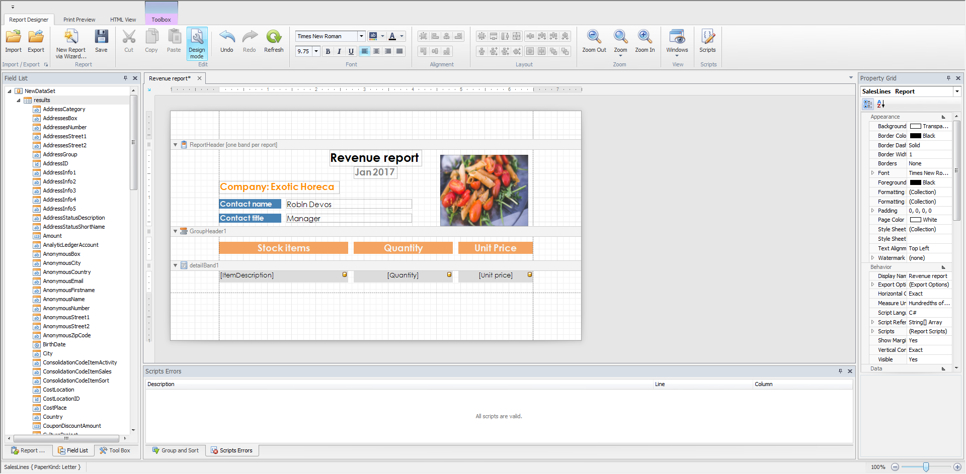
Report Designer
The Report Designer allows you to create new reports from scratch, bind them to data, edit report and even allows you to display its Print Preview and send its output to a printer or export it to a file on disk.
 |
The following sections are available in this guide.
Report Editing Basics
This section describes the most basic tasks you may encounter when initiating a report edit in the Report Designer.
The following topics are available in this section.
Report Editing Basics
Providing Data
Data Representation
Additional Features
Manually Update Report Output
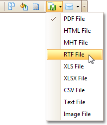
Sometimes you may need to simply update a couple of values in your report before printing it. In these cases, the simplest way to correct your report is to export it to an editable file (e.g. RTF), then use an appropriate editor tool to edit values and print your report.
To export a report, switch to the Preview Tab and click the arrow near the Export Document... button  .
.
 |
Change the Layout of Report Elements
To select a control, click it. To select the next control in tab order, press TAB. To select the previous control in tab order, click SHIFT + TAB.
Individual controls can be moved, using either mouse or keyboard.
 |
They can be precisely aligned to each other using either Snap Gird or Snap Lines.
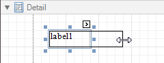
To resize a control using the mouse, select it, and then drag a rectangle drawn on its edge or corner.
 |
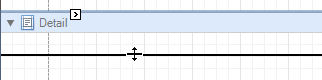
To resize a band, drag its header strip.
 |
To resize an element using the keyboard, press SHIFT+ARROW or CTRL+SHIFT+ARROW.
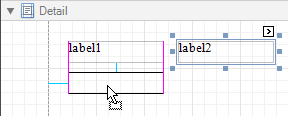
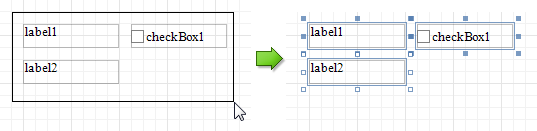
To select multiple elements, do one of the following.
Click elements while holding CTRL or SHIFT.
Click on a blank space and drag the mouse to create a selection frame. When the mouse button is released, all controls within the selection frame's boundaries will be selected. In this case, the previous selection is cleared.
 |
You can also easily align multiple controls or make them the same size, by utilizing the Layout Toolbar.
In addition, to copy, paste and delete controls simultaneously, you can place them within the Panel.
See Also
Change Fonts and Colors of Report Elements
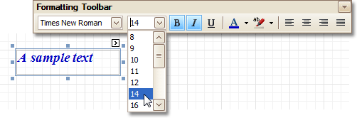
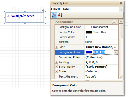
To change fonts and colors (as well as paddings, text alignment and other appearance properties) of a report control or band, select this element and do one of the following.
Use the Formatting Toolbar.
 |
Use the Property Grid, where all appearance-related properties are located under the Appearance category.
 |
Note that the appearance settings of a band are applied to all controls contained within it.
When it's required to apply styles in bulk, we recommend using common style templates, which also can be stored in an external style sheet file, and applied to multiple reports. In addition, this allows you specify separate odd/even styles, to improve your reports' readability. Another noteworthy option, is the capability to conditionally change the appearance of report elements based on a certain logical expression (e.g. if a control's value satisfies some rule). For more information, refer to Styles and Conditional Formatting in Reports.
Add or Modify Static Information in Your Report
In a report, static and dynamic information is displayed using appropriate controls.
Dynamic information changes through a report, such as values from a database (which comprise the main report data) or service information (such as current user name or page numbers). Approaches to embed dynamic information to your report are detailed in the following document: Displaying Values from a Database (Binding Report Elements to Data).
Static information is text or images that aren't obtained from a data source, and therefore don't change through the report, and don't depend on the current computer. Static information can be printed only once (e.g. in a Report Header), can repeat on each page (e.g. in a Page Header) or can repeat with every entry in your report's data source (a data-bound label, which is placed onto the Detail band).
 |
Static information can be either edited in-place, or loaded from an external file.
Change Static Information
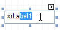
Text elements (e.g. Labels and Rich Text Boxes) allow in-place editing of their content. Simply double-click an element and activate the editor.
 |
Note
For in-place editing, you also can utilize the Formatting Toolbar.
Another way to change a control's static information, is by clicking its Smart Tag. Then, the invoked actions list will contain a link (or, a button) allowing you to edit this control's content.
 |
Load Static Information to Your Report
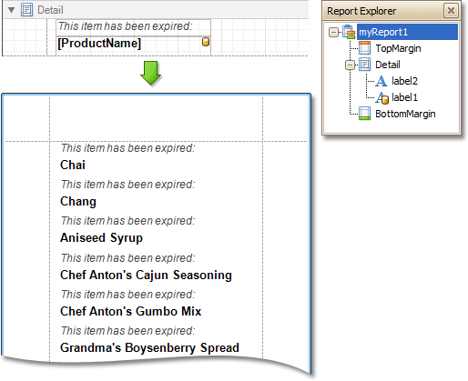
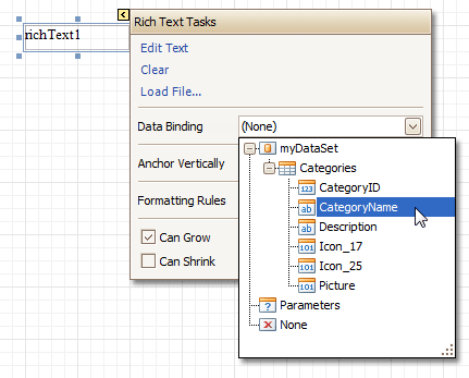
To load static information to your report from an external file, drop an appropriate control from the Control Toolbox (e.g. Label, Rich Text Box or Picture Box). After it is properly positioned, edit its content using the Smart Tag.
For instance, the following instructions describe how to display a rich text (a formatted text with embedded images) into your report.
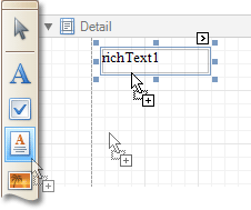
Drop the Rich Text control from the Toolbox onto the Detail band.
 |
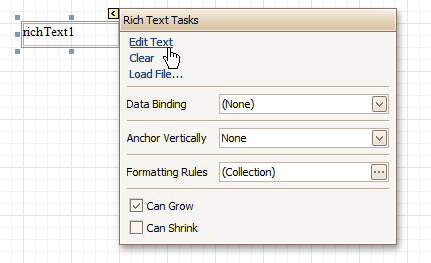
To load content from an external RTF or TXT file, select the created control and click its Smart Tag. In the invoked actions list, click the Load File... link.
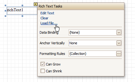 |
Then, in the invoked dialog, locate the required file, and click Open.
See Also
Change Fonts and Colors of Report Elements
Displaying Values from a Database (Binding Report Elements to Data)
Displaying Values from a Database (Binding Report Elements to Data)
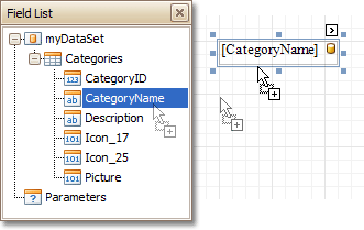
Data-bound controls are indicated by a yellow database icon in their top-right corner, both in the Design Panel and Report Explorer.
|
To embed dynamic information to a report, if this information is contained in the report's data source, this can easily be done using one of the following approaches.
After a control is bound to data, you may wish to employ additional features, which are listed in the final section of this document.
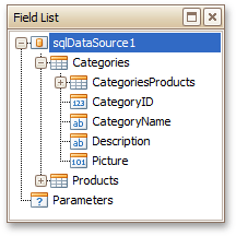
Using the Field List
To bind an existing report control to a data field, click the required field item in the Field List, and then drag and drop it onto the control. The yellow database icon inside it will indicate that it's been successfully bound.
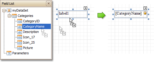 |
To add a new data-bound control, simply drag the required data field from the Field List onto a report band. This will create a Label bound to this data field.
 |
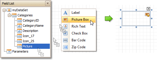
A more flexible way to create data-bound elements is to right-click a Field List item, and then drag and drop it onto a report. This will invoke the Context Menu, where you can choose which control should represent your data, and it will be automatically created and bound to the selected data field.
 |
Using the Smart Tag
Click a control's Smart Tag, and in the invoked actions list, expand the Data Binding drop-down list, and select the required data field.
 |
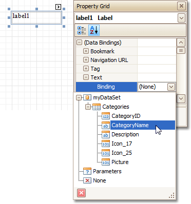
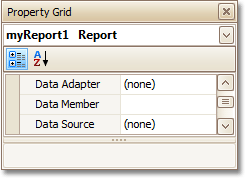
Using the Property Grid
Click a control to select it, and in the Property Grid, expand the (Data Bindings) branch that holds the bindable options. Specify a data field for the required attribute (e.g. Text).
 |
Special Capabilities
After a control is bound, you can apply formatting to its dynamic content (e.g. for it to be treated as currency, or date-time content). For details on this, refer to Change Value Formatting of Report Elements.
It is possible to make a control display a result of a summary function calculated across the data field to which it is bound. For details on this, refer to Add Totals to a Report.
Another noteworthy option is to combine both static and dynamic content within the same control (e.g. to append some text prefix or postfix to a value obtained from a database), or even bind a control to multiple data fields at one time. This is detailed in Use Mail Merge in Report Elements.
If it's required to perform some pre-calculations over the data field to which a control is bound, this can be done by creating a calculated field, and binding the control to it. This is detailed at Add Calculated Fields to a Report.
In turn, a calculated field may contain both dynamic and static parameters, which can be requested each time a report is being previewed. For more information, refer to Add Parameters to a Report.
Use Mail Merge in Report Elements
The mail merge feature allows you to combine both static and dynamic content within the same control (e.g. to append some text prefix or postfix to a value obtained from a database), or even bind a control to multiple data fields at one time.
Mail merge is available for the following controls.
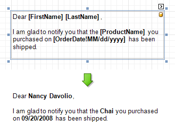
To embed dynamic data into a control's static content, type in data field names surrounded by [square brackets].
 |
To learn how values formatting can be applied to the embedded data fields (e.g. for them to be treated as currency, or date-time content), refer to Change Value Formatting of Report Elements.
Add Calculated Fields to a Report
This section demonstrates how to add a calculated field to a report. The main purpose of calculated fields is to perform pre-calculations (of virtually any level of complexity) over data fields. To learn how to easily perform simple calculations within a single data field, refer to Add Totals to a Report.
In the Report Designer, a calculated field is similar to an ordinary data field (e.g. you can bind controls to it, and group, sort and filter your report against it).
To add a calculated field to your report, follow the instructions below.
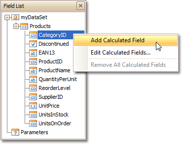
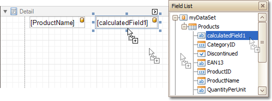
To create a calculated field, in the Field List, right-click any data member, and on the invoked menu, choose Add Calculated Field.
 |
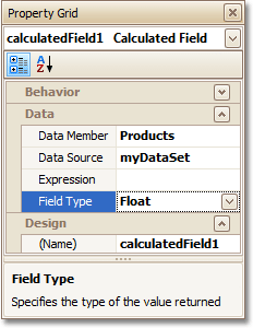
In the Field List, select the created field to show its properties in the Property Grid. Among these options, make sure to change the Field Type property to an appropriate value.
 |
Now, let's create an expression for the calculated field.
Click the ellipsis button in the Expression section, to invoke the Expression Editor. You can also invoke this dialog by right-clicking your calculated field within the Field List and selecting Edit Expression...
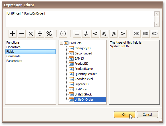 |
Click Fields to see the field list. Double-click field names to add them to the expression string. Use the toolbar to add operators between field names.
Note
Note that it's also possible to employ parameters in a calculated field's expression.
To close the dialog and save the expression, click OK.
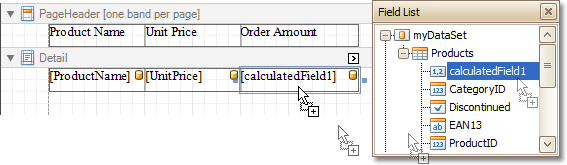
Finally, drag the calculated field from the Field List onto the required band, just like an ordinary data field.
 |
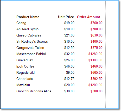
The report with a calculated field is now ready. Switch to the Preview Tab, and view the result.
 |
See Also
Change or Apply Data Filtering to a Report
Add Parameters to a Report
For your report, you can employ parameters, which can be requested each time the report is being previewed. Based on specified values, the report will then be filtered. It is also possible to employ parameters in expressions of calculated fields.
In this example, we'll create two date-time parameters to filter out orders that don't fall in the specified range from the report.
To add parameters and filter your report based on their values, follow the steps below.
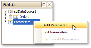
In the Field List window, right-click the Parameters section and in the invoked menu, click Add Parameter.
 |
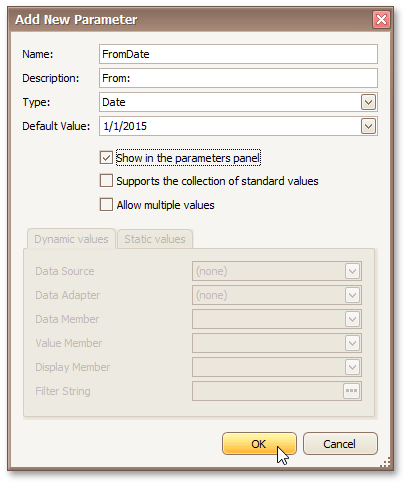
In the invoked window for the created parameter, set its Name and Description. And, make sure to set its Type to an appropriate value.
 |
Note
In Print Preview, the report's document is not generated until you have submitted values of all the parameters that have the Show in the parameters panel option switched on via the Parameters UI.
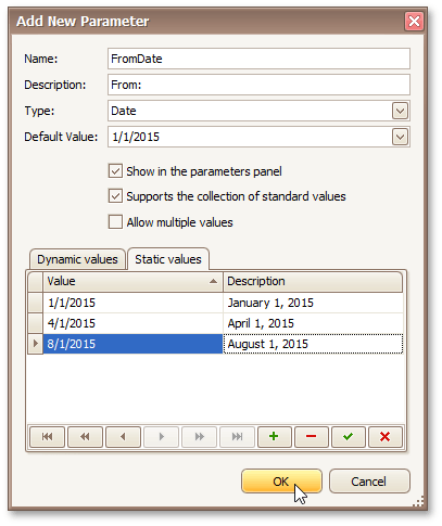
Enabling the Supports the collection of standard values option of the parameter allows end-users to modify its value and also activates the Dynamic values and the Static values tabs of the window:
- On the Dynamic values tab, you can specify a parameter's data source, data adapter and data member. The value member defines a data field that provides values to the parameter. The display member defines a data field that provides display names for parameter values (how these values appear in the user interface available in a Print Preview).
- On the Static values tab, you can manually fill the list of parameter values, with each value having an individual description (specifying how this value appears in the Parameters panel).
 |
Then, repeat the previous steps to create the second parameter, so that every time your report is previewed, you will be asked to specify two dates.
The following instructions explain how to use parameters to filter your report's data.
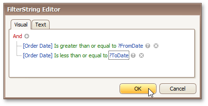
Click your report's Smart Tag, and in the invoked actions list, click the ellipsis button for the Filter String property. Then, in the invoked FilterString Editor, construct an expression where a data field is compared with the created parameters. To access parameters, click the icon on the right until it turns into a question mark.
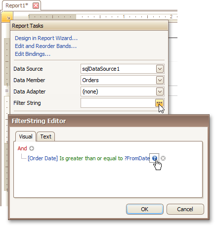 |
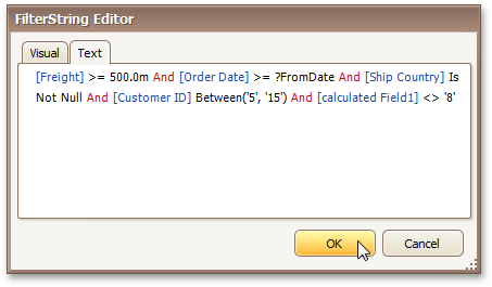
The complete filtering expression will then look like this.
 |
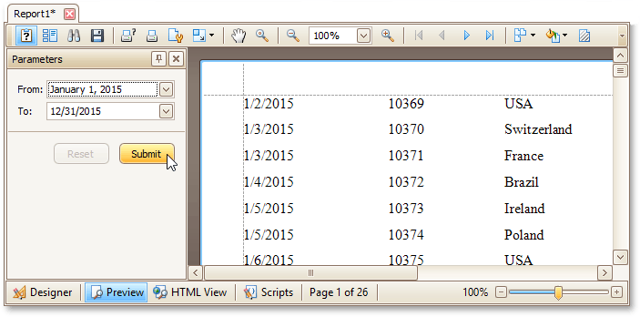
The Parametrized report is now ready. Switch to the Preview Tab, and in the Parameters section, define the required values and click Submit.
 |
If a parameter is bound to a collection of standard values, it is possible to store more than one value in it. To do this, when creating a parameter using the Add New Parameter dialog, select the Allow multiple values. check box.
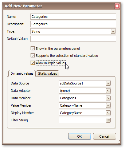 |
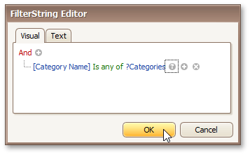
Multi-value parameters are useful when you need to filter report data against a list of values. The image below demonstrates a correct filleting expression that incorporates a multi-value parameter.
 |
The following image shows an editor for a multi-value parameter in a print preview.
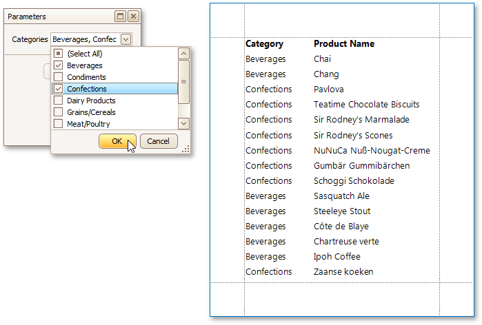 |
See Also
Change Value Formatting of Report Elements
To apply value formatting for a data-bound control's content (e.g. for it to be treated as currency, or date-time content), locate this control, click its Smart Tag, and in the invoked actions list, click the ellipsis button for the Format String entry.
Then, in the invoked format string editor, choose one of the predefined formatting styles, or specify a custom one.
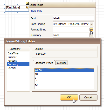 |
To quit the dialog and apply the changes, click OK.
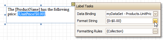
Similarly, when the mail-merge is employed for a control's dynamic content, to apply a value formatting to an embedded data field, select it in the in-place editor, and click the control's smart tag. Then, in the invoked actions list, specify the required format.
 |
Note that when a summary function is being applied to a control's dynamic content, value formatting is applied separately, via the Summary Editor, as described at Add Totals to a Report.
Independently from the general (or, summary) value formatting, you can specify a native XLSX format string, which is to be preserved when the report is being exported to XLSX. This can be done via a control's Xlsx Format String property.
Change or Apply Data Sorting to a Report
This section demonstrates how to sort a report's data. Note that as with data grouping, sorting can be performed only if a report is bound to a data source. In this example, we'll use the report created in the following tutorial: Change or Apply Data Grouping to a Report.
To sort records in a data-aware report, do the following.
Switch to the Group and Sort Panel, and click Add a Sort. In the invoked list, choose a data member across which the report is to be sorted.
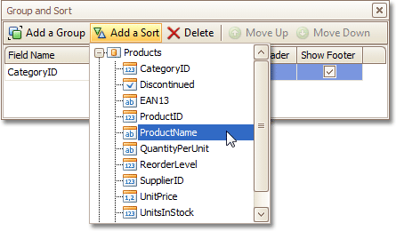 |
Note that sorting across calculated fields is supported, as well.
To manage the sorting order (ascending or descending), use the Sort Order drop-down list.
And, if multiple sorting criteria are specified, you can define the priority for each one, by selecting it in the Group and Sort Panel, and using the Move Up and Move Down buttons.
The sorting is now applied. Switch to the Preview Tab, and view the result.
 |
See Also
Change or Apply Data Grouping to a Report
Change or Apply Data Filtering to a Report
Change or Apply Data Filtering to a Report
For your report, you can specify a filtering expression (of virtually any level of complexity), to exclude excessive or undesired data.
To filter a report's data, click its Smart Tag, and in the invoked actions list, click the ellipsis button for the Filter String entry. Then, in the invoked Filter String Editor, construct an expression.
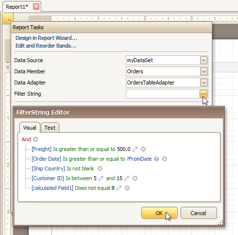 |
In the Filter String Editor, you can either use the Visual expression builder, or specify the expression in Text.
 |
Note that it is possible to embed parameters into the expression, and also request them each time a report is previewed.
To quit the dialog and save the changes, click OK.
See Also
Change or Apply Data Grouping to a Report
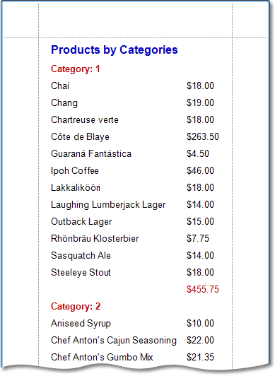
This section demonstrates how to group a report's data. Note that data grouping can be performed only if a report is bound to a data source.
To group records in a report, do the following.
Create a new report and bind it to a data source. In this tutorial, we'll start with the following report.
 |
Now, switch to the Group and Sort Panel, and click Add a Group. In the invoked list, choose a data member across which the report is to be grouped. Note that grouping across calculated fields is supported, as well.
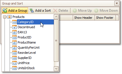 |
If multiple groups are created, you can specify the priority for each group, by selecting it in the Group and Sort Panel, and using the Move Up and Move Down buttons.
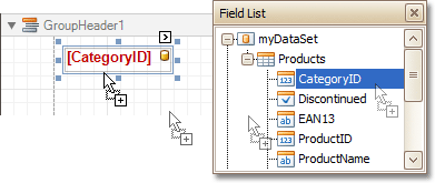
After this, a Group Header band is added to the report, with the specified data member being set as its grouping criterion.
Now, it's only left to drop the corresponding item from the Field List onto this band, so that it's displayed as a header for each group.
 |
If required, you also can apply mail merge to this label.
In addition, you can enable the corresponding Group Footer band, by checking the Show Footer option in the Group and Sort Panel.
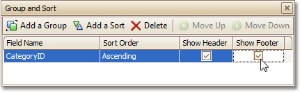 |
To manage the sorting order of the group's items (ascending or descending), use the Sort Order drop-down list.
Then, you can calculate a total across the group, by placing a Label onto this band, and specifying its Summary properties in the following way.
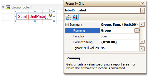 |
Note also that value formatting is applied to a summary independently of the general formatting, and has a greater priority.
The report is now ready. Switch to the Preview Tab, and view the result.
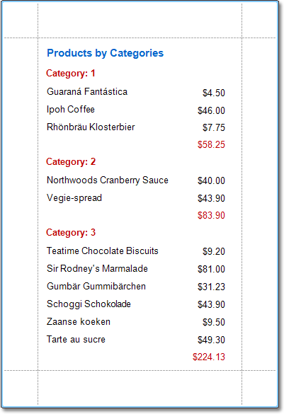 |
To learn how groups can be sorted against a summary function result, see Sort Groups by a Summary Function Result.
To learn how page numbers can be added to groups independently from the report's page numbers, refer to Add Page Numbers for Groups.
See Also
Sort Groups by a Summary Function Result
Count the Number of Records in a Report or a Group
Change or Apply Data Sorting to a Report
Add Totals to a Report
With Report Designer, you can force a data-bound control to calculate one of the standard summary functions (Average, Sum, Count, Percentage, Max, Min, etc.)
To calculate summaries (totals) within a report, follow the instructions below.
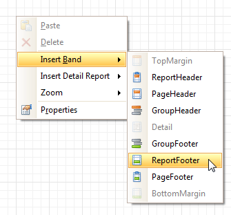
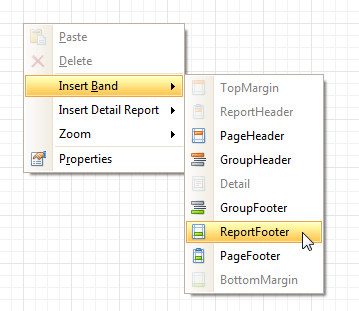
To display the result at the bottom of a report, the Report Footer band should be present. To add it, right-click anywhere over the report's area and in the invoked Context Menu, select Insert Band | ReportFooter.
 |
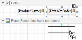
Click the field for which a summary will be calculated, to select it. Then, hold down CTRL and drag the field onto the Report Footer area, to create an exact copy of the Label that will display the summary.
 |
Note
You can also create a new label for your total by simply dragging it from the Control Toolbox.
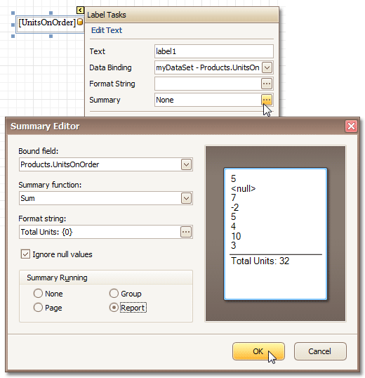
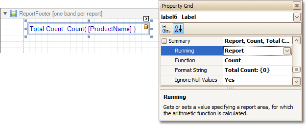
Now, select the newly created Label, click its Smart Tag, and in its actions list, click the ellipsis button for the Summary item. And, in the invoked Summary Editor, specify the summary options.
The following image shows an example of how you can set up your total. Note that the Summary Running option is set to Report, to ensure that all values from the specified data field are taken into account.
 |
Note
The Ignore NULL values option won't affect the result in this example, since NULL values are treated like zeros, by default. So, Sum won't change whether these values are taken into account or not. This option makes sense for functions like Count or Average, because the number of elements counted will depend on it.
Note also that value formatting is applied to a summary independently of the general formatting, and has a greater priority.
When calculating totals for groups, you can sort the groups against a summary function result.
To save the settings and close the dialog, click OK.
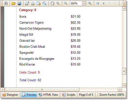
Switch to the Preview Tab, and view the result.
 |
See Also
Sort Groups by a Summary Function Result
Add Page Numbers and System Information to a Report
This section describes how to insert page numbers or other system information (e.g. current date and time, user name, etc.) into a report.
Generally, this information is displayed within the Page Header and Footer or Page Margin bands. To add page numbers or system information to a report, locate the Control Toolbox and drag and drop the Page Info control.
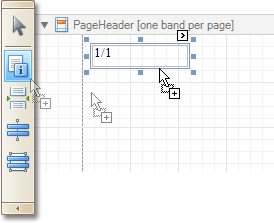 |
Then, follow the instructions below for your specific task.
Add Page Numbers
Select the Page Info control, click its Smart Tag, and in the invoked actions list, expand the drop-down list for the Page Information entry.
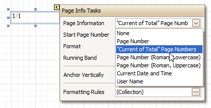 |
Select whether to display only the page number (Latin or Roman - uppercase or lowercase), or the current page number with total pages.
To format the control's text, via its Smart Tag, invoked its actions list, and specify the required format (e.g. Page {0} of {1}).
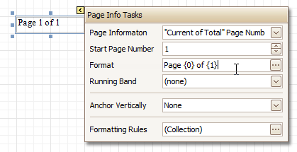 |
Using the control's actions list, you also can specify the starting page number, and the running band (e.g. this option is available when there are groups in a report, and it's required to apply independent page numbering for them). For details on this, refer to Add Page Numbers for Groups.
The result is shown below.
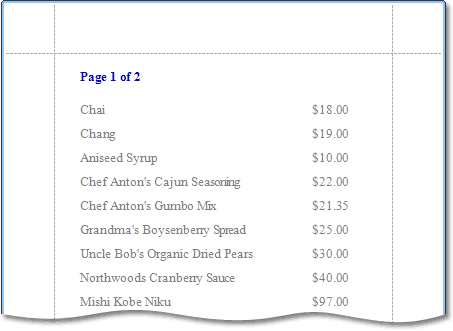 |
Add System Date and Time
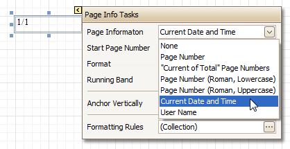
Select the Page Info control, click its Smart Tag, and in the invoked actions list, expand the drop-down list for the Page Information entry, and select Current Date and Time.
 |
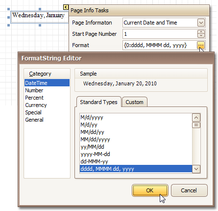
To format the control's text, via its Smart Tag, invoked its actions list, and specify the required format. You can either type it in the Format field, or, click its ellipsis button and use the Format String Editor.
 |
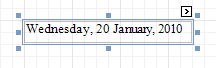
The result is shown below.
 |
Add the User Name
Select the Page Info control, click its Smart Tag, and in the invoked actions list, expand the drop-down list for the Page Information entry, and select User Name.
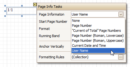 |
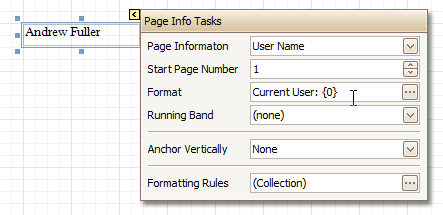
To format the control's text, via its Smart Tag, invoke its actions list, and specify the required format (e.g. Current User: {0}).
 |
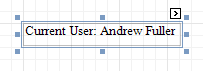
The result is shown below.
 |
See Also
Create or Modify Watermarks of a Report
This section describes how to add a text watermark in a report, or turn a picture into a report's background. Note that watermarks are visible only in Preview and HTML View modes.
To create a new watermark in a report (or to modify the existing one), do the following.
Click the report's Smart Tag, and in its actions list, click the ellipsis button for the Watermark entry.
 |
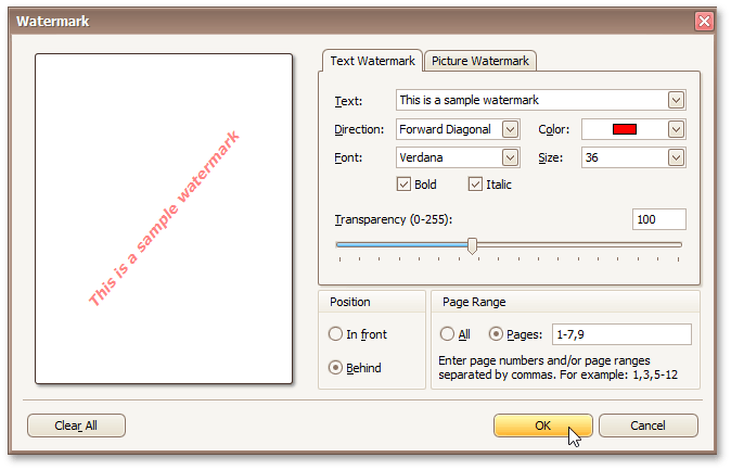
In the Text tab of the invoked Watermark dialog, define the required properties for the text watermark.
 |
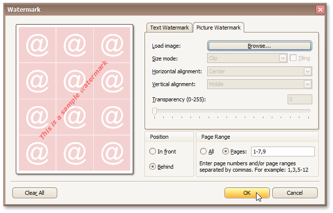
Then, switch to the Picture Watermark tab to load the image to be used as a watermark, and define its properties, such as Size mode, Alignment (vertical and horizontal), Tiling, Transparency, Page Range, etc.
 |
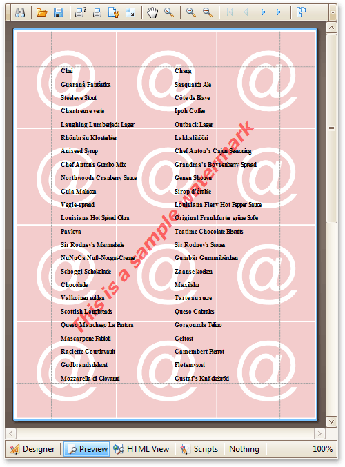
As you can see, it is possible to use both textual and image watermarks simultaneously.
The report with watermark is now ready. Switch to the Preview Tab, and view the result.
 |
See Also
Create Reports
With the help of the Report Designer, you can edit existing reports, as well as create your own reports from scratch. The following sections contain tutorials providing step-by-step instructions on both basic and advanced report customization.
The topics in this section cover the basics of working with reports in the Report Designer.
The tutorials in this section provide you detailed instructions on how to create reports of different types with the Report Designer.
The topics of this section cover appearance-related information about the Report Designer.
The tutorials of this section cover the navigation-related features of the Report Designer.
The topics of this section cover the Report Designer features that don't fall into other categories.
Basic Operations
The topics in this section cover the basics of working with reports in the Report Designer.
This section consists of the following topics.
Change Measurement Units of a Report
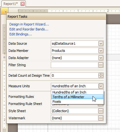
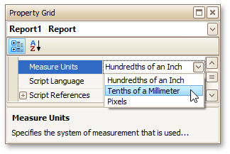
For your report, you can choose its global Measure Units, which can be Hundredths of an Inch, Tenths of a Millimeter or Pixels.
This can be specified either using the report's Smart Tag ...
 |
... or via the Property Grid.
 |
This defines the basic measurement unit for all the unit-related options of a report and its bands and controls (such as location, size, border width, etc.).
See Also
Change Page Settings of a Report
In the Report Designer, page settings of a report can be specified in one of two ways. The first approach forces the default printer settings to be used when the report is printed, while the other one enables you to alter page settings independently.
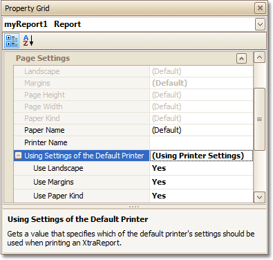
Using settings of the default printer
For the orientation, margins and paper size, you can specify a requirement that applies the corresponding printer settings instead of the report's.
In this instance, the page properties in the Property Grid are disabled and displayed as grayed out.
This may be useful when the report is printed in several places with different printers and printer settings.
 |
Specify the report's page settings
While designing the report, you can specify the page settings via the Property Grid:
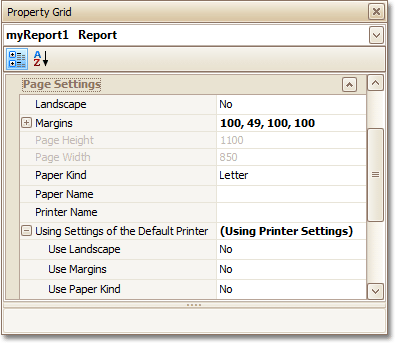 |
You can set the page orientation and modify the margins. The margin values are expressed in the report's measurement units. You can select from the predefined paper sizes (Paper Kind property), choose Custom and create your own paper size, or select one which is already defined for this printer (Paper Name property).
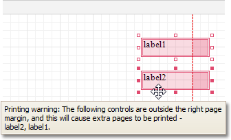
These settings affect the layout of the report's design surface. After their modification, you may notice red warning marks, indicating that the controls go beyond the page width. These warnings can be switched off by setting the Show Printing Warnings property of the report to No.
 |
Modify the settings in Preview Tab
The report's Preview Tab toolbar has a corresponding button that enables you to modify the page settings. Clicking this button invokes the Page Setup dialog, which allows you to adjust the page layout before printing or exporting, and select the printer.
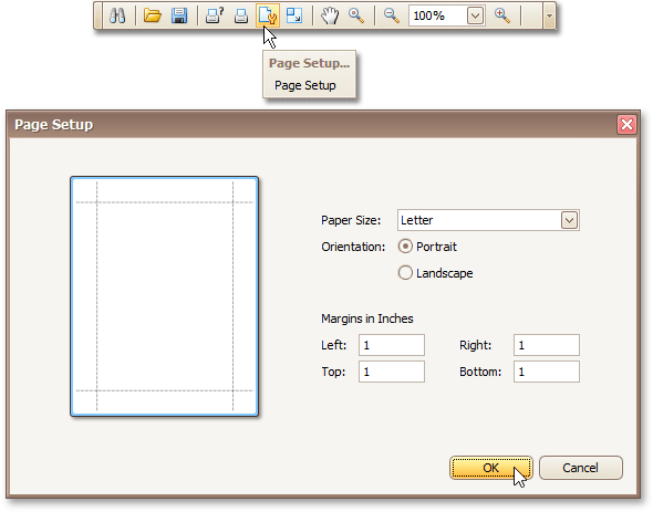 |
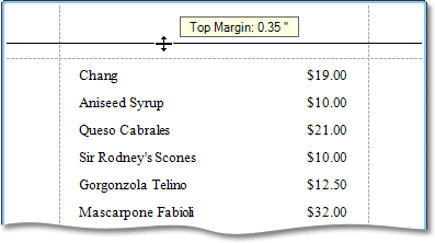
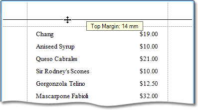
The margins can also be set visually by dragging the dashed lines in the Preview Tab as needed.
To change the measurement units shown in the margins tooltips, customize the report's Measure Units property.
Measure Units = Hundredths of an Inch
 |
Measure Units = Tenths of a Millimeter
 |
To learn about other options available for a report, refer to Report Settings.
See Also
Report Types
The topics in this section provide you detailed instructions on how to create reports of different types with the Report Designer.
Choose a report type from the following table.
Static Report
This section describes the steps to create a static report, which means that the report will not be bound to a data source. In this example, we will create a simple one-page announcement to be repeated 20 times in a report.
To create a static report, do the following.
Create a new report.
From the Control Toolbox, drop the Rich Text control onto the Detail band.
|
Select the created control and click its Smart Tag. In the invoked actions list, click the Load File... context link.
|
In the invoked dialog, define the path to an RTF or TXT file containing a text of the announcement, and click Open.
Note
Note that you can perform additional text formatting using the Formatting Toolbar.
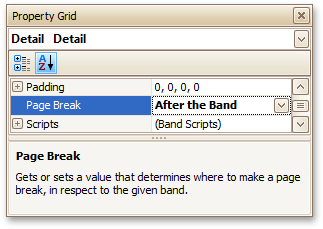
To repeat the created report 20 times, select the Detail band, expand its Report Print Options property in the Property Grid and set the Detail Count at Design Time property to 20.
And, to make the announcement print on separate pages, set the band's Page Break property to After the Band.
 |
The static report is now ready. Switch to the Preview Tab, and view the result.
 |
See Also
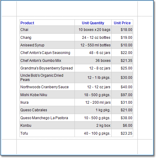
Table Report
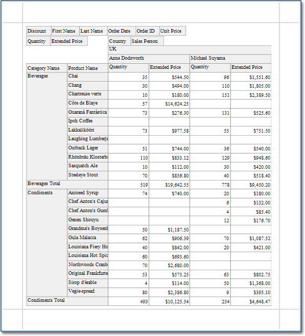
This section describes the steps to create a table report, which means that the report's data is arranged into a table-like layout. This feature should not be confused with the master-detail report or cross-tab report.
To create a table report, follow the steps below.
Create a new report.
Bind the report to a data source.
To add a Page Header to the report, right-click anywhere on the report's surface, and in the invoked Context Menu, choose Insert Band | Page Header.
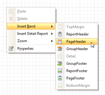 |
Now, add two Table controls to the report's Page Header and Detail band.
To do this, in the Toolbox, click the Table icon. Then, in the Page Header's content area, click and hold down the left mouse button while dragging the mouse cursor across the Detail band.
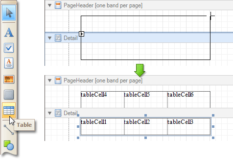 |
As a result, two tables are created. One will be used as a header, and the other one - for the report's detail information.
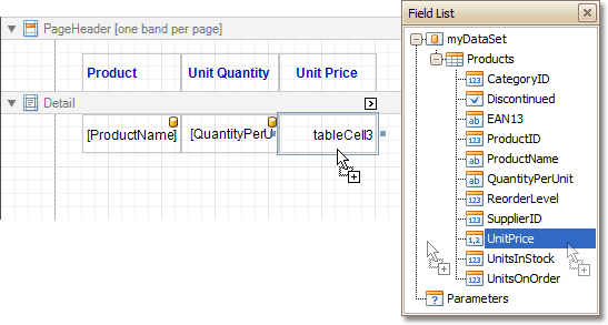
Type the headers into the upper table's cells, and bind the corresponding cells in the detail section to the appropriate data fields. This can be done by simply dropping these fields from the Field List onto the cells.
 |
Finally, you can customize various properties of the tables, to improve their appearance. For example, using the Property Grid you can define their Borders, as well as Background Color. To customize the cells' text options, use the Formatting Toolbar.
A noteworthy feature is the capability to specify odd-even styles for the detail table.
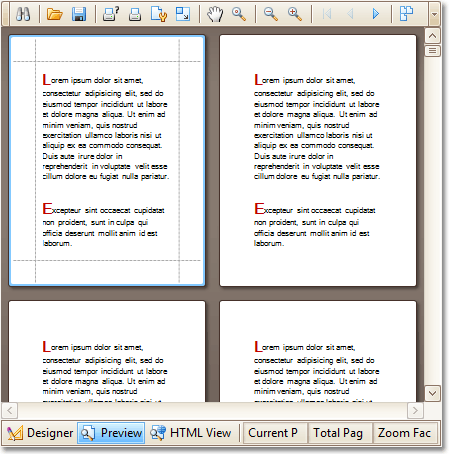
The table report is now ready. Switch to the Preview Tab, and view the result.
 |
See Also
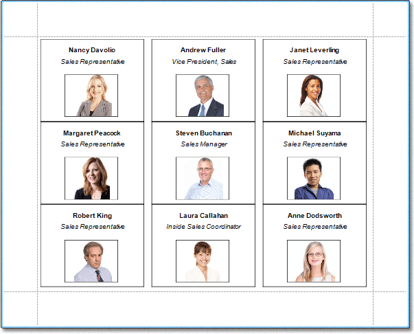
Label Report
This section describes the steps to create a label report containing employee badges, using the Report Wizard.
To create a label report, do the following.
In the Report Designer ribbon click New via Wizard... (or press CTRL+W).
Next, the Wizard will guide you through the process of creating a label report. For detailed instructions on the wizard's steps, refer to Label Report Wizard.
Bind the report to a data source containing information about employees.
Finally, drop the required fields from the Field List onto the available Detail band's area, and customize their layout.
 |
Note that you can employ the mail merge, to combine multiple data fields within the same control.
The label report is now ready. Switch to the Preview Tab, and view the result.
 |
See Also
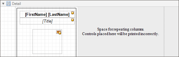
Multi-Column Report
This section describes the steps to create a multi-column report, meaning that each page of the report document is laid out in a specified number of columns.
To demonstrate the multi-column feature, we'll use a report with grouping, similar the one created in the following tutorial: Change or Apply Data Grouping to a Report.
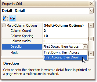
Select the Detail band, and in the Property Grid, expand the Multi-Column Options section.
First, set the required Mode. It determines whether the number of columns is manually specified, or it depends on the fixed column width.
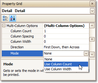 |
Then, if you've chosen to Use Column Count, set the Column Count to 2, and Column Spacing to 10.
The Direction determines the order in which records of the same group are processed.
 |
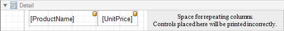
Now, on the Detail band's surface a grey area appears, delimiting the available column's width. Adjust the controls width, so that they fit within the effective borders.
 |
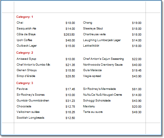
The multi-column report is now ready. Switch to the Preview Tab, and view the result.
 |
See Also
Master-Detail Report
A report is usually called Master-Detail if it is used to display data from a hierarchical data source.
 |
There are two main approaches for creating a master-detail report. The first approach is based on using the Detail Report band. The second approach is to create two different reports and incorporate the detail report into the master report as a subreport.
To see a detailed step-by-step demonstration of how detail report bands and subreports are used to create a master-detail report, refer to the following tutorials.
Master-Detail Report (Detail Report Bands)
This section describes the steps to create a master-detail report (or, invoice report) with hierarchically linked data, using the Detail Report band. For an alternative approach, refer to Master-Detail Report (Subreports).
To start with this tutorial, create a new report and bind the report to a data source. It is only possible to select a single table when binding to data using the Data Source Wizard. For this tutorial, select the table that will be used as the principal table in the master-detail relation.
The topic consists of the following sections.
Provide a Report Data Source with a Master-Detail Relation
This section of the tutorial describes how to provide an SQL data source with a master-detail relation. If you are using an Entity Framework data source that contains data members with master-detail relations between them, the existing relations will be used automatically. In this case, you can skip this section of the tutorial and proceed to the next section: Design a Master-Detail Report.
To add a master-detail relation to an SQL data source, do the following.
First you need to add a detail table to the report data source.
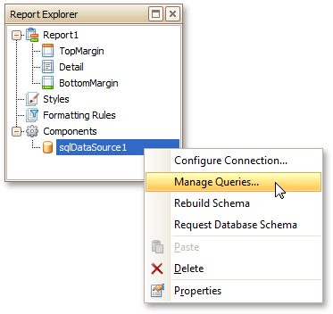
To do this, right-click the data source in the Report Explorer, and select Manage Queries in the invoked context menu.
 |
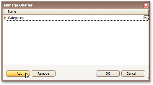
In the invoked Manage Queries dialog, click Add.
 |
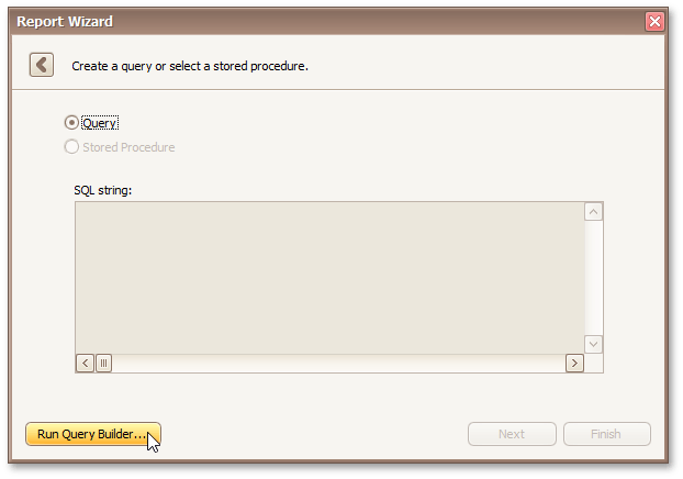
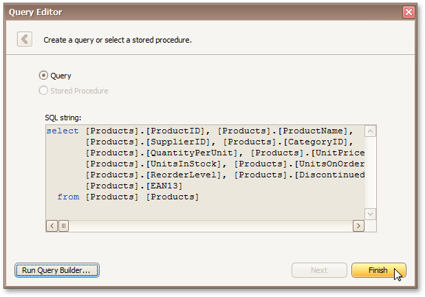
Then, in the invoked Query Editor, click Run Query Builder....
 |
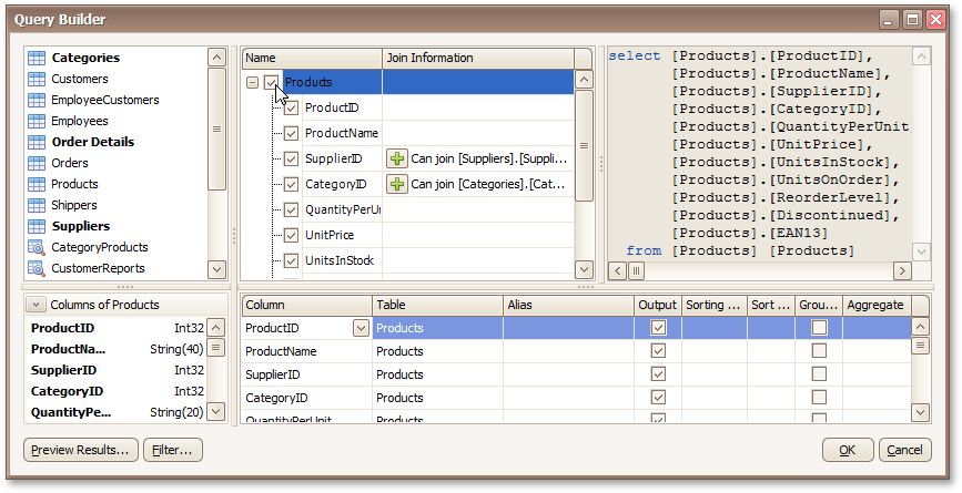
Add the detail table to the query and click OK.
 |
Next, click Finish to exit the Query Editor.
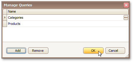
 |
Click OK to exit the Manage Queries dialog.
 |
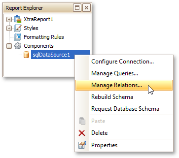
Next, specify the relation between the data source tables. To do this, right-click the data source in the Report Explorer, and select Manage Relations... in the invoked context menu.
 |
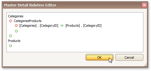
In the invoked Master-Detail Relation Editor, click the + button next to the master query to add a new relation. Specify a relation condition as shown in the following image and click OK to exit the dialog.
 |
The Field List will be updated to reflect the added relation.
 |
Design a Master-Detail Report
To create the layout of a master-detail report, do the following.
Allocate parts of a master report on the report's Detail Band.
For the master report to be generated properly, the report's Data Member should be set to the master query. If you added the master query first, this property is set to the required value automatically. To manually specify the data member, click the report's smart tag and in the invoked actions list, expand the drop-down list for the Data Member property and select the master query.
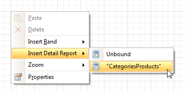
Now, to add a detail report band, right-click anywhere on the report's surface, and in the invoked Context Menu, point to Insert Detail Report. When the report's data source contains a data relationship, it is displayed in the Context Menu.
 |
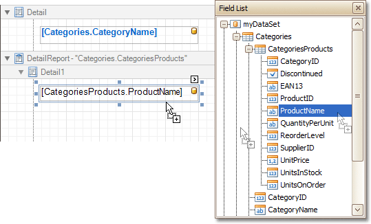
Then, drop the required data fields from the Field List onto the detail report band.
Note that you should drop items from the relation node (in this example it is the CategoriesProducts section), for the detail report to be generated correctly.
 |
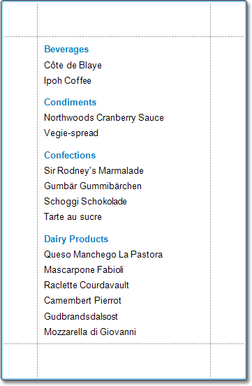
View the Result
The master-detail report is now ready. Switch to the Preview Tab, and view the result.
 |
See Also
Master-Detail Report (Subreports)
This section describes the steps needed to create a master-detail report using the Subreport control. For an alternative approach, refer to Master-Detail Report (Detail Report Bands).
To create a master-detail report using the subreport controls, do the following.
Create a Master Report
Create a new report and bind it to a data source. This report will be used as the master report.
Drop the required fields from the Field List panel onto the Detail Band. In this example, the following report layout is used.
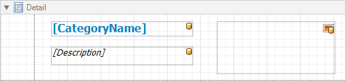 |
Drag the Subreport control from the Toolbox and drop it onto the Detail Band.
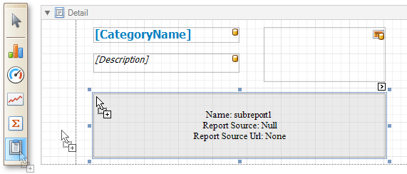 |
Create and Customize the Detail Report
Next, add one more blank report and bind it to the same data source. It will be used as a detail report.
Drop the required fields from the Field List panel onto the Detail Band. This tutorial uses the following layout for the detail report.
 |
To add a parameter to the report, right-click the Parameters section and choose Add Parameter in the Field List.
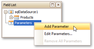 |
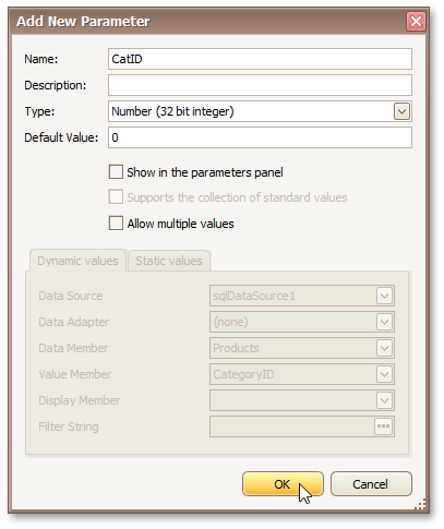
In the invoked Add New Parameter dialog, specify the parameter's options as shown in the image below.
 |
Then, click the report's Smart Tag, and in its actions list, click the ellipsis button for the Filter String property.
In the invoked FilterString Editor, construct an expression where the Category ID data field is compared to the CatID parameter. To access the parameter, click the icon on the right until it turns into a question mark.
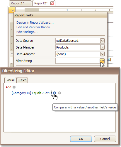 |
To save the detail report, select Save in Report Designer ribbon.
Embed the Sub-report
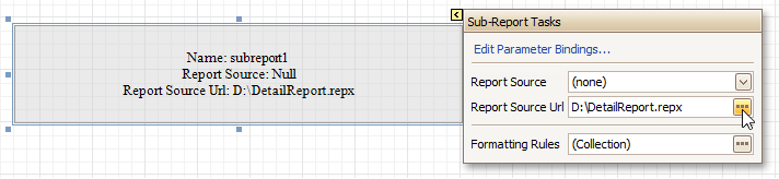
Next, switch back to the master report. Click the subreport control's smart tag, then click the ellipsis button for the ReportSource URL property and select the previously saved detail report.
 |
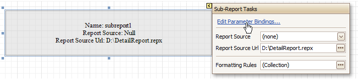
Then, bind the subreport's CatID parameter used as a filtering criterion to the master report's CategoryID data field, which will serve as a source of the parameter value. To do this, click the subreport's smart tag and select Edit Parameter Bindings in the invoked actions list.
 |
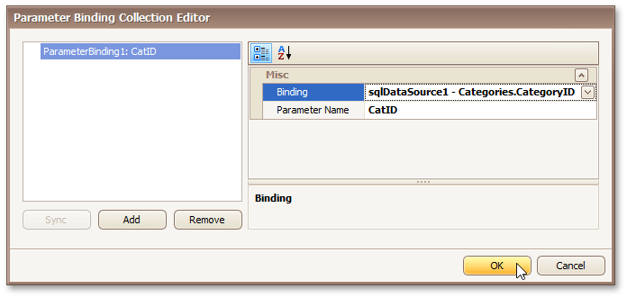
This will invoke a Parameter Binding Collection Editor. Click Add to add new binding. In the binding properties list, specify the data field to which you want to bind a subreport parameter and the name of the parameter that you want to bind.
 |
Get the Result
The master-detail report is now ready to be generated. You can view the result by switching to the Preview tab.
 |
See Also
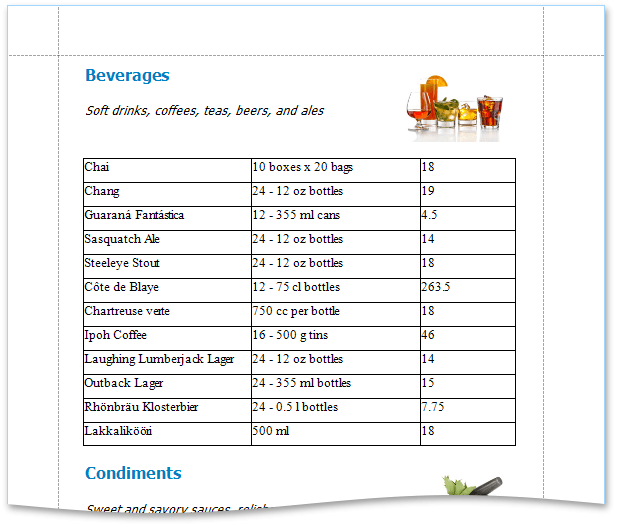
Drill-Down Report
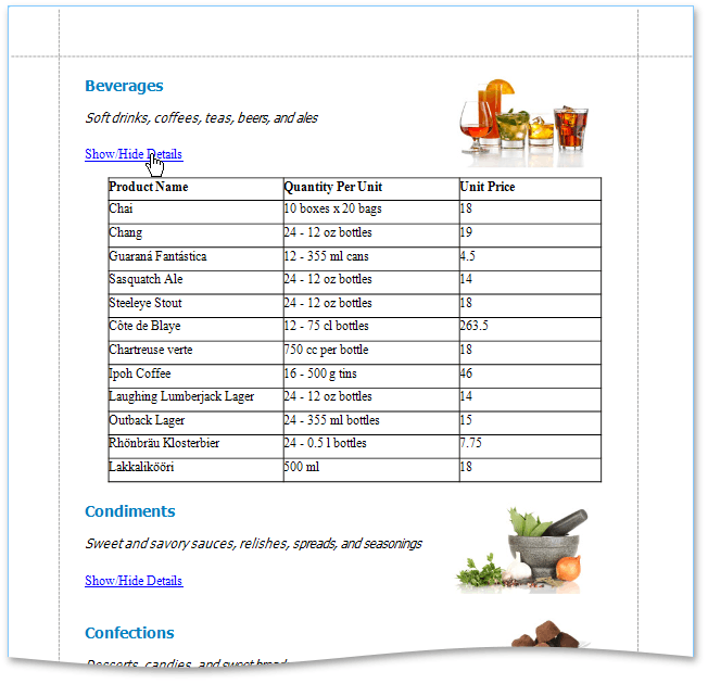
This section describes the steps needed to create a drill-down report. Drill-down reports display data partially - certain data is hidden and not printed on report pages. Hidden data can be accessed in the Preview mode by clicking a designated element, such as a label or image.
To create a drill-down report, do the following.
Create a new master-detail report using the Detail Report band
To create a link for showing/hiding the detail report, drag the Label report control from the Toolbox and drop it onto the report's Detail Band.
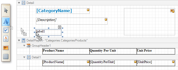 |
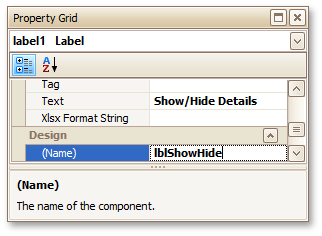
Go to the Property Grid and change the label's Text to Show/Hide Details, and Name to lblShowHide.
 |
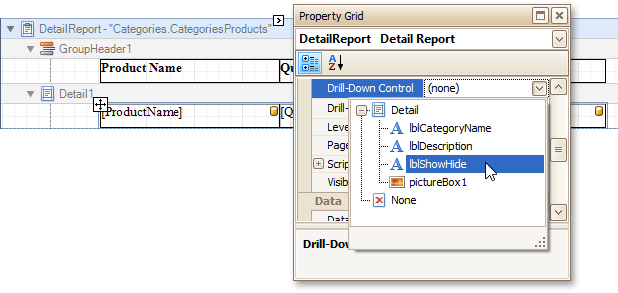
Select the Detail Report Band, and in the Property Grid, expand the drop-down list for the band's DrillDownControl property. The list displays all report controls available on the report band that is one level above the current band in the report bands hierarchy. Select the lblShowHide label in the list. This will make the label expand or collapse the Detail Report band when clicked in Preview mode.
 |
You can also use the band's DrillDownExpanded property to specify whether or not the band is initially expanded. By default, this property is enabled.
The drill-down report is now ready. Switch the report to the Preview mode to view the result.
 |
Cross-Tab Report
This secton describes the steps to create a cross-tab report using a Pivot Grid control. This feature should not be confused with the master-detail report or table report.
To create a cross-tab report, do the following.
Create a new report.
Drop the Pivot Grid control from the Toolbox onto the report's Detail band.
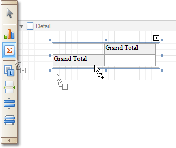 |
To bind the pivot grid to a data source, click its Smart Tag, and in the invoked actions list, expand the Data Source drop-down selector and click Add New DataSource.
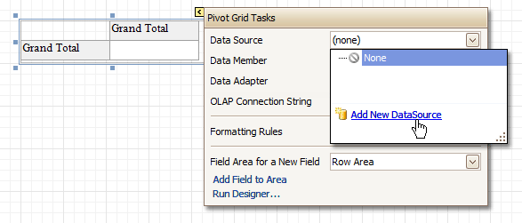 |
The invoked Report Wizard will guide you through the process of assigning a data source to the grid. For detailed instructions on the Wizard's steps, refer to Binding a Report to Data, as this process is similar.
Otherwise, the grid will be blank at the preview and repeated as many times as there are records in the data source.
After the dataset is created, it is assigned to the grid's Data Source property. Its Data Member property defines from which table or view of your dataset the grid obtains its data.
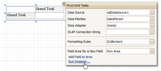
So once again, click the grid's Smart Tag, and in the invoked actions list, click the Run Designer... link.
 |
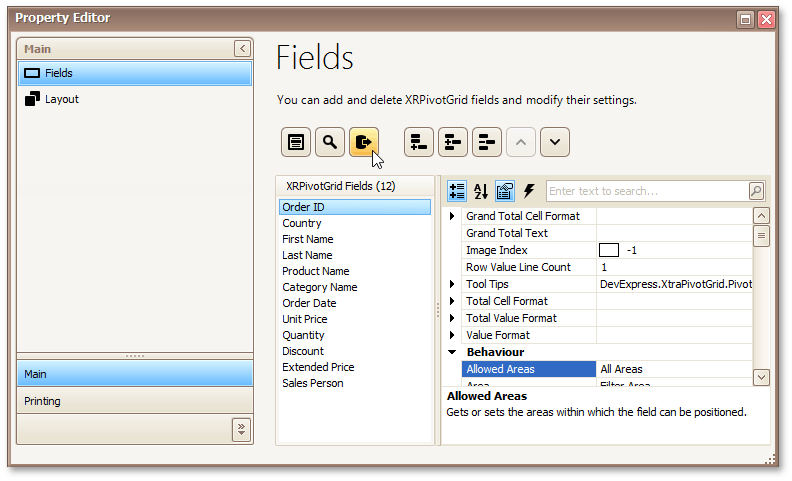
In the invoked Property Editor, click Retrieve Fields.
 |
Then, switch to the Layout section in the navigation bar on the left.
Drag and drop the required fields to the Row Fields, Column Fields and Data Items areas.
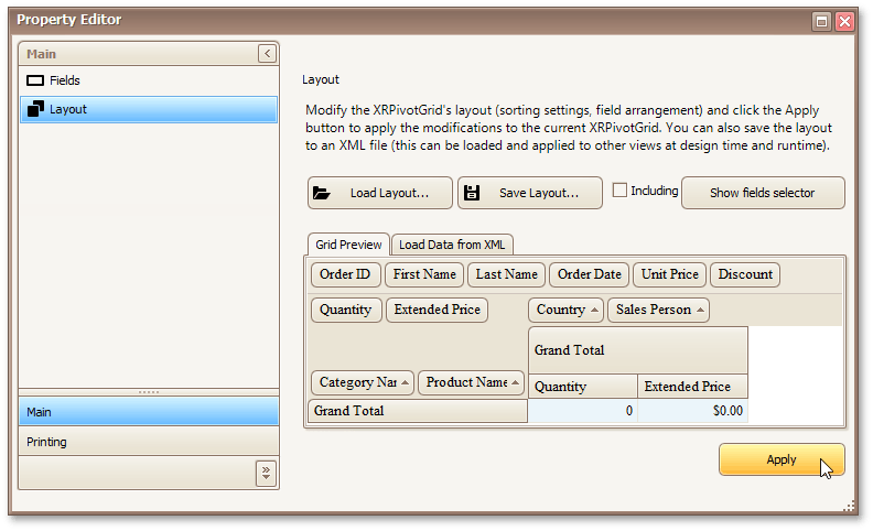 |
Click Apply and close the editor.
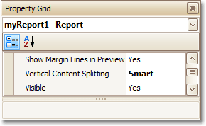
In the last step, you can set your report's Vertical Content Splitting option to Smart. This will split the grid's columns precisely by their borders in the Print Preview.
 |
The cross-tab report is now ready. Switch to the Preview Tab, and view the result.
 |
See Also
Parameterized Report
This section describes the steps needed to create a report with parameters. In this example, we will create two date-time parameters, to filter out orders which don't fall in the specified range from the report.
First, create a report and bind it to a data source.
To add parameters and filter your report based on their values, follow the steps below.
In the Field List window, right-click the Parameters section and in the invoked menu, click Add Parameter.
|
In the invoked window for the created parameter, set its Name and Description. And, make sure to set its Type to an appropriate value.
|
Note
In Print Preview, the report's document is not generated until you have submitted values of all the parameters that have the Show in the parameters panel option switched on via the Parameters UI.
Enabling the Supports the collection of standard values option of the parameter allows end-users to modify its value and also activates the Dynamic values and the Static values tabs of the window:
- On the Dynamic values tab, you can specify a parameter's data source, data adapter and data member. The value member defines a data field that provides values to the parameter. The display member defines a data field that provides display names for parameter values (how these values appear in the user interface available in a Print Preview).
- On the Static values tab, you can manually fill the list of parameter values, with each value having an individual description (specifying how this value appears in the Parameters panel).
|
Then, repeat the previous steps to create the second parameter, so that every time your report is previewed, you will be asked to specify two dates.
The following instructions explain how to use parameters to filter your report's data.
Click your report's Smart Tag, and in the invoked actions list, click the ellipsis button for the Filter String property. Then, in the invoked FilterString Editor, construct an expression where a data field is compared with the created parameters. To access parameters, click the icon on the right until it turns into a question mark.
|
The complete filtering expression will then look like this.
|
The Parametrized report is now ready. Switch to the Preview Tab, and in the Parameters section, define the required values and click Submit.
|
Chart with Static Series
This section describes how to create a report with a Chart control bound to data, so that a particular series has its own data source, and other settings. To simplify the example, both series obtain their data from the same data source. However, different data sources can be used for different series, if necessary.
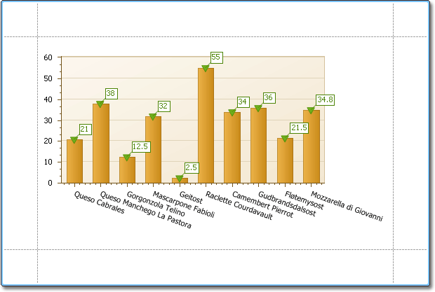
This example describes how to construct a chart of products and their prices for a chosen category.
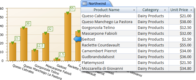 |
To adjust a Chart by manually creating its series, do the following.
Create a new report.
Drop the Chart control from the Toolbox onto the report's Detail band.
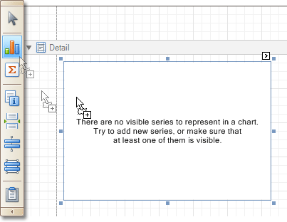 |
Note that after you drop the Chart, the Chart Wizard may be invoked (if its "Show wizard every time a new chart is added" option is enabled). In this example, we don't need to use the Wizard, so click Cancel to close its window.
To bind the Chart to a data source, click its Smart Tag. In the invoked actions list, expand the Data Source drop-down selector, and click Add New DataSource.
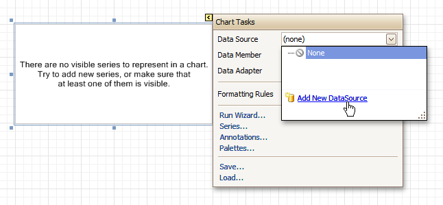 |
The invoked connection Wizard will guide you through the process of assigning a data source to the Chart. For detailed instructions on the Wizard's steps, refer to Binding a Report to Data, as this process is similar.
Note
Note that after these steps, the report's Data Source property must be set to None.
 |
Otherwise, the Chart will be blank when previewed, and repeated as many times as there are records in the data source.
After the data source is created, it is assigned to the Chart's Data Source property. Its Data Member property defines from which table or view of your data source the Chart obtains its data.
So once again, click the Chart's Smart Tag, and in the invoked actions list, click the Series... link.
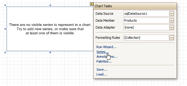 |
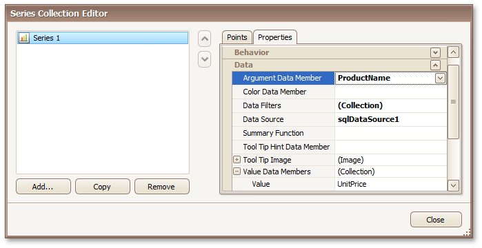
Now, in the invoked Series Collection Editor, create a series of the required view type (e.g. Bar).
Then, switch to the Properties tab at the right of the editor's window, and assign the existing data source object to the Data Source property of the series. And, assign the required data fields to the Argument Data Member and Value Data Member properties, which determine the coordinates for series points.
 |
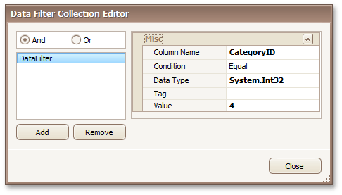
In addition, you can filter the series data. To do this, click the ellipsis button for its Data Filters property, and in the invoked dialog, create and adjust the filtering criteria.
 |
To save the changes and quit the dialog, click Close.
Then, back in the Series Collection Editor, click Copy, to create a similar series, but change its View to Point.
Finally, to improve your Chart's appearance, you can make the following adjustments.
- Remove the Chart's legend, as it shows the same data for both series. To do this, click the Legend, and in the Property Grid, set its Visible property to No.
- The point labels for Series1 are unnecessary, so select the label and set its Visible property to No.
- Customize the appearance of the Series2 markers (e.g. replace the default circle with the upside-down triangle by the View.Point Marker Options.Kind property and set its Size to 12).
- Rotate the X-axis labels for better readability. To do this, select the AxisX item in the chart by mouse click, and adjust properties for its labels (via the Label property). For instance, if the Angle property is 20 and the Antialiasing property is set to Yes, the labels look neat.
If required, it is possible to customize many other properties for the Chart, which are not described here.
The chart is now ready. Switch to the Preview Tab, and view the result.
 |
See Also
Chart with Dynamic Series
This section describes how to create a report with a Chart control bound to data, so that all series are auto-created based on a common template, which specifies universal options for all series. This is possible when the data for all series (their names, along with points' arguments and values) are stored in the same data table.
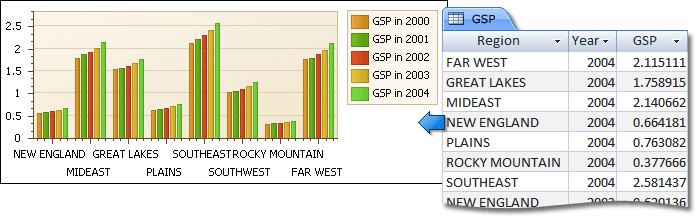 |
Note that in this scenario, the view type, and certain other settings, will be the same for all series.
To adjust a Chart with automatically created series, do the following.
Create a new report.
Drop the Chart control from the Toolbox onto the report's Detail band.
|
Note that after you drop the Chart, the Chart Wizard may be invoked (if its "Show wizard every time a new chart is added" option is enabled). In this example, we don't need to use the Wizard, so click Cancel to close its window.
To bind the Chart to a data source, click its Smart Tag. In the invoked actions list, expand the Data Source drop-down selector, and click Add New DataSource.
|
The invoked connection Wizard will guide you through the process of assigning a data source to the Chart. For detailed instructions on the Wizard's steps, refer to Binding a Report to Data, as this process is similar.
Note
Note that after these steps, the report's Data Source property must be set to None.
|
Otherwise, the Chart will be blank when previewed, and repeated as many times as there are records in the data source.
After the data source is created, it is assigned to the Chart's Data Source property. Its Data Member property defines from which table or view of your data source the Chart obtains its data.
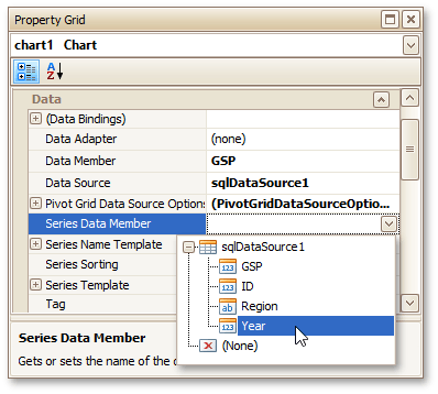
Now, to specify the data field which should provide data for the series names (so that a new series is created for each record in that data field), set the Series Data Member property value.
 |
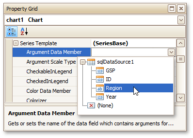
Then, adjust the series template which is accessed via the chart's Series Template property. First, set the Argument Data Member (which specifies from where the data for points' arguments is obtained).
 |
Make sure that the Argument Scale Type property is set to an appropriate value. Otherwise (e.g. when your data is of the date-time type, but this property is set to Qualitative), the resulting Chart will be seriously affected, and incorrectly represent its underlying data.
And, specify the Value Data Members property, indicating the data field(s) from which the points' values are obtained.
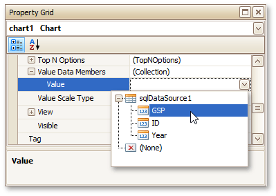 |
As with the argument, make sure to appropriately specify the Value Scale Type.
At this point, the chart's data options are completely defined, so in this step some additional customization capabilities are described.
- Adjust the Series Name Template
By default, the name for every auto-created series is obtained directly from an appropriate data field in the bound data source. However, you can add some text to the beginning or to the end of every series name, via the Series Name Template property. For instance, here we set the Begin Text property to "GSP in ".
- Customize Axis Labels
To avoid overlapping axis labels, select an axis and set its Label.Staggered property to Yes.
If required, it is possible to customize many other properties for the Chart, which are not described here.
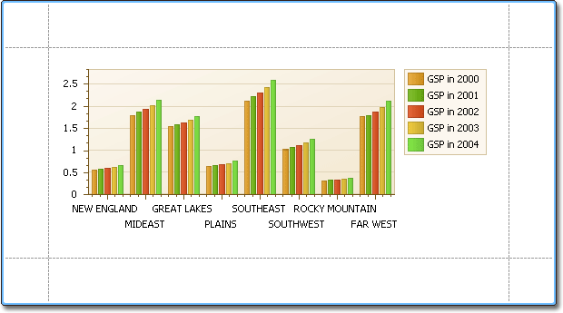
The chart is now ready. Switch to the Preview Tab, and view the result.
 |
See Also
Styles and Conditional Formatting in Reports
The topics of this section cover appearance-related information about the Report Designer.
This section consists of the following topics.
Understanding Style Concepts
This section describes how you can provide a professional look to your reports by effectively adjusting the appearance of its elements.
It consists of the following sections.
Appearance Properties
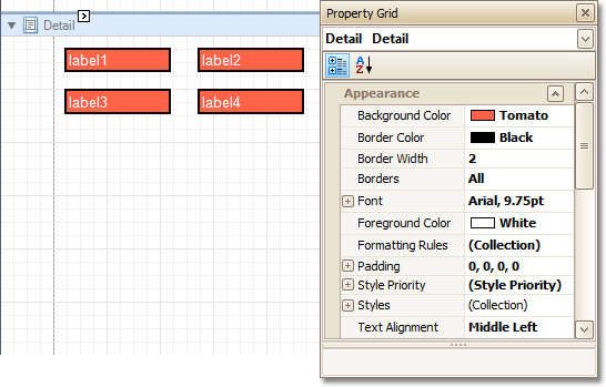
In the Report Designer, a report and each of its elements (bands and controls) has a complete set of appearance options (such as Background Color, Borders, Font, Foreground Color, Text Alignment, etc.).
By default, these properties aren't specified, meaning that their real values are obtained from a control's (or band's) parent, which is the report itself. So, the appearance specified for a report is distributed to all its child elements. Similarly, the appearance of a band is translated to the controls it contains.
 |
In turn, a control's appearance can be adjusted independently from its parent.
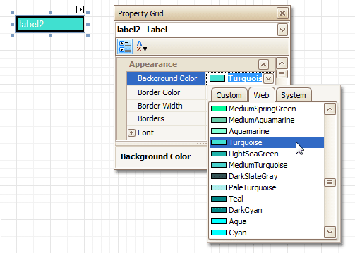 |
To reset a value assigned to a control's appearance property, you can right-click this property in the Property Grid, and in the invoked menu, click Reset. As a result, the control will be restored to the appearance of its parent.
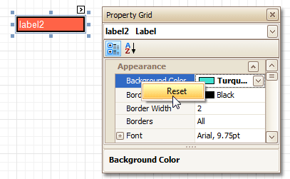 |
Visual Styles
In addition to the capability to specify appearance property values for every control and bands, you can create comprehensive global styles (which are stored in the report's style sheet), and then assign them to individual report elements. There are two ways to store a report's style sheets.
Save them to external files (with a REPSS extension), and then load them to a report using its Style Sheet Path property. This approach is described in the Store and Restore Style Sheets document.
Store the styles within the report, so that they can be easily accessed using its Style Sheet property and can be modified, if required.
Click the ellipsis button for the Style Sheet property to invoke the Styles Editor, which allows you to manage a report's style sheets, customize them, save to a file and load from it.
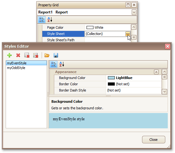 |
Note
Note that if styles contained in a style sheet loaded using the Style Sheet Path property have the same names as styles already contained in a report, the latter are overridden.
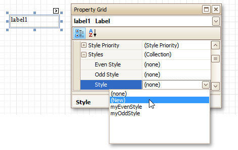
To assign a particular style to a control, invoke the drop-down list for its Style property. Then, select one of the styles stored in a report's sheet collection or select (New) to create a new style sheet.
 |
Note that if a style is assigned to a band, it is applied to all controls that the band contains.
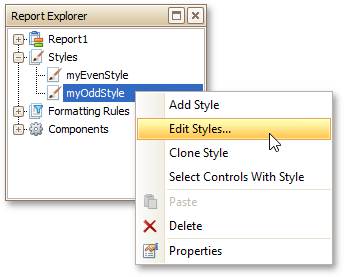
You can also use the Report Explorer to access the style collection. Commands of the context menu allow you to add, edit, clone or delete a style.
 |
To apply style to a report element, drag it from the Report Explorer onto the required report element.
Styles Priority
A style defines the same appearance properties that are defined by a control's (or band's) appearance properties. When both styles and individual appearance settings are assigned to an element, you can control the priority of their differing options using an element's Style Priority property.
By default, most of the Style Priority's options (Use Background Color, Use Border Color, etc.) are set to Yes. This means that if any style is assigned to a control, its properties will have a higher priority than the appearance properties of this element or its parent. You can assign a higher priority to an element's appearance property by disabling the corresponding Use* property.
The following image demonstrates how the Style Priority property works.
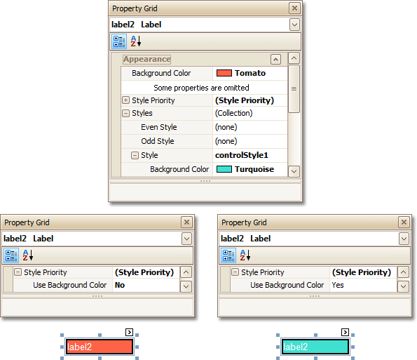 |
The same principles are applied to the odd-even styles feature, which allows you to alternate the appearance of consecutive data rows in your report. For details on this, refer to Use Odd and Even Styles.
Note
When conditional formatting is applied to an element, its appearance definition has the highest priority.
See Also
Use Odd and Even Styles
This section describes how to apply odd and even styles to report controls, e.g. to alternate the background color for each record.
To utilize odd and even styles, do the following.
Create a table report.
Select the detail table, and in the Property Grid, expand its Styles.
Invoke the drop-down list for the Even Style, and click (New).
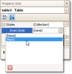 |
This will create a style and assign it to the control's Even Style.
Now, expand the Even Style property, and adjust the required options, e.g. set the Background Color to ControlLight.
 |
If required, perform the same steps, to create and assign an odd style, as well.
Switch to the Preview Tab, and view the result.
|
See Also
Store and Restore Style Sheets
This section describes how you can save a report's style sheet into an external file, and then load it back to the report.
You can store a report's style sheet (containing all the report styles) in an external REPSS file. This makes it possible to easily restore a report's appearance from this file. For general information, refer to Understanding Style Concepts.
To learn how to store and restore report style sheets, do the following.
Create a new report and bind it to a data source.
Click the report's Smart Tag, and in the invoked actions list, click the ellipsis button for the Style Sheet property.
 |
In the invoked Styles Editor, use the
 button to create new styles. Specify the desired options (e.g., Background Color) for these styles, and click the Save button.
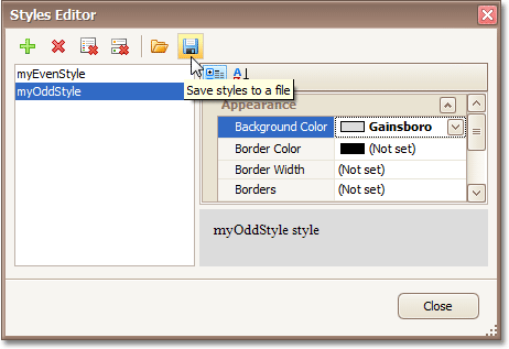 |
Then, in the invoked Save dialog, define a name for the style sheet file (.REPSS), and click Save.
Next, delete the created styles using the
 button, and close the dialog.
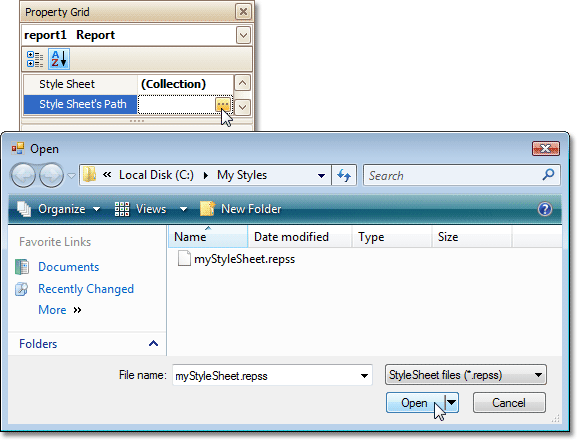
Select the report, and in the Property Grid, click the ellipsis button for the Style Sheet Path property. In the invoked Open dialog, load the created REPSS file.
 |
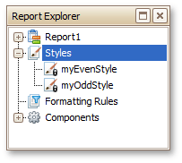
The loaded styles will be displayed inside the Styles node of the Report Explorer. These styles cannot be edited in a report, so they are marked as read-only in the Report Explorer and are not displayed in the Styles Editor.
 |
If you then reset the Style Sheet Path property, all the styles loaded from the style sheet file will be removed.
Another option for obtaining style sheets from an external file is to use the Open button in the Styles Editor. In this case, the loaded style sheets will be stored within a report, and will thus be editable.
To learn how you can assign styles to report elements, refer to the Understanding Style Concepts and Use Odd and Even Styles documents.
Note
Note that the styles loaded from a style sheet file have priority over the styles that exist in a report's style sheet. So, if the styles stored in the report have the same names as the styles loaded from a style sheet file, then the styles from the file will become substitutes for their namesakes.
See Also
Conditionally Change a Control's Appearance
This section describes the steps to conditionally change a control's appearance (e.g. make a Label's text red if its value exceeds some threshold). Thanks to the formatting rules feature, to achieve this, no scripts are required, so you shouldn't write any code.
To conditionally change a control's appearance, do the following.
Click the report's Smart Tag, and in the invoked actions list, click the ellipsis button for the Formatting Rule Sheet option.
 |
And, in the invoked Formatting Rule Sheet Editor, create a new formatting rule (by using the button), and click the ellipsis button for its Condition property.
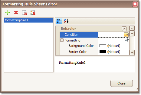 |
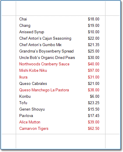
Then, in the invoked Condition Editor, define the required Boolean condition (which means that its result is returned as either true or false). In this tutorial, we will format fields if the UnitPrice value is greater than 30.
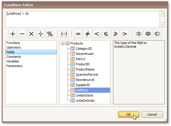 |
To save the condition and close the dialog, click OK.
Now, back in the Formatting Rule Sheet Editor, define the formatting to be applied (e.g. specify the desired font color).
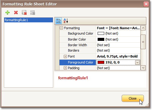 |
To save the changes and quit the dialog, click Close.
Finally, select the band or control to which the formatting rule must be applied (in this example it is the Detail band), and via its Smart Tag, access its collection of Formatting Rules.
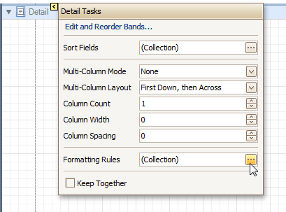 |
And, in the invoked Formatting Rules Editor, move the rule from left to right (using the > button), for it to come into effect for this band.
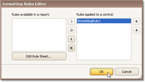 |
If multiple rules are applied, it is possible to customize their precedence, by using the up and down arrow buttons at the right of the dialog. So, the rules are applied in the same order that they appear in the list, and the last rule in the list has the highest priority.
The result is shown in the following image.
 |
See Also
Conditionally Hide Bands
This section describes how to hide bands if a certain logical condition is met. Note that no scripts are required to accomplish this task.
To demonstrate this feature, we'll use a report with grouping, similar to the one created in the following tutorial: Change or Apply Data Grouping to a Report.
To conditionally hide bands in a report, do the following.
Select the Group Header, and click its Smart Tag. Then, in the invoked actions list, click the ellipsis button for the Formatting Rules option.
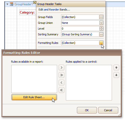 |
In the invoked Formatting Rules Editor, click the Edit Rule Sheet... button.
Now, in the invoked Formatting Rule Sheet Editor, click the
button, to create a new rule. Then, set its Visible property to False, and click the ellipsis button for the Condition property.
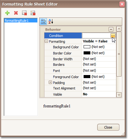 |
Construct the required logical expression (e.g. [CategoryID] < 2), and click OK.
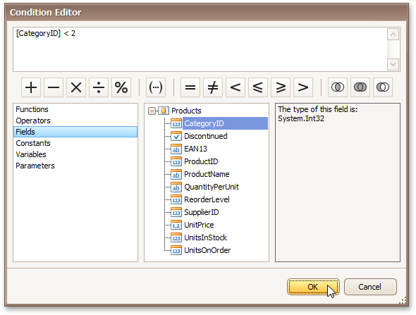 |
To quit the Formatting Rule Sheet Editor, click Close.
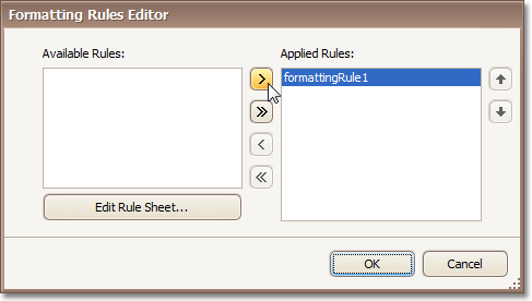
Back in the Formatting Rules Editor, move the created rule to the dialog's right section (Applied Rules), to make it active.
 |
And, do the same for the report's Detail band. That is, click the ellipsis button for its Formatting Rules property, and in the invoked dialog, apply the same rule to this band, as well.
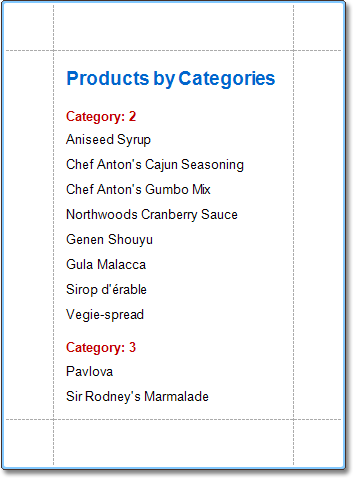
Switch to the Preview Tab, and view the result. In our example, you can see that the first category isn't shown. So, the conditional formatting was applied properly.
 |
See Also
Conditionally Change a Label's Text
This section demonstrates how to change a label's text if a certain condition is met, without using scripts.
To conditionally change a label's text, do the following.
Create a new report and bind it to a data source.
To create a calculated field, in the Field List, right-click any item inside the created data source, and on the invoked menu, choose Add Calculated Field.
|
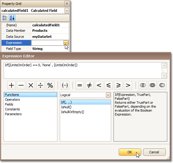
Select the calculated field, and in the Property Grid, set its Field Type to String. Then, click the ellipsis button for its Expression property.
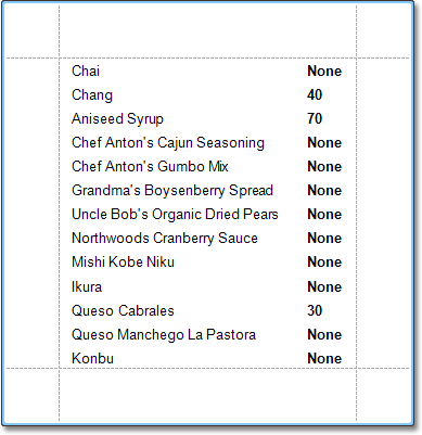
And, in the invoked Expression Editor, define the required logical condition for the calculated field (e.g. Iif([UnitsOnOrder] == 0, 'None', [UnitsOnOrder]), which means that if the UnitsOnOrder data field's value is equal to 0, the control's text will be replaced with None).
 |
To save the changes and close the dialog, click OK.
Finally, drop the required data fields (and the created calculated field as well) from the Field List onto the report's Detail band.
 |
The report is now ready. Switch to the Preview Tab, and view the result.
 |
See Also
Report Navigation
This section cover the navigation-related features of the Report Designer.
This section consists of the following tutorials.
Add Bookmarks
This section describes the steps to create a report with bookmarks (a so-called Document Map). This feature allows you to easily navigate through the report during print preview.
To demonstrate the Document Map feature, we'll use a report with grouping, similar the one created in the following tutorial: Change or Apply Data Grouping to a Report.
To create a report with bookmarks, do the following.
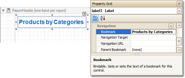
Click the Label in the Report Header band, to select it, and in the Property Grid, set its Bookmark property to the same value as its text (i.e. Products by Categories).
 |
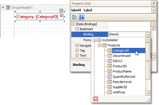
Now, select the Label in the report's Group Header band. As this control is bound to data, we will bind its Bookmark property to the same data field, using the (Data Bindings) property.
 |
Note that as with other bindable properties, you also can apply value formatting to the Bookmark property (e.g. Category {0}).
Then, for this Label, specify its Bookmark, and set the Parent Bookmark property to the Report Header's label, to define the document map's hierarchy.
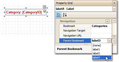 |
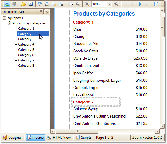
The report with bookmarks is now ready. Switch to the Preview Tab, and view the result.
 |
See Also
Create a Table of Contents
This section describes the steps to create a report with a table of contents. A table of contents is automatically created based on the bookmarks existing in a report.
To create a table of contents in a report, do the following.
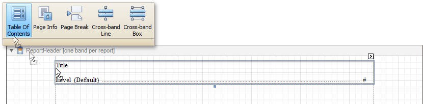
From the Control Toolbox, drop the Table of Contents control onto the Report Header band.
 |
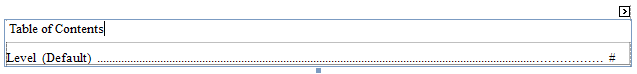
Double-click the title of the table of contents and specify its text.
 |
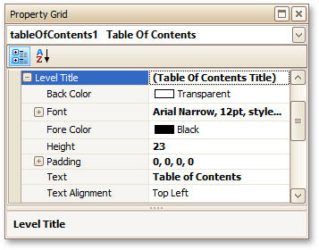
To customize the title appearance, use the Level Title option's settings available in the Properties window.
 |
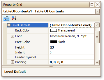
To customize the appearance of all other levels, use the Level Default option's settings.
 |
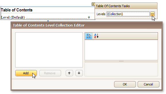
To customize a specific level individually, add a corresponding item to the Levels collection of the table of contents.
 |
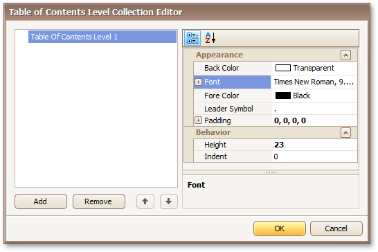
After adding a new level, you can access and customize its properties.
 |
The table of contents is now ready. Switch to the Preview Tab, and view the result.
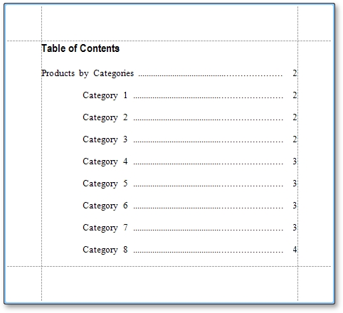 |
Create Hyperlinks
This section demonstrates how to embed a hyperlink into your report.
Note that a label will behave as a hyperlink both in a report's Print preview, HTML preview and when the report is exported to PDF, HTML, MHT, RTF, XLS and XLSX formats.
To insert a hyperlink into your report, do the following.
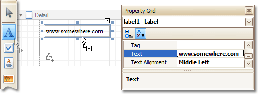
Create a new report.
Drop a Label onto the report, and in the Property Grid, change its Text to the one required for the link.
 |
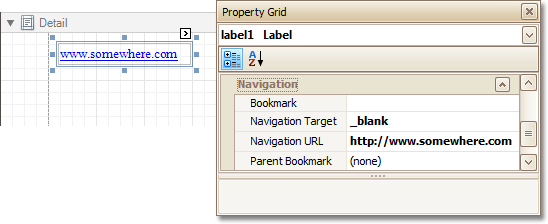
In addition, to make the Label look like a typical link, you can change its appearance appropriately (e.g. make it blue and underlined).
Now, set its Navigation Target to the required value (_blank, _parent, _search, _self, or _top), and define the required Navigation URL.
 |
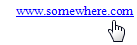
The hyperlink is now ready. Switch to the Preview Tab (or, HTML View Tab), and view the result.
 |
See Also
Add a Cross-Reference
This section demonstrates how to add a cross-reference to your report. A cross-reference is simply a link whose target is located within the current document, which allows you to establish easy navigation through a report. In this example, we place a link at the bottom of each group, leading to the beginning of the report.
To demonstrate this feature, we'll use a report with grouping, similar the one created in the following tutorial: Change or Apply Data Grouping to a Report.
To create a report with cross-references, do the following.
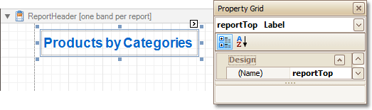
Drop a label onto the created ReportHeader band, which will serve as the report's headline. Click the label, to type the desired contents into it. Then, in the Property Grid, set its Name property to reportTop.
 |
To accompany the existing Group Header with the corresponding Footer, in the Group and Sort Panel, check the Show Footer option.
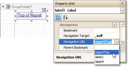
Then, drop a label onto it. As it will be the link, change its Text to Top of Report, and apply the desired formatting to it (e.g. the blue color and underlined text).
Set its Navigation Target property to _self. Then, if you click the drop-down list of the Navigation URL property, you can see the controls available in your report. Choose the one named reportTop.
 |
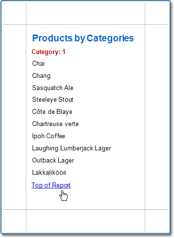
The report with cross-references is now ready. Switch to the Preview Tab (or, HTML View Tab), and view the result.
 |
See Also
Miscellaneous
The section of this section cover the Report Designer features that don't fall into other categories.
This section consists of the following topics.
Handle Events via Scripts
This section describes the basic principles of scripting, which can be performed by handling the events of a report, and its bands and controls.
This documents consists of the following sections.
Scripting Overview
Scripts are program commands, placed within the event handlers of the required report elements. And, when the corresponding event occurs (e.g. a mouse click), the script code runs.
You can write scripts for a report or any of its elements (bands and controls), to be executed when the report is being previewed, printed or exported.
Although when in the Report Designer, virtually any task can be accomplished without scripting (Conditionally Change a Control's Appearance, Conditionally Change a Label's Text and Conditionally Hide Bands), scripting is made available to extend the standard functionality as far as may be required. And, scripting is the only way to calculate custom summaries (this is detailed in the last section of this document).
Every report element has a set of script events, which are individual for each element's type. For example, the events of the Detail band are shown in the following image.
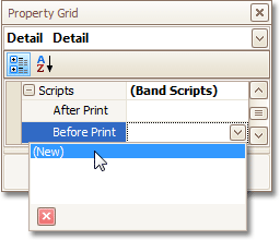 |
After you click (New) for an event (e.g. the Before Print, which is the most used), the Scripts Tab is switched on, where you can manage and edit all the report's scripts.
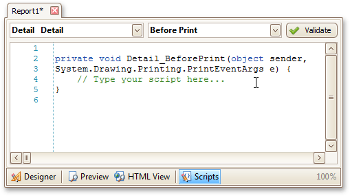 |
In this tab, for a selected event, a script template is auto-added, in the language specified via the Script Language property of the report.
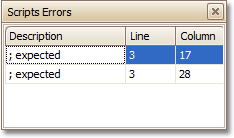
You can verify that your report's scripts are valid, by clicking Validate. The validation result is then displayed in the Scripts Errors Panel.
 |
Scripting Specifics
Scripting language
The report scripts may be written in one of the following languages that the .NET framework supports - C#, Visual Basic and J#. Since J# is not installed with the framework installation, by default, make sure it is present before writing code in it. The scripting language is specified via the Script Language property of the Report object. It is set to C#, by default.
Scripting scope
Script execution is performed in the following way:
The report engine generates a temporary class in memory. The names of the variables are defined by the Name properties of the controls and objects they represent. When the script is preprocessed, its namespace directives are cut from the script code and added to the namespace, where the temporary class is defined.
After preprocessing, all scripts are placed in the code of the temporary class. Then, the resulting class is compiled in memory, and its methods are called when events occur.
Scripting offers many advantages: you can declare classes (they will become inner classes), variables, methods, etc. A variable declared in one script is accessible in another script, because it is, in fact, a variable of the temporary class.
Reference External Assemblies
The Script References property of the Report object specifies the full paths (including the file names) to the assemblies that are referenced in the scripts used in a report.
These paths should be specified for all the assemblies that are included in scripts via the using (C#), Imports (Visual Basic) or import (J#) directives.
Note
Usually, you don't need include any assembles, because most standard assemblies that you may require in scripts are already referenced by the Report Designer.
Example: Custom Summary
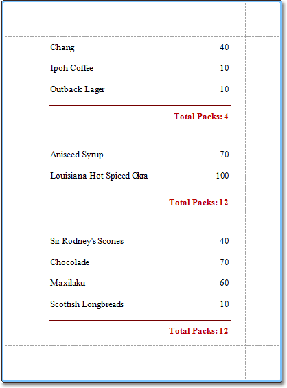
In this example, we will display the total number of product unit packs in a group.
To perform this, execute steps similar to the ones described in Add Totals to a Report, except that for the summary field, you should set the Function property to Custom.
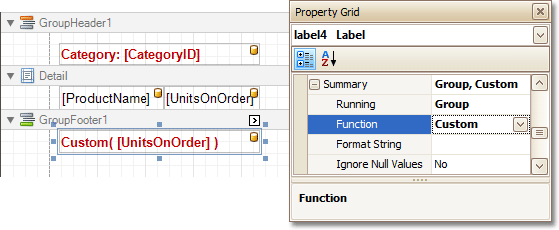 |
Then, the additional events are added to the label's Scripts property.
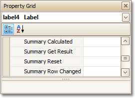 |
You can handle these events in the following way.
C# | // Declare a summary and a pack. double totalUnits = 0; double pack = 15; private void OnSummaryReset(object sender, System.EventArgs e) { // Reset the result each time a group is printed. totalUnits = 0; } private void OnSummaryRowChanged(object sender, System.EventArgs e) { // Calculate a summary. totalUnits += Convert.ToDouble(GetCurrentColumnValue("UnitsOnOrder")); } private void OnSummaryGetResult(object sender, DevExpress.XtraReports.UI.SummaryGetResultEventArgs e) { // Round the result, so that a pack will be taken into account // even if it contains only one unit. e.Result = Math.Ceiling(totalUnits / pack); e.Handled = true; } |
VB | ' Declare a summary and a pack. Private totalUnits As Double = 0 Private pack As Double = 15 Private Sub OnSummaryReset(ByVal sender As Object, ByVal e As System.EventArgs) ' Reset the result each time a group is printed. totalUnits = 0 End Sub Private Sub OnSummaryRowChanged(ByVal sender As Object, ByVal e As System.EventArgs) ' Calculate a summary. totalUnits += Convert.ToDouble(GetCurrentColumnValue("UnitsOnOrder")) End Sub Private Sub OnSummaryGetResult(ByVal sender As Object, _ ByVal e As DevExpress.XtraReports.UI.SummaryGetResultEventArgs) ' Round the result, so that a pack will be taken into account ' even if it contains only one unit. e.Result = Math.Ceiling(totalUnits / pack) e.Handled = True End Sub |
Finally, switch to the Preview Tab, and view the result.
 |
See Also
Count the Number of Records in a Report or a Group
Show the Current Row Index
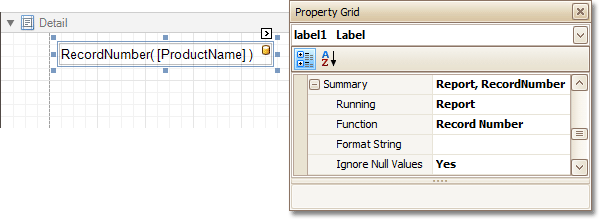
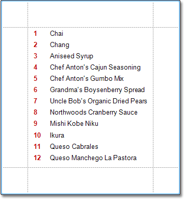
This section describes how to accompany every record in a data-bound report with its current row index.
To show the current row index in a report, use a Label control bound to a data field, and specify its Summary options in the following way.
 |
The result is shown in the following image.
 |
See Also
Count the Number of Records in a Report or a Group
Count the Number of Records in a Report or a Group
This section describes how to count the number of records in a report or a group. To demonstrate this feature, we'll use a report with grouping, similar the one created in the following tutorial: Change or Apply Data Grouping to a Report.
This tutorial consists of the following sections.
Count the Number of Records in a Group
To count the number of records in a group, do the following.
Select the Label in the Group Footer area, and in the Property Grid, expand its Summary category.
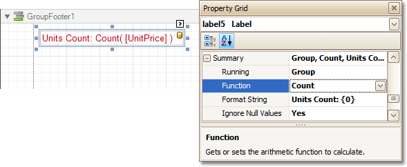 |
Set the Running option to Group and the Function to Count.
The Ignore NULL values option is useful for functions like Count or Average, because the number of elements counted will depend on it.
If required, you can specify the Format String (e.g. as Units Count: {0}). Note that value formatting is applied to a summary independently of the general formatting, and has a greater priority.
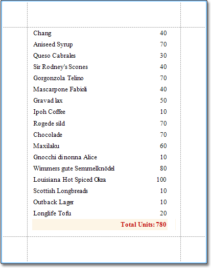
Count the Number of Records in a Report
To count the number of records in a report, do the following.
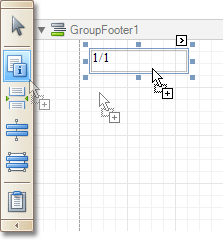
To add a Report Footer band to your report, right-click anywhere on it, and in the invoked Context Menu, choose Insert Band | ReportFooter.
 |
Then, place a Label bound to a data field onto it, and in the Property Grid, expand its Summary category.
 |
Set the Running option to Report and Function to Count.
The Ignore NULL values option is useful for functions like Count or Average, because the number of elements counted will depend on it.
If required, you can specify the Format String (e.g. as Total Count: {0}). Note that value formatting is applied to a summary independently of the general formatting, and has a greater priority.
Get the Result
The report is now ready. Switch to the Preview Tab, and view the result.
 |
See Also
Limit the Number of Records per Page
Add Page Numbers for Groups
This section demonstrates how to display page numbers individually, for each group in your report. To demonstrate this feature, we'll use a report, similar to the one created in the following tutorial: Change or Apply Data Grouping to a Report.
To add page numbers for groups, do the following.
From the Toolbox, drop the Page Info control onto the Group Footer.
 |
Then, select the control, and set its Running Band to GroupHeader1.
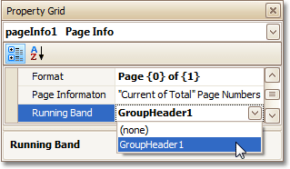 |
If required, you also can specify its Format property (e.g. Page {0} of {1}).
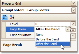
Now, you should force each new group to start on a separate page. Otherwise, group page numbers will be calculated incorrectly.
To do this, select the Group Footer, and set its Page Break to After the Band.
 |
Finally, select the Group Footer, and click its Smart Tag. In its actions list, check the Repeat Every Page option.
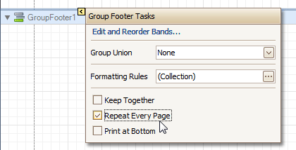 |
Then, you can do the same for the Group Header, as well.
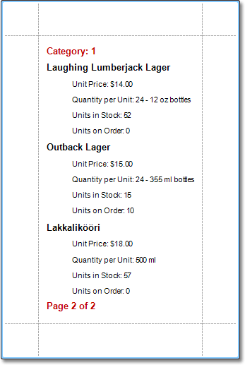
The report is now ready. Switch to the Preview Tab, and view the result.
 |
See Also
Sort Groups by a Summary Function Result
Count the Number of Records in a Report or a Group
Sort Groups by a Summary Function Result
This section demonstrates how to sort groups based on the result of a function summary specified for them. To demonstrate this feature, we'll use a report similar to the one created in the following tutorial: Change or Apply Data Grouping to a Report.
To sort groups by a summary function result, do the following.
Select the Group Header band and click its Smart Tag. In the invoked actions list, click the ellipsis button for the Sorting Summary option.
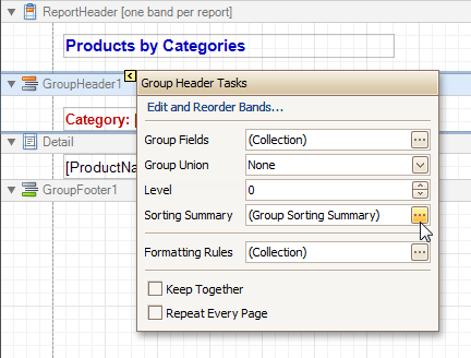 |
Then, in the invoked Group Sorting Summary Editor, check the Enabled option, and specify a field and summary function against which the group should be sorted.
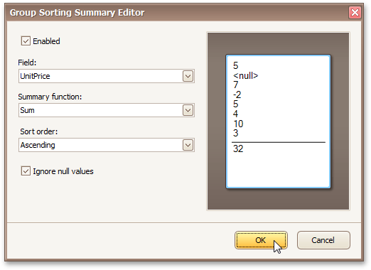 |
If required, you also can change the default sorting order (from descending to ascending), and choose to ignore null values.
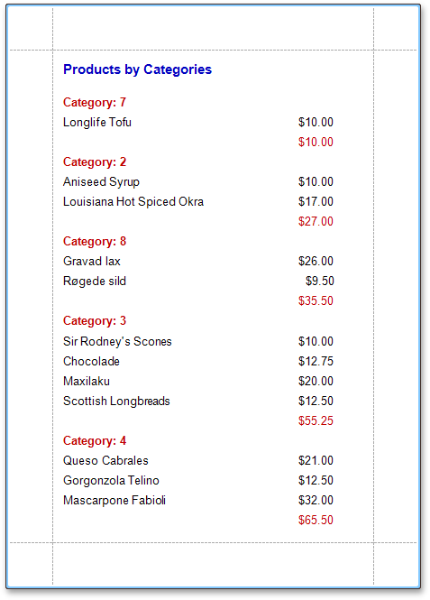
Click OK to apply the changes, and switch to the Preview Tab to view the result.
 |
See Also
Change or Apply Data Grouping to a Report
Calculate an Aggregate Function
This section describes the steps required to create a report with an aggregate function. In this example, products that are not discontinued and have a total unit value greater than $500 will be displayed.
Create a table report with a layout similar to that appearing in the following illustration.
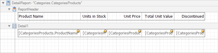 |
Create a new calculated field and set the field name to "AggregateField".
Click the ellipsis button in the Expression section. The Expression Editor dialog will appear.
In this dialog, double click the [CategoriesProducts] field, then choose Functions | Aggregate. Next, double click the Count() function. Insert the following text into the empty square brackets.
"Not[Discontinued]And[UnitTotal] >= 500".
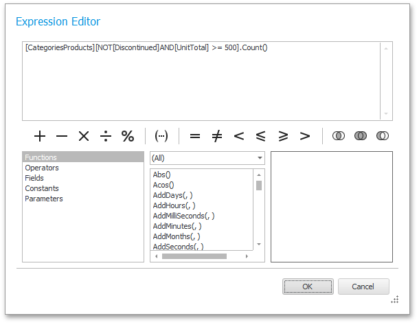 |
Click OK to close the dialog and save the expression.
Next, add three Labels to the Detail Band and customize their content, as shown in the following image.
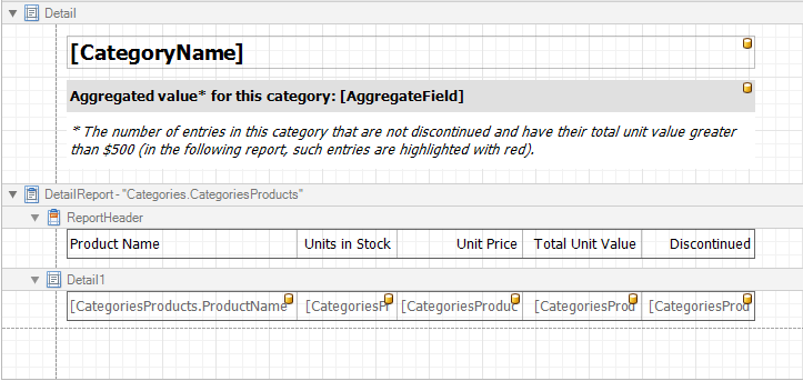 |
The report is now ready. Switch to the Preview Tab, and view the result.
You can also set formatting rules for the report. The following image shows the sample report. The data rows that are not discontinued and have a total unit value greater than $500 are highlighted in red.
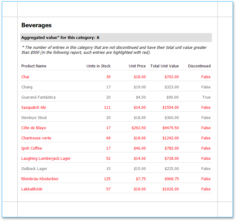 |
See Also
Cancel Printing If a Report Does Not Contain Any Records
To cancel printing when a report does not contain any records, simply set the report's Print when Data Source is Empty property to No.
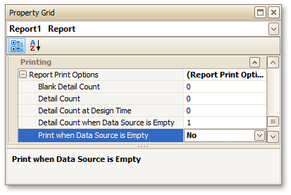 |
See Also
Limit the Number of Records per Page
This section demonstrates how to define how many records should be displayed at each page in a report's Print Preview. Note that no scripts are required to accomplish this task.
To demonstrate this feature, we'll use a report, similar to the one created in the following tutorial: Change or Apply Data Grouping to a Report.
To limit the number of records per page, do the following.
To add a parameter to the report, in the Field List, right-click the Parameters section, and in the invoked menu, choose Add Parameter.
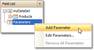 |
Select the parameter, and in the Property Grid, set its Description to Rows per Page:, Parameter Type to Int32 and (Name) to rowsNumber.
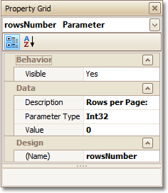 |
From the Toolbox, drop the Page Break control onto the top of the report's Detail band.
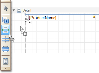 |
Select the Page Break, and set its Visible property to No. Then, click the ellipsis button for its Formatting Rules property, and in the invoked Formatting Rules Editor, click the Edit Rule Sheet... button.
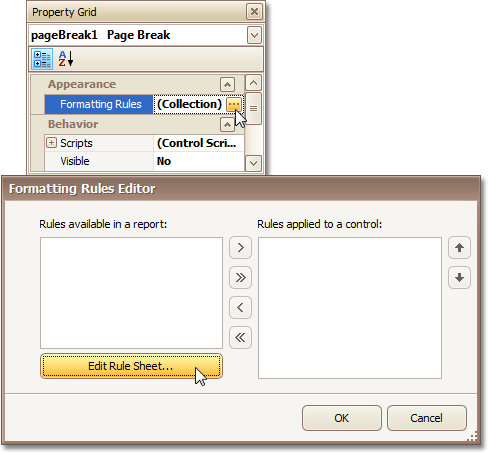 |
Now, in the invoked Formatting Rule Sheet Editor, click
, to create a new formatting rule. Set its Visible property to Yes, and click the ellipsis button for its Condition property.
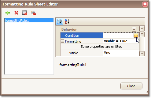 |
In the invoked Condition Editor, define a logical expression for the rule, (e.g. ([DataSource.CurrentRowIndex] % [Parameters.rowsNumber] == 0) And ([DataSource.CurrentRowIndex] != 0)).
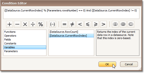 |
To save the changes and close the dialog, click OK.
Then, click Close, to quit the Formatting Rule Sheet Editor, as well.
Now, back in the Formatting Rules Editor, move the created rule to the list of applied rules on the right, using the arrow buttons in the middle of the dialog.
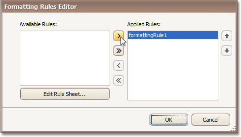 |
To save the changes and close the editor, click OK.
The report is now ready. Switch to the Preview Tab, and in the Parameters section, define the required value and click Submit.
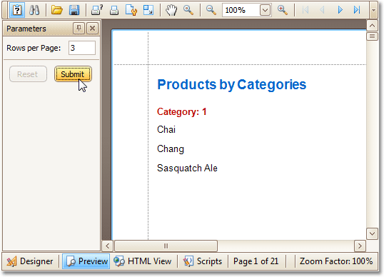 |
Note that while in this example, the number of rows is specified each time the report is being previewed, you can make this number secure, by setting the parameter's Value option to the desired value, and then setting the report's Request Parameters option to No.
See Also
Report Designer Reference
A report is built from controls (text labels, images, zip codes, charts, etc) spread across report sections called bands (various headers, footers and content sections). The main interface elements helping you manage these building blocks are Control Toolbox, Field List and Property Grid. These elements allow you add controls to your report, bind them to data and change their appearance and behavior settings, respectively.
To learn more about these and other elements used in the Report Designer, use the following links.
Topics in section are dedicated to the elements of the Report Designer user interface.
Topics in this section describe options of each report control available in the Report Designer.
Topics in this section details the available kinds of report bands and their settings.
This section details settings that affect the entire report.
Report Designer UI
The topics in this section are dedicated to the elements of the Report Designer user interface.
The following topics describe the Report Designer interface.
Report Designer Interface
General Elements
Quick Access Tools
Toolbars
Dock Panels
Tabs
Additional Elements
Ribbon Designer Elements
This section describes elements that comprise the Ribbon Report Designer.
The following image illustrates a Ribbon Designer.
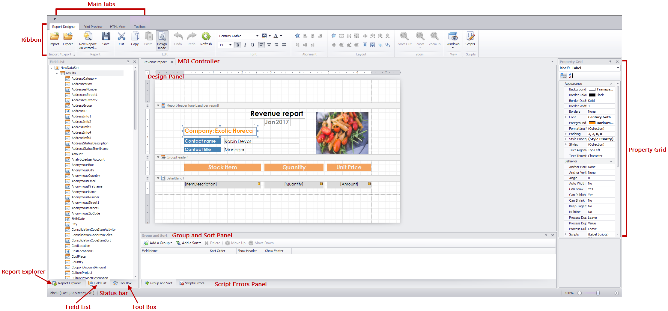 |
The following table lists all the main interface elements of the Ribbon Designer.
Element | Description |
Ribbon | The main toolbar in the Designer that contains the Formatting and Layout toolbars, as well as the Scripts Tab button. |
Contains controls that you can add to your report by dragging and dropping its icons onto a report's area. | |
Main Tabs | Allows you to switch between the Designer, Preview and HTML View tabs. |
MDI Controller | Provides the multi-document interface in the Designer by containing its Design Panels. |
A surface where a report is being edited. The Designer provides a multi-document interface, and can have as many Design Panels as there are reports open in it. | |
Displays the structure of a report in a visual-tree form, which makes the report navigation easier. | |
Shows the structure of a report's data source and is used to bind report controls to data. | |
Used to access and modify properties of a report and all its elements (bands and controls). | |
Allows you to quickly perform grouping and sorting operations throughout a report, and visually represents the report's grouping structure. | |
When errors are found in a report's scripts (after clicking Validate in the Scripts Tab), it lists these errors. Clicking an error opens the corresponding script section in the Scripts tab. |
Component Tray
The Component Tray shows components (non-visual report helpers) whose primary purpose is to bind a report to data. You can click them to display and edit their settings using the Property grid.
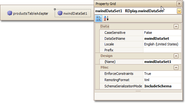 |
Context Menu
The Context Menu can be invoked by the right-clicking a report...
|
... or its elements (bands and controls). This menu provides quick access to frequently used commands (e.g. zooming, clipboard operations, inserting bands, etc.) The available action set varies, depending on the element where you invoked the Context Menu.
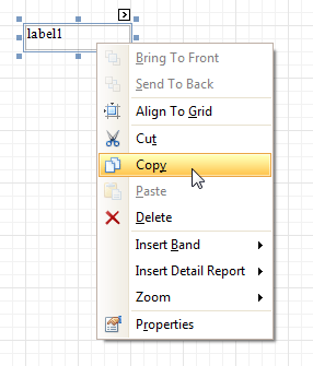 |
Control Toolbox
The Control Toolbox lists all available controls and allows you to add them to your report.
 |
To add a control from the Toolbox, do one of the following.
Double-click an item in the Toolbox for the appropriate control, which will be created at the Detail band's top left corner.
Drag and drop an item from the Toolbox onto the required location within a report.
|
Select an item in the Toolbox, and then click the required location within a report.
Select an item in the Toolbox, and then indicate the bounding rectangle by holding the left mouse button.
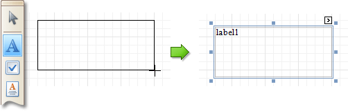 |
Select the  Pointer item when you need to perform selection, re-positioning or resizing operations. It is automatically selected after you drop a control onto a report.
See Also
Design Panel
The Design Panel is the Report Designer's main area, where a report is being constructed and previewed.
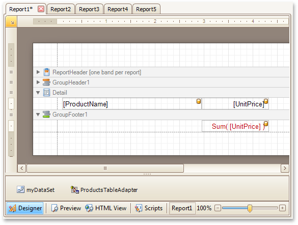 |
On the Designer Tab, multiple reports can be opened at once (each in its own Design Panel).
The Design Panel provides the following tabs (switched at the bottom).
Allows you to modify your report.
Shows a print preview, and enables you to print out your report or export it to a file on disk.
Shows the report output in HTML format.
Allows you to manage your report's scripts.
See Also
Designer Tab
The Designer Tab allows you to customize a report, manage its bands and controls and define their properties.
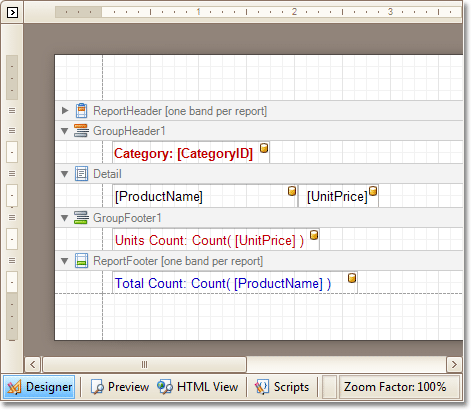 |
See Also
Field List
The Field List window serves the following purposes.
Displays the list of all available data fields (attributes you can show in your report) and allows you to create report elements that will show information from these fields.
Allows you to create calculated fields by building expressions based on the values of data fields, report parameter values, etc.
Shows existing report parameters, and allows you to add parameters to your report.
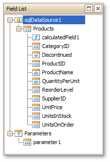 |
See Also
Formatting Toolbar
The Formatting Toolbar allows you to easily customize an element's font, color and alignment settings.
 |
Group and Sort Panel
The Group and Sort Panel allows you to quickly apply grouping and sorting to your report data.
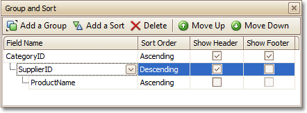 |
To create a new grouping or sorting criterion, simply click Add a Group or Add a Sort.
Then, to control whether the corresponding Group Header or Footer band should be seen, use the Show Header and Show Footer check boxes.
An ascending or descending grouping (sorting) mode is specified via the Sort Order drop-down list.
You can change the order in which multiple grouping and sorting criteria are to be performed, via the Move Up and Move Down buttons.
To remove a grouping or sorting criterion, select it, and click Delete.
See Also
Change or Apply Data Grouping to a Report
HTML View Tab
The HTML View Tab allows you to preview the HTML output of a report.
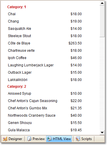 |
See Also
Layout Toolbar
The options in the Layout section allows you to easily align report elements to one another, change their size to match one another and customize spacing and z-order.
 |
See Also
Preview Tab
The Preview Tab is intended to check the print output of a report and customize its additional options.
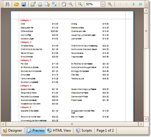 |
See Also
Property Grid
The Property Grid allows you to change the settings of the currently selected report element.
 |
To select an element and show its properties within the Property Grid, do one of the following.
Click the required element on the Report Designer surface.
Select an element using the Report Explorer window.
Select an element from the Property Grid's combo box.
To reset a property value, right-click this property, and in the invoked menu, click Reset.
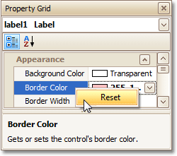 |
See Also
Report Explorer
The Report Explorer shows a report's structure in a tree-like form providing easy access to report elements. Additionally, the Report Explorer contains the Components node, which displays non-visual report components, such as data objects created when binding a report to a data source.
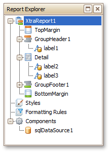 |
Once a report element or component has been selected in the Report Explorer, its settings can be changed using the Property Grid. You can also right-click elements and components to invoke their context menu.
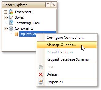 |
The Report Explorer also provides quick access to all styles and formatting rules available for a report. You can manage styles and formatting rules using commands available in context menus. To invoke a context menu, right-click the corresponding root node or their sub-node.
|
To apply a style or formatting rule to a report control, drag it from the Report Explorer onto the required report control.
See Also
Scripts Errors Panel
The Scripts Errors Panel displays the result of scripts validation after it's forced in the Scripts Tab.
Then, if errors are located, they are listed in this panel. To get to the corresponding line of code, click the corresponding item in the panel's list.
|
Or, if all scripts are valid, the panel reports this.
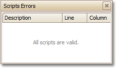 |
For more information, refer to Handle Events via Scripts.
See Also
Scripts Tab
The Scripts Tab allows you to manage your report's scripts. It provides centralized access to all the scripts being written for a report or any of its elements (bands and controls).
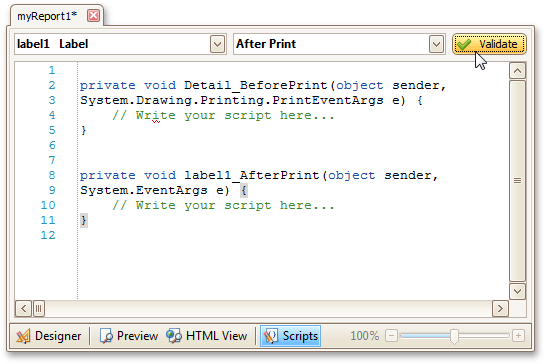 |
The built-in scripts validation capability is provided in this tab. After clicking Validate, the result is displayed in the Scripts Errors Panel.
For more information, refer to Handle Events via Scripts.
See Also
Smart Tag
Most report elements have Smart Tags that provide easy access to the most frequently used settings. Clicking an element's Smart Tag invokes an actions list with action links and editors, allowing you to customize this element.
Report Smart Tag
A report's Smart Tag icon is located at the top left corner of the Design Panel.
|
Band Smart Tag
A band's Smart Tag icon is located on the band strip right next to its caption. For instance, the Smart Tag for the Page Header is shown in the following image.
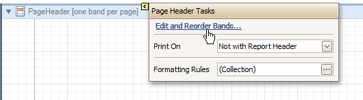 |
Control Smart Tag
A control's Smart Tag icon is located at the top right corner of the control. For instance, the Smart Tag for the Rich Text control is shown in the following image.
|
And, this is the Smart Tag for the Picture Box control.
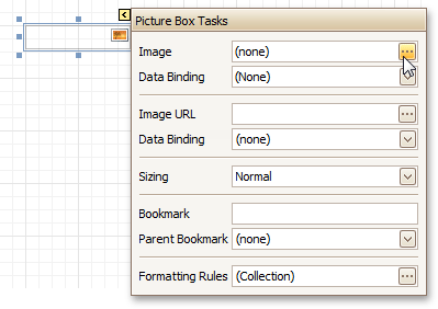 |
See Also
Report Controls
The topics in this section describe options of each report control available in the Report Designer.
In general, report controls allow you to represent information of different kinds (e.g. simple or formatted text, pictures, tables, etc.) in you report both static and dynamic, and to adjust your report's layout (by organizing controls within panels, and inserting page breaks at the required positions).
In the Report Designer, the available controls are listed in the Control Toolbox from which they are dropped onto the required bands.
You also can extend the standard functionality of each control by writing scripts for its available events.
Available Controls
The following table lists the available controls (in the same order as in the Control Toolbox). For each control's options description, refer to the corresponding document.
The most basic Label control is intended to display text in your report. It can represent static or dynamic text, or both. In addition, it can be used to calculate standard summary functions across a data field. The Label's text can only be formatted as a whole. So, if it's required to differently format parts of text, use the Rich Text control. | |
The Check Box control is intended to display True/False or Checked/Unchecked/Indeterminate states in a report, by displaying (or not) a check mark, which can be accompanied by a text description. | |
The Rich Text control allows you to display formatted text in your report. It can represent static or dynamic text, or both. You can load content to the Rich Text from an external TXT or RTF file (which can also contain images) and then format any part of it. The formatting options include font face, styles and sizes, and color. | |
The Picture Box control is intended to display images of numerous formats in a report. An image can be loaded from an external file, from a bound data source, or from a web location using the specified URL. | |
The Panel control is a container that frames separate report controls to allow them to be easily moved, copied and pasted, and visually unite them in the report's preview (with borders or a uniform color background). | |
The Table control is designed to arrange information in a tabular layout. It may contain any number of Rows comprised of individual Cells. Both Rows and Cells can be selected and customized individually. In most aspects, a Cell is similar to a Label, but can also contain other controls (e.g. Picture Box or Rich Text). | |
The Line control draws a line of a specified direction, style, width and color. It can be used for both decoration and visual separation of a report's sections. The Line cannot cross bands, as opposed to the Cross-band Line control. | |
The Shape control allows you to embed simple graphic objects into your report. You can choose one of multiple predefined shapes (e.g. rectangles, ellipses, arrows, polygons, crosses and brackets of various kinds). | |
The Bar Code control transforms its content into a bar code of the specified type. Multiple standard bar code symbologies are supported. | |
The Zip Code control transforms its content into a zip code. The width of a zip code's segment is adjustable. | |
The Chart is a sophisticated control used to embed graphs into your report. It graphically represents a series of points using numerous 2D or 3D chart types. A Chart can be populated with points both manually (by specifying arguments and values for each point) and dynamically (by connecting it to the report's data source, or binding it to a separate one). | |
The Gauge control provides you with the capability to embed graphical gauges into your report. | |
The Sparkline control displays a compact chart that is commonly used to reflect the flow of data for every row in a report. | |
The Pivot Grid control represents dynamic data (obtained from an underlying data source) in a cross-tabulated form to create cross-tab reports, similar to Pivot Tables in Microsoft Excel®. Column headers display unique values from one data field, and row headers - from another field. Each cell displays a summary for the corresponding row and column values. By specifying different data fields, you can see different totals. This allows you to get a compact layout for a complex data analysis. | |
The Page Info control is intended to add page numbers and system information (the current date and time or the current user name) into your report. As with many other controls, you can format this control's content. | |
The Page Break control's sole purpose is to insert a page delimiter at any point within a report. | |
The Cross-band Line control allows you to draw a line through several bands. This can be useful if it is required to visually emphasize a section consisting of multiple band areas. In other aspects, it is similar to a regular Line. | |
The Cross-band Box control allows you to draw a rectangle through several bands. This can be useful if it is required to visually encompass a section consisting of multiple band areas. | |
The Table of Contents control generates a table of contents based on bookmarks specified for report elements. | |
The Subreport control allows you to include other reports in your current report. |
Add Controls to a Report
To create a control, drag it from the Toolbox panel onto the report area.
|
To automatically create a control bound to data, drag a field from the Field List panel, and drop it onto a report's surface. When dropping a field onto an existing control, this control will be bound to the data field.
|
If you drag the field with the right mouse button, when the button is released the context menu is invoked. Use this menu to specify which control should be created.
|
To learn more on data binding for report controls, refer to Displaying Values from a Database (Binding Report Elements to Data).
Note
When controls overlap, the report may be shown incorrectly when exported to some formats. Red markers and a report tooltip will warn of this situation. You may switch off the red warning marks via the report's Show Export Warnings property.
 |
To learn how report controls can be relocated and resized, refer to Change the Layout of Report Elements.
Label
The most basic Label control is intended to display text in your report. It can represent static or dynamic text, or both. In addition, it can be used to calculate standard summary functions across a data field.
The Label's text can only be formatted as a whole. So, if it's required to differently format parts of text, use the Rich Text control.
 |
After a Label is added to a report, you can customize its text, appearance and other properties, which can be accessed in the Property Grid. The most important properties are also available via a control's Smart Tag, which makes it easy to perform common operations. And, the Formatting Toolbar allows you to easily adjust a Label's text formatting.
In the Property Grid, the Label control's properties are divided into the following groups.
Appearance
Background Color
Specifies the background color for the control. This option is also available in the Formatting Toolbar ( ).
).
Borders, Border Color, Border Dash Style and Border Width
Specify border settings for the control.
Font
Specifies the font settings for the control. Some of these settings are available in the Formatting Toolbar.
Foreground Color
Specifies the text color for the control. This option is also available in the Formatting Toolbar ( ).
).
Formatting Rules
Invokes the Formatting Rules Editor, allowing you to choose which rules should be applied to the control during report generation, and define the precedence of the applied rules. To learn more on this, refer to Conditionally Change a Control's Appearance.
Padding
Specifies indent values which are used to render the contents of a Label.
Style Priority
Specifies the priority of various style elements (such as background color, border color, etc.). For more information on style inheritance, refer to Understanding Style Concepts.
Styles
Specifies odd and even styles for the control, as well as to assign an existing style to the control (or a newly created one). For more information on style inheritance, refer to Understanding Style Concepts.
Text Alignment
Specifies the alignment of the control's text. This option is also available in the Formatting Toolbar.
Text Trimming
Specifies the string trimming mode of the control's text.
Behavior
Anchor Horizontally
Specifies the horizontal anchoring style of a Label, so that after page rendering it stays attached to the left control, right control, or both. This property defines how a report control is resized to maintain the distance to the left and right edges of its container control.
Anchor Vertically
Specifies the vertical anchoring style of a Label, so that after page rendering it stays attached to the top control, bottom control, or both. The property setting is useful for data-bound Labels located between upper and lower controls, which are allowed to resize depending on their contents.
Note that if the Anchor Vertically property is set to Bottom or Both, the Can Grow and Can Shrink property (see below) values are ignored, and don't participate in calculating a final height value of this control.
Angle
Specifies the rotation angle of the text. The measurement unit is a degree, and the orientation is counter-clockwise. Since standard HTML does not support text orientation, this parameter is ignored when a report is displayed within a web page.
Auto Width
Specifies whether or not a Label's width should be automatically determined based on its text.
Can Grow
When this property is set to Yes, a Label's height can be automatically increased, if required, to display the text. If there are other controls below the current Label, they will be pushed down to prevent them from overlapping. Note that if a control overlaps the growing Label by even one pixel, it will not be pushed down by the growing Label.
Can Publish
Specifies whether or not a report control is displayed in a printed or exported document.
Can Shrink
When this property is set to Yes, and the text does not completely fill a Label, then the Label's height will be decreased to the height of its text. If there are other controls below the current Label, they will be moved up to fill the gap. Note that if a control overlaps the shrinking Label by even one pixel, it will not be pushed up by the shrinking Label.
Keep Together
Specifies whether the contents of a Label can be horizontally split across pages. In other words, if a Label occupies more space than remains on the page, this property specifies whether this Label should be split between the current page and the next, or whether it will be printed entirely on the next page. This property is in effect only when a Label's content does not fit on the current page. If it does not fit on the next page either, then the Label will be split, irrespective of this property's value.
Multiline
When this property is set to Yes, a Label processes newline characters found in the text to start a new line. For example, when editing a Label's text, you can insert a new line by pressing ENTER, and in this case, the Multiline property will be automatically set to Yes.
Process Duplicates Mode
Determines the control's behavior when its data source contains consecutive repeating records. They can be processed as is (when the property is set to Leave), suppressed except for the first entry (Suppress) and suppressed with the blank space printed instead of the repeated records (Suppress and Shrink).
When the MergeByValue and MergeByTag settings are selected, the control processes duplicate values by merging the identical content into a single line of text.
Process Duplicates Target
Specifies whether to process duplicate values of the control's Text or Tag property.
Process Null Values
Determines whether to process Null (blank) values if they appear in the control's data source. They can be processed as is (when the property is set to Leave), suppressed (Suppress) and suppressed with the blank space printed instead of the blank records (Suppress and Shrink).
Scripts
This property contains events, which you can handle with the required scripts. For more information on scripting, refer to Handle Events via Scripts.
Visible
Specifies whether the control should be visible in print preview.
Word Wrap
When this property is set to Yes, text entered into the multiline Label is wrapped to the next line if it doesn't fit the line or comes across a newline character. If the this property is set to No, text entered into the multiline Label will be displayed on the same line until a newline character is entered.
Data
(Data Bindings)
If the current report is bound to data, this property allows you to bind some of the control's properties (Bookmark, Navigation URL, Tag and Text) to a data field obtained from the report's data source, and to apply a format string to it. For more information on this, refer to Displaying Values from a Database (Binding Report Elements to Data).
Lines
Provides access to the Text property of a Label in the Multiline mode.
Summary
Allows you to perform calculations (summary, max, min, average, etc.) over a data field. For more information on calculating summaries, refer to Add Totals to a Report.
Note
Summarization is possible for a single data column only. To perform calculations with several data fields, use calculated fields.
Tag
This property allows you to add some additional information to the control; for example its id, by which it can then be accessible via scripts.
If the current report has a data source, the Tag property can be bound to a data field obtained from the data source. To do this, expand the (Data Bindings) property and in the Tag.Binding drop-down selector, select the required data field.
Text
Allows you to define a line of static text to be displayed. To type several lines of text, click the control's Smart Tag, and in the invoked actions list, click Edit Text, or use the Lines property. Note that when a Label is selected in the designer, you may simply start typing the text, and it will be automatically entered into the in-place editor.
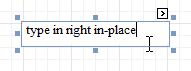 |
If the current report has a data source, the Text property can be bound to a data field obtained from the data source. To do this, expand the (Data Bindings) property and in the Text.Binding drop-down selector, select the required data field. For more information on this, refer to Displaying Values from a Database (Binding Report Elements to Data).
Xlsx Format String
Specifies the native XLSX format string for the control's content, which is to be preserved when the report is being exported to XLSX. This format string is independent from the general value formatting.
Design
(Name)
Determines a control's name, by which it can be accessed in the Report Explorer, Property Grid or via scripts.
Layout
Location
Specifies the control's location, in report measurement units.
Size
Specifies the control's size, in report measurement units.
Snap Line Margin
Specifies the margin (in report measurement units), which is to be preserved around the control when it is aligned using Snap Lines, or when other controls are aligned next to it.
Navigation
Bookmark and Parent Bookmark
These properties are intended for the creation of a hierarchical structure within a report called a document map. For an explanation and help, refer to Add Bookmarks.
If the current report has a data source, the Bookmark property can be bound to a data field, obtained from the data source. To do this, expand the (Data Bindings) property, and in the Bookmark.Binding drop-down selector, select the required data field.
Navigation URL and Navigation Target
Use the Navigation URL property to specify a URL for web browser navigation, when a user clicks a Label. The web browser displays a page in a window or a frame as specified by the Navigation Target property. Note that a URL should have an appropriate prefix (e.g. "http://"). You can create cross-references within the report by assigning the name of the target control to the Navigation URL property, and setting the Navigation Target property to "_self". For more information, refer to Create Hyperlinks.
If the current report has a data source, the Navigation URL property can be bound to a data field obtained from the data source. To do this, expand the (Data Bindings) property, and in the Navigation URL.Binding drop-down selector, select the required data field.
Check Box
The Check Box control is intended to display True/False or Checked/Unchecked/Indeterminate states in a report, by displaying (or not) a check mark, which can be accompanied by a text description.
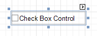 |
In the Property Grid, the Check Box control's properties are divided into the following groups.
Appearance
Background Color
Specifies the background color for the control. This option is also available in the Formatting Toolbar ().
Borders, Border Color, Border Dash Style and Border Width
Specify border settings for the control.
Font
Specifies the font settings for the control. Some of these settings are available in the Formatting Toolbar.
Foreground Color
Specifies the text color for the control. This option is also available in the Formatting Toolbar ().
Formatting Rules
Invokes the Formatting Rules Editor allowing you to choose which rules should be applied to the control during report generation, and define the precedence of the applied rules. To learn more on this, refer to Conditionally Change a Control's Appearance.
Padding
Specifies indent values which are used to render the contents of a Check Box.
Style Priority
Allows you to define the priority of various style elements (such as background color, border color, etc.). For more information on style inheritance, refer to Understanding Style Concepts.
Styles
This property allows you to define odd and even styles for the control, as well as to assign an existing style to the control (or a newly created one). For more information on style inheritance, refer to Understanding Style Concepts.
Text Alignment
Allows you to change the alignment of the control's text. This option is also available in the Formatting Toolbar.
Text Trimming
Specifies the string trimming mode of the control's text.
Behavior
Anchor Horizontally
Specifies the horizontal anchoring style of the control, so that after page rendering it stays attached to the left control, right control, or both. This property defines how a report control is resized to maintain the distance to the left and right edges of its container control.
Anchor Vertically
Specifies the vertical anchoring style of the control, so that after page rendering it stays attached to the top control, bottom control, or both. The property setting is useful for data-bound Check Boxes located between upper and lower controls, which are allowed to resize depending on their contents.
Can Publish
Specifies whether or not a report control is displayed in a printed or exported document.
Keep Together
Specifies whether the contents of a Check Box can be horizontally split across pages. In other words, if a Check Box occupies more space than remains on the page, this property specifies whether this Check Box should be split between the current page and the next, or whether it will be printed entirely on the next page. This property is in effect only when a Check Box's content does not fit on the current page. If it does not fit on the next page either, then the Check Box will be split despite this property's value.
Scripts
This property contains events, which you can handle with the required scripts. For more information on scripting, refer to Handle Events via Scripts.
Visible
Specifies whether the control should be visible in print preview.
Word Wrap
When this property is set to Yes, text entered into a Check Box is wrapped to the next line if it doesn't fit the line.
Data
(Data Bindings)
If the current report is bound to data, this property allows you to bind some of the control's properties (Bookmark, Check State, Navigation URL, Tag and Text) to a data field obtained from the report's data source, and to apply a format string to it. For more information on this, refer to Displaying Values from a Database (Binding Report Elements to Data).
Check State
This property allows you to quickly specify the Checked/Unchecked/Indeterminate state of a Check Box (the Indeterminate state is displayed as a grayed out checked box.) Note that if you only want to use Checked and Unchecked states, you may use the Checked property, instead.
Checked
This property allows you to define whether a Check Box is checked or not.
Tag
This property allows you to add some additional information to the control; for example its id, by which it can then be accessible via scripts.
If the current report has a data source, the Tag property can be bound to a data field obtained from the data source. To do this, expand the (Data Bindings) property and in the Tag.Binding drop-down selector, select the required data field.
Text
Allows you to define a line of static text to be displayed. Note that when a Check Box is selected in the designer, you may simply start typing the text, and it will be automatically entered into the in-place editor.
|
If the current report has a data source, the Text property can be bound to a data field obtained from the data source. To do this, expand the (Data Bindings) property, and in the Text.Binding drop-down selector, select the required data field. For more information on this, refer to Displaying Values from a Database (Binding Report Elements to Data).
Xlsx Format String
Specifies the native XLSX format string for the control's content, which is to be preserved when the report is being exported to XLSX. This format string is independent from the general value formatting.
Design
(Name)
Determines a control's name, by which it can be accessed in the Report Explorer, Property Grid or via scripts.
Layout
Location
Specifies the control's location, in report measurement units.
Size
Specifies the control's size, in report measurement units.
Snap Line Margin
Specifies the margin (in report measurement units), which is to be preserved around the control when it is aligned using Snap Lines, or when other controls are aligned next to it.
Navigation
Bookmark and Parent Bookmark
These properties are intended for the creation of a hierarchical structure within a report called a document map. For an explanation and help, refer to Add Bookmarks.
If the current report has a data source, the Bookmark property can be bound to a data field obtained from the data source. To do this, expand the (Data Bindings) property and in the Bookmark.Binding drop-down selector, select the required data field.
Navigation URL and Navigation Target
Use the Navigation URL property to specify a URL for web browser navigation when a user clicks a Check Box. The web browser displays a page in a window or a frame as specified by the Navigation Target property. Note that a URL should have an appropriate prefix (e.g. "http://"). You can create cross-references within the report by assigning the name of the target control to the Navigation URL property, and setting the Navigation Target property to "_self". For more information, refer to Create Hyperlinks.
If the current report has a data source, the Navigation URL property can be bound to a data field obtained from the data source. To do this, expand the (Data Bindings) property and in the Navigation URL.Binding drop-down selector, select the required data field.
Rich Text
The Rich Text control allows you to display formatted text in your report. It can represent static or dynamic text, or both. You can load content to the Rich Text from an external TXT or RTF file (which can also contain images) and then format any part of it. The formatting options include font face, styles and sizes, and color.
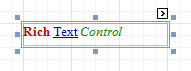 |
A content from an external TXT or RTF file can be loaded to this control via its Smart Tag.
|
In the Property Grid, the Rich Text control's properties are divided into the following groups.
Appearance
Background Color
Specifies the background color for the control. This option is also available in the Formatting Toolbar ().
Borders, Border Color, Border Dash Style and Border Width
Specify border settings for the control.
Font
Specifies the font settings for the control. Some of these settings are available in the Formatting Toolbar.
Foreground Color
Specifies the text color for the control. This option is also available in the Formatting Toolbar ().
Formatting Rules
Invokes the Formatting Rules Editor allowing you to choose which rules should be applied to the control during report generation, and define the precedence of the applied rules. To learn more on this, refer to Conditionally Change a Control's Appearance.
Padding
Specifies indent values which are used to render the contents of the control.
Style Priority
Allows you to define the priority of various style elements (such as background color, border color, etc.). For more information on style inheritance, refer to Understanding Style Concepts.
Styles
This property allows you to define odd and even styles for the control, as well as to assign an existing style to the control (or a newly created one). For more information on style inheritance, refer to Understanding Style Concepts.
Behavior
Anchor Horizontally
Specifies the horizontal anchoring style of the control, so that after page rendering it stays attached to the left control, right control, or both. This property defines how a report control is resized to maintain the distance to the left and right edges of its container control.
Anchor Vertically
Specifies the vertical anchoring style of the control, so that after page rendering it stays attached to the top control, bottom control, or both. The property setting is useful for data-bound controls located between upper and lower controls, which are allowed to resize depending on their contents.
Note that if the Anchor Vertically property is set to Bottom or Both, the Can Grow and Can Shrink properties (see below) values are ignored, and don't participate in calculating a final height value of this control.
Can Grow
When this property is set to Yes, the control's height can be automatically increased, if required, to display the text. If there are other controls below the current control, they will be pushed down to prevent them from overlapping. Note that if a control overlaps the growing Rich Text by even one pixel, it will not be pushed down by the growing Rich Text.
Can Publish
Specifies whether or not a report control is displayed in a printed or exported document.
Can Shrink
When this property is set to Yes, and the text does not completely fill a Rich Text, then the control's height will be decreased to the height of its text. If there are other controls below the current one, they will be moved up to fill the gap. Note that if a control overlaps the shrinking Rich Text by even one pixel, it will not be pushed up by the shrinking Rich Text.
Keep Together
Specifies whether the contents of the control can be horizontally split across pages. In other words, if the control occupies more space than remains on the page, this property specifies whether this control should be split between the current page and the next, or whether it will be printed entirely on the next page. This property is in effect only when the control's content does not fit on the current page. If it does not fit on the next page either, then the control will be split despite this property's value.
Process Duplicates
Determines the control's behavior when its data source contains consecutive repeating records. They can be processed as is (when the property is set to Leave), suppressed except for the first entry(Suppress) and suppressed with the blank space printed instead of the repeated records (Suppress and Shrink).
Process Null Values
Determines whether to process Null (blank) values if they appear in the control's data source. They can be processed as is (when the property is set to Leave), suppressed (Suppress) and suppressed with the blank space printed instead of the blank records (Suppress and Shrink).
Scripts
This property contains events, which you can handle with the required scripts. For more information on scripting, refer to Handle Events via Scripts.
Visible
Specifies whether the control should be visible in print preview.
Data
(Data Bindings)
If the current report is bound to data, this property allows you to bind some of the control's properties (Bookmark, Navigation URL, Rtf and Tag) to a data field obtained from the report's data source, and to apply a format string to it. For more information on this, refer to Displaying Values from a Database (Binding Report Elements to Data).
Lines
Provides access to the Text property of the control, allowing you to input multiple lines of static text.
Tag
This property allows you to add some additional information to the control; for example its id, by which it can then be accessible via scripts.
If the current report has a data source, the Tag property can be bound to a data field obtained from the data source. To do this, expand the (Data Bindings) property, and in the Tag.Binding drop-down selector, select the required data field.
Text
Allows you to define a line of static text to be displayed. To type several lines of text, use the Lines property. Note that when the control is selected in the designer, you may simply start typing the text, and it will be automatically entered into the in-place editor.
|
If the current report has a data source, the Rtf property (instead of Text) can be bound to a data field obtained from the data source. To do this, expand the (Data Bindings) property and in the Rtf.Binding drop-down selector, select the required data field. For more information on this, refer to Displaying Values from a Database (Binding Report Elements to Data).
Design
(Name)
Determines a control's name, by which it can be accessed in the Report Explorer, Property Grid or via scripts.
Layout
Location
Specifies the control's location, in report measurement units.
Size
Specifies the control's size, in report measurement units.
Snap Line Margin
Specifies the margin (in report measurement units), which is to be preserved around the control when it is aligned using Snap Lines, or when other controls are aligned next to it.
Navigation
Bookmark and Parent Bookmark
These properties are intended for the creation of a hierarchical structure within a report, called a document map. For an explanation and help, refer to Add Bookmarks.
If the current report has a data source, the Bookmark property can be bound to a data field obtained from the data source. To do this, expand the (Data Bindings) property and in the Bookmark.Binding drop-down selector, select the required data field.
Navigation URL and Navigation Target
Use the Navigation URL property to specify a URL for web browser navigation when a user clicks the control. The web browser displays a page in a window or a frame as specified by the Navigation Target property. Note that a URL should have an appropriate prefix (e.g. "http://"). You can create cross-references within the report by assigning the name of the target control to the Navigation URL property, and setting the Navigation Target property to "_self". For more information, refer to Create Hyperlinks.
If the current report has a data source, the Navigation URL property can be bound to a data field obtained from the data source. To do this, expand the (Data Bindings) property, and in the Navigation URL.Binding drop-down selector, select the required data field.
Picture Box
The Picture Box control is intended to display images of numerous formats in a report. An image can be loaded from an external file, from a bound data source, or from a web location using the specified URL.
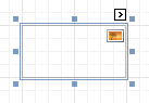 |
The following image formats are supported: BMP, DIB, RLE, JPG, JPEG, JPE, JFIF, GIF, EMF, WMF, TIF, TIFF, PNG and ICO.
To quickly load an image from an external file, use the control's Smart Tag.
|
To bind the control to a data field containing images, right-click the corresponding Field List item, and then drag and drop it onto a report. This will invoke the Context Menu, where you can choose the Picture Box, and it will be automatically created and bound to the selected data field.
|
In the Property Grid, the Picture Box control's properties are divided into the following groups.
Appearance
Background Color
Specifies the background color for the control.
Borders, Border Color, Border Dash Style and Border Width
Specify border settings for the control.
Formatting Rules
Invokes the Formatting Rules Editor allowing you to choose which rules should be applied to the control during report generation, and define the precedence of the applied rules. To learn more on this, refer to Conditionally Change a Control's Appearance.
Padding
Specifies indent values which are used to render the contents of the control.
Style Priority
Allows you to define the priority of various style elements (such as background color, border color, etc.). For more information on style inheritance, refer to Understanding Style Concepts.
Styles
This property allows you to define odd and even styles for the control, as well as to assign an existing style to the control (or a newly created one). For more information on style inheritance, refer to Understanding Style Concepts.
Behavior
Anchor Horizontally
Specifies the horizontal anchoring style of the control, so that after page rendering it stays attached to the left control, right control, or both. This property defines how a report control is resized to maintain the distance to the left and right edges of its container control.
Anchor Vertically
Specifies the vertical anchoring style of the control, so that after page rendering it stays attached to the top control, bottom control, or both. The property setting is useful for data-bound controls located between upper and lower controls, which are allowed to resize depending on their contents.
Can Publish
Specifies whether or not a report control is displayed in a printed or exported document.
Image Alignment
Specifies the alignment of a displayed image in relation to the control's boundaries.
Keep Together
Specifies whether the contents of the control can be horizontally split across pages. In other words, if the control occupies more space than remains on the page, this property specifies whether this control should be split between the current page and the next, or whether it will be printed entirely on the next page. This property is in effect only when the control's content does not fit on the current page. If it does not fit on the next page either, then the control will be split despite this property's value.
Process Duplicates Mode
Specifies how to process report controls with duplicate values.
Process Duplicates Target
Specifies whether to process duplicate values of the Image, or Tag property.
Process Null Values
Specifies how to process a Picture Box control receiving a null value from a connected data source.
Scripts
This property contains events, which you can handle with the required scripts. For more information on scripting, refer to Handle Events via Scripts.
Sizing
Defines the sizing mode of a contained image. To quickly adjust the image size and position within the control, click its Smart Tag, and choose Sizing.
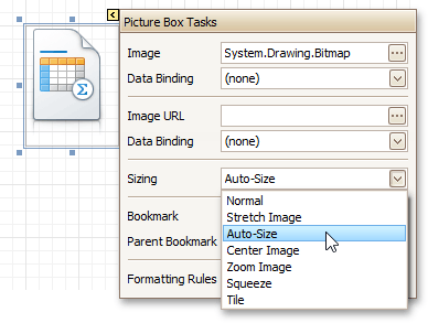 |
The image sizing settings are briefly described in the following table.
Mode | Description |
Normal | The image is placed in the upper-left corner of the control. The image is clipped if it is larger than the Picture Box which contains it. |
Stretch Image | The image within the control is stretched or shrunk to fit the size of a Picture Box. |
Auto-Size | The Picture Box size is adjusted to that of the image it contains. |
Center Image | The image is displayed in the center of the control. If the image is larger than the Picture Box, the outer edges are clipped. |
Zoom Image | The image is sized proportionally (without clipping) for best fit into the control. |
Squeeze | If the dimensions of a Picture Box exceed that of the image it contains, the image is centered and shown full-size. Otherwise, the image is resized to fit into the Picture Box's dimensions. |
Tile | The original image is replicated within the Picture Box starting from the upper-left corner. The replicated image is clipped if it doesn't fit in the Picture Box which contains it. |
Visible
Specifies whether the control should be visible in print preview.
Data
(Data Bindings)
If the current report is bound to data, this property allows you to bind some of the control's properties (Bookmark, Image, Image URL, Navigation URL and Tag) to a data field obtained from the report's data source, and to apply a format string to it. For more information on this, refer to Displaying Values from a Database (Binding Report Elements to Data).
Image
Specifies an image to display in the Picture Box control.
When you click the ellipsis button, you will see the Open File dialog that enables you to specify the file to load. Then, this image is embedded into a report and saved within this report, so it is always available. Note that this increases the size of a saved report definition. If you want to save only the image path, and not the image itself, use the Image URL property instead.
Image URL
Specifies the URL of the image to display in the Picture Box control. It supports both absolute and relative paths. A relative path may be related to the Web site or to the current Web page. In the second case, the path to the image must start with the "~" symbol. Setting a relative path makes it easier to move the entire application to another directory on the server without having to update the code.
Tag
This property allows you to add some additional information to the control; for example its id, by which it can then be accessible via scripts.
If the current report has a data source, the Tag property can be bound to a data field obtained from the data source. To do this, expand the (Data Bindings) property and in the Tag.Binding drop-down selector, select the required data field.
Design
(Name)
Determines a control's name, by which it can be accessed in the Report Explorer, Property Grid or via scripts.
Layout
Location
Specifies the control's location, in report measurement units.
Size
Specifies the control's size, in report measurement units.
Snap Line Margin
Specifies the margin (in report measurement units), which is to be preserved around the control when it is aligned using Snap Lines, or when other controls are aligned next to it.
Navigation
Bookmark and Parent Bookmark
These properties are intended for the creation of a hierarchical structure within a report called a document map. For an explanation and help, refer to Add Bookmarks.
If the current report has a data source, the Bookmark property can be bound to a data field obtained from the data source. To do this, expand the (Data Bindings) property and in the Bookmark.Binding drop-down selector, select the required data field.
Navigation URL and Navigation Target
Use the Navigation URL property to specify a URL for web browser navigation when a user clicks the control. The web browser displays a page in a window or a frame as specified by the Navigation Target property. Note that a URL should have an appropriate prefix (e.g. "http://"). You can create cross-references within the report by assigning the name of the target control to the Navigation URL property, and setting the Navigation Target property to "_self". For more information, refer to Create Hyperlinks.
If the current report has a data source, the Navigation URL property can be bound to a data field obtained from the data source. To do this, expand the (Data Bindings) property and in the Navigation URL.Binding drop-down selector, select the required data field.
Panel
The Panel control is a container that frames separate report controls to allow them to be easily moved, copied and pasted, and visually unite them in the report's preview (with borders or a uniform color background).
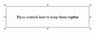 |
Currently, there are several limitations on Panel usage. One of them is that Panel cannot shrink, and therefore cannot suppress the white space that appears when the controls inside are shrunk or collapsed. Also, the Panel cannot cross bands, as Cross-band Line and Cross-band Box can do.
 |
In the Property Grid, the Panel's properties are divided into the following groups.
Appearance
Background Color
Specifies the background color for the control.
Borders, Border Color, Border Dash Style and Border Width
Specify border settings for the control.
Formatting Rules
Invokes the Formatting Rules Editor allowing you to choose which rules should be applied to the control during report generation, and define the precedence of the applied rules. To learn more on this, refer to Conditionally Change a Control's Appearance.
Padding
Specifies indent values which are used to render the contents of controls contained in a Panel.
Style Priority
Allows you to define the priority of various style elements (such as background color, border color, etc.). For more information on style inheritance, refer to Understanding Style Concepts.
Styles
This property allows you to define odd and even styles for the control, as well as to assign an existing style to the control (or a newly created one). For more information on style inheritance, refer to Understanding Style Concepts.
Behavior
Anchor Horizontally
Specifies the horizontal anchoring style of the control, so that after page rendering it stays attached to the left control, right control, or both. This property defines how a report control is resized to maintain the distance to the left and right edges of its container control.
Anchor Vertically
Specifies the vertical anchoring style of the control, so that after page rendering it stays attached to the top control, bottom control, or both.
Note that if the Anchor Vertically property is set to Bottom or Both, the Can Grow property (see below) values are ignored, and don't participate in calculating a final height value of this control.
Can Grow
When this property is set to Yes, the control's height can be automatically increased, if required, to display the text. If there are other controls below the current control, they will be pushed down to prevent them from overlapping. Note that if a control overlaps the growing Panel by even one pixel, it will not be pushed down by the growing Panel.
Can Publish
Specifies whether or not a report control is displayed in a printed or exported document.
Keep Together
Specifies whether the contents of the control can be horizontally split across pages. In other words, if the control occupies more space than remains on the page, this property specifies whether this control should be split between the current page and the next, or whether it will be printed entirely on the next page. This property is in effect only when the control's content does not fit on the current page. If it does not fit on the next page either, then the control will be split despite this property's value.
Scripts
This property contains events, which you can handle with the required scripts. For more information on scripting, refer to Handle Events via Scripts.
Visible
Specifies whether the control should be visible in print preview.
Data
(Data Bindings)
If the current report is bound to data, this property allows you to bind some of the control's properties (Bookmark, Navigation URL and Tag) to a data field obtained from the report's data source, and to apply a format string to it. For more information on this, refer to Displaying Values from a Database (Binding Report Elements to Data).
Tag
This property allows you to add some additional information to the control; for example its id, by which it can then be accessible via scripts.
If the current report has a data source, the Tag property can be bound to a data field obtained from the data source. To do this, expand the (Data Bindings) property and in the Tag.Binding drop-down selector, select the required data field.
Design
(Name)
Determines a control's name, by which it can be accessed in the Report Explorer, Property Grid or via scripts.
Layout
Location
Specifies the control's location, in report measurement units.
Size
Specifies the control's size, in report measurement units.
Snap Line Margin
Specifies the margin (in report measurement units), which is to be preserved around the control when it is aligned using Snap Lines, or when other controls are aligned next to it.
Snap Line Padding
Specifies the padding (in report measurement units), which is to be preserved within the control when controls it contains are aligned using Snap Lines.
Navigation
Bookmark and Parent Bookmark
These properties are intended for the creation of a hierarchical structure within a report called a document map. For an explanation and help, refer to Add Bookmarks.
If the current report has a data source, the Bookmark property can be bound to a data field obtained from the data source. To do this, expand the (Data Bindings) property and in the Bookmark.Binding drop-down selector, select the required data field.
Navigation URL and Navigation Target
Use the Navigation URL property to specify a URL for web browser navigation when a user clicks the control. The web browser displays a page in a window or a frame as specified by the Navigation Target property. Note that a URL should have an appropriate prefix (e.g. "http://"). You can create cross-references within the report by assigning the name of the target control to the Navigation URL property, and setting the Navigation Target property to "_self". For more information, refer to Create Hyperlinks.
If the current report has a data source, the Navigation URL property can be bound to a data field obtained from the data source. To do this, expand the (Data Bindings) property and in the Navigation URL.Binding drop-down selector, select the required data field.
Table
The Table control is designed to arrange information in a tabular layout. It may contain any number of Rows comprised of individual Cells. Both Rows and Cells can be selected and customized individually. In most aspects, a Cell is similar to a Label, but can also contain other controls (e.g. Picture Box or Rich Text).
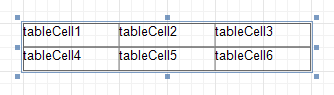 |
When a Table is dropped onto a band from the Toolbox, it has one row and three columns. If you click and drag over several bands, the resulting table will be split by the bands into several tables. This creates a table header and the detail table with one mouse move.
|
When you drag and drop an entire data table from the Field List, a Table with cells bound to the corresponding data fields is created automatically.
A table's elements are managed by using its Context Menu.
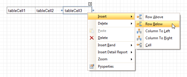 |
The whole Table, or its individual Row or Cell can be selected either in the Report Designer, the Report Explorer or the drop-down selector of the Property Grid.
In the Property Grid, the Table's properties are divided into the following groups.
Appearance
Background Color
Specifies the background color for the control. This option is also available in the Formatting Toolbar ().
Borders, Border Color, Border Dash Style and Border Width
Specify border settings for the control.
Font
Specifies the font settings for the control. Some of these settings are available in the Formatting Toolbar.
Foreground Color
Specifies the text color for the control. This option is also available in the Formatting Toolbar ().
Formatting Rules
Invokes the Formatting Rules Editor, allowing you to choose which rules should be applied to the control during report generation, and define the precedence of the applied rules. To learn more on this, refer to Conditionally Change a Control's Appearance.
Padding
Specifies indent values which are used to render the contents of a Table's cells.
Style Priority
Allows you to define the priority of various style elements (such as background color, border color, etc.). For more information on style inheritance, refer to Understanding Style Concepts.
Styles
This property allows you to define odd and even styles for the control, as well as to assign an existing style to the control (or a newly created one). For more information on style inheritance, refer to Understanding Style Concepts.
Text Alignment
Allows you to change the alignment of a Table's text. This option is also available in the Formatting Toolbar.
Behavior
Anchor Horizontally
Specifies the horizontal anchoring style of the control, so that after page rendering it stays attached to the left control, right control, or both. This property defines how a report control is resized to maintain the distance to the left and right edges of its container control.
Anchor Vertically
Specifies the vertical anchoring style of a Table, so that after page rendering it stays attached to the top control, bottom control, or both.
Can Publish
Specifies whether or not a report control is displayed in a printed or exported document.
Keep Together
Specifies whether the contents of a Table can be horizontally split across pages. In other words, if a Table occupies more space than remains on the page, this property specifies whether the Table should be split between the current page and the next, or whether it will be printed entirely on the next page. This property is in effect only when a Table's content does not fit on the current page. If it does not fit on the next page either, then the Table will be split despite this property's value.
Scripts
This property contains events, which you can handle with the required scripts. For more information on scripting, refer to Handle Events via Scripts.
Visible
Specifies whether the control should be visible in print preview.
Data
TagThis property allows you to add some additional information to the control; for example its id, by which it can then be accessible via scripts.
Design
(Name)
Determines a control's name, by which it can be accessed in the Report Explorer, Property Grid or via scripts.
Layout
Location
Specifies the control's location, in report measurement units.
Size
Specifies the control's size, in report measurement units.
Snap Line Margin
Specifies the margin (in report measurement units), which is to be preserved around the control when it is aligned using Snap Lines, or when other controls are aligned next to it.
Navigation
Bookmark and Parent Bookmark
These properties are intended for the creation of a hierarchical structure within a report called a document map. For an explanation and help, refer to Add Bookmarks.
If the current report has a data source, the Bookmark property can be bound to a data field obtained from the data source. To do this, expand the (Data Bindings) property and in the Bookmark.Binding drop-down selector, select the required data field.
Table Row
The Table Row Control represents a single row within a Table.
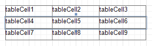 |
This control is useful for changing the layout of the entire row. Although in this document, a Row is described as a separate control, in fact most of its properties are actually applied to the Cells contained within the selected row.
In the Property Grid, the Table Row's properties are divided into the following groups.
Appearance
Background Color
Specifies the background color for the control. This option is also available in the Formatting Toolbar ().
Borders, Border Color, Border Dash Style and Border Width
Specify border settings for the control.
Font
Specifies the font settings for the control. Some of these settings are available in the Formatting Toolbar.
Foreground Color
Specifies the text color for the control. This option is also available in the Formatting Toolbar ().
Formatting Rules
Invokes the Formatting Rules Editor, allowing you to choose which rules should be applied to the control during report generation, and define the precedence of the applied rules. To learn more on this, refer to Conditionally Change a Control's Appearance.
Padding
Specifies indent values which are used to render the contents of a Row.
Style Priority
Allows you to define the priority of various style elements (such as background color, border color, etc.). For more information on style inheritance, refer to Understanding Style Concepts.
Styles
This property allows you to define odd and even styles for the control, as well as to assign an existing style to the control (or a newly created one). For more information on style inheritance, refer to Understanding Style Concepts.
Text Alignment
Allows you to change the alignment of the control's text. This option is also available in the Formatting Toolbar.
Behavior
Can Publish
Specifies whether or not a report control is displayed in a printed or exported document.
Keep Together
Specifies whether the contents of a Row can be horizontally split across pages. In other words, if a Row occupies more space than remains on the page, this property specifies whether this Row should be split between the current page and the next, or whether it will be printed entirely on the next page. This property is in effect only when a Row's content does not fit on the current page. If it does not fit on the next page either, then the Row will be split despite this property's value.
Scripts
This property contains events, which you can handle with the required scripts. For more information on scripting, refer to Handle Events via Scripts.
Visible
Specifies whether the control should be visible in print preview.
Data
Tag
This property allows you to add some additional information to the control; for example its id, by which it can then be accessible via scripts.
Design
(Name)
Determines a control's name, by which it can be accessed in the Report Explorer, Property Grid or via scripts.
Layout
Height
Specifies the Row's height, in report measurement units.
Snap Line Margin
Specifies the margin (in report measurement units), which is to be preserved around the control when it is aligned using Snap Lines, or when other controls are aligned next to it.
Table Cell
The Table Cell control represents an individual cell within a Table.
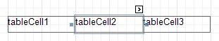 |
In general, the Table Cell control's properties are similar to the properties of the Label control.
In the Property Grid, the Table Cell's properties are divided into the following groups.
Appearance
Background Color
Specifies the background color for the control. This option is also available in the Formatting Toolbar ().
Borders, Border Color, Border Dash Style and Border Width
Specify border settings for the control.
Font
Specifies the font settings for the control. Some of these settings are available in the Formatting Toolbar.
Foreground Color
Specifies the text color for the control. This option is also available in the Formatting Toolbar ().
Formatting Rules
Invokes the Formatting Rules Editor, allowing you to choose which rules should be applied to the control during report generation, and define the precedence of the applied rules. To learn more on this, refer to Conditionally Change a Control's Appearance.
Padding
Specifies indent values which are used to render the contents of a Label.
Style Priority
Allows you to define the priority of various style elements (such as background color, border color, etc.). For more information on style inheritance, refer to Understanding Style Concepts.
Styles
This property allows you to define odd and even styles for the control, as well as to assign an existing style to the control (or a newly created one). For more information on style inheritance, refer to Understanding Style Concepts.
Text Alignment
Allows you to change the alignment of the control's text. This option is also available in the Formatting Toolbar.
Behavior
Angle
Specifies the rotation angle of a Cell's text. The measurement unit is a degree, and the orientation is counter-clockwise. Since standard HTML does not support text orientation, this parameter is ignored when a report is displayed within a web page.
Can Grow
When this property is set to Yes, a Cell's height can be automatically increased, if required, to display the text. If there are other controls below the current Cell, they will be pushed down to prevent them from overlapping. Note that if a control overlaps the growing Cell by even one pixel, it will not be pushed down by the growing Cell.
Can Publish
Specifies whether or not a report control is displayed in a printed or exported document.
Can Shrink
When this property is set to Yes, and the text does not completely fill a Cell, then the Cell's height will be decreased to the height of its text. If there are other controls below the current Cell, they will be moved up to fill the gap. Note that if a control overlaps the shrinking Cell by even one pixel, it will not be pushed up by the shrinking Cell.
Keep Together
Specifies whether the contents of a Cell can be horizontally split across pages. In other words, if a Cell occupies more space than remains on the page, this property specifies whether this Cell should be split between the current page and the next, or whether it will be printed entirely on the next page. This property is in effect only when a Cell's content does not fit on the current page. If it does not fit on the next page either, then the Cell will be split despite this property's value.
Multiline
When this property is set to Yes, a Cell processes newline characters found in the text to start a new line. For example, when editing a Cell's text, you can insert a new line by pressing ENTER, and in this case the Multiline property will be automatically set to Yes.
Process Duplicates
Determines the control's behavior when its data source contains consecutive repeating records. They can be processed as is (when the property is set to Leave), suppressed except for the first entry (Suppress) and suppressed with the blank space printed instead of the repeated records (Suppress and Shrink).
Merging cells with identical dynamic content is performed by setting a cell's Process Duplicates property to "Merge based on Value" or "Merge based on Tag".
Process Null Values
Determines whether to process Null (blank) values if they appear in the control's data source. They can be processed as is (when the property is set to Leave), suppressed (Suppress) and suppressed with the blank space printed instead of the blank records (Suppress and Shrink).
Scripts
This property contains events, which you can handle with the required scripts. For more information on scripting, refer to Handle Events via Scripts.
Text Trimming
Specifies the string trimming mode of the control's text.
Visible
Specifies whether the control should be visible in print preview.
Word Wrap
When this property is set to Yes, text entered into the multiline Cell is wrapped to the next line if it doesn't fit the line or comes across a newline character. If the this property is set to No, text entered into the multiline Cell will be displayed on the same line until a newline character is entered.
Data
(Data Bindings)
If the current report is bound to data, this property allows you to bind some of a Cell's properties (Bookmark, Navigation URL, Tag and Text) to a data field obtained from the report's data source, and to apply a format string to it. For more information on this, refer to Displaying Values from a Database (Binding Report Elements to Data).
Lines
Provides access to the Text property of a Cell in the Multiline mode.
Summary
Allows you to perform calculations (summary, max, min, average, etc.) over a data field. For more information on calculating summaries, refer to Add Totals to a Report.
Note
Summarization is possible for a single data column only. To perform calculations with several data fields, use calculated fields.
Tag
This property allows you to add some additional information to the control; for example its id, by which it can then be accessible via scripts.
If the current report has a data source, the Tag property can be bound to a data field obtained from the data source. To do this, expand the (Data Bindings) property and in the Tag.Binding drop-down selector, select the required data field.
Text
Allows you to define a line of static text to be displayed. When a Cell is selected in the designer, you may simply start typing the text, and it will be automatically entered into the in-place editor.
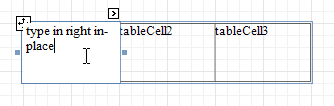 |
To type several lines of text, use the Lines property.
If the current report has a data source, the Text property can be bound to a data field obtained from the data source. To do this, expand the (Data Bindings) property, and in the Text.Binding drop-down selector, select the required data field. For more information on this, refer to Displaying Values from a Database (Binding Report Elements to Data).
Xlsx Format String
Specifies the native XLSX format string for the control's content, which is to be preserved when the report is being exported to XLSX. This format string is independent from the general value formatting.
Design
(Name)
Determines a control's name, by which it can be accessed in the Report Explorer, Property Grid or via scripts.
Layout
Snap Line Margin
Specifies the margin (in report measurement units), which is to be preserved around the control when it is aligned using Snap Lines, or when other controls are aligned next to it.
Width
Specifies the Cell's width, in report measurement units.
Navigation
Bookmark and Parent Bookmark
These properties are intended for the creation of a hierarchical structure within a report called a document map. For an explanation and help, refer to Add Bookmarks.
If the current report has a data source, the Bookmark property can be bound to a data field obtained from the data source. To do this, expand the (Data Bindings) property and in the Bookmark.Binding drop-down selector, select the required data field.
Navigation URL and Navigation Target
Use the Navigation URL property to specify a URL for web browser navigation when a user clicks a Cell. The web browser displays a page in a window or a frame as specified by the Navigation Target property. Note that a URL should have an appropriate prefix (e.g. "http://"). You can create cross-references within the report by assigning the name of the target control to the Navigation URL property, and setting the Navigation Target property to "_self". For more information, refer to Create Hyperlinks.
If the current report has a data source, the Navigation URL property can be bound to a data field obtained from the data source. To do this, expand the (Data Bindings) property and in the Navigation URL.Binding drop-down selector, select the required data field.
Line
The Line control draws a line of a specified direction, style, width and color. It can be used for both decoration and visual separation of a report's sections. The Line cannot cross bands, as opposed to the Cross-band Line control.
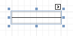 |
In the Property Grid, the Line's properties are divided into the following groups.
Appearance
Background Color
Specifies the background color for the control.
Borders, Border Color, Border Dash Style and Border Width
Specify border settings for the control.
Foreground Color
Specifies the Line's color.
Formatting Rules
Invokes the Formatting Rules Editor allowing you to choose which rules should be applied to the control during report generation, and define the precedence of the applied rules. To learn more on this, refer to Conditionally Change a Control's Appearance.
Line Direction
The line can be drawn vertically, horizontally and from one corner of the rectangle, representing the Line control, to another, across the rectangle. That is, Vertical, Horizontal, Slant and Back Slant types.
Line Style
You can select the solid (by default), dashed, dotted or mixed style for the line.
Line Width
Specifies the Line's width, in report measurement units.
Padding
Specifies indent values which are used to render the contents of the control.
Style Priority
Allows you to define the priority of various style elements (such as background color, border color, etc.). For more information on style inheritance, refer to Understanding Style Concepts.
Styles
This property allows you to define odd and even styles for the control, as well as to assign an existing style to the control (or a newly created one). For more information on style inheritance, refer to Understanding Style Concepts.
Behavior
Anchor Horizontally
Specifies the horizontal anchoring style of the control, so that after page rendering it stays attached to the left control, right control, or both. This property defines how a report control is resized to maintain the distance to the left and right edges of its container control.
Anchor Vertically
Specifies the vertical anchoring style of the control, so that after page rendering it stays attached to the top control, bottom control, or both.
Can Publish
Specifies whether or not a report control is displayed in a printed or exported document.
Keep Together
Specifies whether the contents of the control can be horizontally split across pages. In other words, if the control occupies more space than remains on the page, this property specifies whether this control should be split between the current page and the next, or whether it will be printed entirely on the next page. This property is in effect only when the control's content does not fit on the current page. If it does not fit on the next page either, then the control will be split despite this property's value.
Scripts
This property contains events, which you can handle with the required scripts. For more information on scripting, refer to Handle Events via Scripts.
Visible
Specifies whether the control should be visible in print preview.
Data
(Data Bindings)
If the current report is bound to data, this property allows you to bind the control's Tag property.
Tag
This property allows you to add some additional information to the control; for example its id, by which it can then be accessible via scripts.
Design
(Name)
Determines a control's name, by which it can be accessed in the Report Explorer, Property Grid or via scripts.
Layout
Location
Specifies the control's location, in report measurement units.
Size
Specifies the control's size, in report measurement units.
Snap Line Margin
Specifies the margin (in report measurement units), which is to be preserved around the control when it is aligned using Snap Lines, or when other controls are aligned next to it.
Shape
The Shape control allows you to embed simple graphic objects into your report. You can choose one of multiple predefined shapes (e.g. rectangles, ellipses, arrows, polygons, crosses and brackets of various kinds).
 |
In the Property Grid, the Shape's properties are divided into the following groups.
Appearance
Background Color
Specifies the background color for the control. This option is also available in the Formatting Toolbar ().
Borders, Border Color, Border Dash Style and Border Width
Specify border settings for the control.
Fill Color
Specifies the color to fill the contour of a Shape, if applicable. It is transparent by default.
Foreground Color
Determines the color of a Shape's contour. This option is also available in the Formatting Toolbar ().
Formatting Rules
Invokes the Formatting Rules Editor allowing you to choose which rules should be applied to the control during report generation, and define the precedence of the applied rules. To learn more on this, refer to Conditionally Change a Control's Appearance.
Line Width
Here you can set the width of a line used to draw the Shape, expressed in the measure units defined by the report's Measure Units property. To learn more about this, refer to Change Measurement Units of a Report.
Padding
Specifies indent values which are used to render the contents of the control.
Style Priority
Allows you to define the priority of various style elements (such as background color, border color, etc.). For more information on style inheritance, refer to Understanding Style Concepts.
Styles
This property allows you to define odd and even styles for the control, as well as to assign an existing style to the control (or a newly created one). For more information on style inheritance, refer to Understanding Style Concepts.
Behavior
Anchor Horizontally
Specifies the horizontal anchoring style of the control, so that after page rendering it stays attached to the left control, right control, or both. This property defines how a report control is resized to maintain the distance to the left and right edges of its container control.
Anchor Vertically
Specifies the vertical anchoring style of the control, so that after page rendering it stays attached to the top control, bottom control, or both.
Angle
The value in degrees specifies the rotation angle of a Shape. It indicates counterclockwise rotation.
You can hold CTRL while pressing the left mouse button to rotate a Shape within the control's borders.
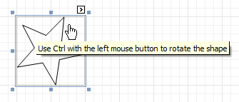 |
Can Publish
Specifies whether or not a report control is displayed in a printed or exported document.
Scripts
This property contains events, which you can handle with the required scripts. For more information on scripting, refer to Handle Events via Scripts.
Shape
Determines which of the various built-in shapes to use within the control.
A certain shape has its own unique set of properties. The following list is intended to give a brief overview of these special properties specific to a certain shape.
Property | Description |
Fillet | This property specifies how much a Shape's corners are rounded. It enables display of rounded boxes and triangles. Supported by Shapes: Arrows, Polygons, Stars and Cross |
Number of Sides | This property allows you to set the number of sides. Supported by Shapes: Polygons |
Count of Star Points | This property allows you to set the number of star points. Supported by Shapes: Stars |
Concavity | Defines the level of inward-curve for the lines connecting the vertices of a Star. It may be an integer in the range of 0 - 100. Supported by Shapes: Stars |
Tip's Length | This property specifies the length of the Bracket's ends. Supported by Shapes: Bracket and Brace |
Tail's Length | This property specifies the tail length of a Brace. Supported by Shapes: Brace |
Stretch
If the Shape is rotated to some degree (that is, its Angle property is not zero), you may turn on the Stretch property. The Shape image will be stretched to cover maximum space within the control's borders.
Visible
Specifies a value indicating whether the current control should be printed (when set to Yes) or hidden (No) on report generation.
Data
(Data Bindings)
If the current report is bound to data, this property allows you to bind some of the control's properties (Bookmark, Navigation URL and Tag) to a data field obtained from the report's data source, and to apply a format string to it. For more information on this, refer to Displaying Values from a Database (Binding Report Elements to Data).
Tag
This property allows you to add some additional information to the control; for example its id, by which it can then be accessible via scripts.
If the current report has a data source, the Tag property can be bound to a data field obtained from the data source. To do this, expand the (Data Bindings) property and in the Tag.Binding drop-down selector, select the required data field.
Design
(Name)
Determines a control's name, by which it can be accessed in the Report Explorer, Property Grid or via scripts.
Layout
Location
Specifies the control's location, in report measurement units.
Size
Specifies the control's size, in report measurement units.
Snap Line Margin
Specifies the margin (in report measurement units), which is to be preserved around the control when it is aligned using Snap Lines, or when other controls are aligned next to it.
Navigation
Bookmark and Parent Bookmark
These properties are intended for the creation of a hierarchical structure within a report called a document map. For an explanation and help, refer to Add Bookmarks.
If the current report has a data source, the Bookmark property can be bound to a data field obtained from the data source. To do this, expand the (Data Bindings) property and in the Bookmark.Binding drop-down selector, select the required data field.
Navigation URL and Navigation Target
Use the Navigation URL property to specify a URL for web browser navigation when a user clicks the control. The web browser displays a page in a window or a frame as specified by the Navigation Target property. Note that a URL should have an appropriate prefix (e.g. "http://"). You can create cross-references within the report by assigning the name of the target control to the Navigation URL property, and setting the Navigation Target property to "_self". For more information, refer to Create Hyperlinks.
If the current report has a data source, the Navigation URL property can be bound to a data field obtained from the data source. To do this, expand the (Data Bindings) property and in the Navigation URL.Binding drop-down selector, select the required data field.
Bar Code
The Bar Code control transforms its content into a bar code of the specified type. Multiple standard bar code symbologies are supported.
 |
Note
The barcode quality can degrade when the report is exported to formats other than PDF. To ensure reliable barcode recognition, print the report directly from an application using the native printing methods. The Module and Auto-Module properties of a control should be used with care.
In the Property Grid, the Bar Code's properties are divided into the following groups.
Appearance
Alignment
Determines the alignment of the barcode image within the control. To define the text alignment, use the Text Alignment property.
Background Color
Specifies the background color for the control. This option is also available in the Formatting Toolbar ().
Borders, Border Color, Border Dash Style and Border Width
Specify border settings for the control.
Font
Specifies the font settings for the control. Some of these settings are available in the Formatting Toolbar.
Foreground Color
Specifies the text and image color for the bar code. This option is also available in the Formatting Toolbar ().
Formatting Rules
Invokes the Formatting Rules Editor, allowing you to choose which rules should be applied to the control during report generation, and define the precedence of the applied rules. To learn more on this, refer to Conditionally Change a Control's Appearance.
Padding
Specifies indent values which are used to render the contents of a Bar Code.
Style Priority
Allows you to define the priority of various style elements (such as background color, border color, etc.). For more information on style inheritance, refer to Understanding Style Concepts.
Styles
This property allows you to define odd and even styles for the control, as well as to assign an existing style to the control (or a newly created one). For more information on style inheritance, refer to Understanding Style Concepts.
Text Alignment
Allows you to change the alignment of the control's text. This option is also available in the Formatting Toolbar. To define the alignment of the barcode image, use the Alignment property.
Behavior
Anchor Horizontally
Specifies the horizontal anchoring style of the control, so that after page rendering it stays attached to the left control, right control, or both. This property defines how a report control is resized to maintain the distance to the left and right edges of its container control.
Anchor Vertically
Specifies the vertical anchoring style of the control, so that, after page rendering, it stays attached to the top control, bottom control, or both.
Auto-Module
When this property is set to Yes, the barcode image is stretched to fit the entire control's width. When this option is turned off, this behavior is determined by the Module property.
Can Publish
Specifies whether or not a report control is displayed in a printed or exported document.
Keep Together
Specifies whether the contents of the control can be horizontally split across pages. In other words, if the control occupies more space than remains on the page, this property specifies whether this Bar Code should be split between the current page and the next, or whether it will be printed entirely on the next page. This property is in effect only when a Bar Code's content does not fit on the current page. If it does not fit on the next page either, then the Bar Code will be split, despite this property's value.
Module
Specifies the width of the narrowest bar or space in the barcode, in report measurement units. You may set this property to Yes for automatic adjustment of its value, when the control is resized. Note that if the Module value is too low, the barcode output may become unreadable by a barcode scanner.
When the Auto-Module property is set to No, there could be a situation when the barcode image generated with the current setting of Module property is larger than the control itself. In this case, the control displays a warning, as illustrated below.
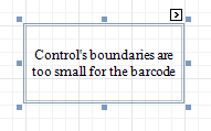 |
So, increase the dimensions of the control, to avoid this.
Orientation
The barcode image within the control can be rotated. If you need this feature, use the Orientation property to specify one of four possible orientations (Normal, Upside Down, Rotate to the Left and Rotate to the Right) for an image within the control.
Scripts
This property contains events, which you can handle with the required scripts. For more information on scripting, refer to Handle Events via Scripts.
Show Text
Determines whether to display the numerical value, or only the barcode within the control.
Symbology
The Symbology defines the mapping between barcode text and an image. The symbologies supported by the Bar Code control are listed in the following table:
Symbology | Description |
Codabar | The Codabar is an old format that uses discrete, self-checking symbology, capable of encoding 16 different characters, plus an additional 4 start/stop characters. You should also specify the Start and Stop Symbols and Wide Narrow Ratio properties. |
Code11 | Code 11, also known as USD-8, was developed as a high-density numerical-only symbology. The symbology is discrete, and is able to encode the numbers 0 through to 9, the dash symbol (-), and start/stop characters. |
Code128 | Code 128 has been widely implemented. It is a high-density symbology which permits encoding messages of arbitrary lengths of any character of the ASCII character set. The symbology includes a checksum digit for verification. You should also specify the Character Set. The recommended setting is Auto Charset. |
Code39 | Code 39 is also known as "3 of 9 Code" and "USD-3". It can encode uppercase letters (A through Z), digits (0 through 9) and several special characters like the $ sign. The Calculate a Checksum and Wide Narrow Ratio (which should be in a range of 2.2 -3) properties can also be specified. |
Code39Extended | This is an extension of Code 39, also known as "Full ASCII Code 39". It is capable of encoding all 128 ASCII characters. The Calculate a Checksum and Wide Narrow Ratio (which should be in a range of 2.2 -3) properties can be specified. |
Code93 | Code 93 was designed to supplement and improve Code 39. It is an alphanumeric, variable length symbology, providing higher reliability and density than Code 39. The Calculate a Checksum property can be specified. |
Code93Extended | It enables encoding of all 128 ASCII characters using Code 93's "Full ASCII Mode". This is accomplished by using the ($), (/), (%), and (+) symbols as "shift" characters. The Calculate a Checksum property can be specified. |
CodeMSI | MSI symbology, also known as Modified Plessey, is a low-density, numerical only symbology. To specify the checksum, use the MSI Checksum property. It can be set to None, Modulo 10 and Double Modulo 10. |
DataMatrix | Data Matrix ECC200 code is a two-dimensional matrix barcode consisting of black and while "cells" arranged in a square or a rectangular pattern. The encoded information can be text or raw data. |
DataMatrix GS1 | GS1 DataMatrix uses a special start combination to differentiate the GS1 DataMatrix symbol from the other Data Matrix ECC 200 symbols. The Bar Code control now supports this symbology. |
EAN128 | UCC/EAN-128 symbology has the newer name GS1-128. It is based on the Code128 standard, additionally specifying the Application Identifiers for data sections within the code. It includes best before dates, batch numbers, quantities, weights and other attributes. The Character Set property can be specified (Auto Charset is the recommended value). The FNC1 Functional Character property defines a symbol that is not included in a bar code when met in text, but used to generate the application identifiers. The Human-Readable Text property, when set to Yes, inserts parentheses into the text below the bar code for better readability. |
EAN13 | The EAN-13 barcode contains 13 digits, no letters or other characters. The first two or three digits represent the country. The leading zero actually signifies the USA, and UPC-A coding. The last digit is the checksum digit. The control calculates it automatically and it should not be present in the control's text string. So, make sure that the text for this symbology contains no more than 12 digits. If fewer digits are supplied, the string is padded with zeroes on the left. |
EAN8 | EAN-8 is a shortened version of the EAN-13 code. It includes a 2 or 3 digit country code, 4 of 5 data digits (depending on the length of the country code), and a checksum digit. The control calculates the checksum digit automatically and it should not be present in the control's text string. So, make sure that the text for this symbology contains no more than 7 digits. If fewer digits are supplied, the string is padded with zeroes on the left. |
GS1 Data Bar | This bar code is based on a family of symbols often used in the GS1 DataBar Coupon (coupon codes commonly used in retail). These bar codes can encode up to 14 digits, which makes them suitable for GTIN 8, 12, 13 and 14. GS1 DataBar Expanded and GS1 DataBar Expanded Stacked can encode up to 74 numeric or 41 alphanumeric characters, and provide the capability to utilize all GS1 Application Identifiers (e.g., expiration date, batch and serial number). These bar codes are often used in manufacturer coupons. |
Industrial2of5 | The Industrial (or non-interleaved) 2 of 5 code is a numerical, low-density symbology, based on two-out-of-five code. The Calculate a Checksum and Wide Narrow Ratio (which should be greater than or equal to 2.5) properties can be specified. |
Intelligent Mail | The Intelligent Mail (IM) code is a 65-bar code for use on mail in the United States. The Intelligent Mail barcode is a height-modulated barcode that encodes up to 31 decimal digits of mail-piece data into 65 vertical bars. |
Interleaved2of5 | The Interleaved 2 of 5 code is a higher-density numerical symbology, based on two-out-of-five code. The Calculate a Checksum and Wide Narrow Ratio (which should be greater than or equal to 2.5) properties can be specified. |
ITF-14 | This bar code, also known as "UPC Shipping Container Symbol", is used to mark packaging materials that contain products labeled with a UPC or EAN product identification number. This bar code provides a GS1 implementation of an Interleaved 2-of-5 symbology for encoding a Global Trade Item Number (an identifier for trade items developed by GS1). This bar code always uses a total of 14 digits. |
Matrix2of5 | A variant of non-interleaved 2 of 5 code. It is a numerical only symbology. The Calculate a Checksum and Wide Narrow Ratio (which should be greater than or equal to 2.5) properties can be specified. |
PDF417 | This Portable Data File symbology is used in a variety of applications, and can also be used to generate postage accepted by the United States Postal Service. It consists of a variable number of rows, each of which is like a small linear bar code. Among other options, the Error Correction Level specifies the amount of redundancy, to protect a barcode's legibility. |
PostNet | This symbology is used by the United States Postal Service to assist in directing mail. The code usually contains the zip-code and delivery point number. Unlike most other barcodes, PostNet actually encodes data in the height of the bars. |
QR Code | QR (Quick Response) Code is a popular two-dimensional matrix barcode that consists of black modules arranged in a square pattern on a white background. |
UPCA | The UPC-A barcode contains 12 digits, no letters or other characters. The first digit is the prefix signifying the product type. The last digit is the "check digit". The check digit is calculated using the first eleven figures when the barcode is constructed. So, for a correct UPC-A, make sure that the text contains no more than 11 digits. If there are fewer than 11, the string is padded with zeroes on the left. |
UPCE0 | This symbology is a variation of UPC-A which allows for a more compact barcode by eliminating "extra" zeros. The first digit is always zero; the last digit is a checksum digit of the original UPC-A code. Not every UPC-A code can be transformed into UPC-E0. E.g., the control's text string "4210000526" is displayed by UPC-E0 symbology as "04252614" and represents the "042100005264" UPC-A code (check digit included). |
UPCE1 | This symbology is a variation of UPC-A, which allows for a more compact barcode by eliminating "extra" zeros. The first digit is always 1, and the last digit is a checksum digit of the original UPC-A code. Not every UPC-A code can be transformed into UPC-E1. E.g., the control's text string "4210000526" is displayed by UPC-E1 symbology as "14252611" and represents the "142100005261" UPC-A code (check digit included). |
UPCSupplemental2 | This is a supplemental two-digit barcode. Make sure that the control's text string contains two digits. |
UPCSupplemental5 | This is a supplemental five-digit barcode, usually used to indicate the suggested retail price of a book. Make sure that the control's text string contains five digits. |
Visible
Specifies whether the control should be visible in print preview.
Data
(Data Bindings)
If the current report is bound to data, this property allows you to bind some of the control's properties (Bookmark, Navigation URL, Tag and Text) to a data field obtained from the report's data source, and to apply a format string to it. For more information on this, refer to Displaying Values from a Database (Binding Report Elements to Data).
Tag
This property allows you to add additional information to the control; for example its id, by which it can then be accessible via scripts.
If the current report has a data source, the Tag property can be bound to a data field obtained from the data source. To do this, expand the (Data Bindings) property, and in the Tag.Binding drop-down selector, select the required data field.
Text
Allows you to define a string to be encoded as a barcode. You can define whether to display this value within the control using the Show Text property. Note that when the control is selected in the designer, you may simply start typing the text, and it will be automatically entered into the in-place editor.
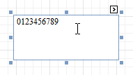 |
If the content does not conform to the rules of a certain symbology (determined by the Symbology property), the control may display a warning, as in the picture below, or automatically correct the input string by padding it with zeroes or only allowing an acceptable number of characters to be displayed.
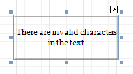 |
If the current report has a data source, the Text property can be bound to a data field obtained from the data source. To do this, expand the (Data Bindings) property, and in the Text.Binding drop-down selector, select the required data field. For more information on this, refer to Displaying Values from a Database (Binding Report Elements to Data).
Design
(Name)
Determines a control's name, by which it can be accessed in the Report Explorer, Property Grid or via scripts.
Layout
Location
Specifies the control's location, in report measurement units.
Size
Specifies the control's size, in report measurement units.
Snap Line Margin
Specifies the margin (in report measurement units), which is to be preserved around the control when it is aligned using Snap Lines, or when other controls are aligned next to it.
Navigation
Bookmark and Parent Bookmark
These properties are intended for the creation of a hierarchical structure within a report, called a document map. For an explanation and help, refer to Add Bookmarks.
If the current report has a data source, the Bookmark property can be bound to a data field obtained from the data source. To do this, expand the (Data Bindings) property, and in the Bookmark.Binding drop-down selector, select the required data field.
Navigation URL and Navigation Target
Use the Navigation URL property to specify a URL for web browser navigation when a user clicks a Bar Code. The web browser displays a page in a window or a frame as specified by the Navigation Target property. Note that a URL should have an appropriate prefix (e.g. "http://"). You can create cross-references within the report by assigning the name of the target control to the Navigation URL property, and setting the Navigation Target property to "_self". For more information, refer to Create Hyperlinks.
If the current report has a data source, the Navigation URL property can be bound to a data field obtained from the data source. To do this, expand the (Data Bindings) property, and in the Navigation URL.Binding drop-down selector, select the required data field.
Zip Code
The Zip Code control transforms its content into a zip code. The width of a zip code's segment is adjustable.
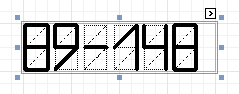 |
In the Property Grid, the Zip Code's properties are divided into the following groups.
Appearance
Background Color
Specifies the background color for the control. This option is also available in the Formatting Toolbar ().
Borders, Border Color, Border Dash Style and Border Width
Specify border settings for the control.
Foreground Color
Specifies the color for the control. This option is also available in the Formatting Toolbar ().
Formatting Rules
Invokes the Formatting Rules Editor allowing you to choose which rules should be applied to the control during report generation, and define the precedence of the applied rules. To learn more on this, refer to Conditionally Change a Control's Appearance.
Padding
Specifies indent values which are used to render the contents of the control.
Style Priority
Allows you to define the priority of various style elements (such as background color, border color, etc.). For more information on style inheritance, refer to Understanding Style Concepts.
Styles
This property allows you to define odd and even styles for the control, as well as to assign an existing style to the control (or a newly created one). For more information on style inheritance, refer to Understanding Style Concepts.
Behavior
Anchor Horizontally
Specifies the horizontal anchoring style of the control, so that after page rendering it stays attached to the left control, right control, or both. This property defines how a report control is resized to maintain the distance to the left and right edges of its container control.
Anchor Vertically
Specifies the vertical anchoring style of the control, so that after page rendering it stays attached to the top control, bottom control, or both.
Can Publish
Specifies whether or not a report control is displayed in a printed or exported document.
Keep Together
Specifies whether the contents of the control can be horizontally split across pages. In other words, if the control occupies more space than remains on the page, this property specifies whether this Zip Code should be split between the current page and the next, or whether it will be printed entirely on the next page. This property is in effect only when a Zip Code's content does not fit on the current page. If it does not fit on the next page either, then the Zip Code will be split despite this property's value.
Scripts
This property contains events, which you can handle with the required scripts. For more information on scripting, refer to Handle Events via Scripts.
Segment Width
This property setting specifies the width of the lines (in pixels) used to draw the numbers in the zip boxes of the control.
Visible
Specifies whether the control should be visible in print preview.
Data
(Data Bindings)
If the current report is bound to data, this property allows you to bind some of the control's properties (Bookmark, Navigation URL, Tag and Text) to a data field obtained from the report's data source, and to apply a format string to it. For more information on this, refer to Displaying Values from a Database (Binding Report Elements to Data).
Tag
This property allows you to add some additional information to the control; for example its id, by which it can be then accessible via scripts.
If the current report has a data source, the Tag property can be bound to a data field obtained from the data source. To do this, expand the (Data Bindings) property, and in the Tag.Binding drop-down selector, select the required data field.
Text
The Text box should contain digits or dashes. Other characters are displayed as empty zip boxes.
If the current report has a data source, the Text property can be bound to a data field obtained from the data source. To do this, expand the (Data Bindings) property, and in the Text.Binding drop-down selector, select the required data field. For more information on this, refer to Displaying Values from a Database (Binding Report Elements to Data).
Design
(Name)
Determines a control's name, by which it can be accessed in the Report Explorer, Property Grid or via scripts.
Layout
Location
Specifies the control's location, in report measurement units.
Size
Specifies the control's size, in report measurement units.
Snap Line Margin
Specifies the margin (in report measurement units), which is to be preserved around the control when it is aligned using Snap Lines, or when other controls are aligned next to it.
Navigation
Bookmark and Parent Bookmark
These properties are intended for the creation of a hierarchical structure within a report called a document map. For an explanation and help, refer to Add Bookmarks.
If the current report has a data source, the Bookmark property can be bound to a data field obtained from the data source. To do this, expand the (Data Bindings) property, and in the Bookmark.Binding drop-down selector, select the required data field.
Navigation URL and Navigation Target
Use the Navigation URL property to specify a URL for web browser navigation when a user clicks the control. The web browser displays a page in a window or a frame as specified by the Navigation Target property. Note that a URL should have an appropriate prefix (e.g. "http://"). You can create cross-references within the report by assigning the name of the target control to the Navigation URL property, and setting the Navigation Target property to "_self". For more information, refer to Create Hyperlinks.
If the current report has a data source, the Navigation URL property can be bound to a data field obtained from the data source. To do this, expand the (Data Bindings) property, and in the Navigation URL.Binding drop-down selector, select the required data field.
Chart
The Chart is a sophisticated control used to embed graphs into your report. It graphically represents a series of points using numerous 2D or 3D chart types. A Chart can be populated with points both manually (by specifying arguments and values for each point) and dynamically (by connecting it to the report's data source, or binding it to a separate one).
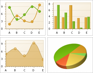 |
There are many available Chart types you can choose from. To name a few, these are Bar, Point, Line, Pie and Doughnut, Area, Radar and Polar, Range Bar, Gantt, Candle Stick and Stock charts.
A Chart control contains multiple elements (diagram, series, series points, axes, legend, titles, labels, strips, constant lines, etc.). When any of these elements is selected, the Property Grid shows only the properties which correspond to the selected item.
The Chart control is data-aware in a different manner than the other report controls. Consider three common report scenarios:
Static data for a Chart's series is provided manually. It can be done using the Series Collection Editor invoked by the Chart's Series property. It allows you to manually define values and arguments for each series point.
Chart's series are created automatically, getting their data from the Chart's Data Source and dependent on the rules defined by the Series Template property. This approach is described in Chart with Dynamic Series.
Each series is created and customized manually and has a separate Data Source. This approach is described in Chart with Static Series.
You can customize a created chart using both the Property Grid and the Chart Wizard. To invoke the Chart Wizard, click a Chart's Smart Tag, and in the invoked actions list, click the Run Wizard... link.
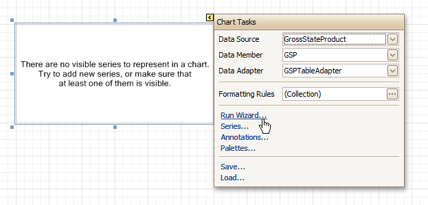 |
Then, the Chart Wizard will guide you through the whole process of customizing the Chart, from defining its view type to providing its data and customizing its appearance.
In the Property Grid, the Chart's properties are divided into the following groups.
Appearance
Appearance Name
Allows you to choose one of the available appearances, to be used to draw the Chart's elements (Diagram, Axes, Legend, etc.).
Background Color
Specifies the background color for a Chart.
Background Image
Allows you to load a background image to a Chart (or define its URL), and also define whether it should be stretched to fit the entire Chart's area, or not.
Borders, Border Color, Border Dash Style and Border Width
Specify border settings for the control.
Fill Style
Determines the fill style of a Chart's background (Empty, Solid, Gradient or Hatch) and define other fill options if required.
Formatting Rules
Invokes the Formatting Rules Editor allowing you to choose which rules should be applied to the control during report generation, and define the precedence of the applied rules. To learn more on this, refer to Conditionally Change a Control's Appearance.
Image Type
Determines whether a Chart should be internally rendered as a metafile in a report (in this case the quality of the rendered image is always good, but in particular cases some details of the control may be lost), or as a bitmap (in this case the quality of the rendered image is sometimes poor, but it allows a control to be drawn more precisely).
Indicators Palette Name
Specifies the palette that is used to paint all indicators that exist in a Chart.
Padding
Specifies the internal space between the Chart's content (the diagram and legend) and its edge, in pixels.
Palette Name
Allows you to choose one from the built-in palettes to be used to draw a Chart's series.
Palette's Base Color Number
Allows you to define an integer index determining the base color for the palette defined by the Chart's Palette Name property.
Style Priority
Allows you to define the priority of various style elements (such as background color, border color, etc.). For more information on style inheritance, refer to Understanding Style Concepts.
Behavior
Anchor Horizontally
Specifies the horizontal anchoring style of the control, so that after page rendering it stays attached to the left control, right control, or both. This property defines how a report control is resized to maintain the distance to the left and right edges of its container control.
Anchor Vertically
Specifies the vertical anchoring style of the control, so that after page rendering it stays attached to the top control, bottom control, or both.
Automatic Binding Settings Enabled
Specifies whether or not the Chart's data binding is automatically adjusted when its data source is a Pivot Grid.
Automatic Layout Settings Enabled
Specifies whether or not the Chart's layout is automatically adjusted when its data source is a Pivot Grid.
Can Publish
Specifies whether or not a report control is displayed in a printed or exported document.
Empty Chart Text
Specifies the text to be shown in the Chart, when it has no data to display.
Scripts
This property contains events, which you can handle by the required scripts. For more information on scripting, refer to Handle Events via Scripts.
Small Chart Text
Specifies the text to be shown in the Chart, when it's too small to fit the diagram.
Visible
Specifies whether a Chart should be visible in print preview.
Data
(Data Bindings)
If the current report is bound to data, this property allows you to bind some of a Chart's properties (Bookmark, Navigation URL and Tag) to a data field obtained from the report's data source, and to apply a format string to it. For more information on this, refer to Displaying Values from a Database (Binding Report Elements to Data).
Data Adapter
Determines a data adapter that will populate a Chart's data source which is assigned via the Data Source property. It is automatically set to the appropriate value, when the Data Member property is defined. To learn more on this, refer to Chart with Static Series.
Data Member
Determines the data source member which supplies data to a Chart. To learn more on this, refer to Chart with Static Series.
Note
Usually, it is not necessary to specify the Data Member property when binding a Chart to data. This property should only be set directly if the dataset contains more than one table.
Data Source
Determines a Chart's data source. To learn more on this, refer to Chart with Static Series.
Pivot Grid Data Source Options
Determines a Chart's data source. To learn more on this, refer to Chart with Static Series.
Series Data Member
Determines the name of the data field whose values are used to automatically generate and populate a Chart's series. To learn more on this, refer to Chart with Dynamic Series.
When Chart binding is used to automatically generate series within a chart control based upon the data obtained from the associated data source (defined by the Data Source property), a rule needs to be defined that helps the Chart recognize the data records whose values are used to construct individual series objects. To do this, the Series Data Member property, which specifies the data field whose values are taken into account when series objects are automatically created and populated, can be used.
Each automatically generated series gets its name from the data field specified by the Series Data Member property. For example, this name is used to identify a series within the chart control's legend. The names of all automatically generated series can be supplemented with the same prefix and postfix defined by the settings which are available via the Series Name Template property.
The template settings for the dynamically created series are defined by the specific properties which are available via the SeriesTemplate property of a Chart. In particular, the Argument Data Member and Value Data Members properties specify the data fields from which the arguments and data values of the series data points are obtained.
Note
Note that if the Series Data Member property is not set for a Chart, the Chart control can't automatically generate series even if the Argument Data Member and Value Data Members properties are defined.
Series Name Template
Determines the settings used to name data bound series defining the prefix and postfix texts for the names of series which are dynamically created as a result of binding a Chart to data (using the Data Source, Series Data Member, Argument Data Member and Value Data Members properties). The series names, to which these prefixes and postfixes are added, are taken by each series from the data field defined by the Series Data Member property. To learn more on this, refer to Chart with Dynamic Series.
Note
Note that the settings available via the Series Name Template property are not applied to the data bound series which are contained within the Series collection of a Chart.
Series Sorting
Allows you to define the sort mode of a Chart's series (None by default, Descending or Ascending).
Series Template
Allows you to customize a template for series which are created dynamically as a result of binding a Chart to data (via the Data Source and Series Data Member properties). The settings which are available via the Series Template property are common to all such data bound series. These settings allow you to provide centralized customization of all dynamically created data bound series. To learn more on using this property, refer to Chart with Dynamic Series.
Note that the settings which are customized via the Series Template property don't apply to the series contained within the Series collection of a Chart.
Tag
This property allows you to add some additional information to the control; for example its id, by which it can then be accessible via scripts.
If the current report has a data source, the Tag property can be bound to a data field obtained from the data source. To do this, expand the (Data Bindings) property and in the Tag.Binding drop-down selector, select the required data field.
Design
(Name)
Determines a control's name, by which it can be accessed in the Report Explorer, Property Grid or via scripts.
Elements
Annotation Repository
Provides centralized access to all annotations that are present in the Chart.
Annotations
Provides access to the annotations collection of the Chart.
Diagram
Allows you to customize a Chart's diagram elements: main and secondary axes and panes.
By default, a Chart is displayed in the Default Pane, but if necessary, you can display each Chart's series in a separate pane. To do this, click the Pane's ellipsis button, to invoke the Pane Collection Editor, allowing you to manage and customize panes. Then, select the required series within the Chart and set its View.Pane property to the required pane.
Note that the diagram is null until no visible series exists in the Chart's collection. So, to access the diagram's options, you should create a series first.
Legend
Allows you to customize a Chart's legend, by defining such properties as text alignment and antialiasing, font style, background color or image, border options, markers' size and visibility, shadow options, etc.
Series
Invokes the Series Collection Editor, which allows you to manage and customize a Chart's series.
Note that series which are bound to data at the level of a chart control (in particular, using the Data Source, Series Data Member and both the Argument Data Member and Value Data Members properties) are created dynamically, based upon the data obtained from the specified data source, and they are not presented within the Series collection. To perform a centralized customization of such series, use the settings which are available via the Series Template property.
Titles
Invokes the Chart Title Collection Editor, which allows you to manage and customize a Chart's titles.
Layout
Location
Specifies the control's location, in report measurement units.
Size
Specifies the control's size, in report measurement units.
Snap Line Margin
Specifies the margin (in report measurement units), which is to be preserved around the control when it is aligned using Snap Lines, or when other controls are aligned next to it.
Navigation
Bookmark and Parent Bookmark
These properties are intended for the creation of a hierarchical structure within a report called a document map. For an explanation and help, refer to Add Bookmarks.
If the current report has a data source, the Bookmark property can be bound to a data field obtained from the data source. To do this, expand the (Data Bindings) property and in the Bookmark.Binding drop-down selector, select the required data field.
Navigation URL and Navigation Target
Use the Navigation URL property to specify a URL for web browser navigation when a user clicks the control. The web browser displays a page in a window or a frame as specified by the Navigation Target property. Note that a URL should have an appropriate prefix (e.g. "http://"). You can create cross-references within the report by assigning the name of the target control to the Navigation URL property, and setting the Navigation Target property to "_self". For more information, refer to Create Hyperlinks.
If the current report has a data source, the Navigation URL property can be bound to a data field obtained from the data source. To do this, expand the (Data Bindings) property, and in the Navigation URL.Binding drop-down selector, select the required data field.
Pivot Grid
The Pivot Grid control represents dynamic data (obtained from an underlying data source) in a cross-tabulated form to create cross-tab reports, similar to Pivot Tables in Microsoft Excel®. Column headers display unique values from one data field, and row headers - from another field. Each cell displays a summary for the corresponding row and column values. By specifying different data fields, you can see different totals. This allows you to get a compact layout for a complex data analysis.
The Pivot Grid has a designer which allows you to easily adjust its layout. It can be invoked using the control's Smart Tag.
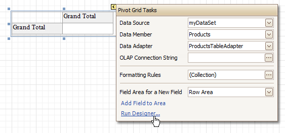 |
In the Property Grid, the Pivot Grid's properties are divided into the following groups.
Appearance
Appearance
Allows you to define the appearance properties (such as Background Color, Foreground Color, Font, etc.) for the Pivot Grid's elements (Cell, Field Value, Filter Separator, Header Group Line, etc.).
Formatting Rules
Invokes the Formatting Rules Editor allowing you to choose which rules should be applied to the control during report generation, and define the precedence of the applied rules. To learn more on this, refer to Conditionally Change a Control's Appearance.
Styles
Allows you to invoke the Styles Editor, which is intended to manage and customize the control's styles, which then can be assigned to the Pivot Grid's elements.
Behavior
Anchor Horizontally
Specifies the horizontal anchoring style of the control, so that after page rendering it stays attached to the left control, right control, or both. This property defines how a report control is resized to maintain the distance to the left and right edges of its container control.
Anchor Vertically
Specifies the vertical anchoring style of the Pivot Grid, so that after page rendering it stays attached to the top control, bottom control, or both.
Can Publish
Specifies whether or not a report control is displayed in a printed or exported document.
Keep Together
Specifies whether the contents of the control can be horizontally split across pages. In other words, if the control occupies more space than remains on the page, this property specifies whether this Pivot Grid should be split between the current page and the next, or whether it will be printed entirely on the next page. This property is in effect only when a Pivot Grid's content does not fit on the current page. If it does not fit on the next page either, then the Pivot Grid will be split despite this property's value.
Scripts
This property contains events, which you can handle by the required scripts. For more information on scripting, refer to Handle Events via Scripts.
Visible
Specifies whether the control should be visible in print preview.
Data
Data Adapter
Determines a data adapter that will populate a Pivot Grid's data source which is assigned via the Data Source property. It is automatically set to the appropriate value, when the Data Member property is defined. To learn more on this, refer to Cross-Tab Report.
Data Member
Determines the data source member which supplies data to a Pivot Grid. To learn more on this, refer to Cross-Tab Report.
Note
Usually, it is not necessary to specify the Data Member property when binding a Pivot Grid to data. This property should only be set directly if the dataset contains more than one table.
Data Source
Determines a Pivot Grid's data source. To learn more on this, refer to Cross-Tab Report.
Fields
Invokes the Pivot Grid Field Collection Editor, allowing you to manage and fully customize a Pivot Grid's fields.
OLAP Connection String
Specifies a connection string to a cube in an Microsoft Analysis Services database. A sample connection string is shown below:
OLAPConnectionString="Provider=msolap;Data Source=localhost;Initial Catalog=Adventure Works DW;Cube Name=Adventure Works;Query Timeout=100;"
A connection string can be built via the Connection String Editor. To invoke it, click the ellipsis button for the OLAP Connection String property.
To represent information from the bound cube, create specific Pivot Grid fields, and bind them to the required fields in the data source.
If the OLAP Connection String property is set to a valid string, the value of the Data Source property is cleared. Setting the Data Source property to a valid object clears the OLAP Connection String property.
Prefilter
When this property is expanded in the Property Grid, you can set its Enabled property to Yes, and use the Criteria property to invoke the Pivot Grid Prefilter dialog.
This dialog allows you to build complex filter criteria with an unlimited number of filter conditions, combined by logical operators. It provides a set of logical operators that significantly simplify the process of creating filters for text, numeric and date-time fields.
Note
The Prefilter is not supported in OLAP mode.
Design
(Name)
Determines a control's name, by which it can be accessed in the Report Explorer, Property Grid or via scripts.
Layout
Location
Specifies the control's location, in report measurement units.
Size
Specifies the control's size, in report measurement units.
Snap Line Margin
Specifies the margin (in report measurement units), which is to be preserved around the control when it is aligned using Snap Lines, or when other controls are aligned next to it.
Navigation
Bookmark and Parent Bookmark
These properties are intended for the creation of a hierarchical structure within a report called a document map. For an explanation and help, refer to Add Bookmarks.
Options
Data Field Options
Allows you to customize the options which control the presentation of the data fields.
Data Options
Allows you to define whether a Pivot Grid's fields must be case sensitive or not.
Options Chart Data Source
Provides access to the options controlling the display of the Pivot Grid's data in a Chart.
Print Options
Allows you to customize the print options of a Pivot Grid.
View Options
Allows you to customize the Pivot Grid's display options.
Page Info
The Page Info control is intended to add page numbers and system information (the current date and time or the current user name) into your report. As with many other controls, you can format this control's content.
 |
In the Property Grid, the Page Info control's properties are divided into the following groups.
Appearance
Background Color
Specifies the background color for the control. This option is also available in the Formatting Toolbar ().
Borders, Border Color, Border Dash Style and Border Width
Specify border settings for the control.
Font
Specifies the font settings for the control. Some of these settings are available in the Formatting Toolbar.
Foreground Color
Specifies the text color for the control. This option is also available in the Formatting Toolbar ().
Formatting Rules
Invokes the Formatting Rules Editor, allowing you to choose which rules should be applied to the control during report generation, and define the precedence of the applied rules. To learn more on this, refer to Conditionally Change a Control's Appearance.
Padding
Specifies indent values which are used to render the contents of the control.
Style Priority
Allows you to define the priority of various style elements (such as background color, border color, etc.). For more information on style inheritance, refer to Understanding Style Concepts.
Styles
This property allows you to define odd and even styles for the control, as well as to assign an existing style to the control (or a newly created one). For more information on style inheritance, refer to Understanding Style Concepts.
Text Alignment
Allows you to change the alignment of the control's text. This option is also available in the Formatting Toolbar.
Behavior
Anchor Horizontally
Specifies the horizontal anchoring style of the control, so that after page rendering it stays attached to the left control, right control, or both. This property defines how a report control is resized to maintain the distance to the left and right edges of its container control.
Anchor Vertically
Specifies the vertical anchoring style of the control, so that after page rendering it stays attached to the top control, bottom control, or both.
Can Publish
Specifies whether or not a report control is displayed in a printed or exported document.
Format
This property allows you to specify the format string for the text displayed in the control. When you click the ellipsis button, you will see the Format String Editor window that will select the predefined format or customize it as needed. For more information about this, refer to Change Value Formatting of Report Elements.
Page Information
You can select the type of information displayed in the control.
Type | Description |
None | Displays an empty control. |
Page Number | The string, specified by the Format property, is displayed. The {0} combination in the string is replaced with the current page number. |
"Current of Total" Page Numbers | The string, specified by the Format property, is displayed. The {0} combination in the string is replaced with the current page number, the {1} combination - with a total number of pages in the report. To display the typical "Page 1 of 11" text, use the format string "Page {0} of {1}". |
Page Number (Roman, Lowercase) | The current page number is displayed using Roman numerals in lowercase. |
Page Number (Roman, Uppercase) | The current page number is displayed using Roman numerals in uppercase. |
Current Date and Time | The string, specified by the Format property, is displayed. The {0:[format]} combination is replaced with the current system date and time formatted according to the [format] string. Use the Format String Editor of the Format property (see below) to select or construct the proper string. |
User Name | The name of the current user, which was used to log into the operating system, is displayed. |
Running Band
Specifies the name of the band, from which the Page Info gathers information. This allows you to implement page numbering independently for the report and its groups. For a tutorial on this, refer to Add Page Numbers for Groups.
By default, this property is not set to any value, meaning that the entire report is being taken into account.
Scripts
This property contains events, which you can handle with the required scripts. For more information on scripting, refer to Handle Events via Scripts.
Start Page Number
Here you can set the start number for page numbering.
Visible
Specifies whether the control should be visible in print preview.
Word Wrap
When this property is set to Yes, text contained in the control is wrapped to the next line if it doesn't fit the line or comes across a newline character. If the this property is set to No, the text in this case will be displayed on the same line until a newline character is entered.
Data
(Data Bindings)
If the current report is bound to data, this property allows you to bind some of the control's properties (Bookmark, Navigation URL and Tag) to a data field obtained from the report's data source, and to apply a format string to it. For more information on this, refer to Displaying Values from a Database (Binding Report Elements to Data).
Tag
This property allows you to add some additional information to the control; for example its id, by which it can be then accessible via scripts.
If the current report has a data source, the Tag property can be bound to a data field obtained from the data source. To do this, expand the (Data Bindings) property and in the Tag.Binding drop-down selector, select the required data field.
Design
(Name)
Determines a control's name, by which it can be accessed in the Report Explorer, Property Grid or via scripts.
Layout
Location
Specifies the control's location, in report measurement units.
Size
Specifies the control's size, in report measurement units.
Snap Line Margin
Specifies the margin (in report measurement units), which is to be preserved around the control when it is aligned using Snap Lines, or when other controls are aligned next to it.
Navigation
Bookmark and Parent Bookmark
These properties are intended for the creation of a hierarchical structure within a report called a document map. For an explanation and help, refer to Add Bookmarks.
If the current report has a data source, the Bookmark property can be bound to a data field obtained from the data source. To do this, expand the (Data Bindings) property and in the Bookmark.Binding drop-down selector, select the required data field.
Navigation URL and Navigation Target
Use the Navigation URL property to specify a URL for web browser navigation when a user clicks the control. The web browser displays a page in a window or a frame as specified by the Navigation Target property. Note that a URL should have an appropriate prefix (e.g. "http://"). You can create cross-references within the report by assigning the name of the target control to the Navigation URL property, and setting the Navigation Target property to "_self". For more information, refer to Create Hyperlinks.
If the current report has a data source, the Navigation URL property can be bound to a data field obtained from the data source. To do this, expand the (Data Bindings) property and in the Navigation URL.Binding drop-down selector, select the required data field.
Page Break
The Page Break control's sole purpose is to insert a page delimiter at any point within a report.
This control is visually represented by a short line, attached to the report's left margin, as shown in the following image.
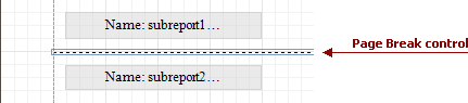 |
The Page Break control is useful when you need to insert a page break between controls within a band - for example, to divide subreports, so that the second subreport starts printing on a new page. Another example of the Page Break's use can be found in the following tutorial: Limit the Number of Records per Page.
Note
Note that when you need a page break before or after printing a certain band, you may set its Page Break property to Before the Band or After the Band, instead of using the Page Break control.
In the Property Grid, the Page Break control's properties are divided into the following groups.
Appearance
Formatting Rules
Invokes the Formatting Rules Editor, allowing you to choose which rules should be applied to the control during report generation, and define the precedence of the applied rules. To learn more on this, refer to Conditionally Change a Control's Appearance.
Behavior
Scripts
This property contains events, which you can handle with the required scripts. For more information on scripting, refer to Handle Events via Scripts.
Visible
Specifies whether the control should be visible in print preview.
Design
(Name)
Determines a control's name, by which it can be accessed in the Report Explorer, Property Grid or via scripts.
Layout
Location
Specifies the control's location, in report measurement units.
Snap Line Margin
Specifies the margin (in report measurement units), which is to be preserved around the control when it is aligned using Snap Lines, or when other controls are aligned next to it.
Cross-band Line
The Cross-band Line control allows you to draw a line through several bands. This can be useful if it is required to visually emphasize a section consisting of multiple band areas. In other aspects, it is similar to a regular Line.
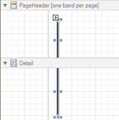 |
Another cross-band control available is the Cross-band Box.
In the Property Grid, the Cross-band Line control's properties are divided into the following groups.
Appearance
Foreground Color
Specifies the color of the control's line. This option is also available in the Formatting Toolbar ().
Formatting Rules
Invokes the Formatting Rules Editor allowing you to choose which rules should be applied to the control during report generation, and define the precedence of the applied rules. To learn more on this, refer to Conditionally Change a Control's Appearance.
Line Style
You can select a solid (by default), dashed, dotted or mixed style for the line.
Behavior
Anchor Horizontally
Specifies the horizontal anchoring style of the control, so that after page rendering it stays attached to the left control, right control, or both. This property defines how a report control is resized to maintain the distance to the left and right edges of its container control.
Anchor Vertically
Specifies the vertical anchoring style of the control, so that after page rendering it stays attached to the top control, bottom control, or both.
Can Publish
Specifies whether or not a report control is displayed in a printed or exported document.
Visible
Specifies whether the control should be visible in print preview.
Data
Tag
This property allows you to add some additional information to the control; for example its id, by which it then can be accessible via scripts.
Design
(Name)
Determines a control's name, by which it can be accessed in the Report Explorer, Property Grid or via scripts.
Layout
End Band
Determines a band, in which the control finishes drawing.
End Point
Determines the end point (from a band's upper left corner) where the control finishes drawing.
Location
Specifies the control's location, in report measurement units.
Snap Line Margin
Specifies the margin (in report measurement units), which is to be preserved around the control when it is aligned using Snap Lines, or when other controls are aligned next to it.
Start Band
Determines a band, in which the control starts drawing.
Start Point
Determines the starting point (from a band's upper left corner) where the control starts drawing.
Width
Specifies the line's width in report measurement units.
Cross-band Box
The Cross-band Box control allows you to draw a rectangle through several bands. This can be useful if it is required to visually encompass a section consisting of multiple band areas.
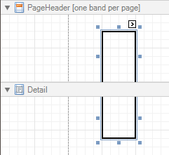 |
Another cross-band control available is the Cross-band Line.
In the Property Grid, the Cross-band Box control's properties are divided into the following groups.
Appearance
Borders, Border Color, Border Dash Style and Border Width
Specify border settings for the control.
Formatting Rules
Invokes the Formatting Rules Editor, allowing you to choose which rules should be applied to the control during report generation, and define the precedence of the applied rules. To learn more on this, refer to Conditionally Change a Control's Appearance.
Behavior
Anchor Horizontally
Specifies the horizontal anchoring style of the control, so that after page rendering it stays attached to the left control, right control, or both. This property defines how a report control is resized to maintain the distance to the left and right edges of its container control.
Anchor Vertically
Specifies the vertical anchoring style of the control, so that after page rendering it stays attached to the top control, bottom control, or both.
Can Publish
Specifies whether or not a report control is displayed in a printed or exported document.
Visible
Specifies whether the control should be visible in print preview.
Data
Tag
This property allows you to add some additional information to the control; for example its id, by which it can then be accessible via scripts.
Design
(Name)
Determines a control's name, by which it can be accessed in the Report Explorer, Property Grid or via scripts.
Layout
End Band
Determines a band, in which the control finishes drawing.
End Point
Determines the end point (from a band's upper left corner) where the control finishes drawing.
Location
Specifies the control's location, in report measurement units.
Snap Line Margin
Specifies the margin (in report measurement units), which is to be preserved around the control when it is aligned using Snap Lines, or when other controls are aligned next to it.
Start Band
Determines a band, in which the control starts drawing.
Start Point
Determines the starting point (from a band's upper left corner) where the control starts drawing.
Width
Specifies the width of the Box, in report measurement units.
Subreport
The Subreport control allows you to include other reports in your current report.
There are several reasons for using subreports. The first one is to reuse reports. This can be of help if there is a particular report structure (template) that has to be included in all reports, and the report must have consistent appearance and functionality. A good example is a report header that contains the company information, logo, date, etc. The second reason for using subreports is creation of master-detail reports (or, invoice reports with hierarchically linked data).
However, for master-detail reports creation, another approach is recommended: using Detail Report bands.
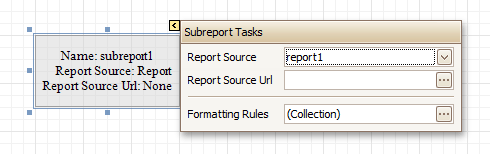 |
You can click a subreport, to open the report to which it is linked in a new Design Panel.
In the Property Grid, the Subreport's properties are divided into the following groups.
Appearance
Formatting Rules
Invokes the Formatting Rules Editor allowing you to choose which rules should be applied to the control during report generation, and define the precedence of the applied rules. To learn more on this, refer to Conditionally Change a Control's Appearance.
Behavior
Can Shrink
Determines whether a Subreport's height should be decreased if its contents don't completely fill the control.
Use this property to specify whether the height of the Subreport control should be taken into account when generating a report. This may be required, because usually the mutual location of report controls is considered when generating a report document. But, as the Subreport control actually represents a report itself, the height of a Subreport normally should not be taken into account in the generated report document.
Also, note that there is no Can Grow option for the Subreport control, as it always increases its height depending on its contents.
Scripts
This property contains events, which you can handle by the required scripts. For more information on scripting, refer to Handle Events via Scripts.
Visible
Specifies a value indicating whether the current control should be printed (when set to Yes) or hidden (No) on report generation.
Data
Parameter Bindings
Provides access to the collection of subreport parameter bindings, which allow you to bind a subreport's parameter value to a master report's data field.
Report Source
Determines a report to be included as a subreport.
If report classes of the application that invoked the Report Designer are compiled into one assembly, then they are available as items in this combo box.
Report Source Url
Defines an URL of a report definition file (*.REPX), to be used as a report source.
Design
(Name)
Determines a control's name, by which it can be accessed in the Report Explorer, Property Grid or via scripts.
Layout
Location
Specifies the control's location, in report measurement units.
Size
Specifies the control's size, in report measurement units.
The Subreport isn't limited by the visible size of the control. The size of its actual content is taken into account when rendering the subreport on the page. Note that depending on its contents, its width is unlimited and its height is increased.
Snap Line Margin
Specifies the margin (in report measurement units), which is to be preserved around the control when it is aligned using Snap Lines, or when other controls are aligned next to it.
Sparkline
The Sparkline control displays a compact chart that is commonly used to reflect the flow of data for every row in a report.
 |
In the Property Grid, the Sparkline control's properties are divided into the following groups.
Appearance
Background Color
Specifies the background color for the control. This option is also available in the Formatting Toolbar ().
Borders, Border Color, Border Width, and Border Dash Style
Specify border settings for the control.
Formatting Rules
Invokes the Formatting Rules Editor, which allows you to choose which rules should be applied to a control during report generation, and define the precedence of the applied rules. To learn more on this, refer to Conditionally Change a Control's Appearance.
Padding
Specifies indent values that are used to render the contents of a Label.
Style Priority
Specifies the priority of various style elements (such as background color, border color, etc.). For more information on style inheritance, refer to Understanding Style Concepts.
Styles
Assigns an existing (or newly created) style to the control, and also specifies odd and even styles.. For more information on style inheritance, refer to Understanding Style Concepts.
View
Specifies the type of a chart displayed by a Sparkline control. The following table lists the available Sparkline view types.
View Type | Description |
Line | A line chart.  |
Area | An area chart.  |
Bar | A bar chart.  |
WinLoss | A win-loss chart.  |
Behavior
Anchor Horizontally
Specifies the horizontal anchoring style of the control, so that after page rendering it stays attached to the left control, right control, or both. This property defines how a report control is resized to maintain the distance to the left and right edges of its container control.
Anchor Vertically
Specifies the vertical anchor style of the control, so that after a page is rendered it stays attached to the top control, bottom control, or both.
Can Publish
Specifies whether or not a report control is displayed in a printed or exported document.
Scripts
This property contains events that you can handle with the required scripts. For more information on scripting, refer to Handle Events via Scripts.
Visible
Specifies whether the control should be visible in a print preview.
Data
(Data Bindings)
If the current report is bound to data, this property allows you to bind some of the control's properties (Bookmark, Navigation URL, Tag and Text) to a data field obtained from the report's data source, and to apply a format string to it. For more information on this, refer to Displaying Values from a Database (Binding Report Elements to Data).
Data Adapter
Determines the data adapter that will populate the Sparkline's data source, which is assigned via the Data Source property. It is automatically set to the appropriate value when the Data Member property is defined.
Data Member
Determines the data source member that supplies data to a Sparkline.
Note
Usually, it is not necessary to specify the Data Member property when binding a Sparkline to data. This property should only be set directly if the dataset contains more than one table.
Data Source
Determines a Sparkline's data source.
Tag
This property allows you to add some additional information to the control; for example its id, by which it can then be accessible via scripts.
If the current report has a data source, the Tag property can be bound to a data field obtained from the data source. To do this, expand the (Data Bindings) property, and in the Tag.Binding drop-down selector, select the required data field.
Value Member
Specifies the data member field that provides point values for a Sparkline.
Value Range
Specifies a range of values displayed by a Sparkline.
Design
(Name)
Determines the control's name by which it can be accessed in the Report Explorer, Property Grid or via scripts.
Layout
Location
Specifies the control's location in report measurement units.
Size
Specifies the control's size in report measurement units.
Snap Line Margin
Specifies the margin (in report measurement units) around the control when it is aligned using Snap Lines, or when other controls are aligned next to it.
Navigation
Bookmark and Parent Bookmark
These properties are intended for the creation of a hierarchical structure within a report called a document map. For more information, refer to the Add Bookmarks topic.
If the current report is bound to a data source, the Bookmark property can be bound to a data field obtained from the data source. To do this, expand the (Data Bindings) property, and in the Bookmark.Binding drop-down selector, select the required data field.
Navigation URL and Navigation Target
Use the Navigation URL property to specify a URL for web browser navigation when a user clicks a Label. The web browser displays a page in a window or a frame as specified by the Navigation Target property. Note that a URL should have an appropriate prefix (e.g., "http://"). You can create cross-references within the report by assigning the name of the target control to the Navigation URL property, and setting the Navigation Target property to "_self". For more information, refer to Create Hyperlinks.
If the current report is bound to a data source, the Navigation URL property can be bound to a data field obtained from the data source. To do this, expand the (Data Bindings) property, and in the Navigation URL.Binding drop-down selector, select the required data field.
Table of Contents
The Table of Contents control generates a table of contents based on bookmarks specified for report elements.
 |
When a Table of Contents control is dropped onto a report's body from the Toolbox, it is placed on the Report Header band of the report. If there is no Report Header in the report, it is created automatically.
A table of contents is generated based on the hierarchy of report bookmarks. To learn how to provide a report with bookmarks, refer to the Add Bookmarks topic.
In the Property Grid, the properties of the Table of Contents are divided into the following groups.
Appearance
Background Color
Specifies the background color for the control. This option is also available in the Formatting Toolbar ().
Borders, Border Color, Border Width and Border Dash Style
Specify border settings for the control.
Formatting Rules
Invokes the Formatting Rules Editor, which allows you to choose which rules should be applied to a control during report generation, and define the precedence of the applied rules. To learn more on this, refer to Conditionally Change a Control's Appearance.
Padding
Specifies indent values that are used to render the contents of a Label.
Foreground Color
Specifies the text color for the control. This option is also available in the Formatting Toolbar ().
Style Priority
Specifies the priority of various style elements (such as background color, border color, etc.). For more information on style inheritance, refer to Understanding Style Concepts.
Styles
Assigns an existing (or newly created) style to the control, and also specifies odd and even styles. For more information on style inheritance, refer to Understanding Style Concepts.
Behavior
Level Default
Specifies the default formatting options for the hierarchical levels of a Table of Contents.
Level Title
Specifies the formatting options for the title of a Table of Contents.
Levels
Invokes the Table of Contents Level Collection Editor, which allows you to edit and customize formatting options for hierarchical levels of a Table of Contents.
Max Nesting Level
Specifies the maximum number of Table of Contents levels to be displayed. If set to 0, no limitation is applied.
Visible
Specifies whether the control should be visible in a print preview.
Data
Tag
This property allows you to add some additional information to the control; for example, its id, by which it can then be accessible using scripts.
Design
(Name)
Determines the control's name by which it can be accessed in the Report Explorer, Property Grid or using scripts.
Layout
Location
Specifies the control's location in report measurement units.
Gauge
The Gauge control provides you with the capability to embed graphical gauges into your report.
 |
In the Property Grid, the Gauge control's properties are divided into the following groups.
Appearance
Background Color
Specifies the background color for the control. This option is also available in the Formatting Toolbar ().
Borders, Border Color, Border Dash Style and Border Width
Specify border settings for the control.
Foreground Color
Specifies the text color for the control. This option is also available in the Formatting Toolbar ().
Image Type
Specifies whether a gauge should be internally rendered as a metafile or bitmap in a report.
Formatting Rules
Invokes the Formatting Rules Editor, which allows you to choose which rules should be applied to a control during report generation, and define the precedence of the applied rules. To learn more on this, refer to Conditionally Change a Control's Appearance.
Padding
Specifies the indent values that are used to render the contents of a Label.
Style Priority
Specifies the priority of various style elements (such as background color, border color, etc.). For more information on style inheritance, refer to Understanding Style Concepts.
Styles
Assigns an existing (or newly created) style to the control, and also specifies odd and even styles. For more information on style inheritance, refer to Understanding Style Concepts.
View Style
Specifies the style of the displayed gauge.
View Theme
Specifies the color theme of the displayed gauge.
View Type
Specifies the type of the displayed gauge. The following view types are supported.
Circular
 |
Linear
 |
Behavior
Anchor Horizontally
Specifies the horizontal anchoring style of the control, so that after page rendering it stays attached to the left control, right control, or both. This property defines how a report control is resized to maintain the distance to the left and right edges of its container control.
Anchor Vertically
Specifies the vertical anchor style of the control, so that after a page is rendered it stays attached to the top control, bottom control, or both.
Can Publish
Specifies whether or not a report control is displayed in a printed or exported document.
Scripts
This property contains events that you can handle with the required scripts. For more information on scripting, refer to Handle Events via Scripts.
Visible
Specifies whether or not the control should be visible in a print preview.
Data
(Data Bindings)
If the current report is bound to data, this property allows you to bind some of the control's properties (Bookmark, Navigation URL, Tag and Text) to a data field obtained from the report's data source, and to apply a format string to it. For more information on this, refer to Displaying Values from a Database (Binding Report Elements to Data).
Actual Value
Specifies the value displayed by a gauge.
Maximum
Specifies the gauge’s maximum value.
Minimum
Specifies the gauge’s minimum value.
Tag
This property allows you to add some additional information to the control; for example, its id, by which it is then accessible via scripts.
Target Value
Specifies the position of the target value marker.
Design
(Name)
Determines the control's name by which it can be accessed in the Report Explorer, Property Grid or via scripts.
Layout
Location
Specifies the control's location in report measurement units.
Size
Specifies the control's size in report measurement units.
Snap Line Margin
Specifies the margin (in report measurement units) around the control when it is aligned using Snap Lines, or when other controls are aligned next to it.
Navigation
Bookmark and Parent Bookmark
These properties are intended for the creation of a hierarchical structure within a report called a document map. For more information, refer to the Add Bookmarks topic.
If the current report is bound to a data source, the Bookmark property can be bound to a data field, obtained from the data source. To do this, expand the (Data Bindings) property, and in the Bookmark.Binding drop-down selector, select the required data field.
Navigation URL and Navigation Target
Use the Navigation URL property to specify a URL for web browser navigation, when a user clicks a Label. The web browser displays a page in a window or a frame as specified by the Navigation Target property. Note that a URL should have an appropriate prefix (e.g., "http://"). You can create cross-references within the report by assigning the name of the target control to the Navigation URL property, and setting the Navigation Target property to "_self". For more information, refer to Create Hyperlinks.
If the current report is bound to a data source, the Navigation URL property can be bound to a data field obtained from the data source. To do this, expand the (Data Bindings) property, and in the Navigation URL.Binding drop-down selector, select the required data field.
Report Bands
The topics in this section details the available kinds of report bands and their settings.
In the Report Designer, a report is built upon bands - sections of varied type and purpose, where report controls are contained. Bands are featured in the Designer Tab, solely to represent different sections of a report document (such as detail, report or page header, or footer). They allow you to select exactly where a control should be printed, and how many times.
Band Types
The following band types are available.
Manage Bands
To manage bands in a report, click its Smart Tag, and in the invoked actions list, click the Edit and Reorder Bands... link.
Then, in the invoked Report Editor you can easily add, remove and reorder bands, and adjust their options.
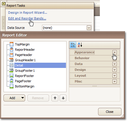 |
Alternatively, you can invoke the Report Editor via any band's Smart Tag.
|
To quickly insert a band of any type (except for the Detail band, since it is required in a report), right-click anywhere on a report's surface, and in the invoked Context Menu, point to Insert Band, and choose the band type.
|
See Also
Detail Report Band for Master-Detail Reports
Detail Band
The Detail band is the central part of a report. Unlike other bands, it cannot be deleted - the present report structure includes the Detail band in its core.
In a data-bound report, the contents of the Detail band are repeated for every data entry (e.g. if you're building a report listing, say, products, it will be rendered for each product in the database). And, if static data is also present in the Detail band, in the resulting report, it is repeated with each new entry.
|
In the Property Grid, the Detail Band's properties are divided into the following groups.
Appearance
Background Color
Specifies the background color for the controls contained within the band. This option is also available in the Formatting Toolbar ().
Borders, Border Color, Border Dash Style and Border Width
Specify border settings for the controls contained within the band.
Font
Specifies the font settings for the controls contained within the band. Some of these settings are available in the Formatting Toolbar.
Foreground Color
Specifies the text color for the controls contained within the band. This option is also available in the Formatting Toolbar ().
Formatting Rules
Invokes the Formatting Rules Editor allowing you to choose which rules should be applied to the band during report generation, and define the precedence of the applied rules. To learn more on this, refer to Conditionally Change a Control's Appearance.
Padding
Specifies indent values which are used to render the contents of the controls contained within the band.
Style Priority
Allows you to define the priority of various style elements (such as background color, border color, etc.). For more information on style inheritance, refer to Understanding Style Concepts.
Styles
This property allows you to define odd and even styles for the controls contained within the band, as well as to assign an existing style to them (or a newly created one). For more information on style inheritance, refer to Understanding Style Concepts.
Text Alignment
Allows you to change the text alignment of the controls contained within the band. This option is also available in the Formatting Toolbar.
Behavior
Drill-Down Control
Specifies a control used to expand/collapse the current report band. This property provides automatic drill-down functionality to report bands.
Drill-Down Expanded
Specifies whether the current report band is expanded or collapsed when using the automatic drill-down feature.
Keep Together
As stated above, the detail band is printed repeatedly for every data entry. When the Keep Together option is on, the report engine tries to keep sequential detail band entries together. This option makes sense only when data is grouped or you're working with a master-detail report. In this case, the report engine tries to keep group contents on one page. If a group doesn't fit and it starts somewhere in the middle of a page, the report moves this group to a new page, thus trying to reduce the number of page breaks in continuous data.
Keep Together with Detail Reports
Specifies whether or not the current detail band band should always be printed on the same page, together with its child Detail Report Band.
Multi-Column Options
This property allows you to arrange the printout of the band's content in several columns. For more information, refer to Multi-Column Report.
Page Break
Use this property if the current report design requires that the detail section should be separated from previous sections or follow-ups. Specify the Before the Band or After the Band values to insert a page break before or after the current band. In many cases, this property may be used instead of the Page Break control.
Scripts
This property contains events, which you can handle by the required scripts. For more information on scripting, refer to Handle Events via Scripts.
Visible
Specifies whether the band should be visible in print preview.
Data
Sort Fields
Invokes the Group Field Collection Editor, which enables you to specify the fields for sorting the records within the band, the sorting order (Ascending/Descending) for each field and the order sequence. For more information, refer to Change or Apply Data Sorting to a Report.
Tag
This property allows you to add some additional information to the band; for example its id, by which it can then be accessible via scripts.
Design
(Name)
Determines a band's name, by which it can be accessed in the Report Explorer, Property Grid or via scripts.
Layout
Height
Specifies the band's height, in report measurement units.
Snap Line Padding
Specifies the padding (in report measurement units), which is to be preserved within the band when controls it contains are aligned using Snap Lines.
Misc
Keep Together with Detail Reports
When this option is on, the Detail Band will be always printed on the same page together with its child Detail Report Band, or multiple bands.
Grouping Bands
The Group Header and Group Footer bands are shown above and below each group. Usually, you don't need to manually manage these bands, as they are auto-created via the Group and Sort Panel. For more information, refer to Change or Apply Data Grouping to a Report and Change or Apply Data Sorting to a Report.
You may use the Group Header bands for grouping by multiple data fields in one of the following ways.
Add several Group Header bands. Specify one group field for each of these bands.
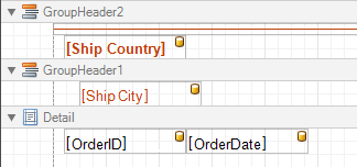 |
This results in nested grouping of the report's data.
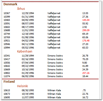 |
Specify several group fields for the Group Fields property of the Group Header band. The data will be grouped by certain combinations of field values.
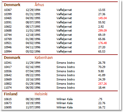 |
The Group Footer band is unnecessary without the corresponding Group Header band, to which its properties are similar. The Group Footer can be used to display group totals, or group page numbers.
In the Property Grid, the properties of both these bands are divided into the following groups.
Appearance
Background Color
Specifies the background color for the controls contained within the band. This option is also available in the Formatting Toolbar ().
Borders, Border Color, Border Dash Style and Border Width
Specify border settings for the controls contained within the band.
Font
Specifies the font settings for the controls contained within the band. Some of these settings are available in the Formatting Toolbar.
Foreground Color
Specifies the text color for the controls contained within the band. This option is also available in the Formatting Toolbar ().
Formatting Rules
Invokes the Formatting Rules Editor allowing you to choose which rules should be applied to the band during report generation, and define the precedence of the applied rules. To learn more on this, refer to Conditionally Change a Control's Appearance.
Padding
Specifies indent values which are used to render the contents of the controls contained within the bands.
Style Priority
Allows you to define the priority of various style elements (such as background color, border color, etc.). For more information on style inheritance, refer to Understanding Style Concepts.
Styles
This property allows you to define odd and even styles for the controls contained within the bands, as well as to assign an existing style to them (or a newly created one). For more information on style inheritance, refer to Understanding Style Concepts.
Text Alignment
Allows you to change the text alignment of the controls contained within the bands. This option is also available in the Formatting Toolbar.
Behavior
Drill-Down Control
Specifies a control used to expand/collapse the current report band. This property provides automatic drill-down functionality to report bands.
Drill-Down Expanded
Specifies whether the current report band is expanded or collapsed when using the automatic drill-down feature.
Group Fields
This property is available for the Group Header band only. It invokes the Group Field Collection Editor, allowing you to add and remove grouping fields, define data fields to be used as grouping criteria and the grouping order (ascending or descending).
In most scenarios, it's quick and practical to use the Group and Sort Panel, rather than manually adjust the band's group fields collection. However, this is the only way to assign multiple group fields to a single Group Header.
Group Union
Determines whether group rows can be printed on different pages (in this case both Group Union and Group Footer Band.Group Union are set to None), or the entire group will be printed on a single page (if the Group Union is set to Whole Page).
Also, if a group can be split across pages, but you don't want a Group Header to be printed on a page if there is no data row below it (in case a group starts at the bottom of the page and there is enough room for only a Group Header), you may set the Group Union to With First Detail. In this case, if a Group Header is alone on a page, it will be moved to the beginning of the next page.
It is the same for the Group Footer. If you don't want it to be printed alone on a page, you may set its Group Union to With Last Detail, and the last group row from the previous page will be moved to the next page to be printed together with a Group Footer.
This property is quickly accessible via the band's Smart Tag.
Keep Together
When this option is on, the report tries to fit the band contents entirely on one page, not allowing it to split across several pages. In general, if the contents are too large to fit on a single page, then the band is started on a new page, and continues on the following page.
Level
Specifies the nesting level of a group band. The lower the level number, the closer the group band is to the Detail band. The numeration starts at zero. It is the parameter that identifies the Group Header / Group Footer band pairs.
This option is auto-defined when using the Group and Sort Panel.
Page Break
Use this property if the current report design requires that the band's section should be separated from previous sections or follow-ups. Specify the Before the Band or After the Band values to insert a page break before or after the current band. In many cases, this property may be used instead of the Page Break control.
Print at Bottom
This property is available for the Group Footer band only. It determines whether the band should be printed at the bottom of a page, or immediately after the last group's details.
If a report contains several Group Footers with their Print at Bottom properties set to different values, then the outer Group Footer has the highest priority.
This feature is helpful when the Page Break property of the Group Header band is set to After the Band. In this instance each group starts a new page, and the Group Footer has two distinct places to reside - after the last row, or at the bottom of the page.
Repeat Every Page
This property improves the readability of reports with group contents that are several pages long. Without a repeated group header at the top of the page, the report may be difficult to read.
This property is also accessible via the band's Smart Tag.
Scripts
This property contains events, which you can handle with the required scripts. For more information on scripting, refer to Handle Events via Scripts.
Sorting Summary
This property is available for the Group Header band only. It allows you to sort groups by a summary function result.
Visible
Specifies whether the bands should be visible in print preview.
Data
Tag
This property allows you to add some additional information to the band; for example its id, by which it can then be accessible via scripts.
Design
(Name)
Determines a band's name, by which it can be accessed in the Report Explorer, Property Grid or via scripts.
Layout
Height
Specifies the band's height, in report units.
Snap Line Padding
Specifies the padding (in report measurement units), which is to be preserved within the band when controls it contains are aligned using Snap Lines.
Report Header and Footer
The Report Header and Report Footer are the only types of report bands rendered once per report.
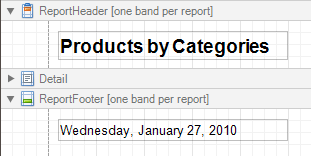 |
The Report Header is the first band of a report on the first page (not counting margins as they are "out-of-page" zones). The Report Header also precedes the Page Header, making it the best place to display the report's name, company logo, date of creation and user name, etc.
And, if you plan to add a Chart that visualizes the report's data, place this control onto this band.
The Report Footer finalizes the informative part of the report. It is placed before the Page Footer and Bottom Margin on the report's last page. Use the Report Footer for report grand totals or conclusions.
In the Property Grid, the properties of these bands are divided into the following groups.
Appearance
Background Color
Specifies the background color for the controls contained within the band. This option is also available in the Formatting Toolbar ().
Borders, Border Color, Border Dash Style and Border Width
Specify border settings for the controls contained within the band.
Font
Specifies the font settings for the controls contained within the band. Some of these settings are available in the Formatting Toolbar.
Foreground Color
Specifies the text color for the controls contained within the band. This option is also available in the Formatting Toolbar ().
Formatting Rules
Invokes the Formatting Rules Editor allowing you to choose which rules should be applied to the band during report generation, and define the precedence of the applied rules. To learn more on this, refer to Conditionally Change a Control's Appearance.
Padding
Specifies indent values which are used to render the contents of the controls contained within the bands.
Style Priority
Allows you to define the priority of various style elements (such as background color, border color, etc.). For more information on style inheritance, refer to Understanding Style Concepts.
Styles
This property allows you to define odd and even styles for the controls contained within the bands, as well as to assign an existing style to them (or a newly created one). For more information on style inheritance, refer to Understanding Style Concepts.
Text Alignment
Allows you to change the text alignment of the controls contained within the bands. This option is also available in the Formatting Toolbar.
Behavior
Keep Together
When this option is on, the report tries to fit the band contents entirely on one page, not allowing it to split across several pages. In general, if the contents are too large to fit on a single page, then the band is started on a new page, and continues on the following page.
Page Break
Use this property if the current report design requires that the band's section should be separated from previous sections or follow-ups. Specify the Before the Band or After the Band values to insert a page break before or after the current band. In many cases, this property may be used instead of the Page Break control.
Print at Bottom
This property is available for the Report Footer band only, and determines whether this band should be printed at the bottom of the last page, or immediately after the last report's details. The Report Footer has priority over the Group Footer's Print at Bottom property, so the Group Footer can never be placed after the Report Footer.
Scripts
This property contains events, which you can handle with the required scripts. For more information on scripting, refer to Handle Events via Scripts.
Visible
Specifies whether the band should be visible in print preview.
Data
Tag
This property allows you to add some additional information to the band; for example its id, by which it can then be accessible via scripts.
Design
(Name)
Determines a band's name, by which it can be accessed in the Report Explorer, Property Grid or via scripts.
Layout
Height
Specifies the band's height, in report units.
Snap Line Padding
Specifies the padding (in report measurement units), which is to be preserved within the band when controls it contains are aligned using Snap Lines.
Page Header and Footer
The Page Header and Page Footer bands are located at the top and bottom of every page in a report.
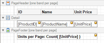 |
The Page Header/Footer bands are the best place for information that should be printed on every page. For example, use them to display the header of a table which is continued from the previous page (an example can be found at the Table Report tutorial).
Note
If you insert page break right after the Report Header (by setting its Page Break to After the Band), the Page Footer and Page Header bands will not be printed on the first page.
In the Property Grid, the properties of these bands are divided into the following groups.
Appearance
Background Color
Specifies the background color for the controls contained within the band. This option is also available in the Formatting Toolbar ().
Borders, Border Color, Border Dash Style and Border Width
Specify border settings for the controls contained within the band.
Font
Specifies the font settings for the controls contained within the band. Some of these settings are available in the Formatting Toolbar.
Foreground Color
Specifies the text color for the controls contained within the band. This option is also available in the Formatting Toolbar ().
Formatting Rules
Invokes the Formatting Rules Editor, allowing you to choose which rules should be applied to the band during report generation, and define the precedence of the applied rules. To learn more on this, refer to Conditionally Change a Control's Appearance.
Padding
Specifies indent values which are used to render the contents of the controls contained within the bands.
Style Priority
Allows you to define the priority of various style elements (such as background color, border color, etc.). For more information on style inheritance, refer to Understanding Style Concepts.
Styles
This property allows you to define odd and even styles for the controls contained within the bands, as well as to assign an existing style to them (or a newly created one). For more information on style inheritance, refer to Understanding Style Concepts.
Text Alignment
Allows you to change the text alignment of the controls contained within the bands. This option is also available in the Formatting Toolbar.
Behavior
Print On
This property specifies whether the band should be printed on the same page with Report Header and Report Footer bands.
Scripts
This property contains events, which you can handle with the required scripts. For more information on scripting, refer to Handle Events via Scripts.
Visible
Specifies whether the band should be visible in print preview.
Data
Tag
This property allows you to add some additional information to the band; for example its id, by which it can then be accessible via scripts.
Design
(Name)
Determines a band's name, by which it can be accessed in the Report Explorer, Property Grid or via scripts.
Layout
Height
Specifies the band's height, in report units.
Snap Line Padding
Specifies the padding (in report measurement units), which is to be preserved within the band when controls it contains are aligned using Snap Lines.
Structure
Sub-Bands
Provides access to the band's collection of sub-bands.
Page Margin Bands
The Top Margin and Bottom Margin bands represent the top and bottom page margins. Unlike other bands, they are not accompanied by strips displaying their titles in the Design Panel.
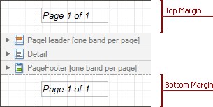 |
They are intended for displaying page numbers, or some sort of supplementary information (e.g. current system time or the user name).
In the Property Grid, the properties of these bands are divided into the following groups.
Appearance
Background Color
Specifies the background color for the controls contained within the band. This option is also available in the Formatting Toolbar ().
Borders, Border Color, Border Dash Style and Border Width
Specify border settings for the controls contained within the band.
Font
Specifies the font settings for the controls contained within the band. Some of these settings are available in the Formatting Toolbar.
Foreground Color
Specifies the text color for the controls contained within the band. This option is also available in the Formatting Toolbar ().
Formatting Rules
Invokes the Formatting Rules Editor allowing you to choose which rules should be applied to the band during report generation, and define the precedence of the applied rules. To learn more on this, refer to Conditionally Change a Control's Appearance.
Padding
Specifies indent values which are used to render the contents of the controls contained within the bands.
Style Priority
Allows you to define the priority of various style elements (such as background color, border color, etc.). For more information on style inheritance, refer to Understanding Style Concepts.
Styles
This property allows you to define odd and even styles for the controls contained within the bands, as well as to assign an existing style to them (or a newly created one). For more information on style inheritance, refer to Understanding Style Concepts.
Text Alignment
Allows you to change the text alignment of the controls contained within the bands. This option is also available in the Formatting Toolbar.
Behavior
Scripts
This property contains events, which you can handle with the required scripts. For more information on scripting, refer to Handle Events via Scripts.
Visible
Specifies whether the band should be visible in print preview.
Data
Tag
This property allows you to add some additional information to the band; for example its id, by which it can then be accessible via scripts.
Design
(Name)
Determines a band's name, by which it can be accessed in the Report Explorer, Property Grid or via scripts.
Layout
Height
Specifies the band's height, in report units.
Note
Note that this property is tied to the report's Margins.Top (or Margins.Bottom) property, so that changing this property's value will cause the appropriate Margin value to be changed, and vice versa
Snap Line Padding
Specifies the padding (in report measurement units), which is to be preserved within the band when controls it contains are aligned using Snap Lines.
Detail Report Band for Master-Detail Reports
The Detail Report band is a type of band used to incorporate one report into another in master-detail reports. It is quite different from the Detail band, since it holds the whole detail report in a master-detail report layout, and therefore can contain other types of bands within it.
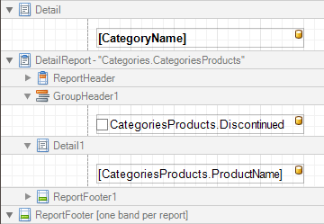 |
There can be an unlimited number of Detail Report bands nested inside one another.
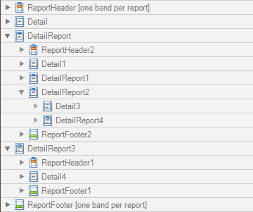 |
To add a Detail Report band, use the Context Menu. If the bound data source contains a data relationship, the submenu will contain an item with its name. Otherwise, add an unbound detail report and specify its data binding options later.
|
In the Property Grid, the properties of this band are divided into the following groups.
Appearance
Background Color
Specifies the background color for the controls contained within the band. This option is also available in the Formatting Toolbar ().
Borders, Border Color, Border Dash Style and Border Width
Specify border settings for the controls contained within the band.
Font
Specifies the font settings for the controls contained within the band. Some of these settings are available in the Formatting Toolbar.
Foreground Color
Specifies the text color for the controls contained within the band. This option is also available in the Formatting Toolbar ().
Formatting Rules
Invokes the Formatting Rules Editor, allowing you to choose which rules should be applied to the band during report generation, and define the precedence of the applied rules. To learn more on this, refer to Conditionally Change a Control's Appearance.
Padding
Specifies indent values which are used to render the contents of the controls contained within the band.
Text Alignment
Allows you to change the text alignment of the controls contained within the band. This option is also available in the Formatting Toolbar.
Behavior
Drill-Down Control
Specifies a control used to expand/collapse the current detail report band. This property provides automatic drill-down functionality to report bands.
Drill-Down Expanded
Specifies whether the current detail report band is expanded or collapsed when using the automatic drill-down feature.
Level
Specifies the order of several Detail Report Band objects in a report. It allows the reordering of different Detail Report Bands at the same level of master-detail relationships. The lower the level number, the closer the band is to the Detail band.
Page Break
Use this property if the current report design requires that the band's section should be separated from previous sections or follow-ups. Specify the Before the Band or After the Band values to insert a page break before or after the current band. In many cases, this property may be used instead of the Page Break control.
Scripts
This property contains events which you can handle with the required scripts. For more information on scripting, refer to Handle Events via Scripts.
Visible
Specifies whether the band should be visible in print preview.
Data
Data Adapter
Determines a Detail Report Band's data adapter that provides the detail data for the report. To learn more, refer to Master-Detail Report (Detail Report Bands).
Data Member
Determines a name of the data relationship established within the bound data source. To learn more, refer to Master-Detail Report (Detail Report Bands).
Data Source
Determines the data source that provides the detail data for the report. If this property isn't defined, the detail report gets data from the master report's data source. To learn more, refer to Master-Detail Report (Detail Report Bands).
Filter String
Allows you to invoke the Filter String Editor, which is intended to easily define a filtering condition for a detail report's data. For more information, refer to Change or Apply Data Filtering to a Report.
Tag
This property allows you to add some additional information to the band; for example its id, by which it can then be accessible via scripts.
XML Data Path
Allows you to define a path to the data contained in an XML file. The data contained in the file will then be used as the Detail Report Band's data source.
In this case, the Data Member property will specify the bound list in the XML data source.
Note
Note that a detail report uses the XML Data Path property value only when the Data Source property is set to None. The XML Data Path property has a lower priority than the Data Source property.
Design
(Name)
Determines a band's name, by which it can be accessed in the Report Explorer, Property Grid or via scripts.
Printing
Report Print Options
Provides the following options that define how a report is printed in various circumstances.
Blank Detail Count
Specifies how many times the empty detail band is repeated before printing the regular data.
Detail Count
Specifies the maximum number of times the detail band will be printed when a data source is defined for the report, and it is not empty.
Detail Count at Design Time
Specifies how many times the detail band is printed when a report is being previewed.
Detail Count when Data Source is Empty
Specifies how many times the detail band should be printed when no data source is defined for the report
Print when Data Source is Empty
Specifies whether or not a report should be printed if its data source is empty.
Structure
Bands
Allows you to invoke the Report Editor intended to manage and customize the report's bands.
Report Settings
This section details settings that affect the entire report.
A Report is the main object in the Report Designer, as it's the document being edited. A typical report is shown in the following image (as it looks in the Designer Tab).
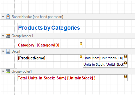 |
While the main report's properties can be accessed via the report's Smart Tag, the complete settings list is available in the Property Grid, where all the report's properties are divided into the following groups.
Appearance
Background Color
Specifies the background color of report elements. This option is also available in the Formatting Toolbar ().
Borders, Border Color, Border Dash Style and Border Width
Specify border settings for report elements.
Font
Specifies the font settings for report elements. Some of these settings are available in the Formatting Toolbar.
Foreground Color
Specifies the text color for report elements. This option is also available in the Formatting Toolbar ().
Formatting Rule Sheet
Invokes the Formatting Rule Sheet Editor, allowing you to manage and customize formatting rules, which can then be defined for a report's bands and controls. To learn more on this, refer to Conditionally Change a Control's Appearance.
Formatting Rules
Invokes the Formatting Rules Editor, allowing you to choose which rules should be applied to the report during report generation, and define the precedence of the applied rules. To learn more on this, refer to Conditionally Change a Control's Appearance.
Padding
Specifies indent values used to render the contents of a report's controls.
Page Color
Specifies the fill color for report pages. This color may be changed later in a report's Print Preview.
Style Sheet
Allows you to invoke the Styles Editor, which is intended to manage and customize a report's style sheets. To learn more on this, refer to Store and Restore Style Sheets.
Style Sheet's Path
Allows you to define a path to the style sheet contained in a report style sheet file (.REPSS). To learn more on this, refer to Store and Restore Style Sheets.
Text Alignment
Allows you to change the alignment of a report controls' text. This option is also available in the Formatting Toolbar.
Watermark
Allows you to customize a report's watermark options. For more information about this, refer to Create or Modify Watermarks of a Report.
Behavior
Display Name
Specifies the name of the report, which is displayed in its Design Panel tab.
 |
Export Options
Allows you to set the export options for each file type (PDF, XLS, TXT, etc.). These options vary with the file type.
Horizontal Content Splitting
Specifies whether report controls outside the bottom page margin should be split across pages, or moved in their entirety to the next page.This option is useful for the cross-tab reports creation.
Measure Units
Allows you to choose units of measurement for a report (one hundredth of an inch or a tenth of a millimeter).
Script Language
Allows you to choose the programming language to be used in scripting (C#, Visual Basic or J#).
Script References
Allows you to manage the collection of strings that represent the paths to the assemblies used by the scripts in a report.
Scripts
This property contains events which you can handle with the required scripts. For more information on scripting, refer to Handle Events via Scripts.
Show Margin Lines in Preview
The page margin lines are dotted lines shown on the currently selected page in the report's preview. Use this property to change the visibility of these lines.
Vertical Content Splitting
Allows you to choose whether report controls outside the right page margin should be split across pages, or moved in their entirety to the next page. This option is useful for the cross-tab reports creation.
Visible
Specifies whether a report should be created in print preview.
Data
Calculated Fields
Allows you to access a report's calculated fields collection.
Data Adapter
Determines a report's data adapter used to populate the report's data source. It is created automatically when the Data Member property is defined. To learn more about this, refer to Binding a Report to Data.
Data Member
Determines a specific list in a report's Data Source, for which the Report Designer objects display data. To learn more about this, refer to Binding a Report to Data.
Note
Usually, it is not necessary to specify the Data Member property when binding a report to data. This property should only be set directly if the dataset contains more than one table.
Data Source
Determines a report's data source. To learn more about this, refer to Binding a Report to Data.
Filter String
Allows you to invoke the Filter String Editor, which is intended to easily define a filtering condition for a report's data. For more information about this, refer to Change or Apply Data Filtering to a Report.
Tag
This property allows you to add some additional information to a report; for example its id, by which it can then be accessible via scripts.
XML Data Path
Allows you to define a path to data contained in an external XML file. The data contained in the file will then be used as a report's data source.
Design
(Name)
Determines a report's name, by which it can be accessed in the Report Explorer, Property Grid or via scripts.
Data Source's Schema
Allows you to load an XML/XSD file, containing the schema of a report's data source.
Designer Options
Contains the following options.
- Show Designer's Hints
The designer hints are intended to provide tooltips, both describing the purpose of certain report elements for inexperienced users, and describing the reasons and solutions for possible export or printing warnings. By using this property, these hints can be turned on or off.
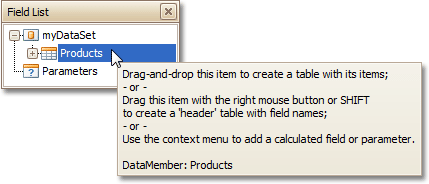 |
- Show Export Warnings
The export warnings appear when report controls are overlapped, indicating that a report layout may be incorrect when exporting to certain table-based formats (such as XLS, HTML or RTF).
|
- Show Printing Warnings
The printing warnings are intended to notify you that some of a report's controls are placed outside the right page margin, so that the report contains unnecessary pages.
|
Navigation
Bookmark
Allows you to define how a report is named in the document map when the report bookmarks are implemented. By default, it is synchronized with the report's Name property.
Bookmark Duplicate Suppress
Specifies whether or not to suppress duplicated bookmarks in a final document.
Page Settings
Landscape
Determines whether the page orientation is Landscape (when set to Yes) or Portrait (when set to No).
Margins
Determines the width of a report's margins (measured in report units).
Note
Note that the report's Margins.Top and Margins.Bottom properties are tied to the Height property of the Page Margin Bands. So, changing these properties' values will cause changing the appropriate bands' Height value as well, and vice versa.
Page Height
Specifies page height, in report units. This property can only be set if the Paper Kind property is set to Custom.
Page Width
Specifies page width, in report units. This property can only be set if the Paper Kind property is set to Custom.
Paper Kind
Determines the type of paper for a report. Setting this property to any value different from Custom will prevent the Page Height, Page Width and Paper Name properties from being customized.
Note
If the Paper Kind property is set to Custom, then the printer paper will be selected according to the Paper Name property's value. In this case, it's also necessary to set the Page Width and Page Height properties to the corresponding values of the paper selected.
Paper Name
Determines the name of the custom paper used in the printer that will print the document.
The Paper Name property's value is in effect only when the Paper Kind property is set to Custom. If the printer on which a document is printed doesn't support the paper type specified by the Paper Name property's value, then it will default to the Letter paper size. In this case, it's also necessary to set the Page Width and Page Height properties to the corresponding values of the selected paper.
Printer Name
Determines the name of the printer to use when printing a report. Note that the specified printer should be installed on the machine.
Using Settings of the Default Printer
Specifies which of the default printer's settings should be used when printing a report.
Parameters
Parameters
Allows you to access a report's parameters collection.
Request Parameters
Allows you to define whether it's required to request the values of a report's parameters when generating the report.
Printing
Report Print Options
Specifies options that define how a report is printed in various circumstances.
- Blank Detail Count
Specifies how many times the empty Detail band is repeated before printing the regular data.
- Detail Count
Specifies how many times the Detail band should be printed when a datasource is defined for the report, and it is not empty.
- Detail Count at Design Time
Specifies how many times the Detail band is printed when a report is being previewed at design time.
- Detail Count when Data Source is Empty
Specifies how many times the Detail band should be printed when no datasource is defined for the report.
- Print when Data Source is Empty
Specifies whether or not a report should be printed if its datasource is empty.
Show Print Margin Warnings
Specifies whether an error message is shown when the page margins are set outside the printable area.
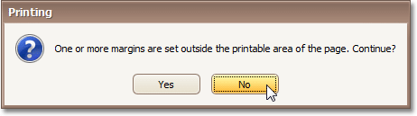 |
Show Print Status Dialog
Specifies whether a print status dialog is shown when a document is being printed.
 |
Structure
Bands
Allows you to invoke the Report Editor, intended to manage and customize a report's bands.
Report Wizard
The Report Wizard is a tool that allows you to easily create reports based on built-in templates. Using this tool, you can do the following:
Create a new report from scratch
In the Report Designer Ribbon, select New Report via Wizard... or press CTRL+W.
Edit an existing report
Click the report's Smart Tag and in the invoked actions list, click the Design in Report Wizard... context link.
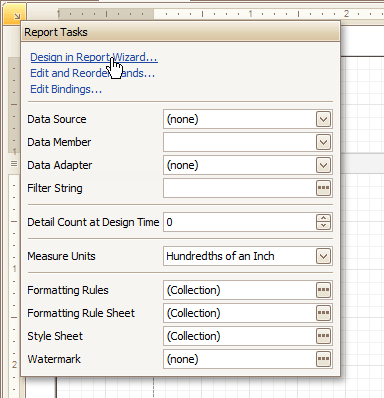 |
Warning
In this case, the initial report layout will be lost after using the wizard.
The Report Wizard provides three different ways to setup your report:
Empty Report
This option allows you to create a report that is not bound to data and does not contain any report controls.
Using this wizard, you can easily create a banded report displaying data in a tabular format. While setting up your report, you'll be able to group data, add totals to your report, apply one of the predefined report styles, etc.
This wizard is useful if you need to print out labels. In this case, you're likely to purchase label paper that meets your particular requirements. Depending on paper supplier and label type, your report will need to generate labels with a specific size and location within paper sheets.
With the Label Report Wizard, you won't have to adjust these settings manually, since we provide a wide choice of paper suppliers and their products. Simply choose your paper type, and the report is adjusted automatically. After completing the wizard, you get an empty report that clearly indicates label boundaries, and of course, properly positions labels within paper sheets.
Data-bound Report Wizard
The Report Wizard allows you to create reports of three kinds - empty reports, data-bound reports and label reports. To create a data-bound report, invoke the Report Wizard dialog and select the Data-bound Report option on the first wizard page.
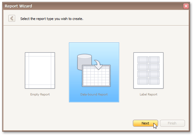 |
After completing the Data-bound Report wizard, you will get a tabular banded report. Depending on how many wizard steps you complete (you don't necessarily have to go through all the pages), you can apply data grouping, display totals, select one of the predefined style sheets, etc.
The following image shows a sample report created using the Data-bound Report Wizard.
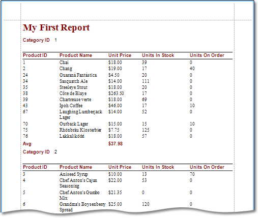 |
Use the links below to learn more about every step of the Data-bound Report wizard.
Depending on the method you used to invoke the Wizard, you may be creating an entirely new report or modifying an existing one. Creating reports from scratch requires data source connection knowledge. In these cases, it's better to contact Syx Support for assistance with the first three steps of the wizard. If you're modifying an existing report, these initial data binding steps will not appear and you will start with Choose Columns to Display in Your Report.
Connect to a Database
The topics in this section describe the steps required to connect a report to a database using the Report Wizard.
This task includes the following steps.
Select a Data Connection
This wizard step appears only if you're creating a new report from scratch. In this instance, familiarity with database connections is required, so we recommend that you contact Syx support. If you're modifying an existing report, you will skip this step and start with the Choose Columns to Display in Your Report wizard page.
Purpose
Connect to a database whose data will be shown in your report.
Page Interface
On this page you can either select one of the currently available data connections from the list, or create a new one.
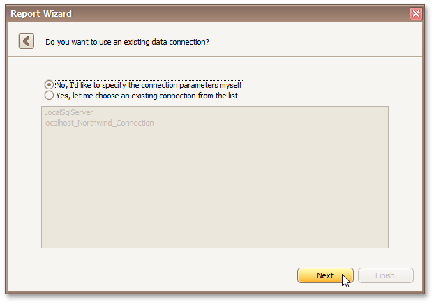 |
Click Next to proceed to the next wizard page, depending on the selected option.
Specify a Connection String
This wizard step appears only if you're creating a new report from scratch. In this instance, familiarity with database connections is required, so we recommend that you contact Syx Support for assistance. If you're modifying an existing report, this step will not appear and you will start with the Choose Columns to Display in Your Report wizard page.
Purpose
On this page, define a custom connection string or select one of the supported data source types.
The following data source types are supported.
Microsoft SQL Server
Microsoft Access 97
Microsoft Access 2007
Microsoft SQL Server CE
Oracle
Amazon Redshift
Google BigQuery
Teradata
Firebird
IBM DB2
MySQL
Pervasive PSQL
PostgreSQL
SAP Sybase Advantage
SAP Sybase ASE
SQLite
VistaDB
VistaDB5
XML file
Page Interface
Select the provider type in the Provider drop-down list. Next, specify the connection options required for the selected provider type (e.g., authentication type and database name).
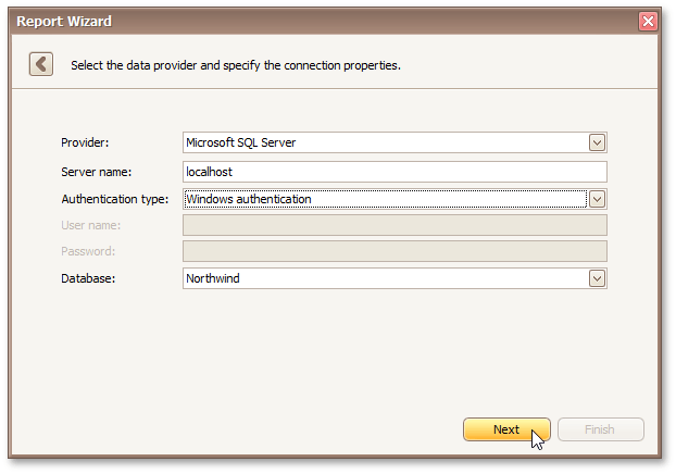 |
Click Next to proceed to the next wizard page, depending on whether or not the created connection uses server authentication.
Save the Connection String - if server authentication is required, this page allows you to specify whether or not you want to save the user credentials along with the connection string.
Customize the Query - if server authentication is not required, the page above does not appear, and you will proceed to constructing the query.
Save the Connection String
This wizard step appears only if you're creating a new report from scratch. In this instance, familiarity with database connections is required, so we recommend that you contact Syx Support for assistance. If you're modifying an existing report, this step will not appear and you will start with the Choose Columns to Display in Your Report wizard page.
Purpose
On this page, you can specify whether or not to save the user credentials along with the connection string.
Page Interface
Select the required option in the list.
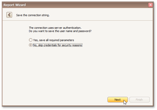 |
Click Next to proceed to the next wizard page: Customize the Query.
Customize the Query
This wizard step appears only if you're creating a new report from scratch. In this instance, familiarity with database connections is required, so we recommend that you contact Syx Support for assistance. If you're modifying an existing report, this step will not appear and you will start with the Choose Columns to Display in Your Report wizard page.
Purpose
On this page, you can construct an SQL query to obtain data from the database, or select a stored procedure.
Query
To construct an SQL query, do the following.
Click the Run Query Builder... button.
|
In the invoked Query Builder window, select an item from the list of available tables on the left and drop it onto the list of data tables to be used.
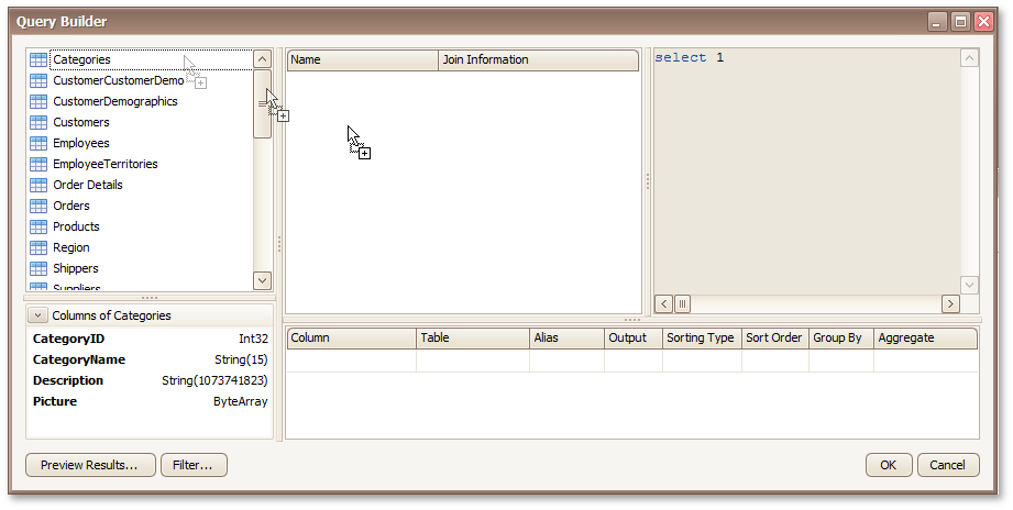 |
It is only possible to select a single table using the Query Builder. When creating a master-detail report, add the master table first.
Enable the check box near the added table to include all of its fields in the data view.
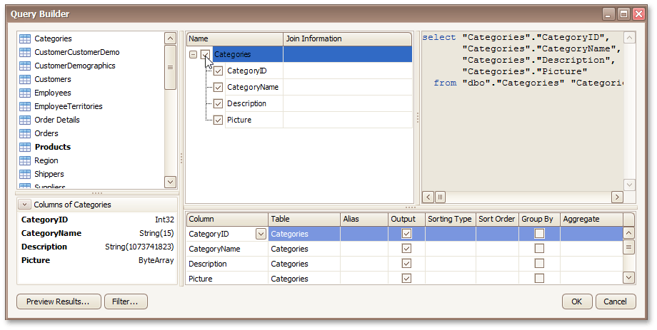 |
To assign a custom name to the selected data column, specify its Alias in the column list displayed under the data source editor. You can also apply sorting, grouping, filtering and aggregate functions to incoming data.
Click OK to exit the Query Builder
Click Next to proceed to the next wizard page: Choose Columns to Display in Your Report.
Stored Procedure
To use a stored procedure, do the following.
Select a stored procedure from the list of the available stored procedures and click Next.
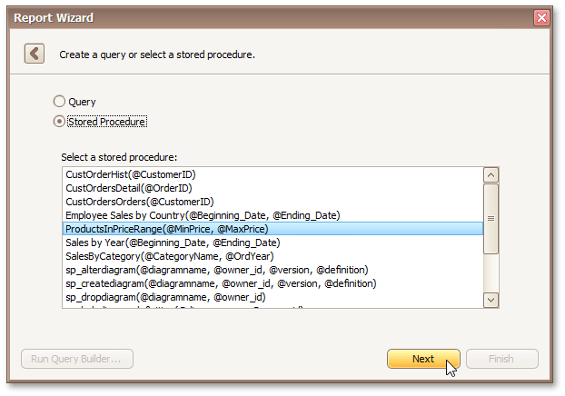 |
Configure the parameters to be passed to the selected stored procedure. Make sure that the value of the passed parameter's Type property corresponds to the actual type the stored procedure parameter.
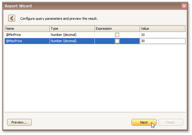 |
Click Next to proceed to the next wizard page: Choose Columns to Display in Your Report.
Connect to an Entity Framework Data Source
The topics in this section describe the steps required to connect a report to an Entity Framework data source using the Report Wizard.
This task includes the following steps.
Select the Data Context
This wizard step appears only if you're creating a new report from scratch. If you're modifying an existing report, this step will not appear and you will start with Choose Columns to Display in Your Report wizard page.
Purpose
Connect to an Entity Framework data context that will provide data to your report.
Page Interface
On this page, select the required data context from the list of available data contexts.
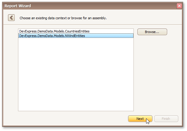 |
Click Next to proceed to the next wizard page: Select the Connection String.
Select the Connection String
This wizard step appears only if you're creating a new report from scratch. If you're modifying an existing report, this step will not appear and you will start with the Choose Columns to Display in Your Report wizard page.
Purpose
Select a connection string to be used to establish a data connection.
Page Interface
On this page, you can specify a connection string using one of the following two options.
Using an existing connection string. To do this, select Yes, let me choose from list. Next, select the required connection string from the list of the available connection strings.
Specify a connection string manually. To do this, select No, specify a custom connection string.
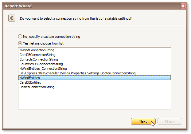 |
Click Next to proceed to the next wizard page, depending on the selected option.
Specify a Connection String
This wizard step appears only if you're creating a new report from scratch. If you're modifying an existing report, this step will not appear and you will start with the Choose Columns to Display in Your Report wizard page.
Purpose
Specify a custom connection string or use the default connections sting.
Page Interface
On this page, you can either use the default connection string or manually specify a connection sting. Additionally, this page requires you to specify whether or not to save the connection string in the configuration file.
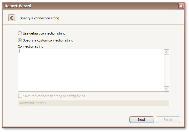 |
Click Next to proceed to the next wizard page: Bind to a Stored Procedure.
Bind to a Stored Procedure
This wizard step appears only if you're creating a new report from scratch. If you're modifying an existing report, this step will not appear and you will start with the Choose Columns to Display in Your Report wizard page.
Purpose
Bind to a stored procedure provided by an Entity Framework data context.
Page Interface
To bind to a stored procedure, do the following.
On the wizard page, click Add. Then, in the invoked window, select a required stored procedure and click OK.
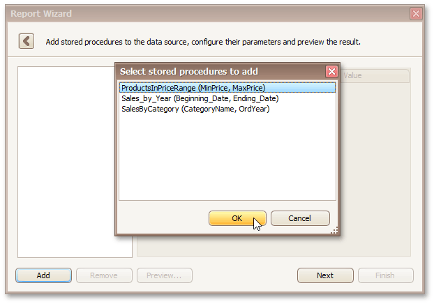 |
Configure the parameters to be passed to the selected stored procedure. Make sure that the value of the passed parameter's Type property corresponds to the actual type of the stored procedure parameter.
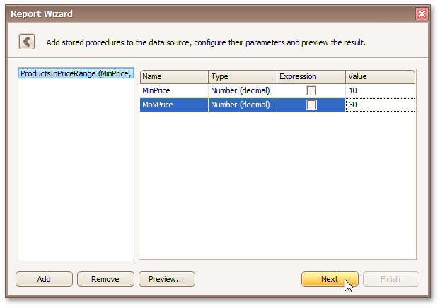 |
Click Next to proceed to the next wizard page: Choose Columns to Display in Your Report.
Connect to an Object Data Source
The topics in this section describe the report wizard steps required to connect a report to an object data source.
This task includes the following steps.
Select an Assembly
This wizard step appears only if you're creating a new report from scratch. If you're modifying an existing report, this step will not appear and you will start with the Choose Columns to Display in Your Report wizard page.
Purpose
Select an assembly that contains the class type definition of the data source.
Page Interface
On this page, select the required assembly. To exclude irrelevant assemblies from the list, select the Show only highlighted assemblies check box.
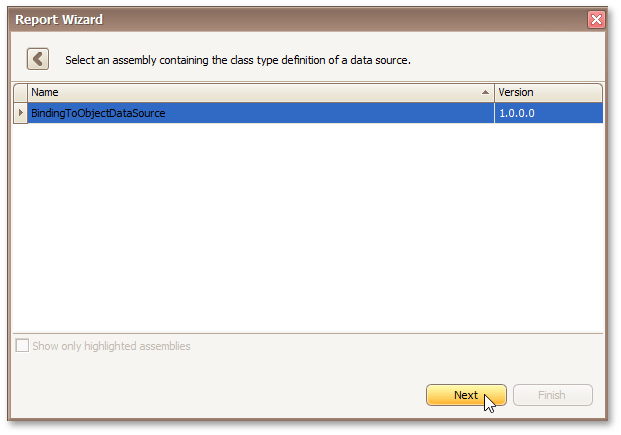 |
Click Next to proceed to the next wizard page: Select a Data Source Type.
Select a Data Source Type
This wizard step appears only if you're creating a new report from scratch. If you're modifying an existing report, this step will not appear and you will start with the Choose Columns to Display in Your Report wizard page.
Purpose
Select a data source type.
Page Interface
On this wizard page, select a required data source type. To exclude irrelevant classes from the list, select the Show only highlighted classes check box.
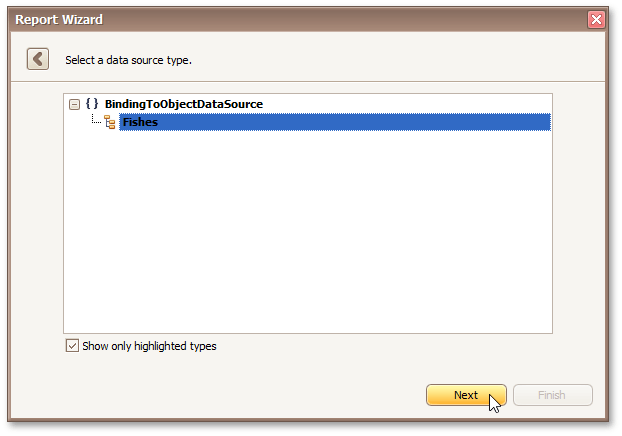 |
Click Next to proceed to the next wizard page: Select a Data Source Member.
Select a Data Source Member
This wizard step appears only if you're creating a new report from scratch. If you're modifying an existing report, this step will not appear and you will start with the Choose Columns to Display in Your Report wizard page.
Purpose
Select a data source member that will provide data to your report.
Page Interface
On this wizard page, specify whether you want to bind to the entire object or to its public member (method or property). To exclude irrelevant members from the list of available members, select the Show only highlighted members check box.
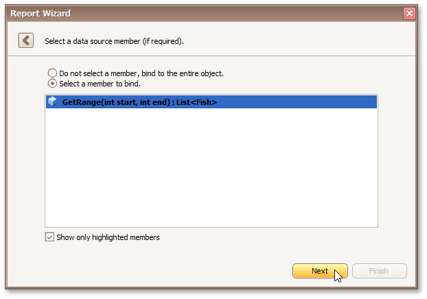 |
Click Next to proceed to the next wizard page depending on the selected option.
Specify the Member Parameters
This wizard step appears only if you're creating a new report from scratch. If you're modifying an existing report, this step will not appear and you will start with the Choose Columns to Display in Your Report wizard page.
Purpose
On this wizard page, specify the member parameters.
Page Interface
To specify the member parameter's value, use the Value column. Enable the check box in the Expression column to make it possible to specify the parameter expression using the Expression Editor. In this case, you can pass an existing report parameter to the member or even create a new report parameter using the in-place editor.
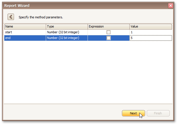 |
Click Next to proceed to the next wizard page: Select the Data Binding Mode.
Select the Data Binding Mode
This wizard step appears only if you're creating a new report from scratch. If you're modifying an existing report, this step will not appear and you will start with the Choose Columns to Display in Your Report wizard page.
Purpose
Specify whether you need to retrieve the actual data from the data source or obtain the data source schema.
Page Interface
On this wizard page, you can choose one of the following two binding modes.
Retrieve the data source schema - Select this option to retrieve only the data source schema from the specified object and edit the report layout without having access to the actual underlying data.
Retrieve the actual data - Select this option to automatically create an instance of the data source type and obtain its actual data.
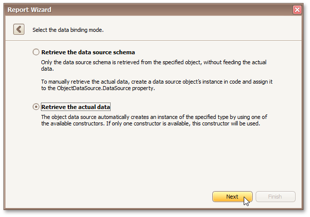 |
Click Next to proceed to the next wizard page depending on the selected option.
Select a Data Source Constructor
This wizard step appears only if you're creating a new report from scratch. If you're modifying an existing report, this step will not appear and you will start with the Choose Columns to Display in Your Report wizard page.
Purpose
Select a data source constructor to be used to create an instance of the data source.
Page Interface
On this page, select one of the available data source constructors. To exclude irrelevant constructors from the list, select the Show only highlighted constructors check box.
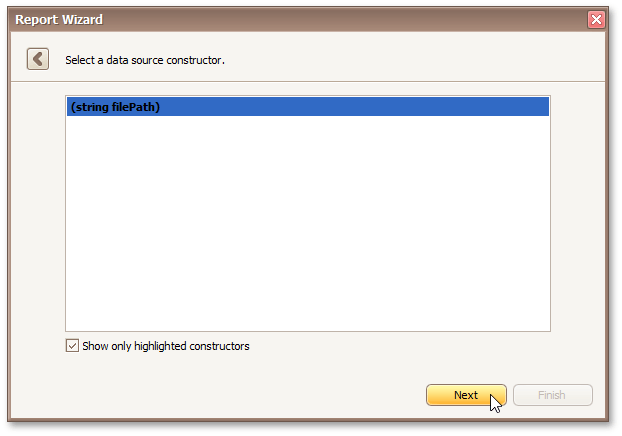 |
Click Next to proceed to the next wizard page: Specify the Constructor Parameters.
Specify the Constructor Parameters
This wizard step appears only if you're creating a new report from scratch. If you're modifying an existing report, this step will not appear and you will start with the Choose Columns to Display in Your Report wizard page.
Purpose
On this wizard page, specify the constructor parameters.
Page Interface
To specify the constructor parameter's value, use the Value column. Enable the check box in the Expression column to make it possible to specify the parameter expression using the Expression Editor. In this case, you can pass an existing report parameter to the constructor or even create a new report parameter using the in-place editor.
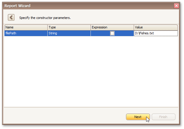 |
Click Next to proceed to the next wizard page: Choose Columns to Display in Your Report.
Connect to an Excel Data Source
The topics in this section describe the report wizard steps required to connect a report to an Excel data source.
This task includes the following steps.
Select an Excel Workbook or CSV file
This wizard step appears only if you're creating a new report from scratch. If you're modifying an existing report, this step will not appear and you will start with Choose Columns to Display in Your Report wizard page.
Purpose
Select a Microsoft Excel Workbook or CSV file that will provide data to your report.
Page Interface
On this wizard page, select a required Microsoft Excel Workbook (the XLS, XLSX and XLSM formats are supported) or CSV file. To do this, click the ellipsis button and locate the source file or enter the full path to this file.
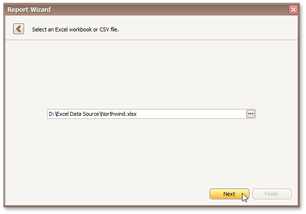 |
Click Next to proceed to the next wizard page: Specify Import Settings.
Specify Import Settings
This wizard step appears only if you're creating a new report from scratch. If you're modifying an existing report, this step will not appear and you will start with Choose Columns to Display in Your Report wizard page.
Purpose
Specify settings required for importing data. This page provides access to different settings depending on whether you have selected an Excel Workbook or CSV file.
Import Settings for an Excel Workbook
The following settings are available if an Excel workbook has been selected.
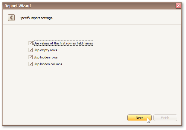 |
Use values of the first rows as field names - Specifies whether values of the first row should be imported as field names. If this option is disabled, values of the first row will be imported as data and field names will be generated automatically.
Skip empty rows - Specifies whether or not to include empty rows to the resulting data source.
Skip hidden rows - Specifies whether or not to include hidden rows to the resulting data source.
Skip hidden columns - Specifies whether or not to include hidden columns to the resulting data source.
Click Next to proceed to the next wizard page: Select a Worksheet, Table or Named Region.
Import Settings for a CSV file
The following settings are available if a CSV file has been selected.
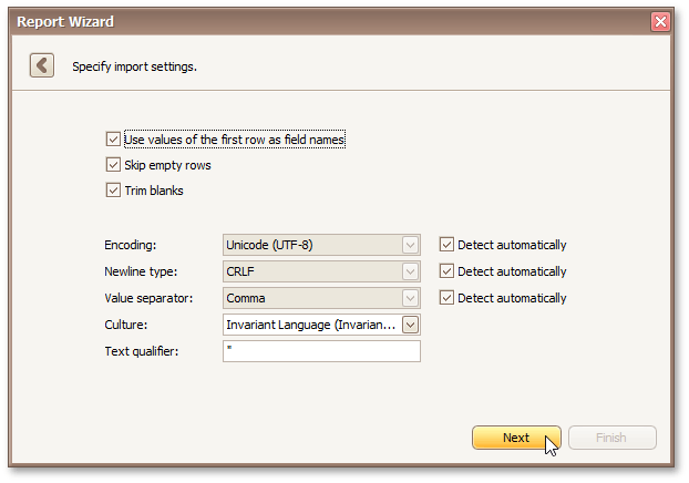 |
Use values of the first rows as field names - Specifies whether or not values of the first row should be imported as field names. If this option is disabled, values of the first row will be imported as data and field names will be generated automatically.
Skip empty rows - Specifies whether or not to include empty rows to the resulting data source.
Trim Blanks - Specifies whether or not to delete all leading and trailing empty spaces from each value in the source CSV file.
Encoding - Specifies the character encoding in the source CSV file. If the corresponding Detect automatically check box is enabled, this setting's value is automatically determined.
Newline type - Specifies the line break type in the source CSV file. If the corresponding Detect automatically check box is enabled, this setting's value is automatically determined.
Value separator - Specifies a character used to separate values in the source CSV file. If the corresponding Detect automatically check box is enabled, this setting's value is automatically determined.
Culture - Specifies culture information used to import data from the source CSV file.
Text Qualifier - Specifies the character that encloses values in the source CSV file.
Click Next to proceed to the next wizard page: Choose Columns.
Select a Worksheet, Table or Named Region
This wizard step appears only if you're creating a new report from scratch and if you have selected a Microsoft Excel Workbook on the previous step. If you're modifying an existing report, this step will not appear and you will start with Choose Columns to Display in Your Report wizard page.
Purpose
Select the required worksheet, table or named region that will provide data for you report.
Page Interface
On this wizard page, select one of the available worksheets, tables or named regions.
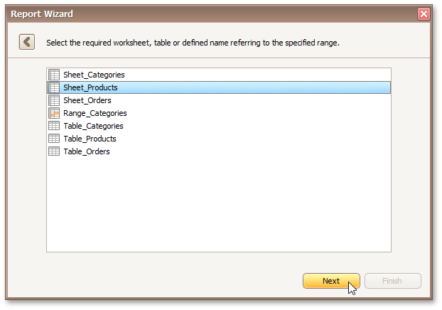 |
Click Next to proceed to the next wizard page: Choose Columns.
Choose Columns
This wizard step appears only if you're creating a new report from scratch. If you're modifying an existing report, this step will not appear and you will start with Choose Columns to Display in Your Report wizard page.
Purpose
Select required columns and specify their settings.
Page Interface
To select a column, enable the corresponding Selected check box. Use Name to specify the custom column name and Type to choose the column type.
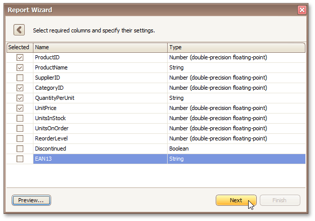 |
This page also allows you to preview resulting data by clicking the Preview... button.
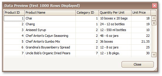 |
Click Next to proceed to the next wizard page: Choose Columns to Display in Your Report.
Select the Data Source Type
This wizard step appears only if you're creating a new report from scratch. In this instance, familiarity with data source connections is required, so we recommend that you contact Syx Support for assistance. If you're modifying an existing report, this step will not appear and you will start with Choose Columns to Display in Your Report.
The first page allows you to select the required data source type.
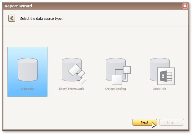 |
Click Next to proceed to the next wizard page, depending on the selected data source type.
Choose Columns to Display in Your Report
Purpose
Choose fields (attributes) whose data will be displayed in your report. The selected fields and corresponding captions will be automatically added to your report, arranged one under another.
Page Interface
The list on the left-hand side shows all available fields (attributes). To select the required fields, double-click them or drag them to the list box on the right-hand side. Another way to select fields is to use arrow buttons to move them back and forth.
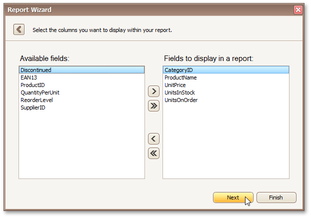 |
Note
To continue or finish report creation, you must select at least one field.
Result
You can stop the wizard at this step by clicking Finish. In this case, your report will look similar to the image below.
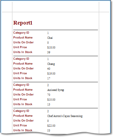 |
If you want to customize your report further, click Next to proceed to the next wizard page: Add Grouping Levels.
Add Grouping Levels
Purpose
This page allows you to group data in your report. For instance, if you are displaying car sales information, you may want to keep records corresponding to the same model together. Each set of records with the same model will become a "group" with its own header.
Nested grouping and grouping against multiple fields are fully supported. The following image illustrates all basic grouping types.
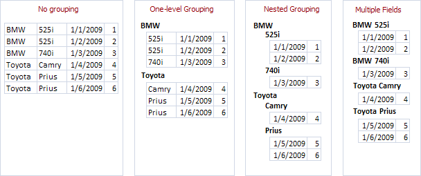 |
Note
If you don't need to group your data, simply click Next on this page to skip this step.
Page Interface
The list on the left-hand side displays data fields that can be used to group data. To apply grouping, do one of the following.
Select columns and click the right arrow (>) button.
Double-click columns.
Note that grouping fields on the right-hand side can be selected by clicking them. This is useful if you need to remove them or change their order. To accomplish the latter, use the up arrow (∧) and down arrow (∨) buttons.
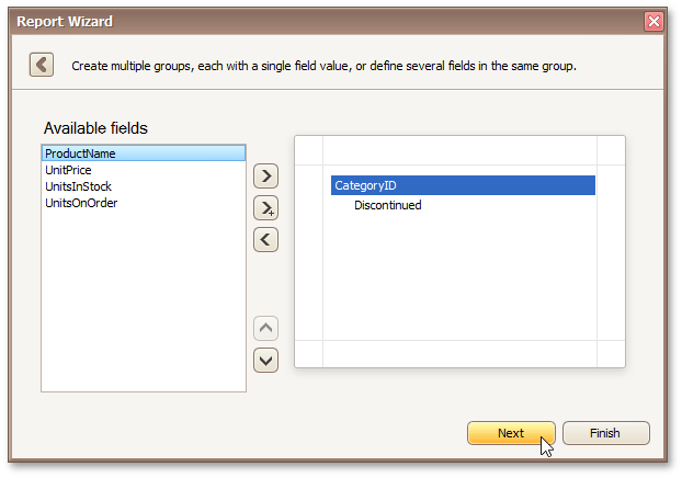 |
Result
You can stop the wizard on this step by clicking Finish. In this case, your report will look similar to the image below.
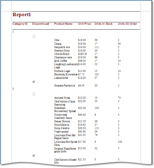 |
If you want to customize your report further, click Next. If data grouping has been applied on this page, you'll proceed to Summary Options page. If you haven't grouped your data, you'll skip the Summaries step and go to Choose Report Layout page.
Summary Options
This wizard step is only available if you've applied data grouping in the previous step (Add Grouping Levels). If you haven't grouped data, this step is skipped.
Purpose
Use this page to specify totals to be displayed for each data group and grand totals for the entire report. For instance, you may need to display the sum of values in a particular field, the average value, etc. Specified totals will be displayed after corresponding groups, and in the report footer.
Page Interface
This page displays all available numerical and date-time fields that aren't used to group data. Using the check box table, you can specify which functions should be calculated for these fields.
Sometimes, data fields can contain empty values (this is different from, say, zero in a numeric field). If you don't want to take these values into account when calculating totals, check Ignore NULL values. Otherwise, these values will be treated as zeros for numeric fields and the earliest system date for date-time fields.
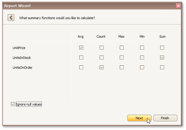 |
Result
You can stop the wizard on this step by clicking Finish. In this case, your report will look similar to the image below.
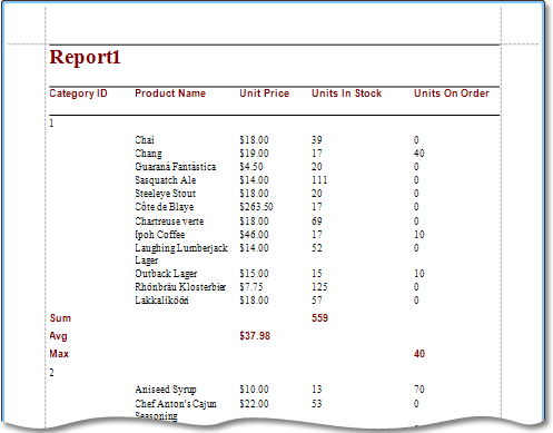 |
If you want to customize your report further, click Next to proceed to the next wizard page: Choose Report Layout.
Choose Report Layout
Purpose
This page sets the layout of elements in your report. If you haven't applied data grouping, you can specify how data field values are arranged - into a table, one under another, etc. If report data is grouped, you can choose one of the available indentation styles for nested elements.
Additionally, this page allows you to specify the page orientation for your report.
Page Interface
The following options are available if data grouping has been applied.
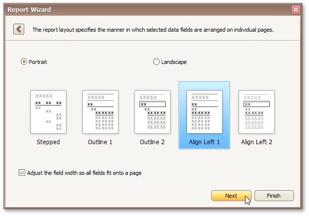 |
If data hasn't been grouped, you will see the following report layout options.
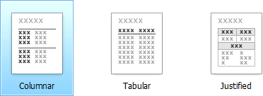 |
If you want to customize your report further, click Next to proceed to the next page: Choose Report Style. Otherwise, click Finish to complete report customization.
Choose Report Style
Purpose
Apply a predefined style sheet to your report.
Page Interface
Select one of the predefined styles from the list box.
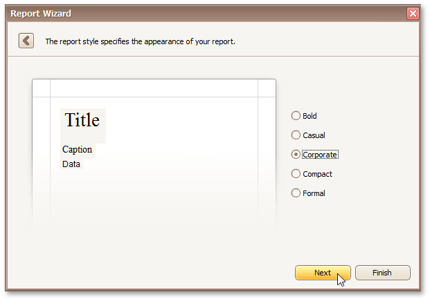 |
If you want to customize your report further, click Next to proceed to the next page: Enter a Report Title. Otherwise, click Finish to complete report customization.
Enter a Report Title
Purpose
Specifies the report title.
Page Interface
Enter a title string into the editor and click Finish to complete report creation.
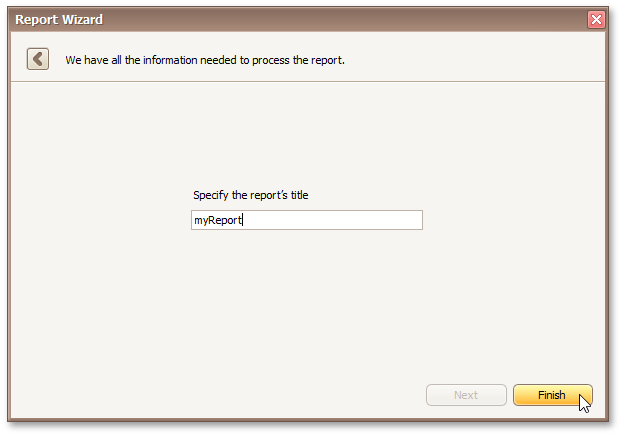 |
Label Report Wizard
The Report Wizard allows you to create reports of three kinds - empty reports, databound reports and label reports. To create a label report, invoke the Report Wizard dialog and choose the Label Report option.
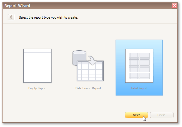 |
After completing the Label Report wizard, you will get a blank report that generates labels of a particular size. Since the report designer will clearly indicate the label area, you can then populate this area with the required content and print out your labels.
Use the links below, to learn more about every step in the Label Report wizard.
Select a Label Type
Purpose
When you need to print out stickers or, say, water-proof labels, you need to purchase the appropriate paper. Every supplier will provide it's own specific label size or label position within a paper sheet. To make it easier for you to produce labels, this wizard step lists several label paper suppliers and their products. Once you've selected a supplier and a product (paper and label type), the report will change its settings so that your labels will be printed exactly where they're supposed to, without you having to adjust the label position and size manually.
Page Interface
On this page, choose the supplier from the Label Products combo box and a particular product from the Product Number list. The selected type defines the label's size and layout, as well as the page type, which is default for this label.
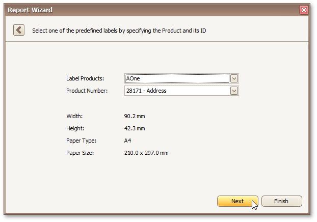 |
If you don't need further customization, click Finish to complete the report adjustment. If manual correction of label or paper size is required, click Next.
Customize Label Options
Purpose
On this page, you can manually adjust settings that were automatically specified in the previous step, based on your supplier and product choice.
Page Interface
Editors on this page allow free customization of all parameters specified on the previous page. The pane on the right-hand side provides a label dimensions preview.
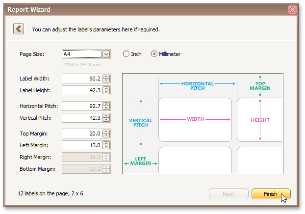 |
Click Finish to complete report setup.
Preview, Print and Export Reports
Preview and Print a Report
To switch a report to the print preview mode, click the Preview Tab. You will see your report populated with data and broken down into pages, as specified. When in the Print Preview mode, you can print out your report using the appropriate menu and toolbar commands..
Export a Report
In the Preview Tab, you can export your report to files in different formats. The resulting files can either be saved to the hard drive or sent by e-mail.