Example
Due to the flexible nature of the Dashboards, there are many ways to design these. What follows is an example of designing a dashboard. Please note that multiple configurations are possible to design a dashboard.
Example: Sales Dashboard
Sales Dashboard
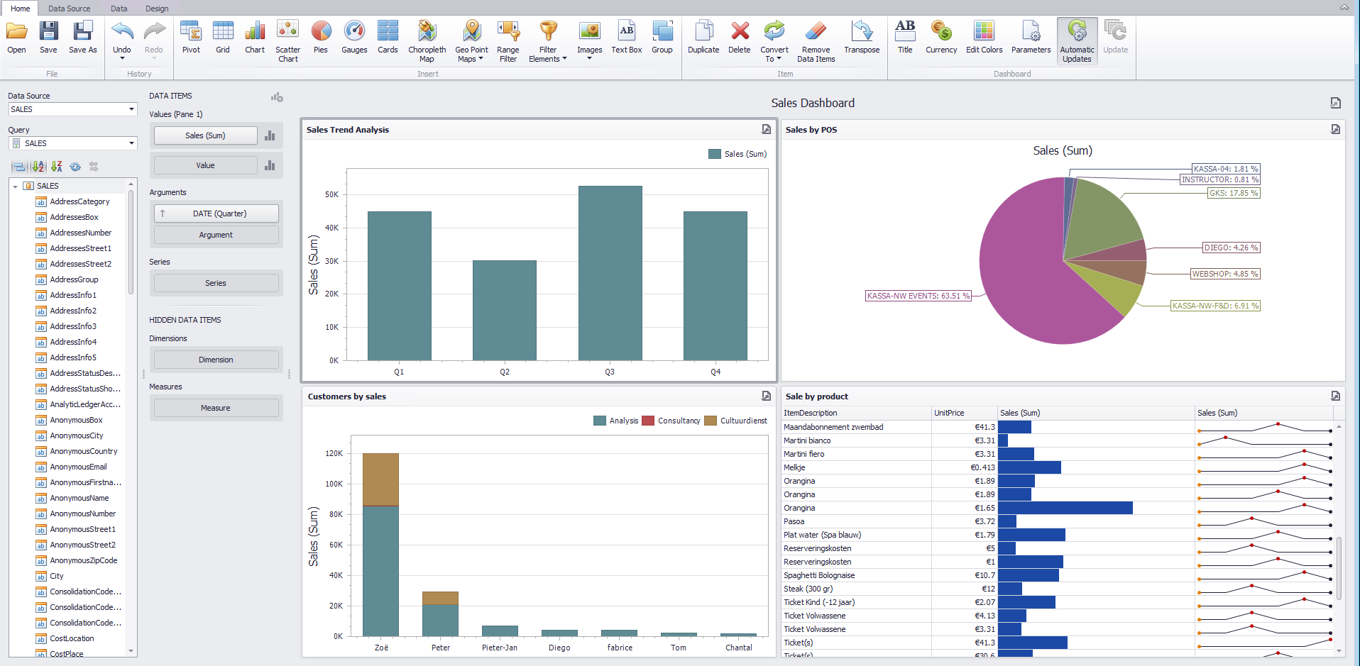 |
Sales Trend Analysis and Customers by Sales
To configure a chart that shows sales for a period of time, you can choose Chart from the Home ribbon.
In the Data Items column, select Sales for the Values field, which will form the Y axis of the chart. Select a Date field for Arguments, which will form the X axis of the chart.
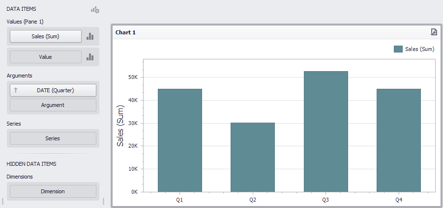 |
For more information on formatting numeric and date-time values, see Formatting Data .
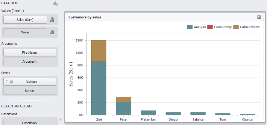
Similarly, you can configure a chart showing customers by sales.
To do so, in the Data Items column, select Sales for the Values field. Select a field corresponding to customer's name, for example First name, for Arguments.
It is also possible to add a third dimension of Divisions in the Series field to visualise sales by customer across divisions.
 |
To learn about customisation possibilities of charts, see Chart.
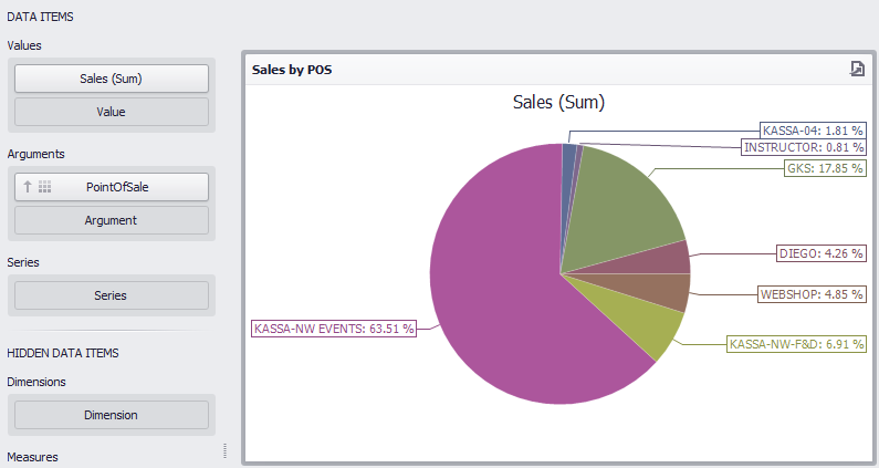
Sales by POS
To configure a chart that shows sales by POS, you can choose Pies from the Home ribbon.
In the Data Items column, select Sales for the Values field, which will form the title of the pie chart. Select PointOfSales field for Arguments, which will form the sections of the pie chart.
 |
To learn about customisation possibilities of pie chart, see Pies.
Sales by product
To visualise a comparative graph of product sales and its sales trend, you can choose Grid from the Home ribbon.
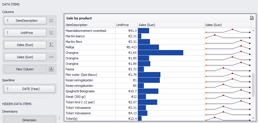 |
Here, the first data field under Columns, Item Description forms the first column of the grid. You can add the product's price field as well.
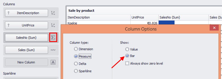
Select data field Sales for the third column. To visualise sale values in form of bar, click on the column indicator and select Bar for Column type Measure.
 |
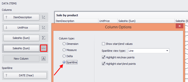
Next, to visualise a sales trend for each product, once again add the Sales field under Columns and add Date field under Sparkline.
Click on the column indicator for the Sales field and select the Column type option Sparkline.
 |
To learn about customisation possibilities of grid, see Grid.
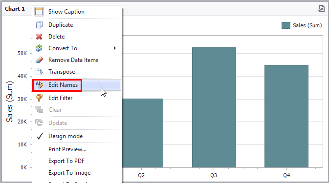
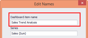
Edit title of the graphs
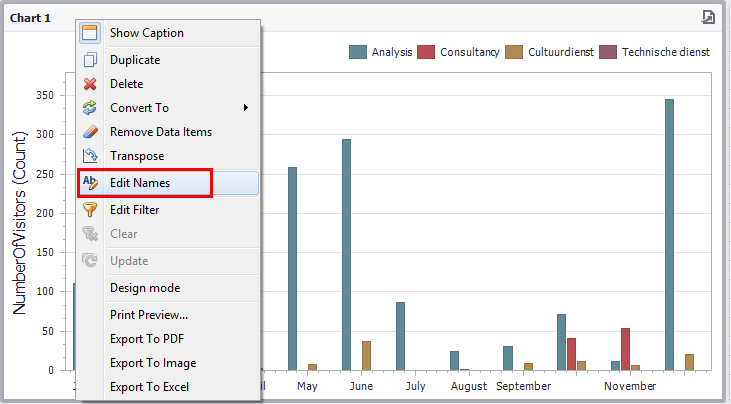
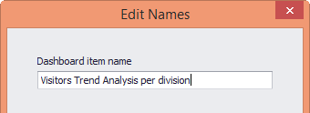
To change the title of a graph, right-click on the graph's title and select Edit Names.
 |
In the resulting window, enter the graph's title.
 |
For more information on customizing the dashboard layout, see Dashboard Layout.
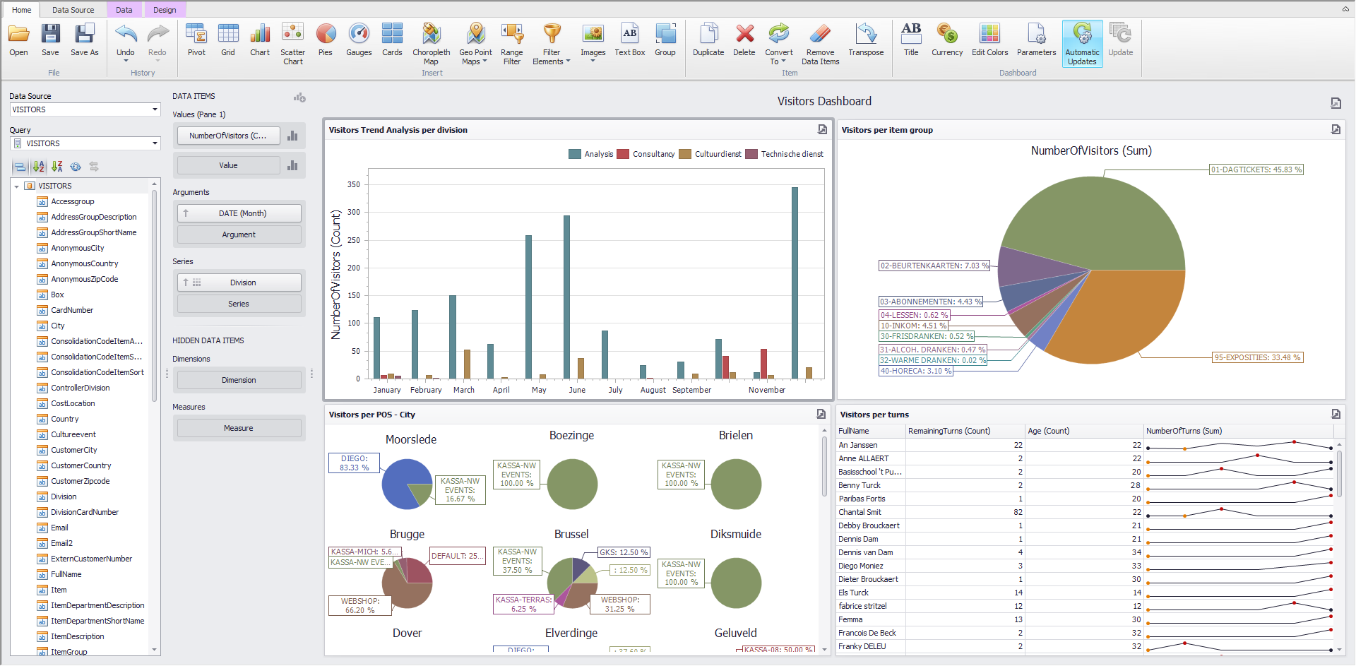
Visitors Dashboard
 |
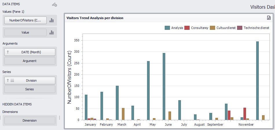
Visitors trend analysis per division
To configure a chart that shows visitors for a period of time, you can choose Chart from the Home ribbon.
In the Data Items column, select NumberOfVisitors for the Values field, which will form the Y axis of the chart. Select a Date field for Arguments, which will form the X axis of the chart.
To add the third dimension to the chart, add Divisions in the Series field to visualise visitors over a period of time across divisions.
 |
For more information on formatting numeric and date-time values, see Formatting Data .
To learn about customisation possibilities of charts, see Chart.
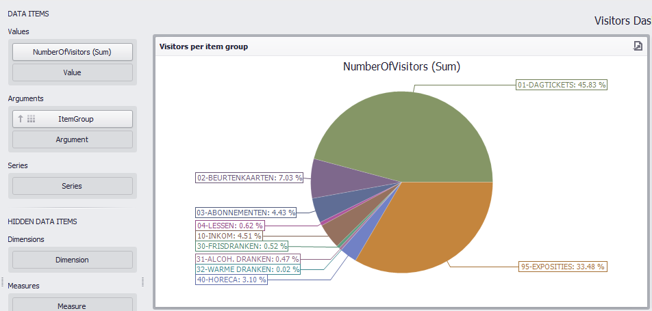
Visitors per item group and Visitors per POS
To configure a chart that shows visitors by item group, you can choose Pies from the Home ribbon.
In the Data Items column, select NumberOfVisitors for the Values field, which will form the title of the pie chart. Select ItemGroup field for Arguments, which will form the sections of the pie chart.
 |
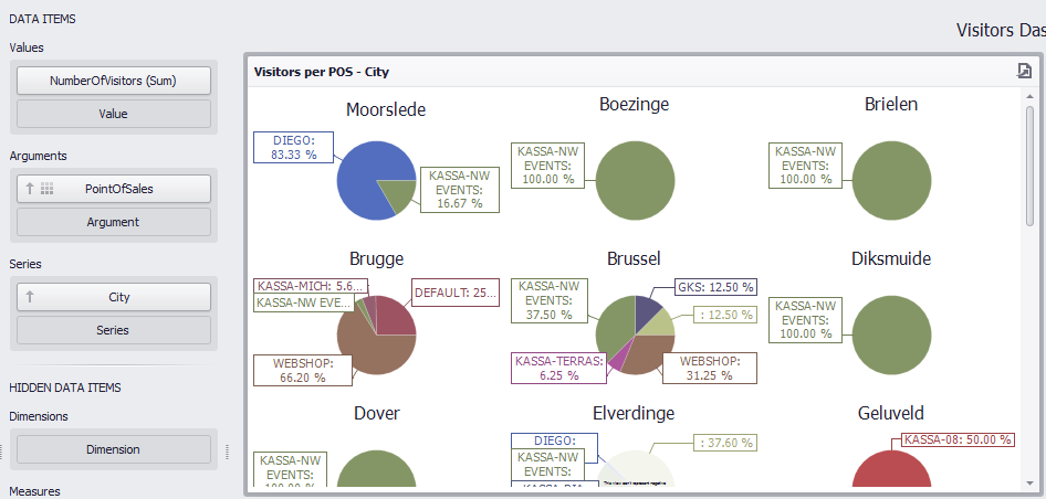
Similarly, you can configure a chart showing visitors per POS across cities.
To do so, In the Data Items column, select NumberOfVisitors for the Values field, which will form the title of the pie chart. Select PointOfSales field for Arguments, which will form the sections of the pie chart.
It is also possible to add a third dimension of City in the Series field to visualise visitors per POS across cities.
 |
To learn about customisation possibilities of pie chart, see Pies.
Visitors per turns
To visualise a comparative graph of visitors per turns and its trend, you can choose Grid from the Home ribbon.
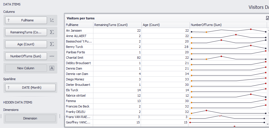 |
Here, the first data field under Columns, FullName forms the first column of the grid. You can add the RemainingTurns and Age field as well.
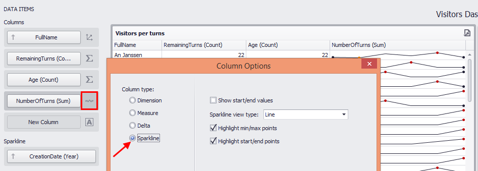
Next, to visualise the trend for number of turns per customer over a period of time, add thefield NumberOfTurns under Columns and add Date field under Sparkline.
Click on the column indicator for the NumberOfTurns field and select the Column type option Sparkline.
 |
To learn about customisation possibilities of grid, see Grid.
Edit title of the graphs
To change the title of a graph, right-click on the graph's title and select Edit Names.
 .
.
In the resulting window, enter the graph's title.
 |
For more information on customizing the dashboard layout, see Dashboard Layout.