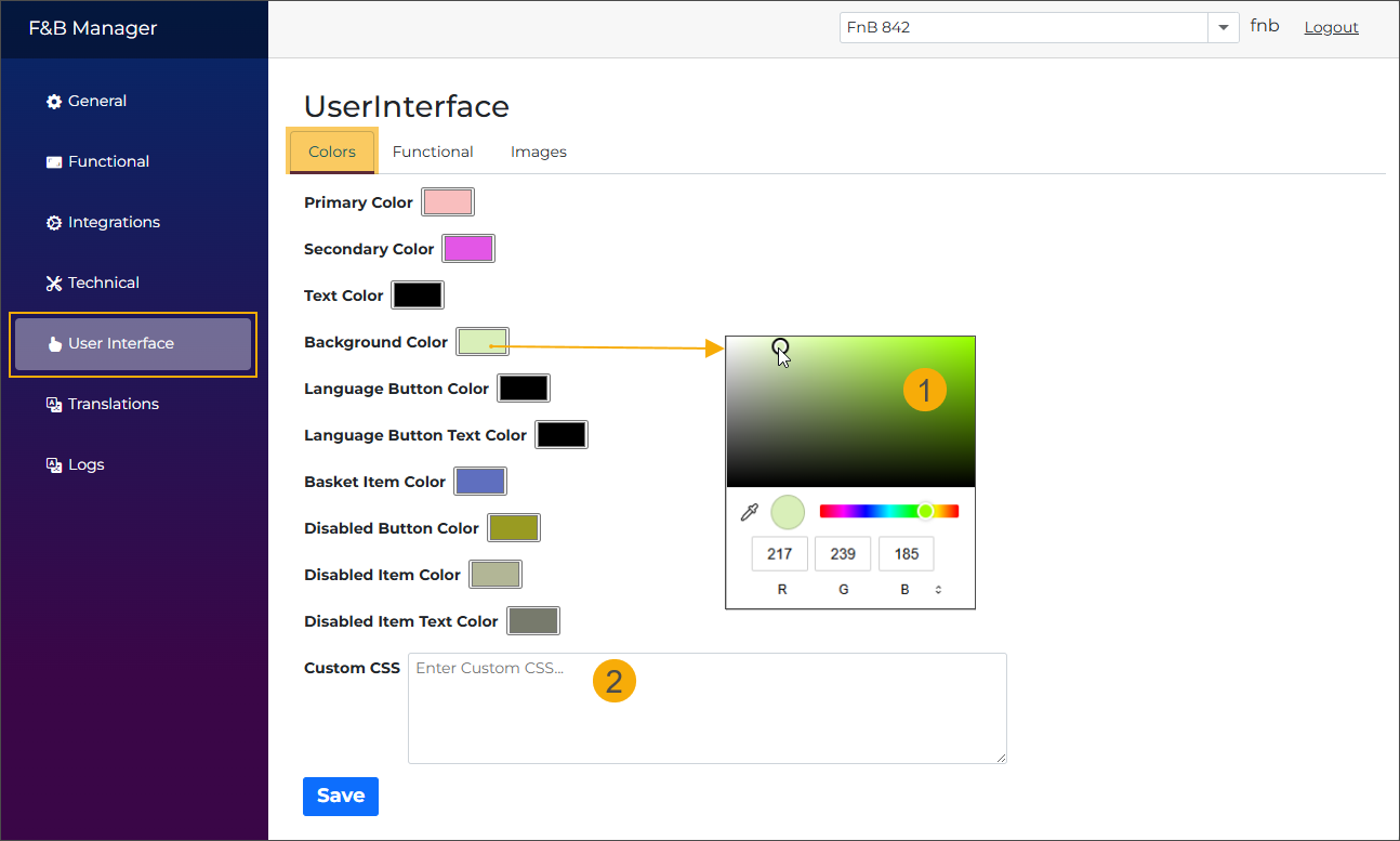
User interface
Colours
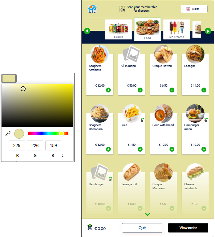
Use the colour settings to customise the look and feel of the kiosk interface. You can adjust the primary and secondary colours, text colour, and define the background and text colours for unavailable products.
Choose colours with the built-in colour picker (1) or apply your styling using a custom CSS configuration (2).
Primary colour
Default: white
The primary colour defines the general accent used across the kiosk interface.
Secondary colour
Default: orange
The secondary colour applies to the following elements:
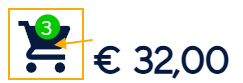
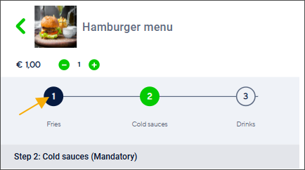
Basket icon - the circle colour
Stepper - marking the current step when ordering an article with options
Text colour
Default: dark blue
The text colour applies to the following elements:
Basket icon
Stepper - marks the completed step
Background colour
Default: grey
Customise the background colour of the kiosk screens.
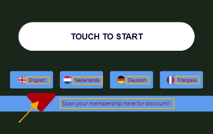
Language button colour
Customise the colour of the language buttons and the background of the scan membership message.
Language button text colours
Customise the colour of the language button text, the scan membership message text, and the animated arrow.
Basket item colour
Customise the colour of the basket item tiles.
Disabled button colour
Customise the colour of buttons when they are in a disabled state, for example:
Next and Add to basket: remain disabled until a required selection is made.
View order: remains disabled when the basket is empty.
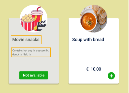
Disabled item colour
Sets the colour of the product tile in the following cases:
When the product is not available
When the product is filtered out by the allergen filter.
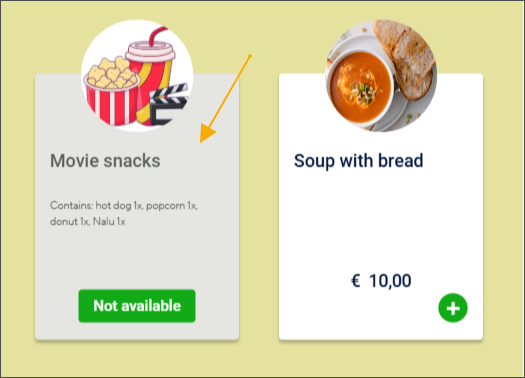
Disabled item text colour
Sets the text colour on the product tile of an unavailable product, including the product name and description.
Focusable colour
Default: blue (#197ab7)
This colour is used to visually highlight the element that currently has keyboard focus (e.g. when navigating with the keyboard/ADA device).
Custom CSS
Use a custom CSS file to define the kiosk’s colour styling instead of selecting each colour individually. You can include only the colours you want to override. The rest of the colours will follow the default settings.
The Custom CSS field includes validation to block invalid CSS and show clear error messages when the code cannot be saved.
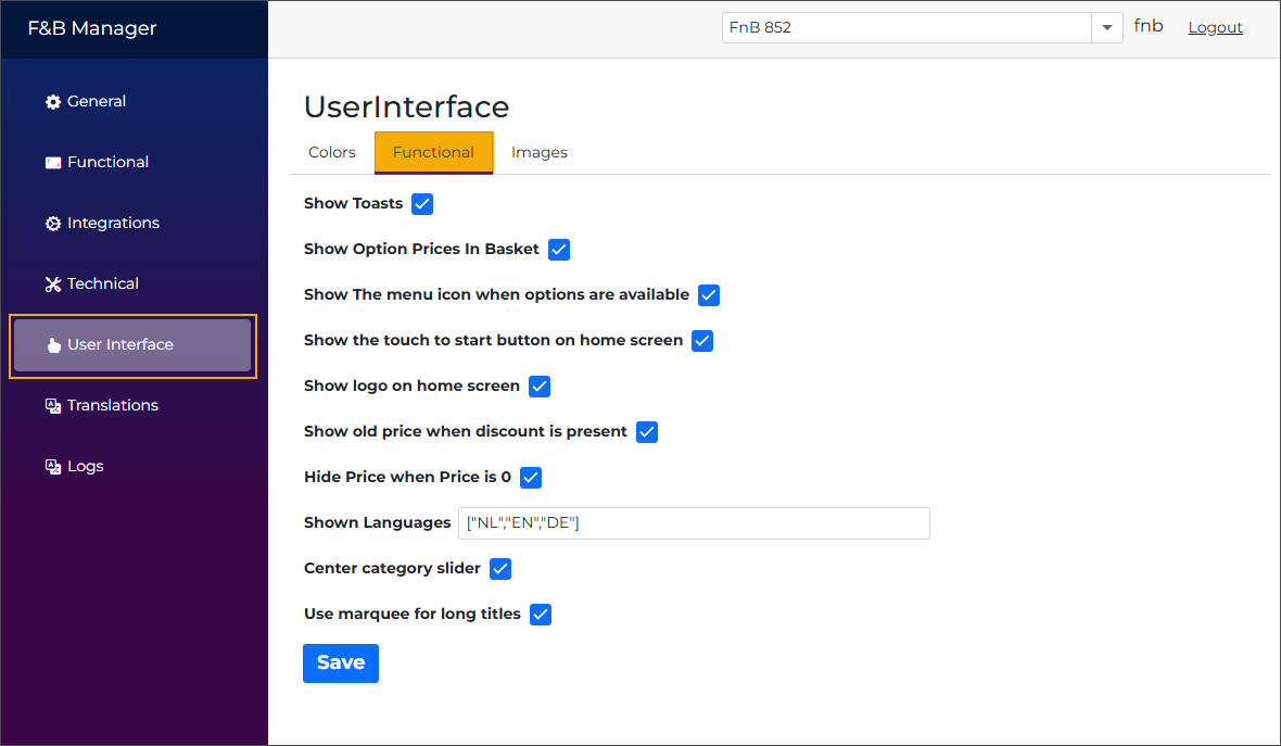
Functional
This section includes general display and behaviour settings that control how information is displayed and how users interact with the kiosk interface.
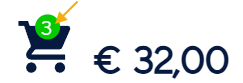
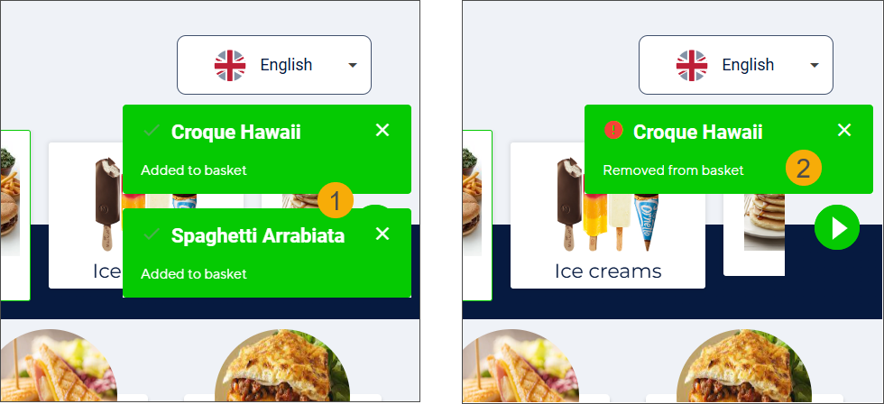
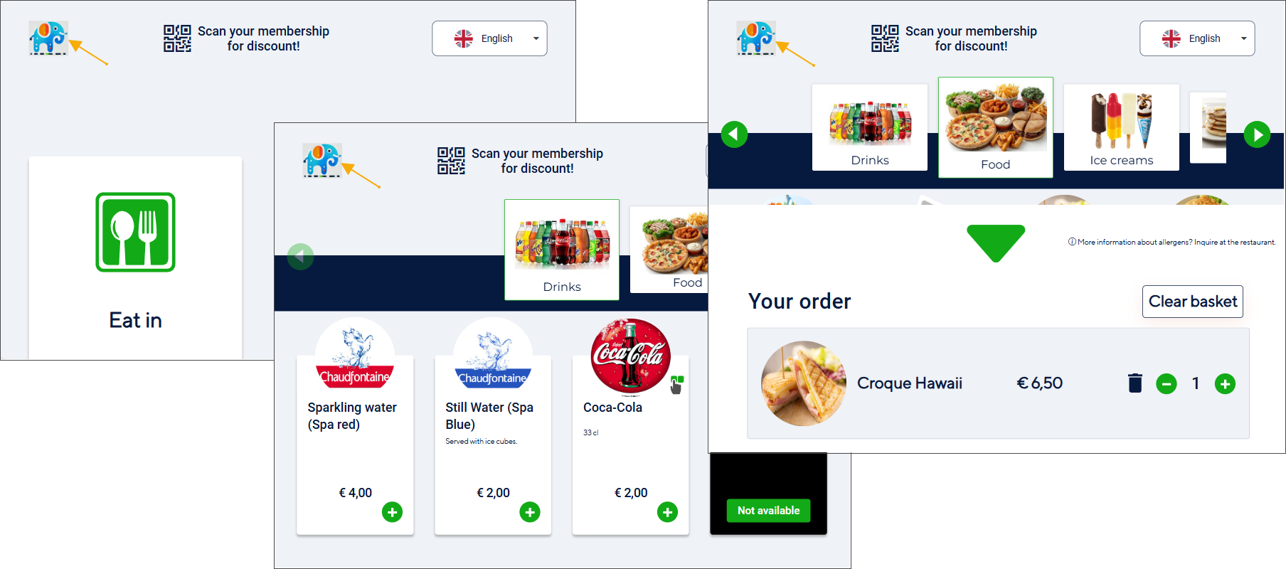
Show toasts
You can choose to display toast messages for specific user actions, such as adding (1) or removing (2) products from the basket. These messages appear in the top-right corner of the kiosk screen.
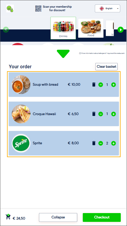
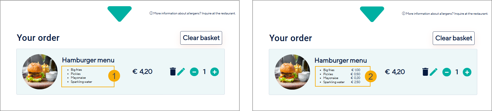
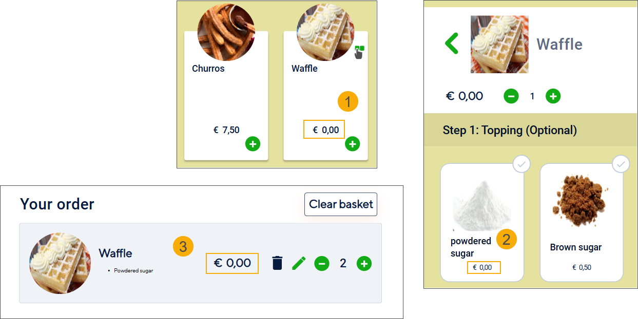
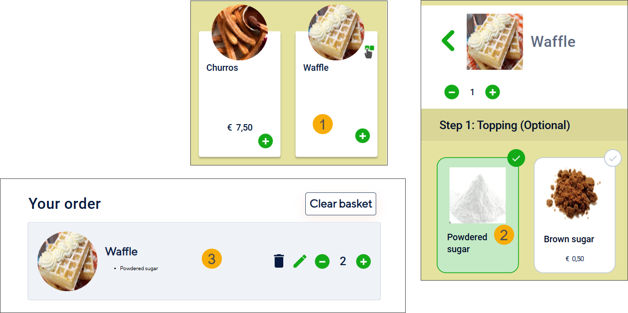
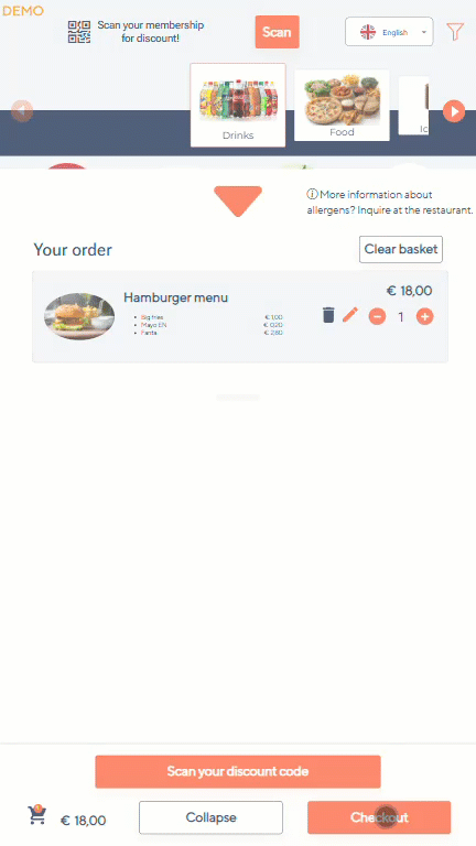
Show option prices in the basket
Disabled: The basket shows only the total article price, without listing the prices of selected options. (1)
Enabled: The basket displays the individual prices of options (such as drink size or sauce) in addition to the total price. (2)
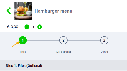
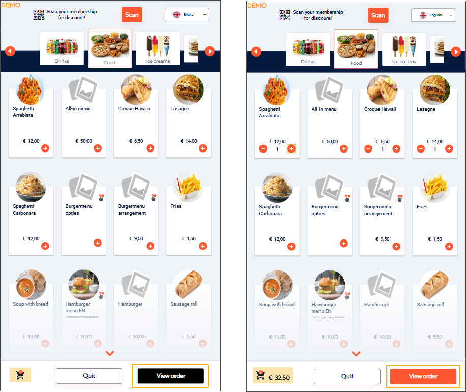
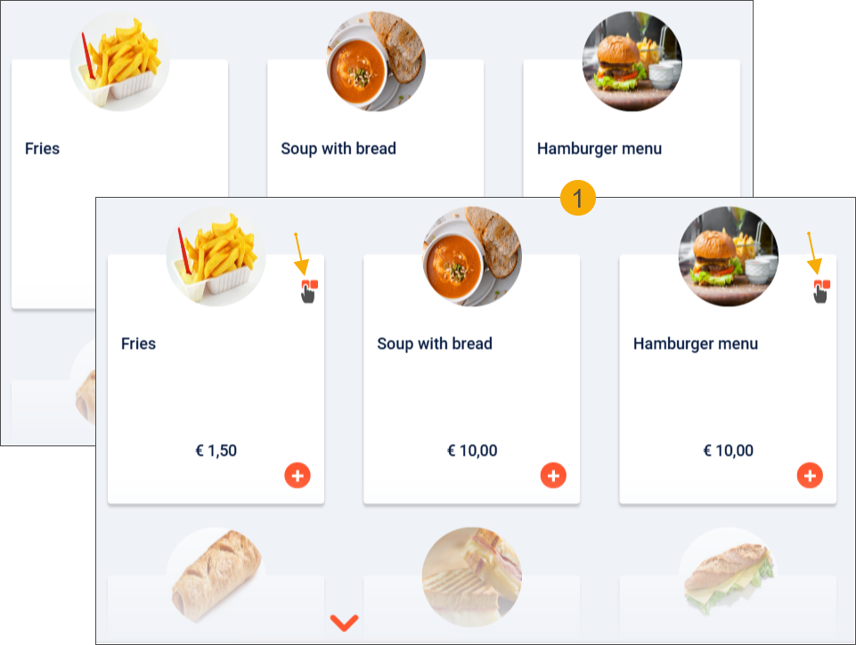
Show the menu icon when options are available
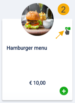
If a main product has options, you can choose to display a menu icon on the main product tile (1). The menu icon's colour (2) follows the secondary colour setting (F&B Manager > User interface > Colours tab).
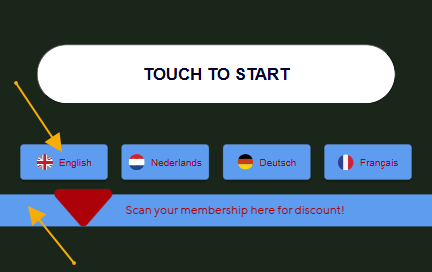
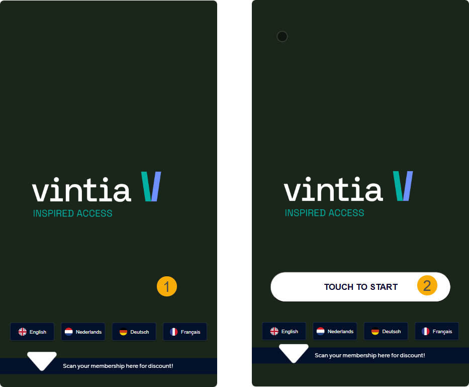
Show the touch-to-start button on home screen
Show (2) or hide (1) the touch-to-start button on the kiosk home screen.
Show logo on home screen
When enabled, the logo will also appear in the top-left corner of the home screen. Disabling this setting removes the logo from the home screen but will keep it displayed on other kiosk screens.

See also how to upload a logo image.
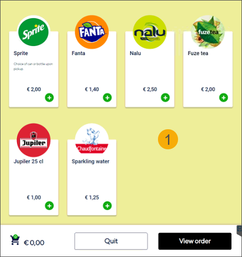
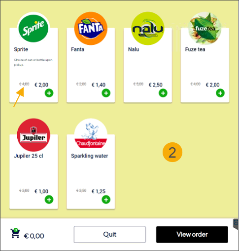
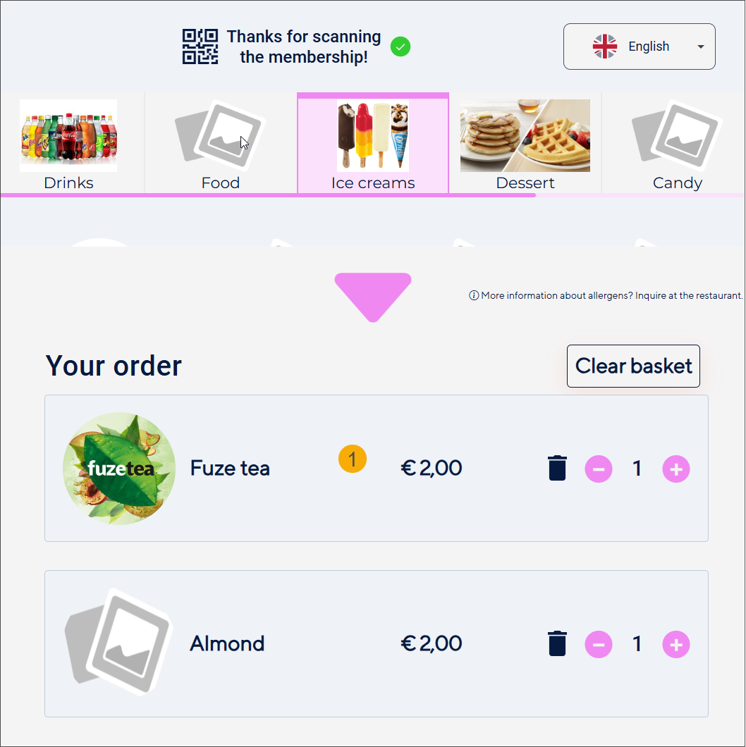
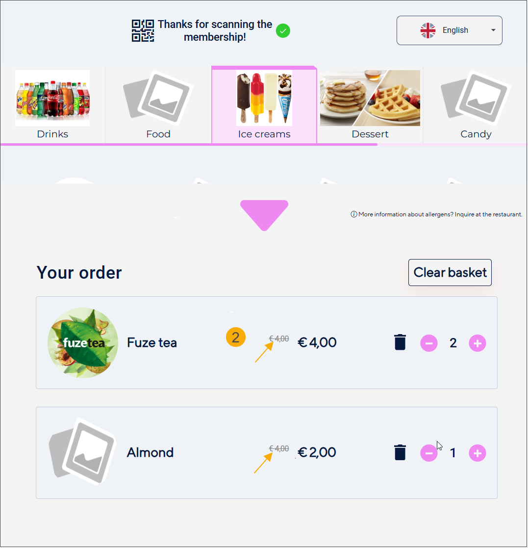
Show old price when discount is present
When a discount is available for an article (based on a price group discount configured in Recreatex backoffice), you can choose how the pricing is displayed after a customer scans their membership :
Product selection screen
Basket
Disabled (1): Only the discounted price is shown.
Enabled (2): Both prices are displayed, with the original price shown in a different colour and struck through.
Anmerkung
Due to limited space, the basket displays both the original and discounted prices only for the main articles, while options show only the discounted price.
Hide price when price is 0
If you offer a free product or option, you can choose to hide the price instead of displaying it as €0.00. This setting applies to product tiles of products (1) and options (2) in selection screens and to the basket overview (3).
Setting disabled
Setting enabled
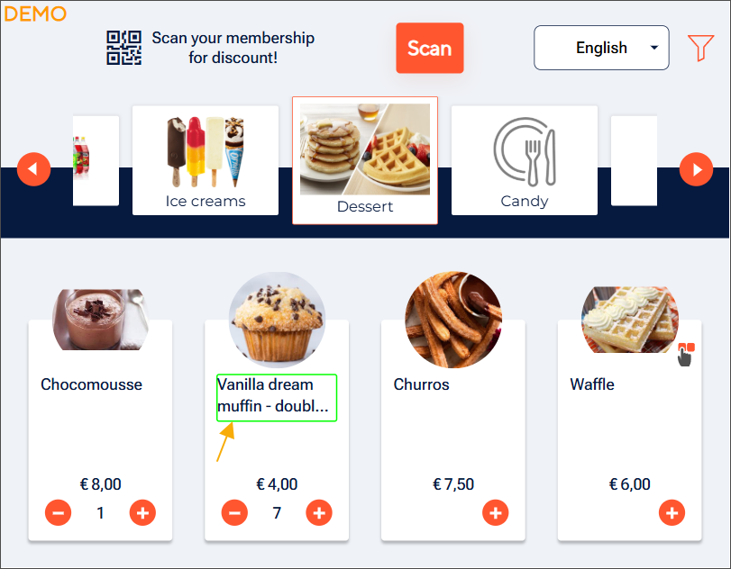
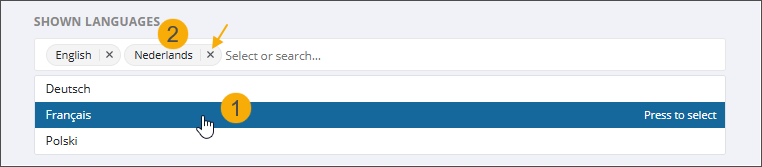
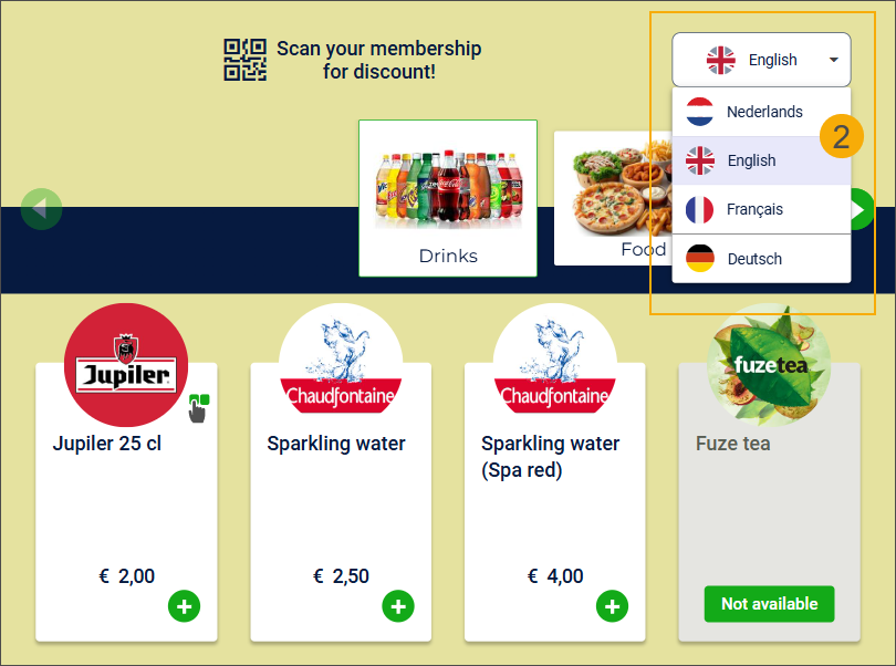
Shown languages
Select the relevant languages from the drop‑down of predefined languages (1). Each selected language is added as a tag with an X button (2), allowing you to remove languages easily when needed.
The kiosk application currently supports the following languages: English (EN), Dutch (NL), French (FR), German (DE) and Polish (PL)
Wichtig
At least one language must be defined for the kiosk application to function properly.
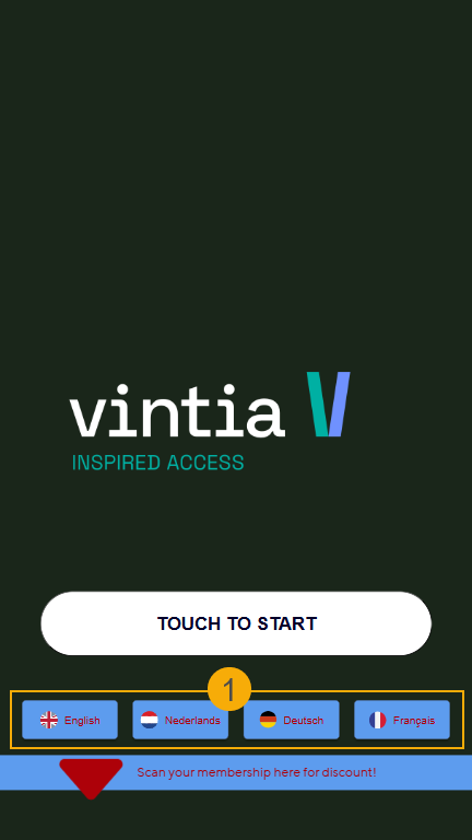
The selected languages appear as language buttons on the start page (1) and in the language selector in the header of the kiosk selection screen (2). Languages are displayed in the order in which they are configured.
To set the default language for the kiosk user interface, go to the tab General.
See also the settings Language button colour and Language button text colours to customise the button and text colours.
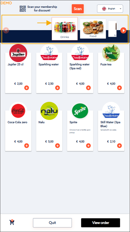
Center category slider
This setting controls the initial position of the category list on the product overview screen of the Vintia Order Kiosk.
Enabled: The Vintia Order Kiosk automatically scrolls to the middle category when the product overview screen loads.
Disabled (default): The category list is focused on the first category when the product overview screen loads.
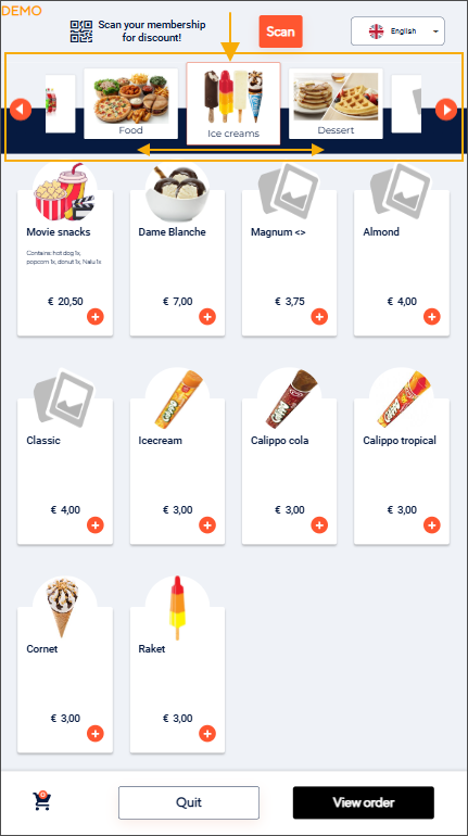
Spinner type
Choose from the following animated spinner options with food- and drink-themed designs to enhance the user experience while loading the next screen.
Classic
Burger

Ice cream

Fries
Example
Ask telephone
Enabling this setting allows your customers to opt in to receive an SMS notification when their order is ready for pickup.
The setting can only be activated if at least one of the two sales zones (Eat in or Take out) has the buzzer function deactivated.
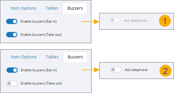
If buzzers are enabled for both sales zones, the Ask telephone setting is disabled and cannot be activated.
If buzzers are disabled for at least one of the sales zones, the Ask telephone setting can be activated.
The phone number is then automatically asked in the checkout flow for the zone(s) where the buzzer is not active.
You can find the buzzer settings in F&B Manager, in the section Functional > tab Buzzers.
Wichtig
To send SMS messages, you also need:
The Recreatex setup for SMS messaging, including the Recreatex SMS module and a configured SMSNotificationPlugin, to create SMS templates, and send and trace messages.
SMS templates linked to the sales zones in the Invoicing parameters (Module Sales admin > Parameters > Order notification).
When customers proceed to checkout, the Phone number screen appears:
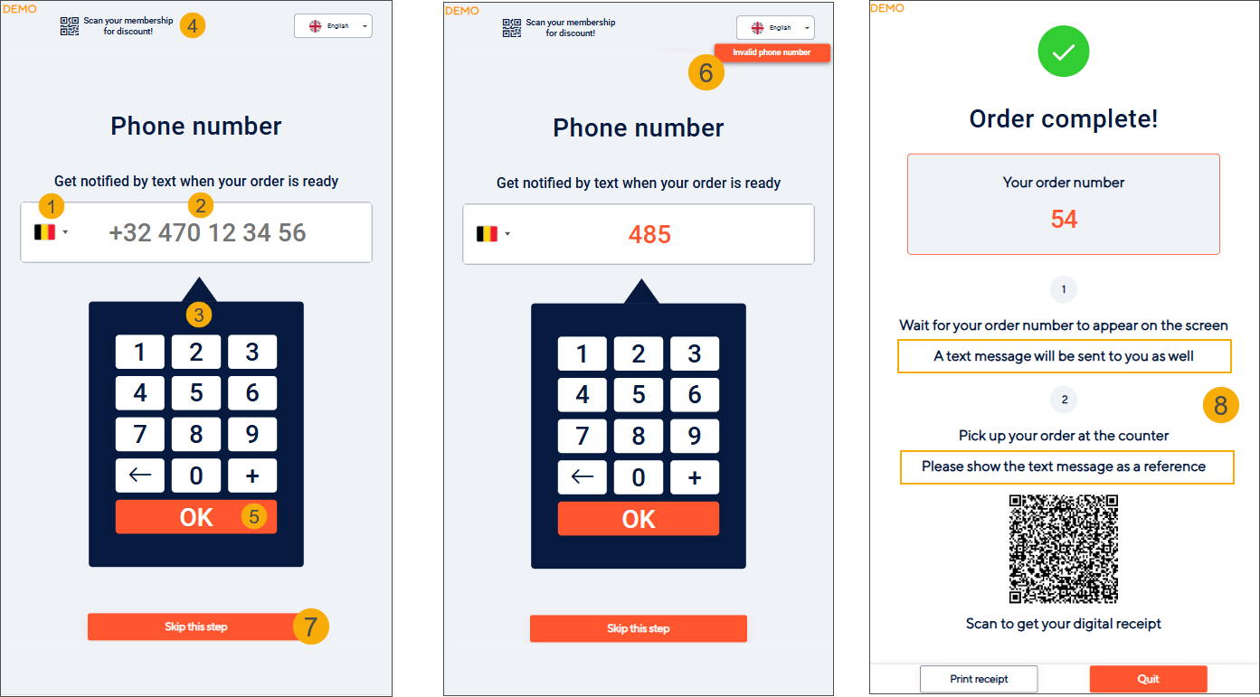
Country selection
Customers can select their country from the flag dropdown (1).
The correct country calling code (e.g., +32) is applied automatically.
Alternatively, customers can type the full number starting with "+". The flag updates automatically.
Phone number input
The expected number format is shown in the input field (2).
The number is auto-formatted while typing using the on-screen number pad (3).
Option: If the customer scans their membership card (4) and a valid phone number exists in their Recreatex account (Tel1 field), it is pre-filled and can be edited.
Validation
Clicking OK on the number pad validates the phone number.
If invalid, an error message appears in the top-right corner (6).
If valid, the customer proceeds to payment.
Option to skip
Customers can choose to Skip this step (7) and continue without entering a phone number.
Order confirmation
After successful payment, the Order complete screen displays additional instructions indicating that an SMS will be sent and must be presented at the counter when picking up the order (8).
Phone number linked to order
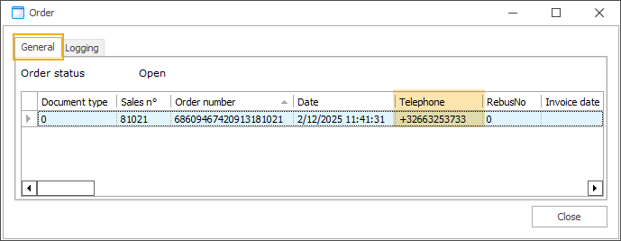
The phone number entered during checkout is saved in the Telephone field of the order in Recreatex.
This number is used to send the SMS when the order is marked as processed.
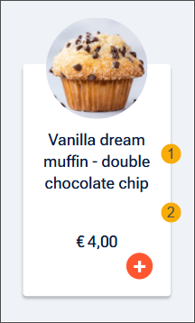
Hide descriptions on cards
This setting controls how the product name (article description in Recreatex) and the product's detailed information (detailed description in Recreatex) are displayed on product tiles, which is especially useful when product names are longer.
Disabled (default):
Longer product names are truncated after 2 lines, with an ellipsis (...) added to indicate longer text. (1) The full product name is always visible when viewing the order detail in the basket.
The detailed information is displayed on the product tile on up to 4 lines, with an ellipsis (...) added if the text exceeds 152 characters. (2)
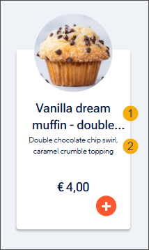
Enabled:
The product name is displayed on up to 4 lines, allowing longer names to be shown in full. (1)
The detailed information is not displayed on the product tile. (2)
Images
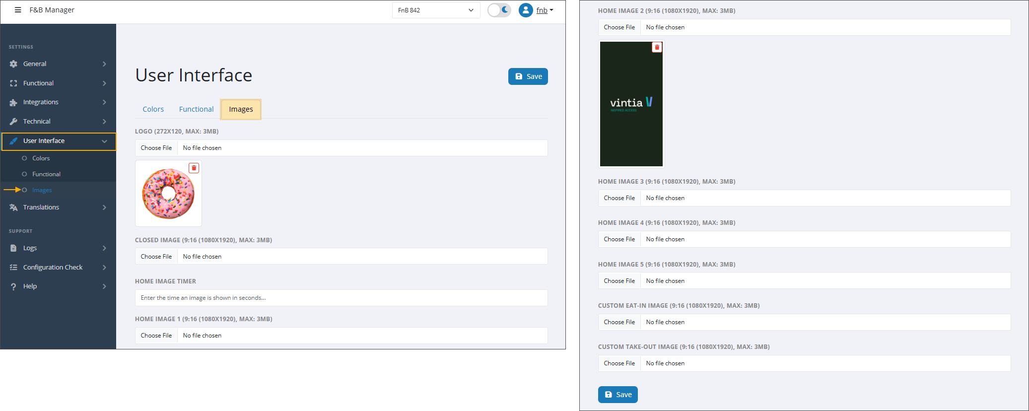
Logo
Upload a logo to be displayed at the top of the kiosk screens, remaining visible throughout the ordering process.
Max size: 3mb / Ratio: 272x120
To display the logo on the home screen as well, activate the setting Show logo on home screen
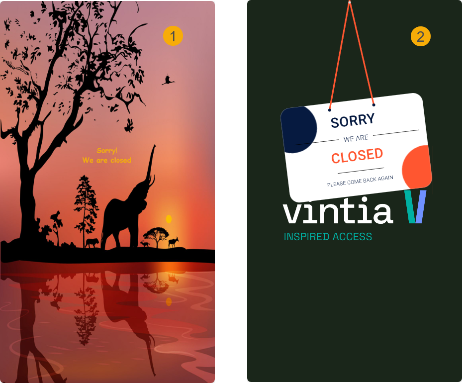
Closed image
Upload a custom image (1) to be displayed when the kiosk is closed. If no image is uploaded, the kiosk will show the default option: the image uploaded as Home image 1, with a closed icon overlaid (2).
Max size: 3Mb / Ratio: 9:16 (1080x1920)
Home image timer
Set the interval in seconds to determine how quickly images rotate on the kiosk start page.
Home image (1 to 5)
Max size: 3Mb / Ratio: 9:16 (1080x1920)/ supports GIF format
You can add up to five images as the background of the kiosk start screen. These images rotate in a carousel pattern at the preset interval defined by the Home image timer setting.
If fewer than five images are added, the carousel will rotate through only the provided images, ignoring any empty fields.
If only one image is added, it will be displayed without a carousel pattern.
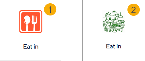
Custom Eat-in image
Max size: 3Mb / Ratio: 9:16 (1080x1920)/ supports GIF format
Upload a custom image (2) that will appear on the Eat‑in button instead of the default image (1).
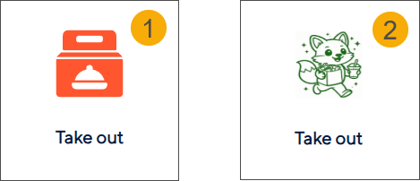
Custom Take-out image
Max size: 3Mb / Ratio: 9:16 (1080x1920)/ supports GIF format
Upload a custom image (2) that will appear on the Take-out button instead of the default image (1).