Dashboard Designer
The Dashboard Designer provides an intuitive UI that facilitates data binding and shaping, and layout design. Many of these normally complex tasks can be accomplished with a simple drag-and-drop operation, allowing you to start creating dashboards immediately.
 |
Creating Dashboards
The following topics will guide you through the process of creating a dashboard.
The Dashboard Designer provides the capability to print or export the individual items of a dashboard, as well as the entire dashboard. For more information, see Printing and Exporting.
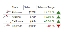
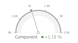
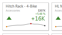
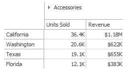
Dashboard Items
Dashboard items are used to present information in various ways, including charts, grids, cards and gauges. For more information, see Dashboard Items.
UI Elements
The topics in the section UI Elements describes the main elements of Dashboard Designer.
Using Dashboard Parameters
You can use dashboard parameters when it is necessary to pass data of a certain type to a dashboard (e.g., to pass a specific value to the data source filter string or a calculated field).
The topics in this section describe how to use dashboard parameters.
Creating Parameters
Creating Parameters in the Dashboard Designer
To create dashboard parameters in the Dashboard Designer, do the following:
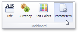
Click the Parameters button on the Ribbon's Home ribbon.
 |
In the invoked dialog, click the Add button to add a new parameter.
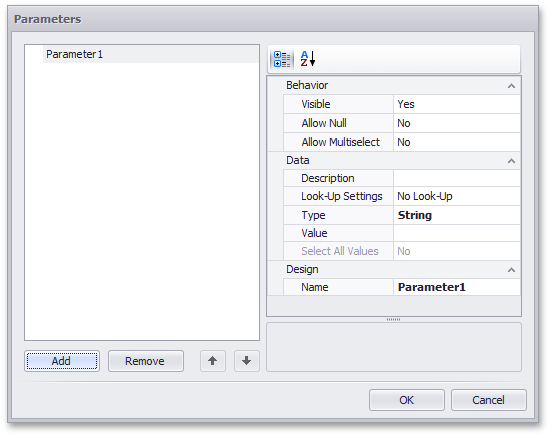 |
Specify the following settings.
Settings | Description |
Visible | Specifies whether or not the parameter editor is visible in the Dashboard Parameters dialog. |
Allow Multiselect | Specifies whether or not multi-selection is enabled for the current parameter. The following limitations are applied to parameters with multi-selection enabled.
|
Allow Null | Specifies whether or a not null value can be passed as a parameter value. |
Description | Specifies the parameter's description displayed to an end-user. The parameter's description is the value displayed in the Parameter Name column of the Dashboard Parameters dialog. |
Look-Up Settings | Specifies the parameter's look-up editor settings. |
Type | Specifies the parameter type. |
Value | Specifies the default parameter’s value. |
Name | Specifies the parameter name. When creating and modifying parameter names, follow the rules below.
|
Then, click OK to add the created parameters to the dashboard.
Look-Up Editor Settings
There are three types of look-up editor settings that can be specified for a parameter. Select the required type from the LookUpSettings drop-down list.
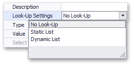 |
No Look-Up - set the Value to use a static value as a parameter.
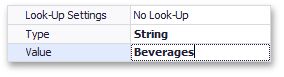
Static List - click the ellipsis button to add static values for the current dashboard parameter.
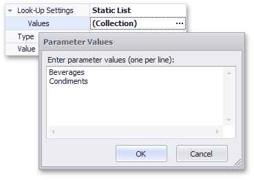
In this case, the Value specifies the default parameter's value.
Dynamic List - allows you to use a list of values from the existing data source as a parameter. You need to select the required Data Source from the list of available data sources and data members for the dashboard parameter's display name and value, respectively.
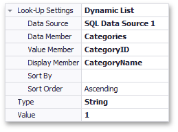
In this case, the Value specifies the default parameter's value.
Passing Parameter Values
In this topic, you will learn how to pass parameter values to a dashboard.
SQL Queries
The Dashboard Designer provides the capability to use a dashboard parameter as an SQL query/stored procedure parameter. To pass a dashboard parameter, do the following:
Create a query parameter or select the required stored procedure parameter.
Enable the Expression checkbox for this parameter and select the required dashboard parameter in the Value column.
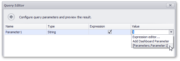 |
If necessary, you can select Expression editor... and specify an expression to bind a query parameter to a dashboard parameter using custom logic.
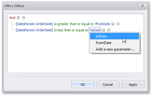
Filtering
You can filter the specified query of the SQL Data Source or apply filtering to a specific dashboard item according to the current parameter value(s) using the Filter Editor.
In the Filter Editor, you can compare a field value with the following objects.
A static value (represented by the
 icon). Click this button to switch to the next item mode ("another field value"), to compare the field value with another field value.
Another field value (represented by the
 icon). Click this button to switch to the next item mode (“parameter value”), to compare the field value with a parameter value.
A parameter value (represented by the
 icon). Click this button to switch back to the initial mode ("static value"), to compare the field value with a static value.
Thus, to compare a field value with a parameter value, click the button, then click the button.
 |
Conditional Formatting
You can apply conditional formatting to a specific dashboard item according to the current parameter value when creating the Expression format condition. In the Expression dialog, you can compare a field value with parameter values in the same manner as in the Filter Editor dialog.
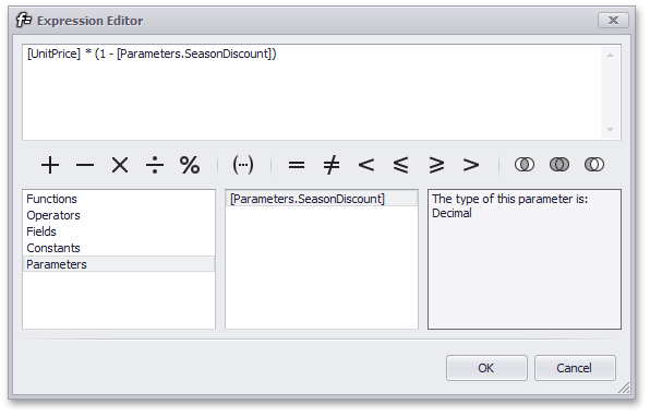
Calculated Fields
You can use parameters when constructing expressions for calculated fields. A parameter is inserted into the expression using the “Parameters.” prefix.
To see a list of available parameters, click Parameters in the Expression Editor dialog.
 |
Requesting Parameter Values
The dashboard provides a built-in Dashboard Parameters dialog, which provides the capability to change dashboard parameter values. This dialog is created automatically, depending on the parameter type and visibility settings.
To invoke the Dashboard Parameters dialog in the Dashboard Designer, click the Parameters ( ) button in the dashboard title. Depending on the visibility state of the created dashboard parameters, this invokes the following dialog.
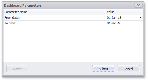 |
Select the required parameter values in the Dashboard Parameters dialog and click the Submit button to apply the changes.
To reset the changes to the default values, click the Reset button.
Creating Dashboard Items and Binding to Data
This section consists of the following topics:
Binding Dashboard Items to Data
Creating Dashboard Items
This topic describes how to add a new dashboard item to the dashboard, and the basic actions that can be performed on the item.
Overview
Dashboard items can be divided into the following groups, by type:
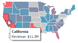
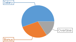
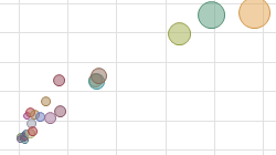
Data Visualization Items
Data visualization items represent UI elements used to display data within the Dashboard.
|
|
| |||
|
|
| |||
|
|
| |||
|
|
|
The Dashboard also provides the Image and Text Box dashboard items used to display static images or text within the dashboard.
Filter Elements
Filter elements are used to apply filtering to other dashboard items.
Combo Box | List Box | Tree View | |||
|
|
|
Dashboard Item Group
Dashboard item group arranges dashboard items and allows you to manage interaction between dashboard items within and outside the group.
 |
Creating Dashboard Items
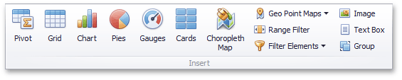
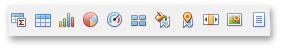
To create a dashboard item in the Dashboard Designer, click the corresponding button in the ribbon or the toolbar.
 |
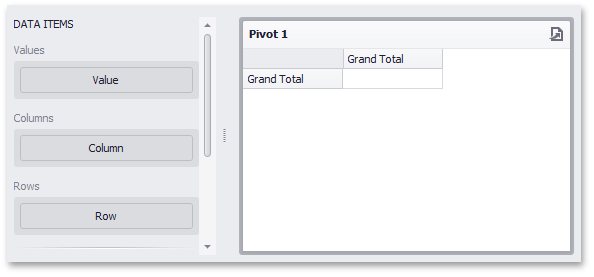
This creates an empty dashboard item, and displays the required data sections for binding this item to data.
 |
Perform the following steps to design a dashboard item.
Bind the dashboard item to data.
Perform the required data shaping operations (such as grouping, sorting and filtering).
Use the interactivity features to enable interaction between various dashboard items.
Adjust the dashboard item's position and size and specify the dashboard item caption settings.
Specify specific dashboard item settings based on its type. To learn more, see Dashboard Items.
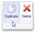
After you have created and designed the dashboard item, you can create an exact copy of it. To do this, click the Duplicate button in the Home ribbon tab...
 |
... or use the dashboard item's context menu. To remove the dashboard item from the dashboard, use the Delete button or the corresponding item in the context menu.
Converting Dashboard Items
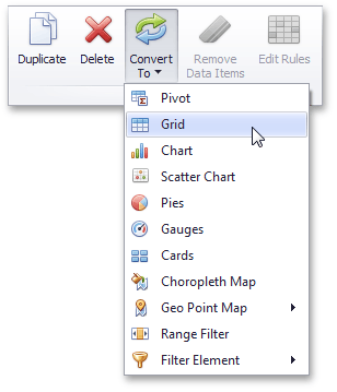
The Dashboard Designer provides the capability to convert data-bound dashboard items to another type. To convert the selected dashboard item to another type, use the Convert button in the ribbon's Home tab or the corresponding command in the item's context menu.
 |
The Dashboard Designer preserves the initial set of data items in the converted dashboard item. The data shaping settings of data items and their names are also persisted.
The following dashboard item settings are preserved, if possible.
Data item container settings (e.g., delta or sparkline settings).
Interactivity settings (e.g., the specified master filter mode).
Specific dashboard item settings (e.g., map extent).
Hidden Data Items
The HIDDEN DATA ITEMS area can be used to perform various data shaping and analysis operations by measures or dimensions that do not directly take part in the visual representation of data.
To create hidden data items, choose the required data field from the Data Source Browser and drop it onto the appropriate section in the HIDDEN DATA ITEMS area.
You can perform the following operations using hidden data items.
Filtering
You can use hidden dimensions to apply filtering to the dashboard item. To do this, select the required hidden dimension in the Filter Editor dialog and specify the required condition.
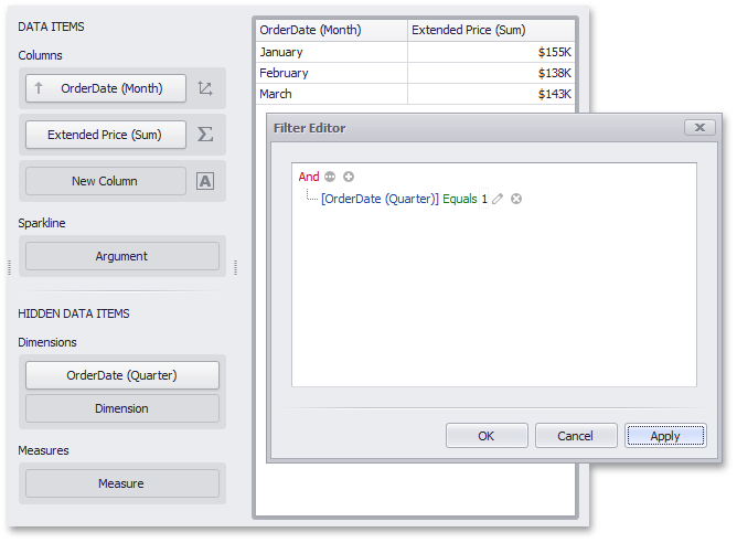 |
For instance, the Grid on the image above is filtered by the first quarter of the OrderDate (Quarter) dimension.
Sorting
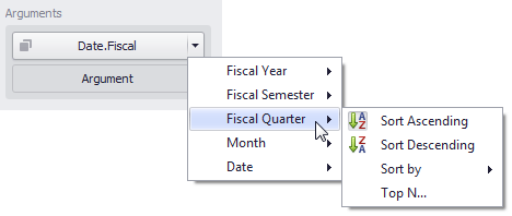
You can sort values of the specified dimension by the hidden measure. To do this, select the required measure from the dimension's Sort By sub-menu.
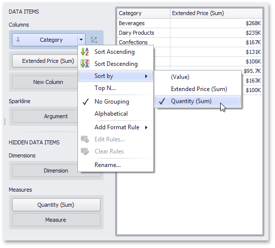 |
For instance, categories displayed in the Grid on the image above are sorted by values of the hidden Quantity (Sum) measure.
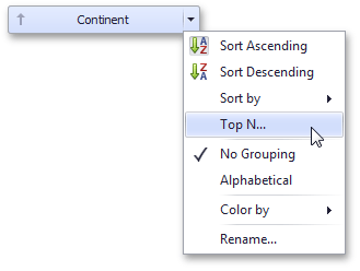
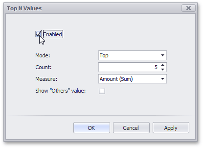
Top N
You can use hidden measures in Top N conditions. To do this, select the required measure from the Measure combo box in the Top N Values dialog.
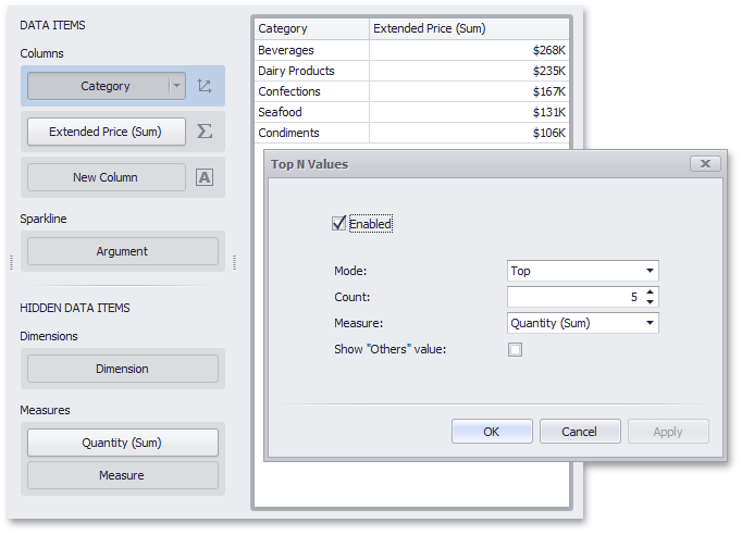 |
For instance, the Grid on the image above displays top 5 categories for the Quantity (Sum) hidden measure.
Conditional Formatting
You can create format rules based on hidden measures to apply conditional formatting to elements corresponding to visible values. To do this, use the Add Format Rule menu of the hidden measure.
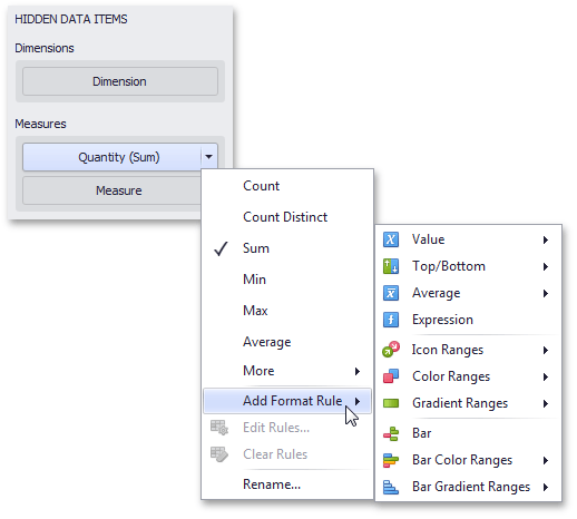 |
For the Expression format condition, you can use the required hidden measure in the same manner as in the Filter Editor dialog.
Binding Dashboard Items to Data in OLAP mode
In OLAP mode, the cube schema is fetched automatically, and the Data Source Browser displays the entire OLAP cube structure.
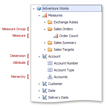 |
To visualize data from the OLAP cube, drag-and-drop measures, attributes or hierarchies onto the appropriate data sections in the DATA ITEMS area.
Note that OLAP measures can only be placed in the Values section, while dimension attributes and hierarchies can only be placed in other data sections.
OLAP hierarchies allow you to customize each level separately. To access hierarchy level options, invoke the data item menu for the hierarchy and then use the submenu that corresponds to the desired level.
 |
Anmerkung
You can easily drill down through OLAP hierarchies using the Drill-Down feature.
See Also
Data Shaping
This section describes how to perform various data shaping operations (such as grouping, sorting and filtering) in the Dashboard Designer.
The section contains the following topics.
Summarization
To obtain numeric values that should be displayed within a dashboard item, Dashboard calculates a summary function against the specified measure.
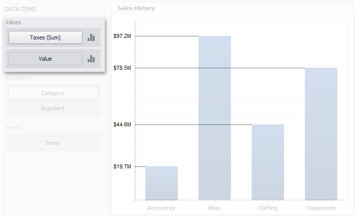 |
This topic describes how to specify which summary function should be calculated against a particular measure.
The following sections are available.
Summary Function Types
The following summary functions are available:
Count | The number of values (excluding Null and DBNull values). This is the only summary type that can be calculated against non-numeric data. | |
Count Distinct | The number of distinct values. | |
Sum | The sum of the values.
| |
Min | The smallest value. | |
Max | The largest value. | |
Average | The average of the values.
| |
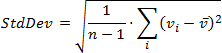
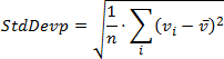
StdDev | An estimate of the standard deviation of a population, where the sample is a subset of the entire population.
| |
StdDevP | The standard deviation of a population, where the population is the entire data to be summarized.
| |
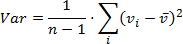
Var | An estimate of the variance of a population, where the sample is a subset of the entire population.
| |
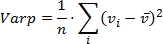
VarP | The variance of a population, where the population is the entire data to be summarized.
|


Changing Summary Type
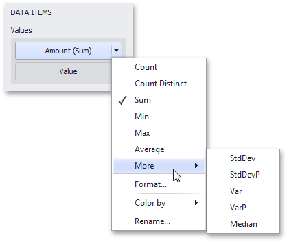
By default, Dashboard calculates Sum for numeric measures and Count for measures that contain another type of data.
You can change the summary function type for numeric measures. To do this in the Designer, invoke the data item menu and select the desired summary type. Less common summary types are organized in the More submenu.
 |
Grouping
The Dashboard Designer allows you to group dimension values and display summaries for entire groups rather than individual values.
You can arrange dimension values in groups of different sizes by specifying the appropriate group interval. For instance, date-time values can be grouped by years, months, quarters, etc.
This topic lists the supported text and date-time group intervals, and describes how to change the group interval.
The following sections are available.
Text Group Intervals
String values support the following grouping intervals.
No Grouping | Each value is displayed "as is". |
Alphabetical | Values are grouped alphabetically. Example: A, B, C, ... Z |
Date-Time Group Intervals
Date-time values support the following group intervals.
Anmerkung
Examples in the table below are formatted using the default settings. To learn how to customize format settings, see Formatting Data.
Group interval | Description | Examples |
Year | Values are grouped by the year. | 2010, 2011, 2012 |
Quarter | Values are grouped by the quarter. | Q1, Q2, Q3, Q4 |
Month | Values are grouped by the month. | January, February, March, ... December |
Day | Values are grouped by the day of the month. | 1, 2, 3, ... 31 |
Hour | Values are grouped by the hour. | 0, 1, 2, ... 23 |
Minute | Values are grouped by the minute. | 0, 1, 2, ... 59 |
Second | Values are grouped by the second. | 0, 1, 2, ... 59 |
Day of the Year | Values are grouped by the day of the year. | 1, 2, 3, ... 365 |
Day of the Week | Values are grouped by the day of the week. | Sunday, Monday, Tuesday, ... Saturday |
Week of the Year | Values are grouped by the week of the year. | 1, 2, 3, ... 52 |
Week of the Month | Values are grouped by the week of the month. | 1, 2, 3, 4, 5 |
Month-Year | Values are grouped by the year and month. | January 2012, February 2012, ... December 2012, January 2013, ... |
Quarter-Year | Values are grouped by the year and quarter. | Q3 2012, Q4 2012, Q1 2013, Q2 2013, ... |
Day-Month-Year | Values are grouped by date. | 3/4/2012, 3/5/2012, 3/6/2012, ... |
Date-Hour | Values are grouped by date with the hour value. | 3/4/2012 0:00 AM, 3/4/2012 1:00 AM, 3/4/2012 2:00 AM, ... |
Date-Hour-Minute | Values are grouped by date with the hour and minute values. | 3/4/2012 0:00 AM, 3/4/2012 0:01 AM, 3/4/2012 0:02 AM, ... |
Date-Hour-Minute-Second | Values are grouped by date with the hour, minute and second values. | 3/4/2012 0:00:00 AM, 3/4/2012 0:00:01 AM, 3/4/2012 0:00:02 AM, ... |
Exact Date | Each value is displayed "as is". | 2009, Q2 2009, 6/15/2009 1:45:30 PM, ... |
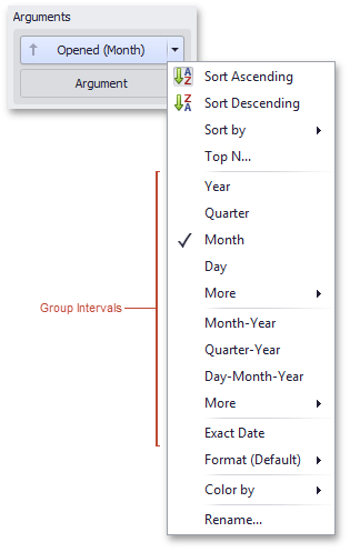
Changing Group Interval
To specify the group interval in the Designer, invoke the data item menu and select the desired group interval. Less common group intervals are organized in the More submenus.
 |
Sorting
The Dashboard Designer allows you to easily change the sort order of values within a dashboard item. You can also enable sorting by parameter values.
Changing Sort Order
The sort order of dimension values is indicated with an arrow.
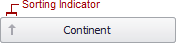 |
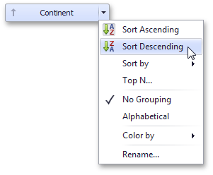
To change the sort order in the Designer, click the data item. You can also toggle sorting from the data item menu.
 |
Sorting by Measure Values
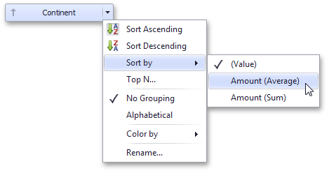
Dashboard allows you to sort dimension values by summary values calculated for a specific measure.
To enable sorting by measure in the Designer, use the Sort by submenu in the dimension's menu.
 |
You can also sort dimension values by the values of hidden measures.
OLAP Sorting Specifics
In OLAP mode, you can use the following options to specify the sort order for attribute members.
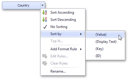 |
No Sorting - Specifies the default server sorting for the current attribute.
Sort by - Allows you to choose the OLAP member property by whose values sorting is performed:
(Value) - sorting is performed by member values;
(Display Text) - soring is performed by captions associated with members;
(Key) - sorting is performed by member keys;
(ID) - sorting is performed by member IDs.
Filtering
The Dashboard allows you to filter a query of the SQL Data Source or apply filtering to a specific data-aware dashboard item.
This topic describes how to enable and reset filtering.
Apply Filtering
To configure filtering, select the target dashboard item and do one of the following.
If you are using a Ribbon menu, click the Edit Filter button in the Data tab.
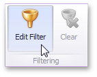 |
If you are using a toolbar menu, click the
 button.
Right-click a dashboard item and select Edit Filter from its context menu.
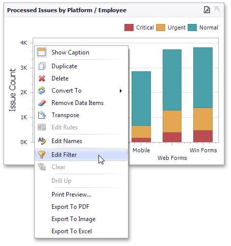 |
This will invoke the Filter Editor dialog. Use this dialog to build filter criteria with a convenient tree-like interface.
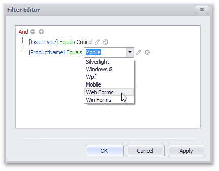 |
You can use hidden dimensions within the Filter Editor dialog, allowing you to filter data based on their values.
Clear Filtering
To clear filtering in the Designer, select the target dashboard item and do one of the following.
If you are using a Ribbon menu, click the Clear button in the Data tab.
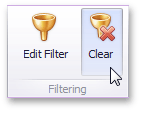 |
If you are using a toolbar menu, click the
 button.
Right-click a dashboard item and select Clear from its context menu.
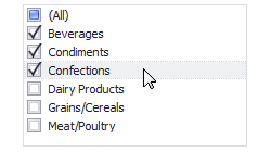
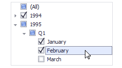
OLAP Filtering Specifics
You cannot apply filtering by building complex filter criteria in OLAP mode. Instead, you can filter dimension attributes and hierarchies by manually selecting the values you wish (or do not wish) to include in the dashboard.
For dimension attributes, the Filter Editor contains a list of all values. You can select the values that you wish to display.
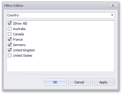 |
For hierarchies, a tree is displayed instead, allowing you to filter individual values at any hierarchy level.
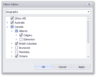 |
Top N
The Top N feature allows you to display only a limited number of values that correspond to the highest or lowest values of a particular measure.
To display the top values in a dimension, select Top N from the data item menu.
 |
This invokes the Top N Values dialog.
 |
In this dialog, check the Enabled check box and specify the following settings.
Mode | Specifies whether top or bottom values should be displayed. |
Count | The number of values to be displayed. |
Measure | The parameter that will determine the top or bottom value. |
Show "Others" value | If enabled, all values that are not the top/bottom values are consolidated in the "Others" value. |
You can use the hidden measure as a parameter that will determine the top or bottom value.
Formatting Data
Dashboard allows you to customize various data format settings for numeric and date-time values.
Formatting Numeric Values
To specify a format for numeric values, select Format from the data item menu.
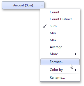 |
This invokes the Numeric Format window.
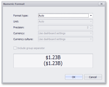 |
In the Format type field, select the required format type.
Auto | Format settings are automatically determined based on the data type. |
General | Converts a number to the most compact of either fixed-point or scientific notation, depending on the type of the number. |
Number | Converts a number to a string of the "-d,ddd,ddd.ddd…" form where "-" indicates a negative number symbol (if required), "d" indicates a digit (0-9), "," indicates a group separator, and "." indicates a decimal point symbol. |
Currency | Converts a number to a string that represents a currency amount. To learn about currency formatting specifics, see the Currency Formatting Specifics section of this document. |
Scientific | Converts a number to a string of the "-d.ddd…E+ddd" or "-d.ddd…e+ddd" form where each "d" indicates a digit (0-9). |
Percent | Multiplies a number by 100 and converts it to a percentage string. |
Other format settings are in effect for only specific format types.
Setting | Description | Format Types |
Unit | The unit to which values should be converted. | Number, Currency |
Precision | The number of fractional digits that should be displayed. | Scientific, Percent |
Currency | Defines the currency sign and format settings that should be used to display currency values. To learn about currency formatting specifics, see the Currency Formatting Specifics section of this document. | Currency |
Currency culture | For currencies used in a region with several cultures, specifies the culture that defines format settings. | Currency |
Include group separator | Specifies whether or not separators should be inserted between digit groups. | Number, Currency, Percent |
Formatting Date-Time Values
To specify a format for date-time values, use the Format submenu in the data item menu.
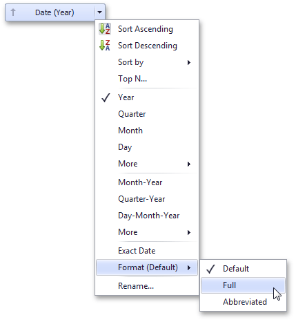 |
This submenu lists the available format types that depend on the selected group interval (for details on group intervals, see Grouping).
Anmerkung
Specific group intervals do not have format options. This means that corresponding values can only be presented in a single manner. The Format submenu is not displayed for such group intervals.
The following table lists format types by group interval.
Group Interval | Format type | Description | Examples |
Year | Full Abbreviated | The full year pattern. The year from 00 to 99. | 6/15/2009 1:45:30 PM -> 2009 (en-US) 6/15/2009 1:45:30 PM -> 09 (en-US) |
Quarter | Full Numeric | The full quarter pattern. The quarter from 1 through 4. | 6/15/2009 1:45:30 PM -> Q2 (en-US) 6/15/2009 1:45:30 PM -> 2 (en-US) |
Month | Full Abbreviated Numeric | The full name of the month. The abbreviated name of the month. The month from 1 through 12 | 6/15/2009 1:45:30 PM -> June (en-US) 6/15/2009 1:45:30 PM -> Jun (en-US) 6/15/2009 1:45:30 PM -> 6 (en-US) |
Hour | Long Short | Long hour pattern, 12-hour format. Short hour pattern, 24-hour format. | 6/15/2009 1:45:30 PM -> 1:00 PM 6/15/2009 1:45:30 PM -> 13 |
Day of Week | Full Abbreviated Numeric | The full name of the day of the week. The abbreviated name of the day of the week. The day of the week from 1 through 7. | 6/15/2009 1:45:30 PM -> Monday (en-US) 6/15/2009 1:45:30 PM -> Mon (en-US) 6/15/2009 1:45:30 PM -> 2 (en-US) |
Day-Month-Year | Long Short | Long date pattern. Short date pattern. | 6/15/2009 1:45:30 PM -> Monday, June 15, 2009 (en-US) 6/15/2009 1:45:30 PM -> 6/15/2009 (en-US) |
Date-Hour | Long Short Time only | Long date pattern, long hour pattern. Short date pattern, long hour pattern. Long hour pattern. | 6/15/2009 1:45:30 PM -> Monday, June 15, 2009 1:00 PM (en-US) 6/15/2009 1:45:30 PM -> 6/15/2009 1:00 PM (en-US) 6/15/2009 1:45:30 PM -> 1:00 PM (en-US) |
Date-Hour-Minute | Long Short Time only | Long date pattern, long time pattern. Short date pattern, long time pattern. Long time pattern. | 6/15/2009 1:45:30 PM -> Monday, June 15, 2009 1:45 PM (en-US) 6/15/2009 1:45:30 PM -> 6/15/2009 1:45 PM (en-US) 6/15/2009 1:45:30 PM -> 1:45 PM (en-US) |
Date-Hour-Minute-Second | Long Short Time only | Long date pattern, long time pattern. Short date pattern, long time pattern. Long time pattern. | 6/15/2009 1:45:30 PM -> Monday, June 15, 2009 1:45:30 PM (en-US) 6/15/2009 1:45:30 PM -> 6/15/2009 1:45:30 PM (en-US) 6/15/2009 1:45:30 PM -> 1:45:30 PM (en-US) |
The table below lists format types related to the Exact Date group interval.
Exact Date Format | Format Type | Description | Examples |
Year | Full Abbreviated | The full year pattern. The year from 00 to 99. | 6/15/2009 1:45:30 PM -> 2009 (en-US) 6/15/2009 1:45:30 PM -> 09 (en-US) |
Quarter | n/a | The default year and full quarter pattern. | 6/15/2009 1:45:30 PM -> Q2 2009 (en-US) |
Month | n/a | The default year pattern and the full name of the month. | 6/15/2009 1:45:30 PM -> June, 2009 (en-US) |
Day | Long Short | Long date pattern. Short date pattern. | 6/15/2009 1:45:30 PM -> Monday, June 15, 2009 (en-US) 6/15/2009 1:45:30 PM -> 6/15/2009 (en-US) |
Hour | Long Short Time only | Long date pattern, long time pattern. Short date pattern, long time pattern. Long time pattern. | 6/15/2009 1:45:30 PM -> Monday, June 15, 2009 1:00 PM (en-US) 6/15/2009 1:45:30 PM -> 6/15/2009 1:00 PM (en-US) 6/15/2009 1:45:30 PM -> 1:00 PM (en-US) |
Minute | Long Short Time only | Long date pattern, long time pattern. Short date pattern, long time pattern. Long time pattern. | 6/15/2009 1:45:30 PM -> Monday, June 15, 2009 1:45 PM (en-US) 6/15/2009 1:45:30 PM -> 6/15/2009 1:45 PM (en-US) 6/15/2009 1:45:30 PM -> 1:45 PM (en-US) |
Second | Long Short Time only | Long date pattern, long time pattern. Short date pattern, long time pattern. Long time pattern. | 6/15/2009 1:45:30 PM -> Monday, June 15, 2009 1:45:30 PM (en-US) 6/15/2009 1:45:30 PM -> 6/15/2009 1:45:30 PM (en-US) 6/15/2009 1:45:30 PM -> 1:45:30 PM (en-US) |
Currency Formatting Specifics
The Dashboard allows you to specify a currency format at two levels: for the entire dashboard and for individual data items.
1. Data Item Currency
To specify which currency to use for a particular data item, select Format from the data item menu.
|
In the Numeric Format dialog, select Currency in the Format type field and use the Currency combo box to select the required currency.
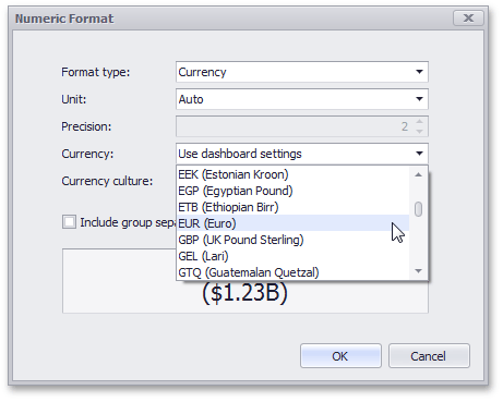 |
Anmerkung
This option only affects the way values are displayed. The Dashboard does not convert monetary amounts from one currency to another.
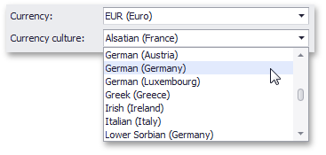
For regions with several cultures, you can also select the culture that will be used to format currency values.
 |
You can also apply the default dashboard currency by selecting Use dashboard settings in the Currency field.
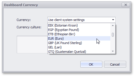
2. Dashboard Currency
You can also specify the default currency for the dashboard. This setting will be applied to dashboard items that have no currency defined.
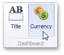
To set the dashboard currency, click the Currency button in the Ribbon (or the  button if you are using the toolbar menu).
 |
This invokes the Dashboard Currency window. In this window, select the required currency using the Currency combo box.
 |
Anmerkung
This option only affects the way values are displayed. The Dashboard does not convert monetary amounts from one currency to another.
For regions with several cultures, you can also select the culture that will be used to format currency values.
|
Additionally, you can specify the client culture that should be used for the dashboard by selecting the Use client system settings item.
Interactivity
This section describes features that enable interaction between various dashboard items. These features include Master Filtering and Drill-Down.
The section consists of the following topics.
Master Filtering
The Dashboard allows you to use any data aware dashboard item as a filter for other dashboard items (Master Filter). You can select elements in a Master Filter item (grid records, chart bars, pie segments, etc.) to filter data in other dashboard items by the selected values.
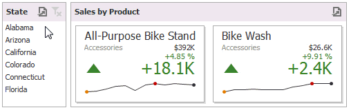 |
Master Filtering Overview
Dashboard items can be divided into four groups by their master filtering capabilities.
Data visualization dashboard items allow you to enable master filtering by specifying the selection mode. The following dashboard items allow you to manage their master filtering mode.
To learn how to manage master filtering for these items, see Master Filter Settings.
Filter elements represent a special type of dashboard item whose main purpose is to apply filtering to other dashboard items. This capability is always enabled for these dashboard items.
The following filter elements are available.
Combo Box
List Box
Tree View
Instead of switching between standard master filtering modes, some filter elements allow you to switch their type. This allows you to select a single value or multiple values.
To learn more, see the Filter Elements section.
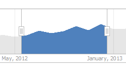
Range Filter is a special type of dashboard item that displays a chart with selection thumbs and allows you to filter out values displayed along the argument axis.
To learn more, see the Range Filter section.
Dashboard item group allows you to manage interaction between dashboard items in and out of the group.
To learn more about the interactivity capabilities of the dashboard item group, see the Interactivity paragraph in the Dashboard Item Group topic.
Master Filter Settings
Master Filtering Modes
The Master Filter item supports two selection modes.
Multiple - Allows you to select multiple elements in the Master Filter item.
Single - Allows you to select only one element in the Master Filter item. When this mode is enabled, the default selection will be set to a Master Filter element. You can change this selection, but cannot clear it.
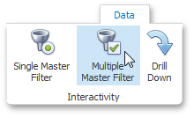
To enable/disable master filtering, use the Multiple Master Filter or Single Master Filter buttons in the Data Ribbon tab.
 |
Anmerkung
If the selected dashboard item contains several types of elements that can be used for filtering, the Ribbon or Toolbar will provide the appropriate buttons to switch between these types (e.g., the Arguments and Series buttons in the Chart). For details, refer to the individual dashboard items in the Dashboard Items section.
Preventing Items from Being Filtered
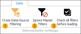 |
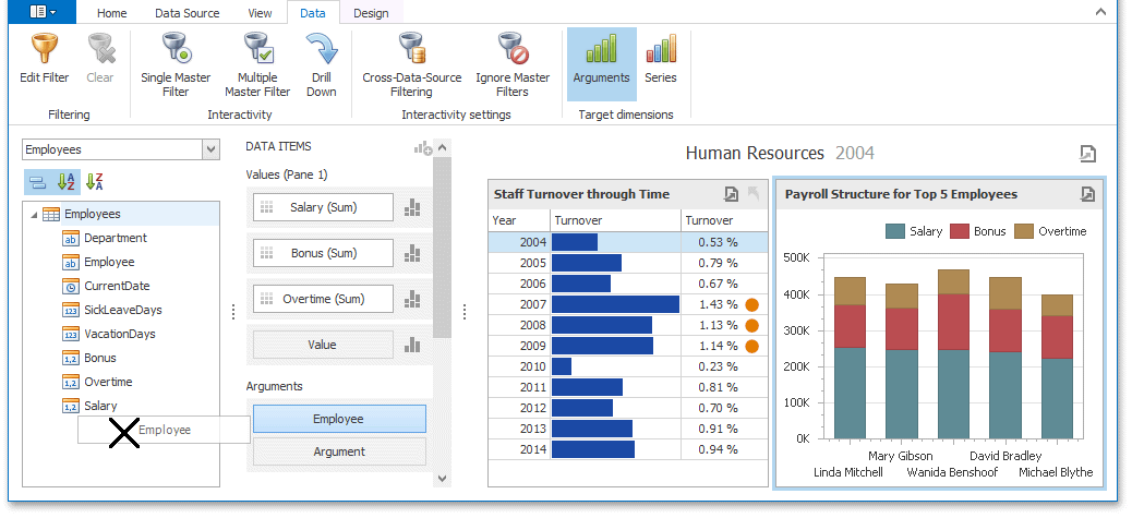
You can prevent specific dashboard items from being affected by Master Filters. To do this, use the Ignore Master Filters (2) button in the Data Ribbon tab.
Use the option Check all filters before loading (3) to configure whether all filters should be selected or not when the report is loaded. This option is available for Filter elements (List Box, Tree View or Combo Box).
Save the dashboard design to apply the setting.
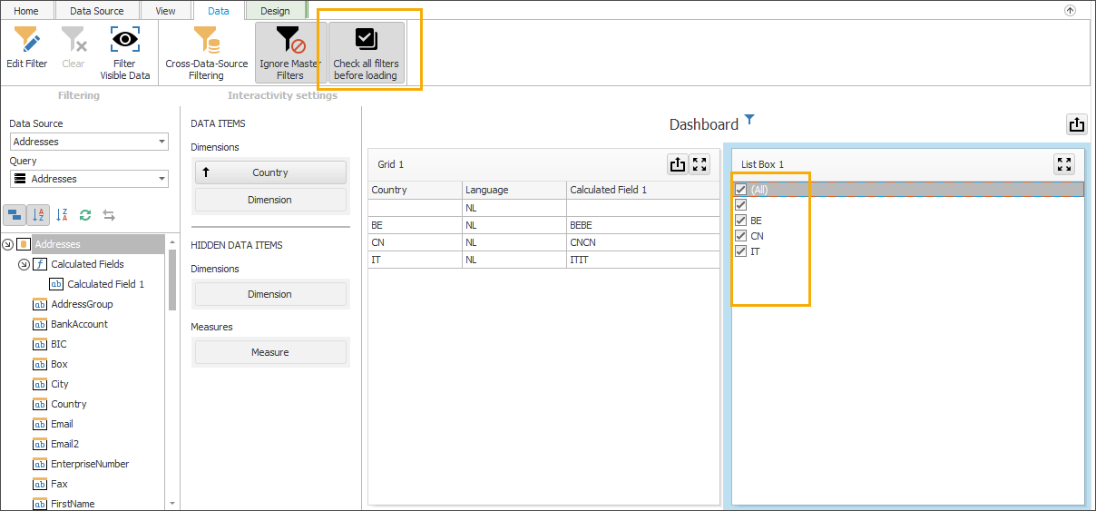
When you load the dashboard (Reporting > Dashboards > View) the filters will either be preselected or not, depending on the configuration.
Apply Filtering
To learn how to apply filtering in a specific dashboard item, refer to the Master Filtering topic in the Interactivity section for this item.
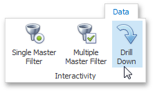
Drill-Down
Dashboard provides the Drill-Down feature, which allows end-users to change the detail level of data displayed in a dashboard item. The Drill-Down feature enables users to drill down to display detail data, or drill up to view more general information.
 |
Enable Drill-Down
Drill-down requires that the data section contains several dimensions...
 |
... or a hierarchy data item (in OLAP mode).
 |
To enable drill-down, click the Drill-Down button in the Data Ribbon tab (or the  button if you are using the toolbar menu).
 |
Anmerkung
If the selected dashboard item contains several types of elements that can be used for drill-down, the Ribbon or Toolbar will provide the appropriate buttons to switch between these types (e.g., Arguments and Series buttons in a Chart). For details, refer to the individual dashboard items in the Dashboard Items section
The following dashboard items support the Drill-Down feature.
To learn how you can drill down using a particular dashboard item, refer to the Drill-Down topic in the Interactivity section for this item.
Aggregations
Topics in this section describe functions used to introduce additional aggregation levels to prepare underlying data.
Aggregate Functions
The Dashboard Designer allows you to perform aggregations when constructing a calculated field expression. This allows you to evaluate calculated fields on a summary level.
In the Dashboard Designer, you can use the following set of predefined aggregate functions.
 |
Function | Description |
Aggr(SummaryExpression, Dimensions) | Aggregates underlying data using the detail level specified by a predefined set of dimensions and a specified summary function. To learn more, see Intermediate Level Aggregations. |
Avg(Value) | Returns the average of all the values in the expression. |
Count() | Returns the number of values. |
CountDistinct(Value) | Returns the number of distinct values. |
Max(Value) | Returns the maximum value across all records. |
Min(Value) | Returns the minimum value across all records. |
Median(Value) | Returns the median of the values. |
Sum(Value) | Returns the sum of all values. |
Var(Value) | Returns an estimate of the variance of a population where the sample is a subset of the entire population. |
Varp(Value) | Returns the variance of a population where the population is the entire data to be summarized. |
StdDev(Value) | Returns an estimate of the standard deviation of a population where the sample is a subset of the entire population. |
StdDevp(Value) | Returns the standard deviation of a population where the population is the entire data to be summarized. |
These functions can be used for all types of numeric fields. After creating such calculated fields, you can use them as measures contained in an OLAP cube.
Intermediate Level Aggregations
The Dashboard can aggregate and summarize data on different levels.
The Query Builder allows you to prepare an underlying data source before analyzing data. You can apply grouping, sorting, summarization and other data shaping operations during data selection.
Dashboard items aggregate and summarize data at a visualization level using dimensions and measures, respectively. To learn more, see Binding Dashboard Items to Data.
The Aggr function allows you to introduce an intermediate detail level that is not related to the visualization level. This allows you to create custom aggregations at different levels and combine these aggregations with existing visualizations.
Overview
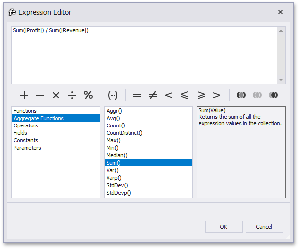
The Aggr function aggregates and summarizes underlying data using the detail level specified by a predefined set of dimensions and a specified summary function. This function can be used during the creation of a new calculated field in the Expression Editor.
The Aggr function has the following syntax.
Expression | Aggr(summaryExpression, dimension1, dimension2, ...) |
The first argument is a summary expression calculated against a specific data source field. The next arguments are the set of dimensions whose values are aggregated and used to calculate summaries specified using the first argument. For instance, the following function calculates sums of sales for each product within the specified category.
Expression | Aggr(Sum([Sales]), [Category], [Product]) |
If you created the calculated field that includes the Aggr function and dropped the created field into an existing dashboard item, the Dashboard joins the resulting aggregation with the already displayed data. This means that you can add data with increased or decreased granularity to the dashboard item. There are two main scenarios.
In the first scenario, an aggregation has a less detailed granularity than visualized data.
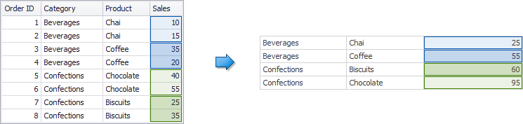
In this scenario, an underlying data source contains the list of orders for two categories and corresponding products.
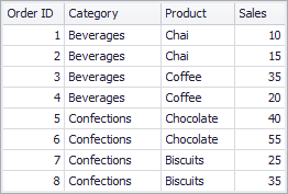 |
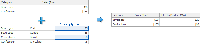
To aggregate this data by individual categories, create a calculated field with the following expression.
Expression | Aggr(Sum([Sales]), [Category]) |
The following internal table will be generated for this calculated field.
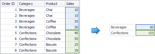 |
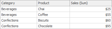
The sample Grid dashboard item contains more detailed data and includes the following columns: Category, Product and the sum of Sales.
 |
If you drop the created calculated field to the Grid, the sum of sales for each category will be repeated for each Grid row.
 |
For instance, you can use these values later to calculate a contribution of each product to a category’s sales.
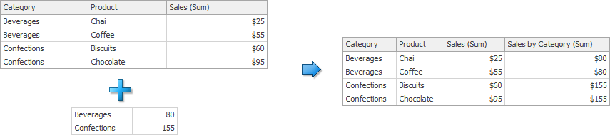
An aggregation has a more detailed granularity than visualized data.
To aggregate this data by categories and products, create a calculated field with the following expression.
Expression | Aggr(Sum([Sales]), [Category], [Product]) |
The following internal table will be generated for this calculated field.
 |
Drop the created calculated field to the Grid and set its summary type to Min. The Grid will display minimum product sales within each category.
 |
Calculations
Calculations provide the capability to apply specific computations to measure values and allow you to perform different analytical tasks such as to compute running totals, percentages of totals, differences, etc.
Topics in this section.
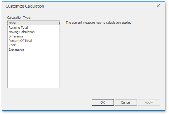
Calculations Overview
Calculations provide the capability to apply specific computations to measure values and allow you to perform different analytical tasks such as to compute running totals, percentages of totals, differences, etc.
 |
The Dashboard Designer allows you to apply calculations to values of the specified measure. The following calculation types are supported.
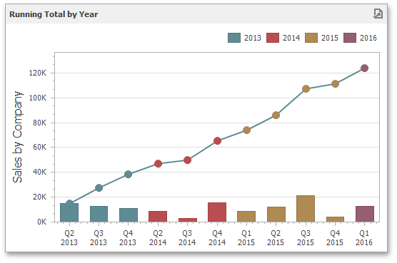
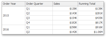
Running Total - Allows you to calculate a cumulative total for a set of measure values.
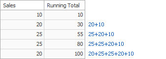 |
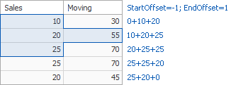
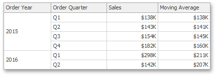
Moving Calculation - Allows you to apply a moving calculation, which uses neighboring values to calculate a total. Note that neighboring values are specified using offsets from the currently processed value.
 |
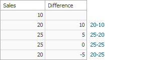
Difference - Allows you to compute differences between measure values.
 |
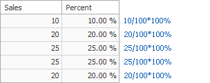
Percent of Total - Allows you to calculate a contribution of individual measure values to a total.
 |
Rank - Allows you to rank values of the specified measure.
 |
Note that the computing of calculations depends on two factors.
The type of the dashboard item.
In this case, you need to specify a calculation direction that depends on the dashboard item type. For instance, the Pivot dashboard item provides the capability to apply calculations along with its columns or rows.
The set of dimensions that are used to calculate measure values.
In this case, a calculation direction depends on the dimensions' order.
In both cases, measure values participating in a calculation fall into a specified window.
To learn how to create a calculation in the Dashboard Designer, see Creating Calculations.
Window Definition
A window definition specifies a window that limits measure values participating in a calculation. To learn more, see Calculations Overview.
Dashboard Item Window Definition
The following table lists window definitions in terms of the Pivot dashboard item. A calculation is performed using the Index function along the following directions.
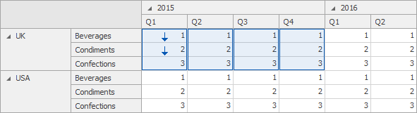
Columns
A calculation is performed horizontally through Pivot columns.
Example:
In this example, a window is a combination of Country/Category dimensions.
 |
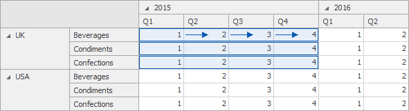
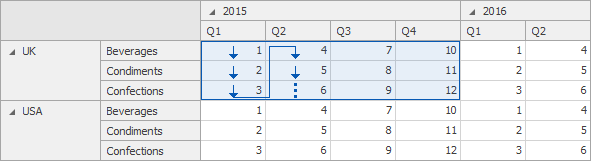
Rows
A calculation is performed vertically through Pivot rows.
Example:
In this example, a window is a combination of Year/Quarter dimensions.
 |
Columns / Rows
A calculation is performed horizontally through Pivot columns, then rows.
Example:
In this example, a window is the entire pivot table.
 |
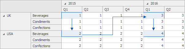
Rows / Columns
A calculation is performed vertically through Pivot rows, then columns.
Example:
In this example, a window is the entire pivot table.
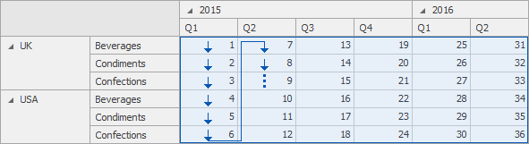 |
Columns within Groups
A calculation is performed horizontally through Pivot columns within groups.
Example:
In this example, a window is a combination of the Country/Category and Year dimensions.
 |
Rows within Groups
A calculation is performed vertically through Pivot rows within groups.
Example:
In this example, a window is a combination of the Year/Quarter and Country dimensions.
 |
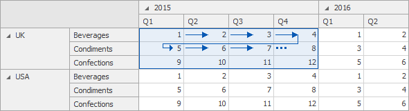
Columns / Rows within Groups
A calculation is performed horizontally through Pivot columns then rows within groups.
Example:
In this example, a window is a combination of Country/Year dimensions.
 |
Rows / Columns within Groups
A calculation is performed vertically through Pivot rows, then columns within groups.
Example:
In this example, a window is a combination of Country/Year dimensions.
 |
Anmerkung
Group refers to an area that is limited by a set of values corresponding to the bottommost partitioning dimensions.
Specific Window Definition
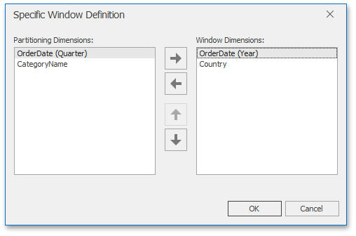
If necessary, you can manually specify the set of dimensions that fall into the window. These dimensions are called window dimensions.
For instance, the Index function is applied to measure values of the pivot table below using the OrderDate (Year) and Country window dimensions.
 |
The Specific Window Definition dialog allows you to do this.
 |
Creating Calculations
The Dashboard Designer allows you to add a calculation for numeric measures. To do this, invoke the data item menu and select the required calculation type.
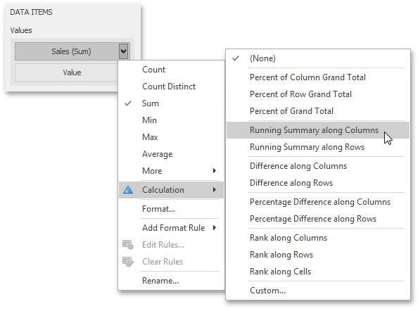 |
The image above shows a calculation menu of the Pivot dashboard item. The following items are available.
Percent of Column Grand Total - Calculates a contribution of individual measure values to a column grand total.
Percent of Row Grand Total - Calculates a contribution of individual measure values to a row grand total.
Percent of Grand Total - Calculates a contribution of individual measure values to a grand total.
Running Summary along Columns - Calculates a cumulative total for measure values along columns (horizontally).
Running Summary along Rows - Calculates a cumulative total for measure values along rows (vertically).
Difference along Columns - Calculates differences between measure values along columns (horizontally).
Difference along Rows - Calculates differences between measure values along rows (vertically).
Percent Difference along Columns - Calculates percentage differences between measure values along columns (horizontally).
Percent Difference along Rows - Calculates percentage differences between measure values along rows (vertically).
Rank along Columns - Ranks measure values along columns (horizontally).
Rank along Rows - Ranks measure values along rows (vertically).
Rank along Cells - Ranks measure values along cells (throughout the entire pivot table).
Custom... - Allows you to create a custom calculation by specifying various settings. Clicking this item invokes the Customize Calculation dialog that allows you to add additional customizations to calculations.
 |
To learn more, see descriptions of the available calculations below.
Anmerkung
Note that the list of available items in this menu can be changed by the Dashboard Designer dynamically. For instance, if the Pivot dashboard item does not contain dimensions in the Rows section, menu items related to rows will be disabled.
Running Total
The Running Total calculation can be used to compute a cumulative total for the specified measure across a window. For example, the Grid below displays cumulative sales across all quarters.
 |
The Customize Calculation dialog provides the following settings for the Running Total calculation.
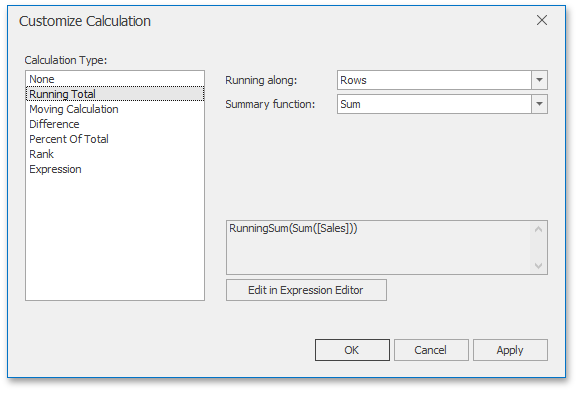 |
Running along - Specifies a window and direction used to calculate running totals.
Summary function - Specifies a summary function used to apply calculation. To learn more about the available summary functions, see the Summary Function Types in the summary function topic.
Moving Calculation
The Moving calculation uses neighbouring values to calculate a total. For example, the Grid below shows a moving average across all quarters.
 |
The Customize Calculation dialog provides the following settings for the Moving calculation.
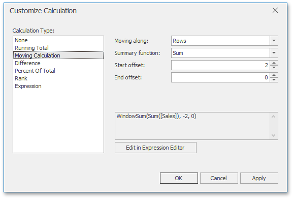 |
Moving along - Specifies a window and direction used to apply a calculation.
Summary function - Specifies a summary function used to apply a calculation. To learn more about the available summary functions, see the Summary Function Types in the summary function topic.
Start offset / End offset - Specify start/end offsets from the currently processed value. For instance, if you specified offsets as 1/1, the previous and next values will be used along with the current value to apply the Moving calculation.
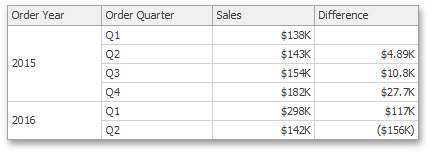
Difference
The Difference calculation can be used to compute the difference between measure values across a window. For example, the Grid below shows absolute differences between quarterly sales.
 |
The Customize Calculation dialog provides the following settings for the Difference calculation.
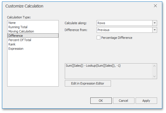 |
Calculate along - Specifies a window and direction used to calculate differences.
Difference from - Specifies the value used to calculate the difference. The following values are available: Previous, Next, First and Last.
You can also use the Percent Difference option to specify whether the absolute or percentage difference is displayed.
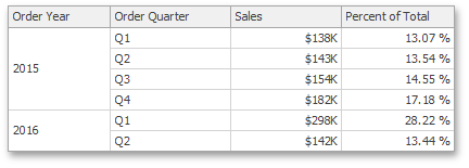
Percent of Total
A calculation is used to compute a percentage of the total for the specified measure across a window. For example, the Grid below shows a contribution of individual quarterly sales to total sales.
 |
The Customize Calculation dialog provides the following settings for the Percent of Total calculation.
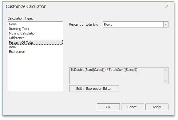 |
Percent of Total - Specifies a window and direction used to apply a Percent of Total calculation.
Rank
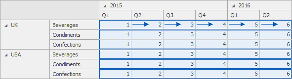
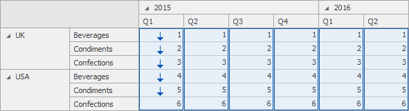
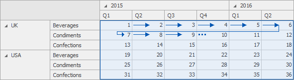
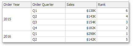
Use the Rank calculation to compute rankings for the specified measure across a window. For example, the Grid below shows a ranking of sales for individual quarters.
The Customize Calculation dialog provides the following settings for the Rank calculation.
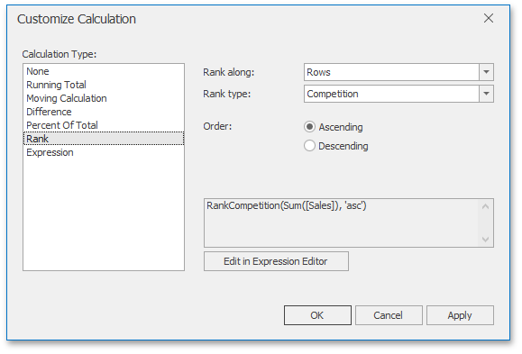
Rank along - Specifies a window and direction used to rank values.
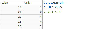
Rank type - Specifies the type of ranking. The following rank types are available: Unique, Competition, Dense, Modified and Percentile.
Order - Specifies the order of ranking. You can select Ascending or Descending.
Expression
Use Expression to specify a custom calculation by adding the required calculation functions inside the measure expression.
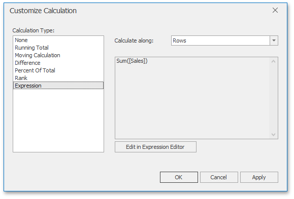 |
Click the Edit in Expression Editor button to invoke the Expression Editor and specify the required expression.
 |
The Expression type provides the Calculate along option that specifies the window and direction used to calculate differences. Note that this option is in effect if the expression contains a calculation function.
Calculation Functions Reference
This topic contains the descriptions of window functions that can be used to specify measure expressions.
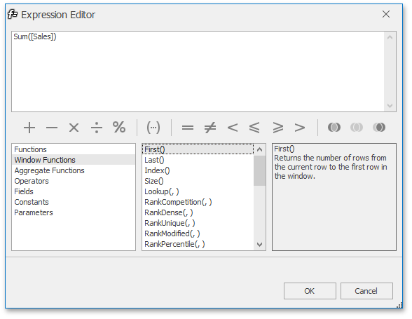
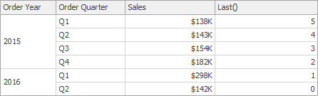
Last()
Returns the number of rows from the current row to the last row in the window.
Example:
 |
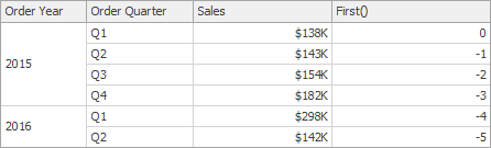
First()
Returns the number of rows from the current row to the first row in the window.
Example:
 |
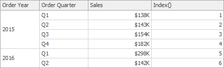
Index()
Returns the index of the current row in the window.
Example:
 |
Size()
Returns the number of rows in the window.
Example:
 |
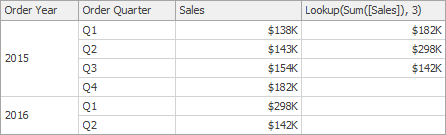
Lookup(SummaryExpression, Position)
Returns the value of the expression in a target position specified as a relative offset from the current position.
Example:
Lookup(Sum([Sales]), 3)
 |
RankCompetition(SummaryExpression, [ 'asc' | 'desc' ])
Returns the standard competition rank for the current row in the window.
Example:
RankCompetition(Sum([Sales]), 'asc')
RankDense(SummaryExpression, [ 'asc' | 'desc' ])
Returns the dense rank for the current row in the window.
Example:
RankDense(Sum([Sales]), 'asc')
RankUnique(SummaryExpression, [ 'asc' | 'desc' ])
Returns the unique rank for the current row in the window.
Example:
RankUnique(Sum([Sales]), 'asc')
RankModified(SummaryExpression, [ 'asc' | 'desc' ])
Returns the modified competition rank for the current row in the window.
Example:
RankModified(Sum([Sales]), 'asc')
RankPercentile(SummaryExpression, [ 'asc' | 'desc' ])
Returns the percentile rank for the current row in the window.
Example:
RankPercentile(Sum([Sales]), 'desc')
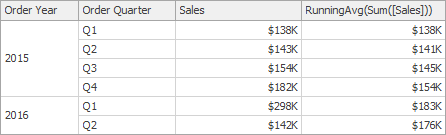
RunningAvg(SummaryExpression)
Returns the running average of the specified expression from the first row in the window to the current row.
Example:
RunningAvg(Sum([Sales]))
 |
RunningCount(SummaryExpression)
Returns the running count of the specified expression from the first row in the window to the current row.
Example:
RunningCount(Sum([Sales]))
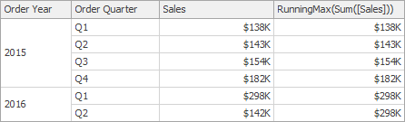
RunningMax(SummaryExpression)
Returns the running maximum of the specified expression from the first row in the window to the current row.
Example:
RunningMax(Sum([Sales]))
 |
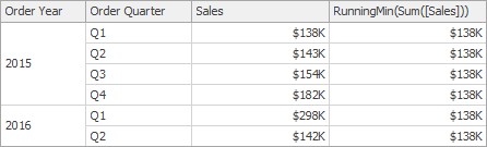
RunningMin(SummaryExpression)
Returns the running minimum of the specified expression from the first row in the window to the current row.
Example:
RunningMin(Sum([Sales]))
 |
RunningSum(SummaryExpression)
Returns the running sum of the specified expression from the first row in the window to the current row.
Example:
RunningSum(Sum([Sales]))
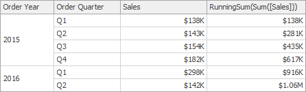 |
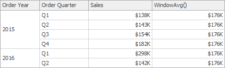
WindowAvg(SummaryExpression, StartOffset, EndOffset)
Returns the average of the expression within the window, which is defined using offsets from the current row.
Example:
WindowAvg(Sum([Sales]), First(), Last())
 |
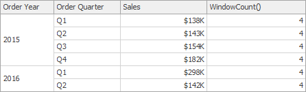
WindowCount(SummaryExpression, StartOffset, EndOffset)
Returns the count of the expression within the window.
Example:
WindowCount(Sum([Sales]), First()+2, Last())
 |
WindowCountDistinct(SummaryExpression, StartOffset, EndOffset)
Returns the distinct count of the expression within the window.
Example:
WindowCountDistinct(Sum([Sales]), First(), Last())
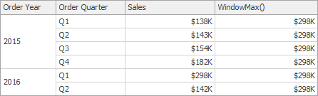
WindowMax(SummaryExpression, StartOffset, EndOffset)
Returns the maximum of the expression within the window.
Example:
WindowMax(Sum([Sales]), First(), Last())
 |
WindowMin(SummaryExpression, StartOffset, EndOffset)
Returns the minimum of the expression within the window.
Example:
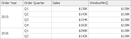
WindowMin(Sum([Sales]), First(), Last())
 |
WindowMedian(SummaryExpression, StartOffset, EndOffset)
Returns the median of the expression within the window.
Example:
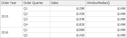
WindowMedian(Sum([Sales]), First(), Last())
 |
WindowSum(SummaryExpression, StartOffset, EndOffset)
Returns the sum of the expression within the window.
Example:
WindowSum(Sum([Sales]), First()+2, Last())
 |
WindowVar(SummaryExpression, StartOffset, EndOffset)
Returns the variance of the expression within the window.
Example:
WindowVar(Sum([Sales]), First(), Last())
WindowVarp(SummaryExpression, StartOffset, EndOffset)
Returns the biased variance of the expression within the window.
Example:
WindowVarp(Sum([Sales]), First(), Last())
WindowStdDev(SummaryExpression, StartOffset, EndOffset)
Returns the sample standard deviation of the expression within the window.
Example:
WindowStdDev(Sum([Sales]), First(), Last())
WindowStdDevp(SummaryExpression, StartOffset, EndOffset)
Returns the biased standard deviation of the expression within the window.
Example:
WindowStdDevp(Sum([Sales]), First(), Last())
Total(SummaryExpression)
Returns the total for the specified expression in a calculation window.
Example:
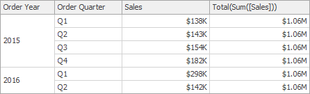
Total(Sum([Sales]))
 |
Calculation Limitations
Supported Dashboard Items
Calculations can be applied to measures of the following dashboard items.
Data Shaping Limitations
The use of calculations imposes the following limitations related to data shaping features.
Sorting by measure cannot be applied if the target measure has a calculation applied.
Top N cannot be applied if its target measure has a calculation.
Conditional Formatting
The Dashboard Designer provides the capability to apply formatting to dashboard item elements whose values meet the specified condition. This feature allows you to highlight specific elements using a predefined set of rules.
To learn more about specifics of using a conditional formatting feature for different dashboard items, see the following topics.
 |
The current topic describes the following common concepts.
Conditional Formatting Overview
Comparison rules used in conditional formatting can be divided into the following groups.
Value - Allows you to compare static values (such as Greater Than, Less Than, Between, etc.).
Top-Bottom - Highlights a specific number of topmost/bottommost values.
Average - Highlights values above the average value or below the average value.
A Date Occurring - Allows you to highlight date-time values that fall into a specified interval.
Expression - Allows you to use complex conditions to apply formatting. You can also pass dashboard parameters to expressions.
Icon Ranges - Allows you to apply formatting by displaying specific icons for different ranges of values. You can select a predefined set of icons or use a specific icon for each range.
Color Ranges - Allows you to apply formatting using specific colors for different ranges of values. You can select a predefined set of colors or use custom appearance settings to highlight values within specified ranges.
Gradient Ranges - Allows you to apply formatting using gradient color scales.
Bar - Allows you to visualize numeric values using bars. You can also color bars corresponding to positive and negative values using different colors.
Bar Color Ranges - Allows you to visualize numeric values using bars whose colors are contained in the specified color set.
Bar Gradient Ranges - Allows you to visualize numeric values using bars whose colors are contained in the specified color gradient.
You can create comparison rules for measures or dimensions. The table below lists format conditions that can be applied to different types of data items.
Data Item | Supported Format Conditions |
Measure/numeric Dimension | |
String Dimension | Value with the condition type set to Equal To, Not Equal To or Text that Contains |
Date-time Dimension | A Date Occuring for dimensions with the continuous date-time group interval |
Create a Format Rule
To create a new rule used to apply formatting according to the required condition, do the following.
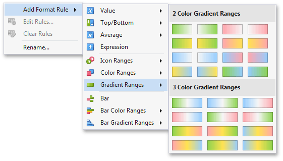
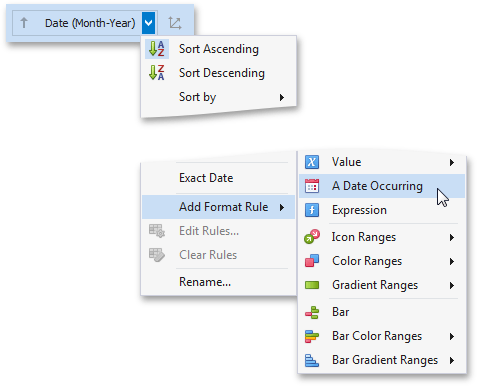
Choose a measure/dimension by whose values a format condition will be calculated. Click the measure/dimension menu button, select Add Format Rule and choose the condition.
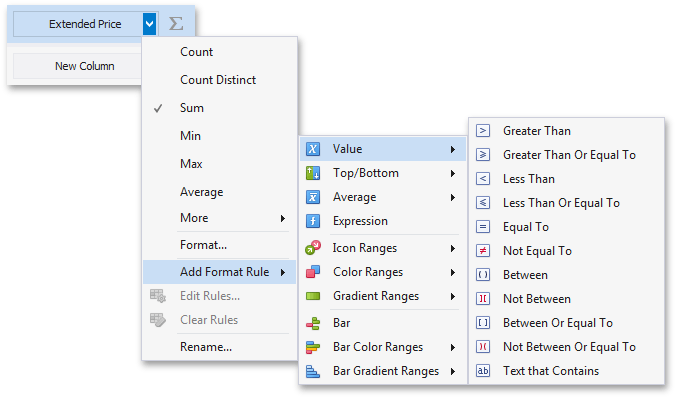 |
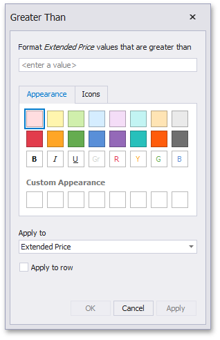 |
In this dialog, specify settings specific for the selected condition (for instance, specify a value to compare with dimension/measure values).
Specify appearance settings applied to elements whose values meet the specified condition.
Specify the data item to whose values conditional formatting is applied using the Apply to combo box. Thus, you can create a format rule for one data item and apply new appearance settings to the other data item. You can also create format rules for hidden measures and apply formatting to values of visible data items.
Anmerkung
Different dashboard items can provide additional capabilities for creating a new format rule. For details, refer to the individual dashboard items in the Dashboard Items section.
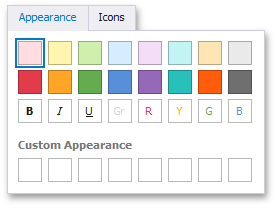
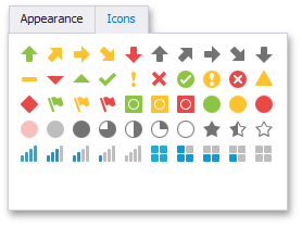
Specify Appearance Settings
When creating a new format rule, you can select the required appearance settings applied according to the current format condition. All format conditions allow you to customize appearance settings in a similar manner. For instance, the Value format condition allows you to specify appearance settings in the following way:
The Appearance tab allows you to choose the predefined background color/font.
 |
The Icons tab allows you to add the predefined icon.
 |
Use the Custom Appearance area in the Appearance tab to add presets containing custom appearance settings. To add a new preset, click an empty square. This invokes the Custom Style Settings dialog, allowing you to specify the required appearance settings.
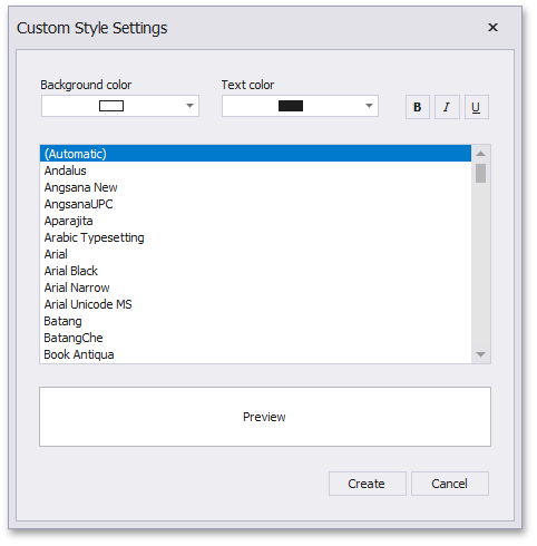 |
In this dialog, you can specify the background/foreground colors and font settings. Click Create to add a preset. The created preset will be displayed in the Custom Appearance area.
Edit a Format Rule
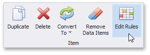
To edit format rules for the selected dashboard item, click the Edit Rules button in the Home ribbon tab.
 |
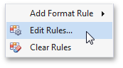
As an alternative, use the Edit Rules data item's menu item or the corresponding item in the dashboard item's context menu.
 |
This invokes the Edit Rules dialog containing existing format rules for this dashboard item.
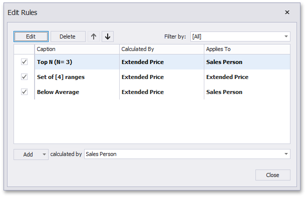 |
This dialog allows you to perform the following actions:
To edit the selected rule, use the Edit button or double-click the required rule.
To delete the selected rule, use the Delete button.
To reorder format rules, use the Up and Down buttons (the
 and
and  icon, respectively). Reordering of rules allows you to specify the priority of rules from higher (a bottommost rule) to lower (a topmost rule).
To enable/disable the required rule, use the corresponding check box on the left column.
To create a new rule, click the Add button and select the required format condition. The calculated by combo box allows you to select the measure/dimension by whose values a format rule is applied.
To filter format rules by the specified data item, use the Filter by combo box.
To clear all rules for the specified data item, use the Clear Rules button in the data item's context menu.
Value
The Value format condition allows you to compare static values (such as Greater Than, Less Than, Between, etc.).
The following condition types are supported for measures or date-time dimensions.
Format Condition | Description | |
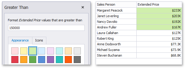
Greater Than/Greater Than or Equal To | The Greater Than/Greater Than or Equal To format conditions allow you to apply formatting to elements whose values are greater than/greater than or equal to the specified value. For instance, the following image displays a Grid dashboard item whose Extended Price cells are filled in green if their values are Greater Than 150 000.
Can be applied to: Measures or date-time dimensions | |
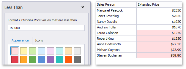
Less Than/Less Than or Equal To | The Less Than/Less Than or Equal To format conditions allow you to apply formatting to elements whose values are less than/less than or equal to the specified value. For instance, the following image displays a Grid dashboard item whose Extended Price cells are filled in red if their values are Less Than 150 000.
Can be applied to: Measures or date-time dimensions | |
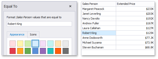
Equal To/Not Equal To | The Equal To/Not Equal To format conditions allow you to apply formatting to elements whose values are equal to/not equal to the specified value. For instance, the following image displays a Grid dashboard item whose Sales Person cells are filled in blue if their values are equal to 'Robert King'.
Can be applied to: Measures, string or date-time dimensions | |
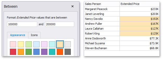
Between/Not Between | The Between/Not Between format conditions allow you to apply formatting to elements whose values are between/not between the specified values. For instance, the following image displays a Grid dashboard item whose Extended Price cells are filled in orange if their values are Between 100 000 and 200 000.
Can be applied to: Measures or date-time dimensions | |
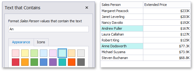
Text That Contains | The Text That Contains format condition allows you to apply formatting to elements whose values contain the specified text. For instance, the following image displays a Grid dashboard item whose Sales Person cells are in cyan if their values contain the 'An' text.
Can be applied to: Measures, string or date-time dimensions |
Top-Bottom
The Top-Bottom format conditions allow you to highlight a specific number of topmost/bottommost values. You can specify this number as an absolute or percent value.
The following condition types are supported for measures.
Format Condition | Description | |
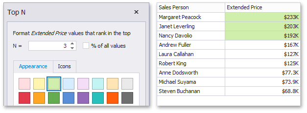
Top N | The Top N format condition allows you to apply formatting to elements whose values are ranked at the top. For instance, the following image displays a Grid dashboard item whose top 3 Extended Price values filled in green.
Can be applied to: Measures | |
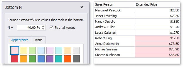
Bottom N | The Bottom N format condition allows you to apply formatting to elements whose values are ranked at the bottom. For instance, the following image displays a Grid dashboard item whose bottom 40 percent Extended Price values are filled in red.
Can be applied to: Measures |
Average
The Average format conditions allow you to highlight values above or below an average value.
The following condition types are supported for measures.
Format Condition | Description | |
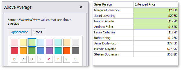
Above Average/Above or Equal Average | The Above Average/Above or Equal Average format conditions allow you to apply formatting to elements whose values are above/above or equal to the average. For instance, the following image displays a Grid dashboard item whose Extended Price values that are above average (~ 141 000) filled in green.
Can be applied to: Measures | |
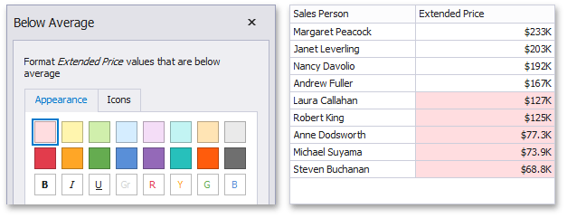
Below Average/Below or Equal Average | The Below Average/Below or Equal Average format conditions allow you to apply formatting to elements whose values are below/below or equal to the average. For instance, the following image displays a Grid dashboard item whose Extended Price values that are below average (~ 141 000) filled in red.
Can be applied to: Measures |
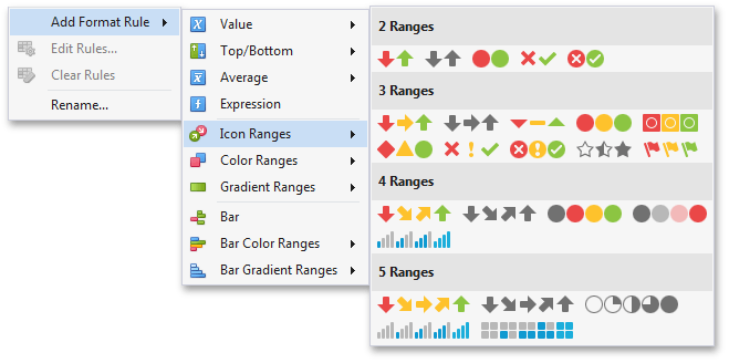
Icon Ranges
Icon Ranges allow you to use predefined or custom sets of icons to apply conditional formatting to different ranges of values.
To format values according to the required condition, click the data item menu button, select Add Format Rule | Icon Ranges and choose the required icon set.
 |
This invokes the Range Set dialog containing the set of value ranges and corresponding icons. The Grid dashboard item on the right displays the default formatting applied using the predefined set of 3 icons.
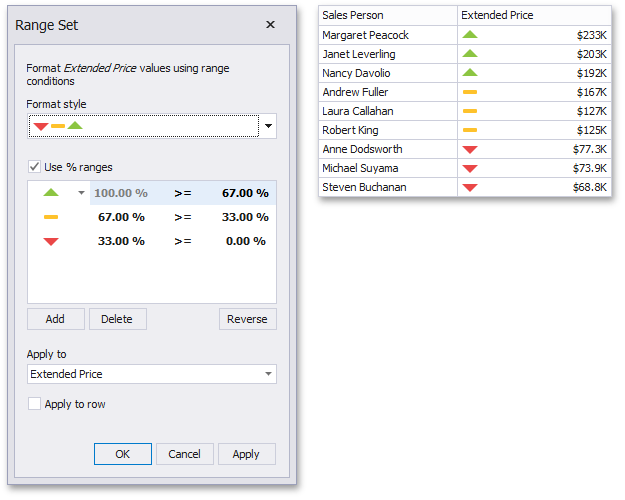 |
This dialog allows you to change the following options specific to Icon Ranges.
The Format Style combo box allows you to change the icon set used to apply formatting.
The Use % ranges check box specifies whether the percent or absolute scale is used to generate ranges.
Anmerkung
Note that this option is not available for date-time dimensions.
To change the icon displayed for values corresponding to the specified range, click the button next to the required icon and select a new icon.
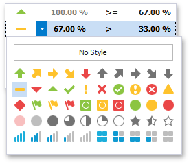 |
Select No Style to disable the indication for the required range.
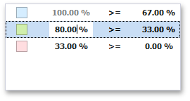
You can change range boundaries by specifying the required values.
 |
Anmerkung
Note that a new value should fall into a range between corresponding values of the previous and next range.
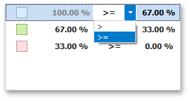
To change the comparison logic for the required range, click the comparison sign and select the required option.
 |
The greater or equal sign includes the smallest value of the current interval while the greater sigh excludes the smallest value from the current interval and includes it in the next interval.
Use the Add and Delete buttons to add new ranges or delete the selected range respectively. Note that new range is added below the selected range.
Color Ranges
Color Ranges allow you to use predefined sets of colors to apply conditional formatting to different ranges of values. You can also use custom appearance settings for specific ranges.
To format values according the required condition, click the data item menu button, select Add Format Rule | Color Ranges and choose the required icon set.
 |
This invokes the Range Set dialog containing the set of value ranges and corresponding appearance settings. The Grid dashboard item on the right displays the default formatting applied using the predefined set of 3 colors.
 |
This dialog allows you to change the following options specific to Icon Ranges.
The Format Style combo box allows you to change the color set used to apply formatting.
The Use % ranges check box specifies whether the percent or absolute scale is used to generate ranges.
Anmerkung
Note that this option is not available for date-time dimensions.
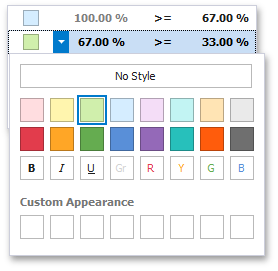
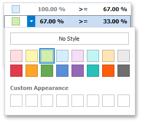
To change the appearance settings applied to values corresponding to the specified range, click the button next to the required color and select a new color or specify custom appearance settings. To learn how to specify custom settings, see the Specify Appearance Settings paragraph in the Conditional Formatting topic.
 |
Select No Style to disable the indication for the required range.
You can change range boundaries by specifying the required values.
 |
Anmerkung
Note that a new value should fall into a range between corresponding values of the previous and next range.
To change the comparison logic for the required range, click the comparison sign and select the required option.
 |
The greater or equal sign includes the smallest value for the current interval while the greater sigh excludes the smallest value from the current interval and includes it in the next interval.
Use the Add and Delete buttons to add new ranges or delete the selected range respectively.
Gradient Ranges
Gradient Ranges allow you to use predefined color gradients to apply conditional formatting to different ranges of values. You can also use specific colors to generate custom gradients.
To format values according the required condition, click the measure menu button, select Add Format Rule | Color Ranges and choose the required color gradient.
 |
This invokes the Gradient Ranges dialog containing the set of value ranges and corresponding appearance settings. The Grid dashboard item on the right displays the default formatting applied using the predefined Red-Blue gradient.
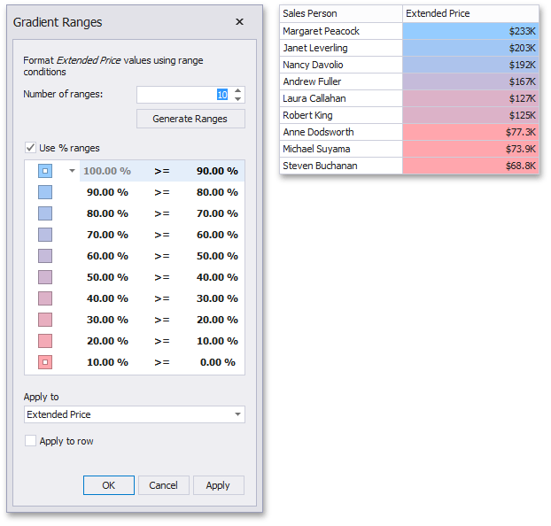 |
This dialog allows you to change the following options specific to Gradient Ranges.
Number of ranges allows you to specify the number of ranges used to classify values. Click the Generate Ranges button to generate a new gradient scale according to the specified number of ranges.
The Use % ranges check box specifies whether the percent or absolute scale is used to generate ranges.
Anmerkung
Note that this option is not available for date-time dimensions.
To change the specific color in the gradient, click the button next to the required color and select a new color or specify a custom background color. This allows you to create a color gradient based on more than two colors. In this case, the specified colors are marked with an empty square.
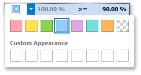 |
To learn how to specify a custom color, see the Specify Appearance Settings paragraph in the Conditional Formatting topic.
You can change range boundaries by specifying the required values.
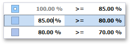 |
Anmerkung
Note that a new value should fall into a range between corresponding values of the previous and next range.
To change the comparison logic for the required range, click the comparison sign and select the required option.
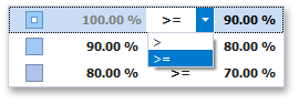 |
The greater or equal sign includes the smallest value in the current interval while the greater sign excludes the smallest value from the current interval and includes it in the next interval.
A Date Occurring
A Date Occurring format condition allows you to highlight date-time values that fall into a specified interval. Note that this format condition can be applied to dimensions with the continuous date-time group interval.
To format values according to the Date Occurring condition, click the menu button of the required dimension and select Add Format Rule | A Date Occurring.
 |
This invokes the A Date Occurring dialog that allows you to select a date-time interval(s) whose value should be formatted.
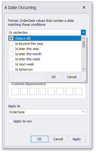 |
The following intervals are supported.
Is beyond this year - Dates that follow the current year.
Is later this year - Dates of the current year starting from the following month.
Is later this month - Dates of the current month that follow the next week.
Is later this week - Dates of the current week starting from the day after tomorrow.
Is next week - Dates that belong to the following week.
Is tomorrow - Tomorrow.
Is today - Today.
Is yesterday - Yesterday.
Is earlier this week - Dates of the current week that are prior to yesterday.
Is last week - Dates of the previous week.
Is earlier this month - Dates of the current month that are prior to the previous week.
Is earlier this year - Dates of the current year that are prior to the current month.
Is prior to this year - Dates that are prior to the current year.
Empty - Does not specify any condition.
Beyond - Dates that belong to the month in three-months time and beyond.
ThisWeek - Dates that belong to the current week.
ThisMonth - Dates that belong to the current month.
MonthAfter1 - Dates that belong to the following month.
MonthAfter2 - Dates that belong to the month in two-months time.
MonthAgo1 - Dates that belong to the previous month.
MonthAgo2 - Dates that belong to the month two months ago.
MonthAgo3 - Dates that belong to the month three months ago.
MonthAgo4 - Dates that belong to the month four months ago.
MonthAgo5 - Dates that belong to the month five months ago.
MonthAgo6 - Dates that belong to the month six months ago.
Earlier - Dates that belong to the month seven months ago and earlier.
Expression
An Expression format condition allows you to use complex conditions to apply formatting.
To format values according to the Expression condition, click the menu button of the required data item and select Add Format Rule | Expression.
|
This invokes the Expression dialog that allows you to specify the required expression. For instance, the following image displays a Grid dashboard item whose rows are filled in green if the Extended Price/Quantity values are greater than 150 000 and 7 500, respectively.
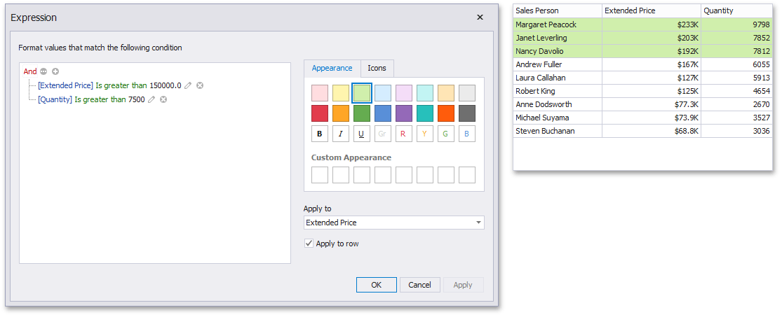 |
You can pass static values when creating conditions or pass a dashboard parameter to apply conditional formatting dynamically. To learn more, see Passing Parameter Values.
Bar
The Bar format condition allows you to visualize numeric values using bars. You can also paint bars corresponding to positive and negative values using different colors.
To format values according to the Bar condition, click the menu button of the required data item and select Add Format Rule | Bar.
|
This invokes the Bar dialog that allows you to specify the required settings. For instance, the following image displays a Grid dashboard item whose Extended Price cell contains data bars corresponding to numeric values.
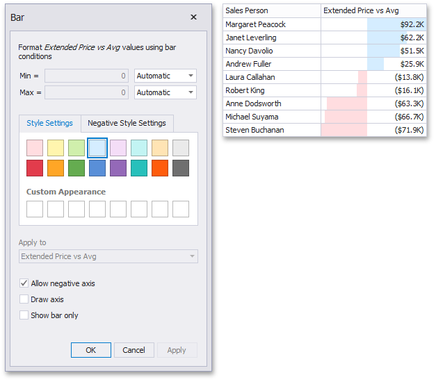 |
This dialog allows you to change the following options specific to the Bar format condition.
By default, lengths of the shortest and longest bars correspond to minimum and maximum values, respectively. If necessary, you can specify values corresponding to the shortest and longest bars manually. To do this, change the type of minimum/maximum value from Automatic to Number or Percent, and specify the required values.
Style Settings and Negative Style Settings allow you to specify style settings used to color data bars corresponding to positive and negative values, respectively. To learn how to specify custom style settings, see the Specify Appearance Settings paragraph in the Conditional Formatting topic.
The Allow negative axis option allows you to specify whether negative data bars are displayed in the direction opposite to the positive data bars.
The Draw axis option specifies whether to draw the vertical axis between positive and negative data bars.
The Show bar only option specifies whether to show bars without corresponding values.
Bar Color Ranges
Bar Color Ranges allow you to visualize numeric values using bars whose colors are contained in the specified color set.
To format values according the required condition, click the data item menu button, select Add Format Rule | Bar Color Ranges and choose the required color set.
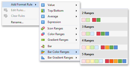 |
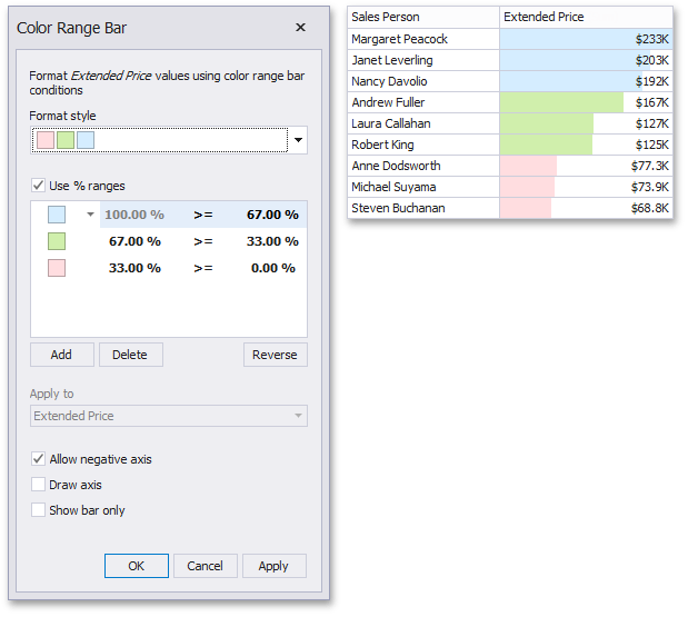
This invokes the Color Range Bar dialog containing the set of value ranges and corresponding colors. The Grid dashboard item on the right displays the default formatting applied using the predefined set of 3 colors.
 |
This dialog allows you to change the following options specific to Bar Color Ranges.
The Format Style combo box allows you to change the color set used to apply formatting.
The Use % ranges check box specifies whether the percent or absolute scale is used to generate ranges.
Anmerkung
Note that this option is not available for numeric dimensions.
To change the appearance settings applied to values corresponding to the specified range, click the button next to the required color and select a new color or specify custom appearance settings. To learn how to specify custom settings, see the Specify Appearance Settings paragraph in the Conditional Formatting topic.
 |
Select No Style to disable the indication for the required range.
You can change range boundaries by specifying the required values.
|
Anmerkung
Note that a new value should fall into a range between corresponding values of the previous and next range.
To change the comparison logic for the required range, click the comparison sign and select the required option.
|
The greater or equal sign includes the smallest value for the current interval, while the greater sign excludes the smallest value from the current interval and includes it in the next interval.
Use the Add and Delete buttons to add new ranges or delete the selected range respectively.
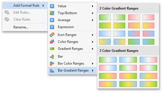
Bar Gradient Ranges
The Bar Gradient Ranges allow you to visualize numeric values using bars whose colors are contained in the specified color gradient.
To format values according the required condition, click the measure menu button, select Add Format Rule | Bar Gradient Ranges and choose the required color gradient.
 |
This invokes the Bar Gradient Ranges dialog containing the set of value ranges and corresponding appearance settings. The Grid dashboard item on the right displays the default formatting applied using the predefined Red-Blue gradient.
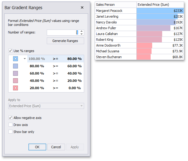 |
This dialog allows you to change the following options specific to Bar Gradient Ranges.
Number of ranges allows you to specify the number of ranges used to classify values. Click the Generate Ranges button to generate a new gradient scale according to the specified number of ranges.
The Use % ranges check box specifies whether the percent or absolute scale is used to generate ranges.
Anmerkung
Note that this option is not available for numeric dimensions.
To change the specific color in the gradient, click the button next to the required color and select a new color or specify a custom background color. This allows you to create a color gradient based on more than two colors. In this case, the specified colors are marked with an empty square.
|
To learn how to specify a custom color, see the Specify Appearance Settings paragraph in the Conditional Formatting topic.
You can change range boundaries by specifying the required values.
|
Anmerkung
Note that a new value should fall into a range between corresponding values of the previous and next range.
To change the comparison logic for the required range, click the comparison sign and select the required option.
|
The greater or equal sign includes the smallest value in the current interval while the greater sign excludes the smallest value from the current interval and includes it in the next interval.
Coloring
The Dashboard Designer provides the capability to manage coloring of dashboard item elements. You can choose whether to use a global color scheme providing consistent colors for identical values across the dashboard or a local color scheme that provides an independent set of colors for each dashboard item. The Dashboard Designer also allows you to edit colors automatically assigned from the default palette.
The section contains the following topics:
Coloring Concepts
The Dashboard Designer provides the capability to color dashboard item elements by associating dimension values/measures and specified colors. You can choose whether to use a global color scheme to provide consistent colors for identical values or specify a local color scheme for each dashboard item.
The Dashboard allows you to manage coloring for the Chart and Pie dashboard items.
Anmerkung
Note that the Chart dashboard item does not allow you to manage coloring for the financial series.
Color Schemes
The dashboard provides two ways for coloring dashboard item elements.
Using a global color scheme that provides consistent colors for identical values across the dashboard. The image below shows the dashboard containing Pie and Chart dashboard items. Pie segments and chart series points corresponding to 'Bevereges', 'Condiments' and 'Diary Products' dimension values are colored using identical colors from the default palette.
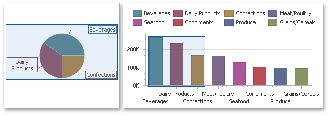 |
To use global colors for coloring dashboard item elements, click the Global Colors button in the Design ribbon tab.
 |
Warnung
When a global color scheme is used, the dashboard reserves automatically generated colors for certain values regardless of the filter state.
Using a local color scheme that provides an independent set of colors for each dashboard item.
To use local colors for coloring dashboard item elements, click the Local Colors in the Design ribbon tab.
 |
Warnung
When a local color scheme is used, the dashboard reassigns palette colors when the filter state is changed.
Anmerkung
By default, the dashboard colors dimension values/measures use the default palette that contains 20 unique colors. To learn how to change default colors or create a new color table, see Customizing a Color Scheme.
Coloring Dimensions and Measures
Dashboard items allow you to manage coloring individual dimensions or all dashboard item measures using predefined coloring modes.
Coloring Mode | Description |
Default | Dimension values/measures are colored by default. To learn how specific dashboard items color their elements by default, see Default Coloring. |
Hue | Dimension values/measures are colored by hue. If coloring by hue is enabled, a data item indicates this using the |
None | Dimension values/measures are colored with the same color. |

Coloring Dimension Values
To specify the coloring mode for the required dimension, click the dimension's menu button and use the Color by submenu. For instance, the image below shows the Chart dashboard item whose 'Country' dimension is colored by hue.
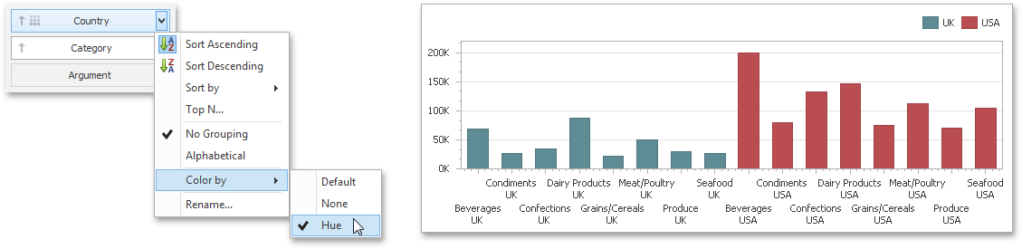 |
Coloring Measures
To specify the coloring mode for dashboard item measures, click the menu button of any measure and use the Color by submenu. For instance, the image below shows the Pie dashboard item whose measures are colored by hue.
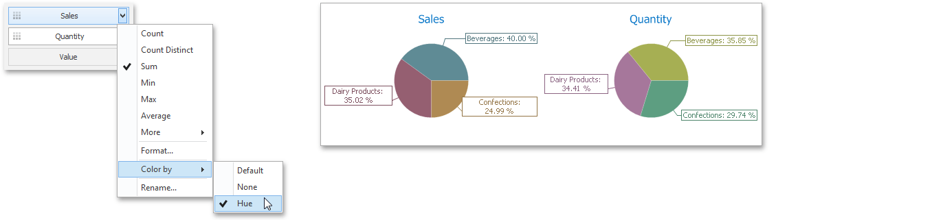 |
If you enabled coloring by hue for several dimensions/measures, all combinations of dimension values/measures will be automatically colored using different colors from the default palette. To learn how to customize these colors, see Customizing a Color Scheme.
Default Coloring
The list below describes specifics of default coloring for different dashboard items:
Customizing a Color Scheme
The Dashboard Designer provides the capability to edit colors contained in global and local color schemes. You can select the required color from the default dashboard palette or specify a custom color.
Invoke a Color Scheme Dialog
To edit colors, use the Color Scheme dialog. You can invoke this dialog in the following ways.
To edit colors in a global color scheme, use the Edit Colors button in the Home ribbon tab or the Edit Colors button in the dashboard item's Design tab.
 |
 |
To edit colors in a local color scheme, use the Edit Colors button in the contextual Design ribbon tab.
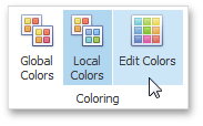 |
Lets consider a Chart dashboard item whose dimensions and measures are colored by hue using local colors.
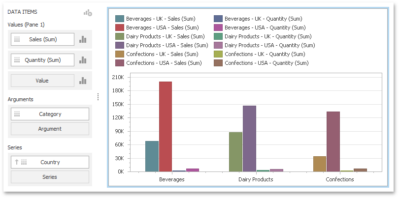 |
For this dashboard item, the Color Scheme dialog will contain combinations of all dimension values and a specific measure.
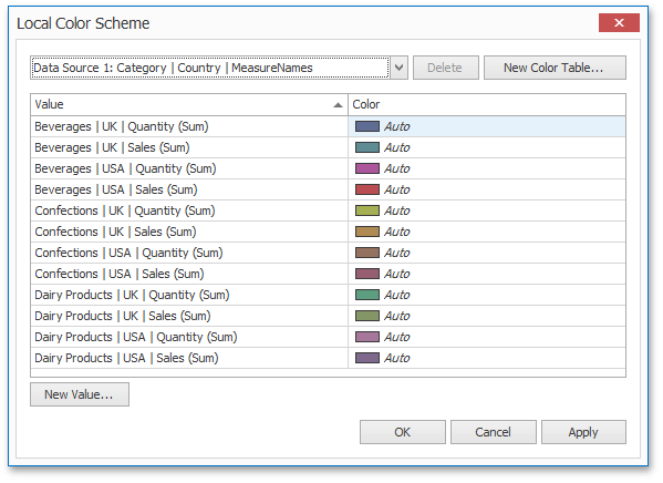 |
In this dialog, you can perform the following actions.
Edit automatically assigned colors or specify new colors.
Add new values to a color table.
Add new color tables containing values whose colors are not yet assigned.
Edit Colors
You can customize automatically assigned colors in several ways.
To retain the automatically assigned color for the selected value, right-click the required value in the Value column and select Retain this color.
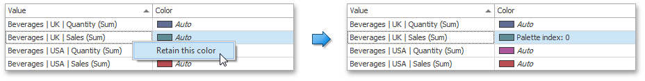 |
This reserves the current palette color for the selected value.
You can select another palette color by clicking the required cell in the Color column.
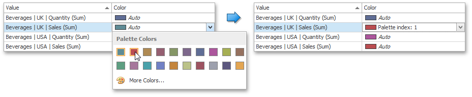 |
To specify a custom color, click More Colors... and pick any color using the RGB or HSB color model in the invoked Select Color dialog.
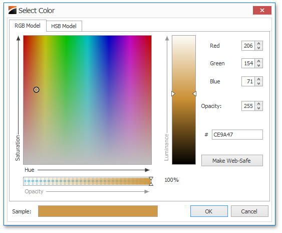 |
You can reset the customized color for the selected value using the Reset menu item.
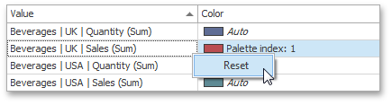 |
Add a New Value
The Color Scheme dialog allows you adding a new value with the specified color to the selected color table. To do this, click the New Value... button.
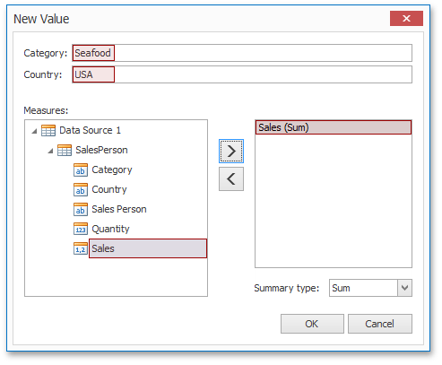 |
In the invoked New Value dialog, specify the dimension values, add the required measures and click OK. This creates a new value whose color can be specified as described in Edit Colors.
You can remove manually added values using the Remove context menu item.
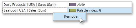 |
Add a New Color Table
The Color Scheme dialog also allows you to add a new color table containing values whose colors are not yet assigned. To do this, click New Color Table... button.
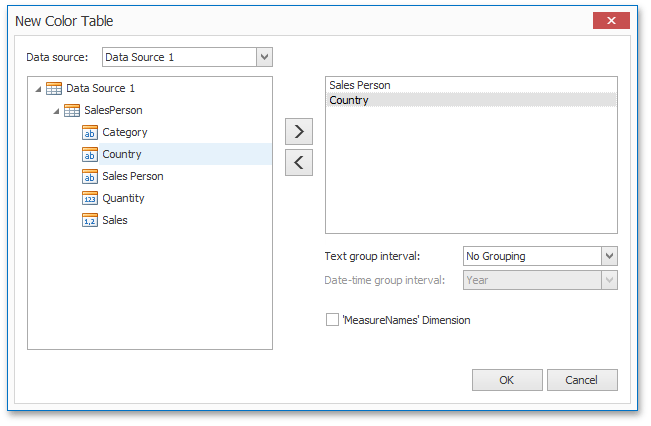 |
In the invoked dialog, specify the data source, add the required dimensions and enable the 'MeasureNames' Dimension check-box if you need to add measures to a color table.
Click OK to add the color table to a color scheme. Then, you can add values to this table (see Add a New Value) and specify its colors (see Edit Colors).
Dashboard Layout
This section describes the features related to the Dashboard layout.
The section consists of the following topics.
Dashboard Title
The Dashboard Title is located at the top of the dashboard surface. It can contain text or image content.
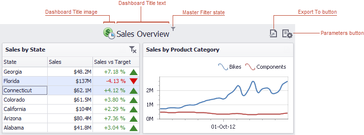 |
If you are using the Ribbon menu in the Dashboard Designer, you can change title settings by clicking the Title button (or the  button if you are using the toolbar menu).
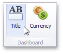 |
This invokes the Dashboard Title dialog, which allows you to change the text within the dashboard title, add an image, etc.
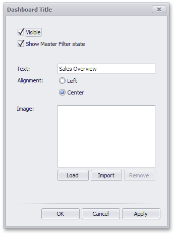 |
This dialog allows you to specify the following options.
Visible - Specifies whether or not the dashboard title is visible.
Show Master Filter state - Specifies whether or not to show the state of master filter items in the dashboard title.
When an end-user hovers over the filter icon ( ), all master filters applied to the dashboard are displayed in the invoked popup.
 |
Alignment - Specifies the alignment of the dashboard title.
Load button - Allows you to specify the image displayed within the dashboard title. In this case, the dashboard definition will contain the URL to access the image.
Import button - Allows you to specify the image displayed within the dashboard title. In this case, the dashboard definition will contain an image as a byte array.
The dashboard title can contain command buttons.
Export To button - allows you to print/export the dashboard. To learn more about printing and exporting, see the Printing and Exporting topic.
Parameters button - allows you to modify dashboard parameter values. To learn more about parameters, see the Using Dashboard Parameters topic.
Dashboard Item Caption
Each dashboard item has a caption that is displayed at the top of the item. The caption contains static text along with other information, as well as command buttons.
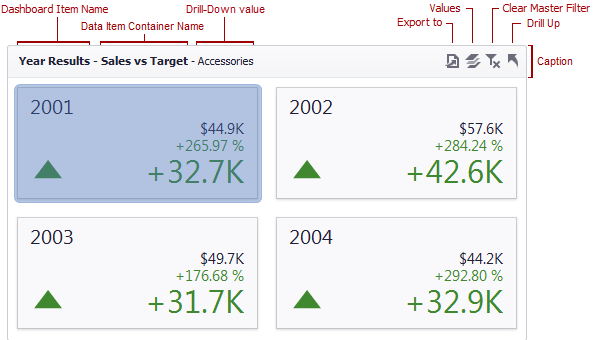 |
To show or hide the caption of a dashboard item, click the Show Caption button in the Design Ribbon tab...
 |
...or right-click the item when designing the dashboard, and click the Show Caption menu item.
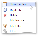 |
Anmerkung
The caption of the Range Filter dashboard item is not visible by default.
The caption of the Dashboard item contains the following information and buttons, depending on the dashboard item type.
Names |
You can change the default name of the dashboard item or data item container using the Edit Names dialog. To invoke this dialog, right-click the item when designing the dashboard, and click the Edit Names... menu item (alternatively, you can use the Edit Names button in the Design Ribbon tab).
| |
Interactivity Information | Drill-Down value - shows the value or values from the current drill-down hierarchy. To learn more, see the Drill-Down topic. | |
Command Buttons |
|
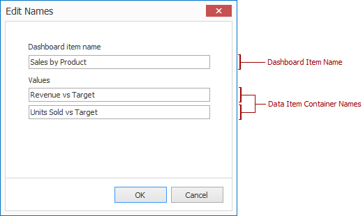
Dashboard Items Layout
The Dashboard Designer provides the capability to arrange and resize dashboard items and groups in various ways, using simple drag-and-drop operations.
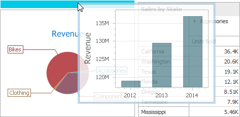 |
Layout Concepts
The dashboard arranges dashboard items and groups using layout items and layout groups. They are special containers that are used to present a dashboard layout as a hierarchical structure.
A layout item is used as a container that displays an individual dashboard item.
A layout group is used as a container that is used to arrange layout items (or other layout groups) either horizontally or vertically. At the same time, layout groups are used as containers that display dashboard item groups.
Thus, a dashboard layout is hierarchically arranged from the root layout group to bottommost layout items, which display individual dashboard items.
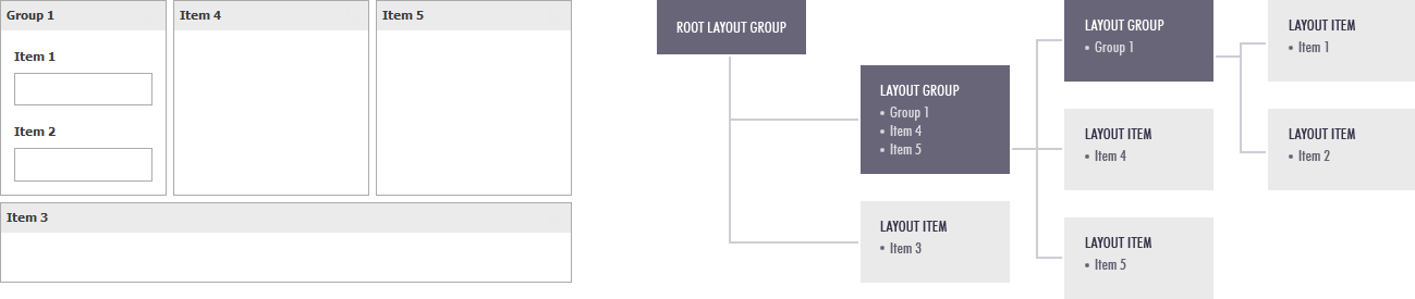 |
Item Resizing
You can resize individual items/groups of items by dragging their edges.
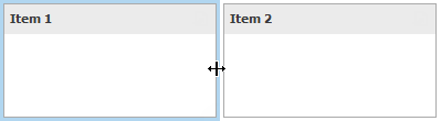 |
By default, a 2x2 layout group of dashboard items is horizontally oriented and contains two child layout groups. This arranges dashboard items in two 'columns' and allows you to set a different height for items in different columns. You can switch the orientation of the 2x2 group to Vertical using the indicator at the group intersection.
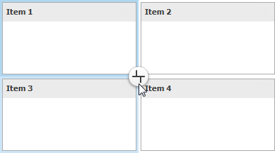 |
This allows you to specify different widths for dashboard items in different 'rows'. The table below lists and describes different modes.
Indicator | Result | Description | |
 |
| Orients the layout group horizontally and allows you to change the height of individual items and the width of 'columns'. | |
 |
| Orients the layout group vertically and allows you to change the width of individual items and the height if 'rows'. |
Item Positioning
You can change the position of a dashboard item by using drag-and-drop and one of the following approaches.
If the caption of the dashboard item is visible, click it and hold down the left mouse button while dragging the item.
If the caption of the dashboard item is not visible, click the
 icon in the top left corner, and hold down the left mouse button while dragging the item.
Depending on the required dashboard item position, a new layout group is created (if required) to maintain the arrangement of items. Thus, the dashboard item can be inserted to the desired area of a new or existing dashboard layout group.
The following table illustrates how a dashboard item is dragged.
Action | Description | |
| Select the required dashboard item. | |
| Drag the dashboard item to the expected area. The drag indicator...  ...will show possible positions for the dashboard item. | |
| Move the mouse cursor to the required position. The drop indicator...  …highlights the hovered position. | |
| Then, the drop indicator sequentially displays areas that can be occupied by the dashboard item. Release the left mouse button when the drop indicator displays the required area. | |
| The dashboard item is moved to a new position. |
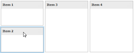
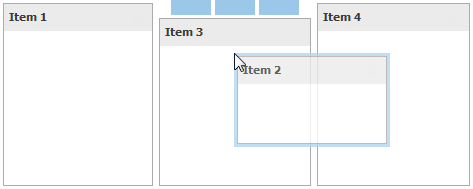
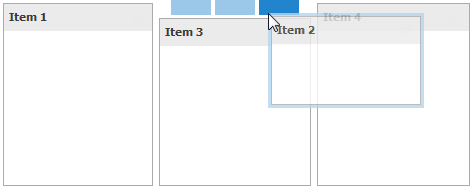
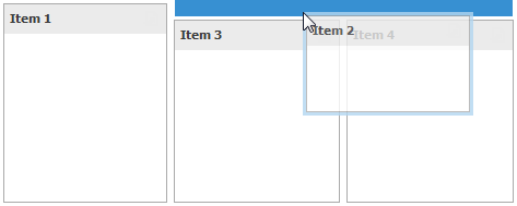
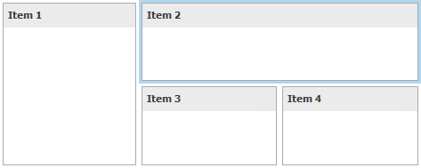
Undo and Redo Operations
The Dashboard Designer keeps track of all user actions, and allows you to undo or repeat them using the Undo/Redo buttons (or 
 buttons, if you are using the toolbar menu).
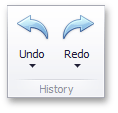 |
To undo/redo the last action, use the following buttons.
 |
To undo/redo several actions at once, click the arrow next to Undo/Redo button and select the actions in the list that you want to undo/redo.
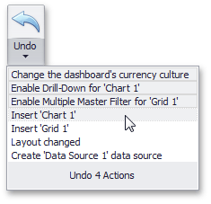 |
Automatic and Manual Updates
When you perform a data-aware operation in the Dashboard Designer (for instance, change the binding of a specified dashboard item or apply filtering), the dashboard sends a query to a data source and updates itself automatically according to the returned data. If the dashboard is bound to a large data source, updating the dashboard according to each change can consume a significant amount of time. In this case, you can disable automatic updates and update the dashboard manually when needed.
Automatic updates are enabled by default and can be managed using the Automatic Updates button in the Home ribbon tab.
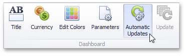 |
Click this button to disable automatic updates. In this case, the dashboard item will not be updated automatically according to each change. Imagine that you have a Grid dashboard item containing the dimension and measure columns. If you change the sort order of the Sales Person column or change the summary type of the Extended Price column, the Grid will be shaded and will display the  icon within its caption.
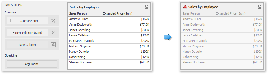 |
This indicates that this dashboard item requires the update to reflect changes. To update the Grid manually, click the Update button in the Home ribbon tab.
 |
Note that the state of the Automatic Updates option is saved to the dashboard XML definition but affects only the Dashboard Designer.
Anmerkung
Note that automatic updates are disabled if you click the Cancel button on the loading panel when performing a time-consuming operation.
Storing Dashboards
A dashboard provides the capability to save a dashboard definition (dashboard items, data sources, data binding, layout settings, etc.) in the Recreatex database.
Saving a Dashboard Definition
Once a dashboard is designed, you can save it in Recreatex database. In the Dashboard Designer, this can be accomplished in the following ways.
You can save the dashboard definition by clicking the Save or Save As button in the Home ribbon of the Designer (or by clicking the
 buttons if you are using the toolbar menu).
 |
If the option Save As is selected, a Save As dialog will be invoked, which allows you to locate the folder in which you wish to store your file.
The dashboard definition can be saved when the window containing the Dashboard Designer is closed. If the dashboard has been modified since the last save, a save confirmation dialog will be invoked.
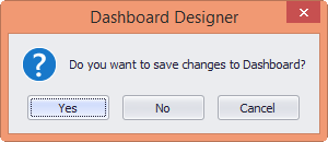 |
Loading a Dashboard Definition
A previously saved dashboard can be loaded to the Dashboard Designer.
You can open the dashboard definition by clicking the Open button in the Home ribbon of the Designer (or the  button if you are using the toolbar menu).
 |
This invokes the Open file dialog, which allows you to locate the required dashboard file.
Printing and Exporting
This section explains how to print or export a dashboard and its items using the Dashboard Designer functionality.
Printing and Exporting Dashboards
To print or export the entire dashboard, click the  button in the dashboard title area and choose the required action.
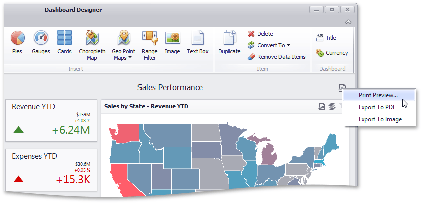 |
If you select the Print Preview... menu item, the Preview window will be invoked. Here, you can change the orientation and size of the printed page, specify the margins, scale the document, etc.
If you select the Export to PDF or Export to Image menu item, the Export To... dialog will be invoked.
Export to PDF | Export to Image | ||
The following options are available.
Specify the required options in this dialog and click the Export button to export the dashboard. To reset changes to the default values, click the Reset button. |
The following options are available.
Specify the required options in this dialog and click the Export button to export the dashboard. To reset the changes to the default values, click the Reset button. |
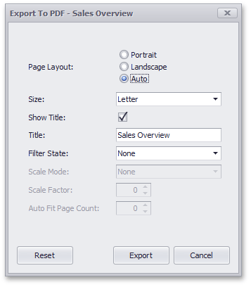
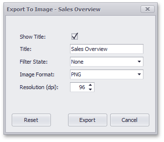
Anmerkung
The current state of the dashboard is maintained when it is printed (e.g., the dashboard layout, the scroll position of individual dashboard items and selections within master filter items).
Printing and Exporting Dashboard Items
To print or export a dashboard item, click the  button in the dashboard item caption area and choose the required action. Alternatively, you can use the dashboard item's context menu.
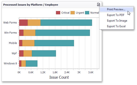 |
If you select the Print Preview... menu item, the Preview window will be invoked.
If you select the Export to… item, an Export To... dialog specific to the exported dashboard item will be invoked. To learn more, see the Printing and Exporting section for the required dashboard item.
Anmerkung
When an individual dashboard item is printed, the entire item's content is reflected in the printed document regardless of the item's current scroll position.
Dashboard Items
The Dashboard provides a number of visualization elements designed to present visual or textual information in a dashboard - dashboard items.
This section describes the available dashboard items.
Chart
The topics in this section describe the features available in the Chart dashboard item, and provide extensive information on how to create and customize charts in the Dashboard Designer.
 |
This section is divided into the following subsections.
Provides information on how to supply the Chart dashboard item with data.
Enumerates and describes different types of series that can be displayed within the Chart dashboard item.
Introduces the concept of chart panes (visual areas within a diagram that display chart series), and provides information on how to create them.
Describes features that enable interaction between the Chart and other dashboard items.
Describes how to customize settings related to chart axes.
Provides information about the chart legend and its options.
Describes how to toggle the chart's orientation.
Providing Data
The Dashboard Designer allows you to bind various dashboard items to data in a virtually uniform manner. To learn more, see the Binding Dashboard Items to Data topic.
The only difference is in the data sections that the required dashboard item has. This topic describes how to bind a Chart dashboard item to data in the Designer.
The Chart dashboard item has the following data sections.
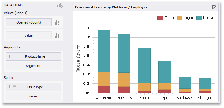 |
The Values section contains data items against which the Y-coordinates of data points are calculated. The Options button next to the Value data item allows you to select the series type and specify different options.
The Arguments section contains data items that provide values displayed along the X-axis of the chart.
The Series section contains data items whose values are used to create chart series.
Anmerkung
The Chart dashboard item allows you to manage the coloring of their measures and dimensions. To learn more, see Coloring.
The Chart dashboard item provides the capability to transpose chart arguments and series. In this case, data items contained in the Arguments section are moved to the Series section, and vice versa.
To transpose the selected Chart dashboard item, use the Transpose button in the Home ribbon tab.
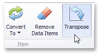 |
Series
This section describes how to select a desired series type in the overview topic, and lists the variety of available series types.
The section consists of the following topics.
Series Overview: Provides information on how to specify a series type in the Dashboard Designer.
Bar Series: Lists the available types of bar series.
Point and Line Series: Lists the available types of point and line series.
Area Series: Lists the available types of area series.
Range Series: Lists the available types of range series.
Weighted Series: Lists the available types of weighted series.
Financial Series: Lists the available types of financial series.
Series Overview
The Chart dashboard item supports a variety of series types - from simple bar and line charts to complex candle stick and bubble graphs.
This topic describes how to change the series type and specify various series options (for instance, how to use secondary axis or enable point labels).
Series Types
To switch between series types in the Dashboard Designer, click the Options button next to the required data item (or placeholder) in the Values section.
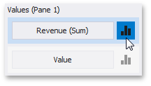 |
In the invoked Series Options dialog, select the required series type and click OK.
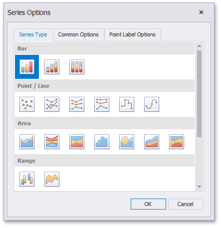 |
You can also do this using the Series Type gallery in the Design Ribbon tab.
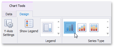 |
Series Options
To manage common series options, use the Common Options tab of the Series Options dialog.
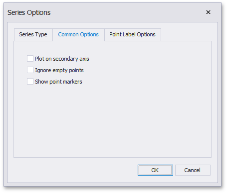 |
Plot on secondary axis - Specifies whether or not the secondary axis is used to plot the current series.
Ignore empty points - Specifies whether or not empty points are ignored when plotting the current series.
Note that this option is in effect for the Line, Area and Range Area series.
Show point markers - Specifies whether or not to show point markers for the current series.
Anmerkung
Note that point markers are always shown when Master Filtering is enabled for the Chart dashboard item. This option is in effect for the Line and Area series.
Series Point Labels
The Point Label Options tab of the Series Options dialog allows you to enable series point labels and manage their settings.
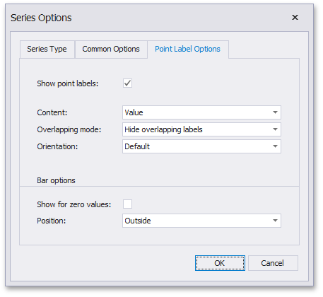 |
Show point labels - Specifies whether or not to show point labels for the current series.
Content - Specifies the type of content displayed within point labels.
Overlapping mode - Specifies the label overlap mode.
Anmerkung
This option is not in effect when the dashboard is displayed in the Web Viewer.
Orientation - Specifies the orientation of point labels.
Anmerkung
The settings for Bar options are in effect for Bar series only.
Show for zero values - Specifies whether or not to show labels for points with zero values.
Position - Specifies the position of point labels relative to bars.
Bar Series
Bar series visualize data using rectangular bars with lengths proportional to the values that they represent.
The following types of Bar series are available.
Bar series can be used to compare values across categories.
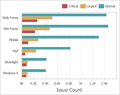 |
Stacked Bar
Stacked Bar series show the contribution of individual categories to the whole.
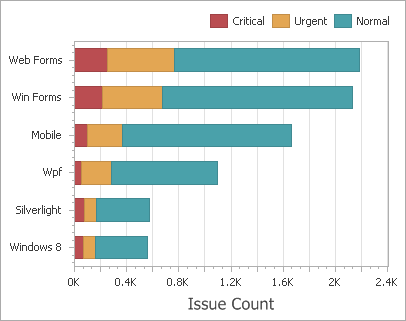 |
Full-Stacked Bar
Full-Stacked Bar series allow you to compare the percentage that each value contributes to a total across categories.
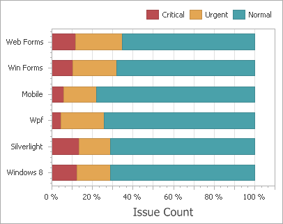 |
Point and Line Series
Point series visualize data as a set of individual numeric data points. Line series are used to connect numeric data points by different types of line segments.
The following types of Point and Line series are available.
Point
Point series visualize data as a set of individual numeric data points.
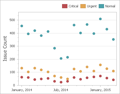 |
Line
Line series connect numeric data points by straight line segments.
 |
Stacked Line
Stacked Line series can be used to show the trend of the contribution for each value.
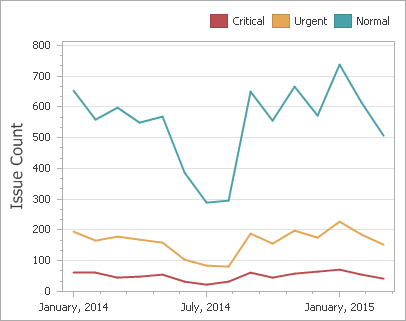 |
Full-Stacked Line
Stacked Line series are useful for showing the trend of the percentage for each value.
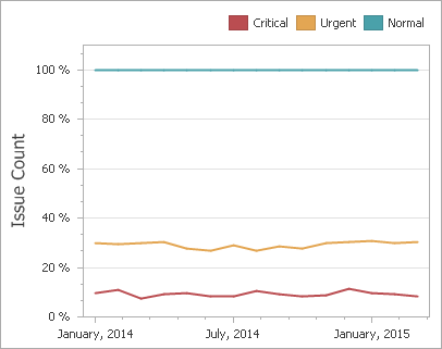 |
Step Line
Step Line series use vertical and horizontal lines to connect the numeric data points forming a step-like progression.
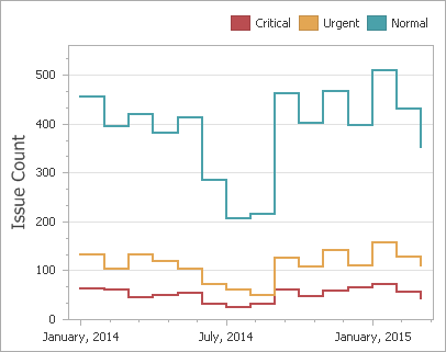 |
Spline
Spline series plot a fitted curve through each numeric data point.
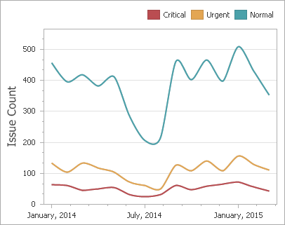 |
Area Series
Area series connect numeric data points by different types of line segments and fill the area between the line and X-axis/other series.
The following types of Point and Line series are available.
Area
Area series connect numeric data points by straight line segments and fill the area between the line and X-axis.
 |
Stacked Area
Stacked Area series can be used to show the trend of the contribution for each value. Stacked Area series connect numeric data points by straight line segments and fill the area between the line and previous series.
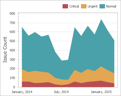 |
Full-Stacked Area
Full-Stacked Area series are useful to show the trend of the percentage for each value.
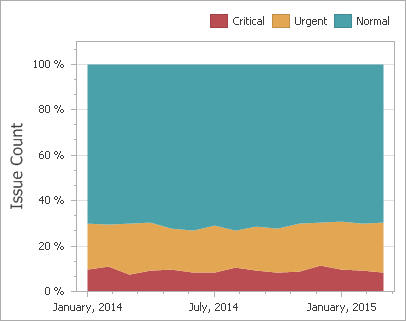 |
Step Area
Step Area series use vertical and horizontal lines to connect the numeric data points forming a step-like progression and fill the area between the line and X-axis.
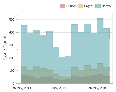 |
Spline Area
Spline Area series plot a fitted curve through each numeric data point and fill the area between the line and X-axis.
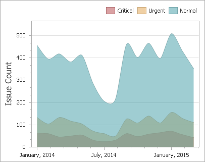 |
Stacked Spline Area
Stacked Area series can be used to show the trend of the contribution for each value. Stacked Area series plot a fitted curve through each numeric data point, and fill the area between the line and previous series.
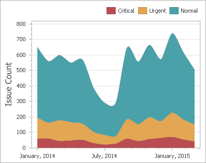 |
Full-Stacked Spline Area
Full-Stacked Spline Area series are useful to show the trend of the percentage for each value.
 |
Range Series
Range series are generally used to show variations in a specified time range like temperature, price, etc.
The following types of Range series are available.
Data Binding Specifics
A range series is a space between two simple series displayed as a filled area (Range Area) or bars that stretch from a point in one series to the corresponding point in the other (Range Bar). Thus, you need to provide two measures instead of one to display a range series.
Value 1 - a measure against which the first set of values is calculated.
Value 2 - a measure against which the second set of values is calculated.
When you select the Range Bar or Range Area series type in the Designer, the DATA ITEMS area displays two data item placeholders. Drag and drop the required measures to corresponding placeholders.
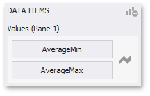 |
Range Bar
Range Bar series are similar to Bar series except that they are drawn between a range of values.
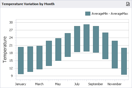 |
Range Area
Range Area series are similar to Area series except that their areas are filled between a range of values.
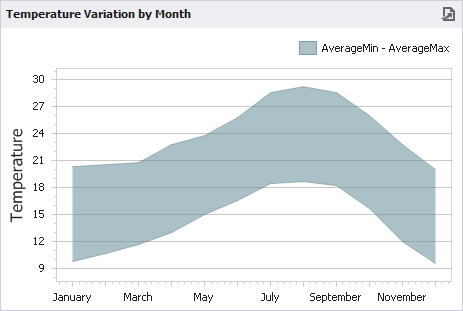 |
Weighted Series
Weighted series allow you to visualize data in three dimensions.
The following types of Weighted series are available.
Data Binding Specifics
Data points in a weighted series present the following two measures:
Value - the Y-coordinate of series points.
Weight - the size of series points.
When you select the Bubble series type in the Designer, the DATA ITEMS area displays two data item placeholders. Drag and drop the required measures to corresponding placeholders.
 |
Bubble
Bubble series are similar to Point series except that they allow you to provide an additional measure whose values are expressed in a bubble size.
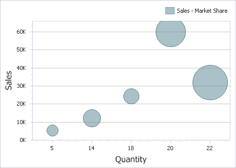 |
Financial Series
Financial series are used to illustrate stock prices.
The following types of Financial series are available.
Coloring Specifics
Note that financial series do not support a standard coloring mechanism used to color chart series points. The Chart dashboard item colors series points of financial series in the following way.
Black/Blue if the price at the end of the previous period is lower than the price at the end of the current period.
Red if the price at the end of the previous period is larger than the price at the end of the current period.
High-Low-Close
When you select the High-Low-Close series type in the Designer, the DATA ITEMS area displays three data item placeholders. High-Low-Close series require three measures to be provided.
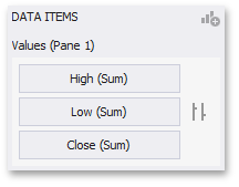 |
High - the maximum price within the specified period (the top of the series point).
Low - the minimum price within the specified period (the bottom of the series point).
Close - the price at the end of the specified period (the tick mark).
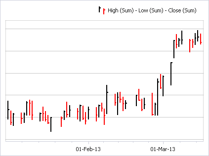 |
Stock
When you select the Stock series type in the Designer, the DATA ITEMS area displays four data item placeholders. Stock series require four measures to be provided.
 |
Open - the price at the beginning of the specified period (the left tick mark).
High - the maximum price within the specified period (the top of the series point).
Low - the minimum price within the specified period (the bottom of the series point).
Close - the price at the end of the specified period (the right tick mark).
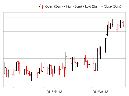 |
Candle Stick
When you select the Candle Stick series type in the Designer, the DATA ITEMS area displays four data item placeholders. Candle Stick series require four measures to be provided.
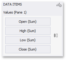 |
Open - the price at the beginning of the specified period.
High - the maximum price within the specified period (the upper shadow top).
Low - the minimum price within the specified period (the lower shadow bottom).
Close - the price at the end of the specified period.
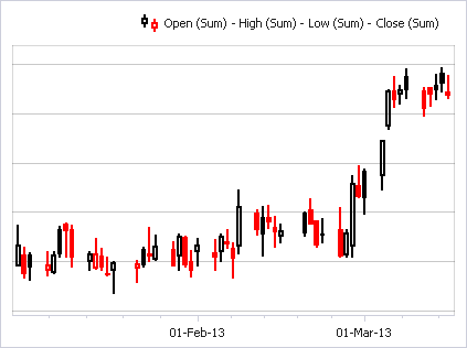 |
Panes
The Chart dashboard item can contain any number of panes. Panes are visual areas within a diagram that display chart series.
Each pane has its own Y-axis and displays a specific set of series. All panes in a chart share the same X-axis.
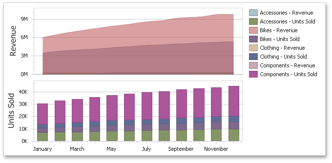 |
To add a pane, click the Add Pane button (the  icon) at the top right of the DATA ITEMS pane.
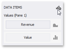 |
Once a new pane is added, the Dashboard Designer creates another Values section in the DATA ITEMS pane.
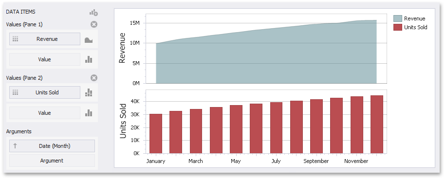 |
Use this section to provide data items that supply values to be displayed in the new pane (see Providing Data for details on data binding).
To remove a pane, click the Remove Pane button (the  icon) displayed in the corresponding Values section.
Interactivity
This section describes features that enable interaction between the Chart and other dashboard items. These features include Master Filtering and Drill-Down.
The section contains the following topics.
Master Filtering
The Dashboard allows you to use any data aware dashboard item as a filter for other dashboard items (Master Filter). To learn more, see the Master Filtering topic, which describes filtering concepts common to all dashboard items.
The Chart dashboard item supports filtering by argument or series values.
Filtering by Arguments
When filtering by arguments is enabled, you can click series points to make other dashboard items only display data related to selected argument values.
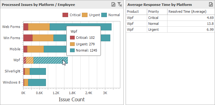 |
To enable filtering by arguments in the Designer, set the required Master Filter mode and click the Arguments button in the Data Ribbon tab (or the  button if you are using the toolbar menu).
 |
Filtering by Series
When filtering by series is enabled, you can click a series point to make other dashboard items only display data related to the selected series.
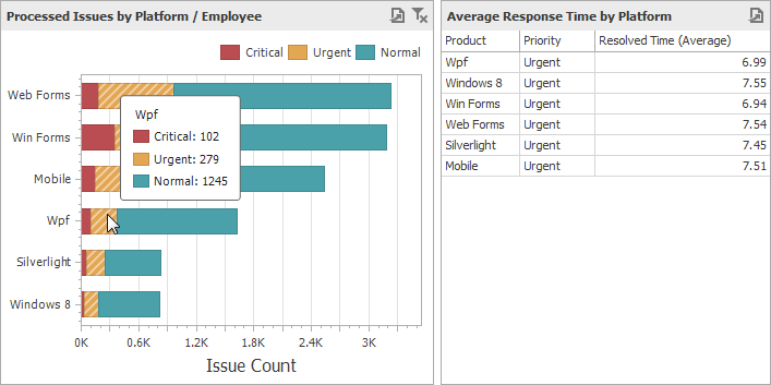 |
To enable filtering by series in the Designer, set the required Master Filter mode and click the Series button in the Data Ribbon tab (or the  button if you are using the toolbar menu).
 |
Filtering by Points
When filtering by points is enabled, you can click a individual point to make other dashboard items display only data related to the selected point.
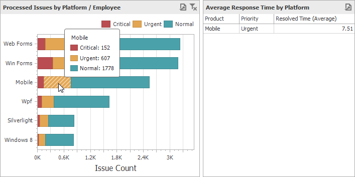 |
To enable filtering by points in the Designer, set the required Master Filter mode and click the Points button in the Data Ribbon tab.
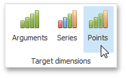 |
Reset Filtering
To reset filtering, use the Clear Master Filter button in the Chart's caption area…
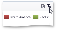 |
…or the corresponding command in the Chart's context menu.
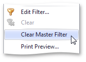 |
Drill-Down
The built-in drill-down capability allows you to change the detail level of data displayed in dashboard items on the fly. To learn more about drill-down concepts common to all dashboard items, see the Drill-Down topic.
The Chart dashboard item supports drill down on argument or series values.
Drill Down on an Argument
When drill down on arguments is enabled, you can click a series point to view a detail chart for the corresponding argument value.
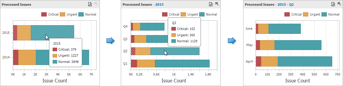 |
Anmerkung
When Filtering by Arguments is enabled, you can view the details by double-clicking a series point.
Drill down on arguments requires that the Arguments section contains several data items, from the least detailed to the most detailed item.
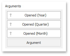 |
Anmerkung
In OLAP mode, you can perform drill-down for either a hierarchy data item or several dimension attributes.
To enable drill down on arguments, click the Drill Down button in the Data Ribbon tab (or the  button if you are using the toolbar menu)...
|
...and the Arguments button (or the button if you are using the toolbar menu).
|
Drill Down on a Series
When drill down on a series is enabled, you can click a series point (or corresponding legend item) to view a detail chart for the corresponding series.
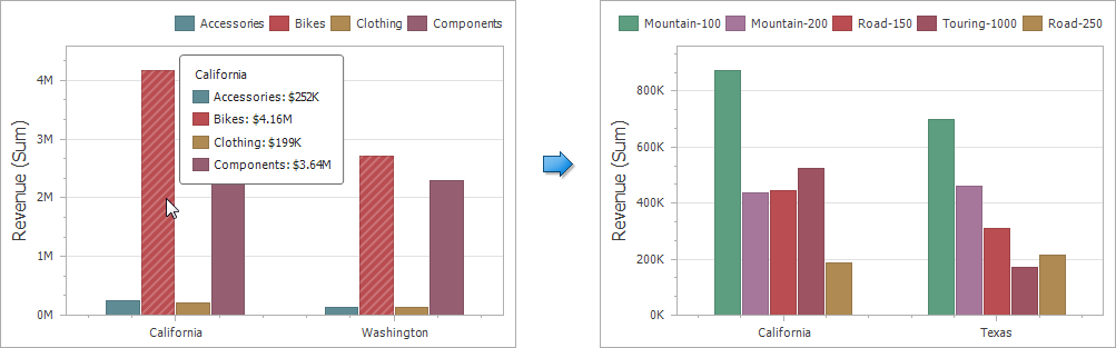 |
Anmerkung
When Filtering by Series is enabled, you can view the details by double-clicking a series point.
Drill down on a series requires that the Series section contains several data items, from the least detailed to the most detailed item.
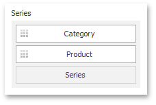 |
Anmerkung
In OLAP mode, you can perform drill-down for either a hierarchy data item or several dimension attributes.
To enable drill down on a series, click the Drill Down button in the Data Ribbon tab (or the button if you are using the toolbar menu)...
|
...and the Series button (or the button if you are using the toolbar menu).
|
Drill Up
To return to the previous detail level (drill up), use the Drill Up button within the Chart caption or in the context menu.
 |
Legend
A legend is an element of a chart that identifies chart series and series points (for instance, colored points corresponding to argument values).
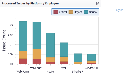 |
This topic describes how to customize various legend settings.
Visibility
You can specify whether or not a chart should display a legend.
In the Designer, use the Show Legend button in the Legend section of the Design Ribbon tab (or the  button if you are using the toolbar menu).
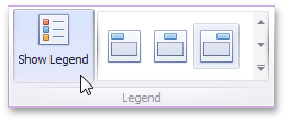 |
Position and Orientation
To specify the legend's position and orientation, select one of the predefined options from the gallery in the Design Ribbon tab.
 |
If you are using the toolbar menu, use the  button to invoke this gallery.
 |
Axes
The Chart dashboard item displays two axes by default: the X-axis and the Y-axis. The topics in this section describe how to customize axis settings.
The section contains the following topics:
X-Axis
The X-axis is the axis of arguments.
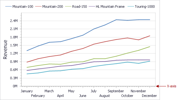 |
This topic consists of the following sections.
General X-Axis Settings
To access X-axis settings, use the X-Axis Settings button in the Diagram section of the Design Ribbon tab (or the  button if you are using the toolbar menu).
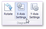 |
This will invoke the X-Axis Settings dialog.
 |
This dialog contains the following settings.
Reverse | Allows you to reverse the X-axis. If the X-axis is reversed, its values are ordered from right to left. |
Show X-axis | Allows you to hide and show the X-axis. |
Show title | Allows you to hide and show the X-axis title. You can choose whether to use the default text or specify a custom string. |
Enable zooming | Allows you to enable zooming for the X-axis. The X-axis' scroll bar provides the capability to perform navigation in the zoomed diagram. |
Limit visible points | Allows you to limit the number of points displayed on the chart's diagram along the X-axis. The X-axis' scroll bar provides the capability to perform navigation if the number of all points exceeds the number of visible points. |
Continuous and Discrete X-Axes
If the dimension in the Arguments section contains numeric data, the Chart can create either a continuous X-axis or a discrete X-axis.
Continuous X-axis | Discrete X-axis | ||
If a continuous axis is used, the distance between argument values is proportional to their values.
| On a discrete axis, all argument values are an equal distance from each other.
|
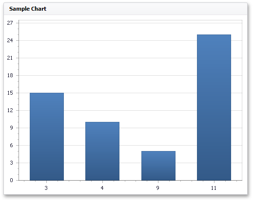
To specify the X-axis type in the Designer, invoke the data item menu for the argument dimension and select the axis type.
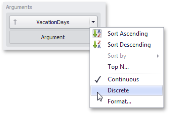 |
Anmerkung
Note that the continuous X-axis is not supported in OLAP mode.
Y-Axis
The Y-axis is the numerical axis of values.
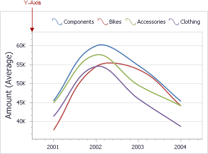 |
General Settings
To access the Y-axis settings, use the Y-Axis Settings button in the Diagram section of the Design Ribbon tab (or the  button if you are using the toolbar menu).
 |
This will invoke the Y-Axis Settings dialog.
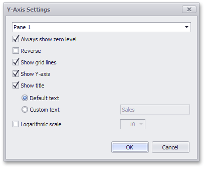 |
Use the combo box at the top to select the pane for the Y-axis settings you need to edit.
The dialog contains the following settings.
Always show zero level | Specifies whether or not the axis' zero level is visible. If this option is unchecked, the visible axis range is defined based on the values plotted in the chart.
| |
Reverse | Allows you to reverse the X-axis. If the X-axis is reversed, its values are ordered from top to down. | |
Show grid lines | Allows you to hide and show grid lines for the Y-axis. | |
Show Y-axis | Allows you to hide and show the Y-axis. | |
Show title | Allows you to hide and show the Y-axis title. You can choose whether to use the default text or specify a custom string. |
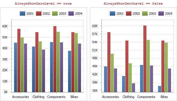
Orientation
You can rotate the Chart so that the X-axis becomes vertical, and the Y-axis becomes horizontal.
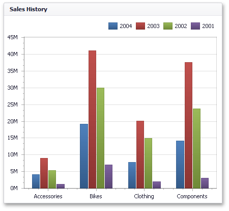 |
To rotate a Chart in the Designer, use the Rotate button in the Diagram group of the Design Ribbon tab (or the  button if you are using the toolbar menu).
 |
Scatter Chart
The topics in this section describe the features available in the Scatter Chart dashboard item, and provide information on how to create and customize scatter charts.
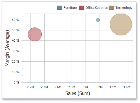 |
This section is divided into the following subsections.
Providing Data: Provides information on how to supply the Scatter Chart dashboard item with data.
Interactivity: Describes features that enable interaction between the Scatter Chart and other dashboard items.
Legend: Provides information about the chart legend and its options.
Axes: Describes how to customize settings related to chart axes.
Orientation: Describes how to toggle the chart's orientation.
Labels: Provides information about point labels and tooltips that contain descriptions of data points.
Providing Data
The Dashboard Designer allows you to bind various dashboard items to data in a virtually uniform manner. To learn more, see the Binding Dashboard Items to Data topic.
The only difference is in the data sections that the required dashboard item has. This topic describes how to bind a Scatter Chart dashboard item to data in the Designer.
The Scatter Chart dashboard item has the following data sections.
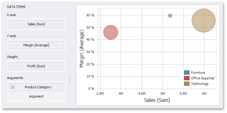 |
The X-Axis section contains the data item against which the X-coordinates of data points are calculated.
The Y-Axis section contains the data item against which the Y-coordinates of data points are calculated.
The Weight section contains the data item whose values are used to calculate the weight of data points.
The Arguments section contains data items providing scatter chart arguments that are used to create data points.
Anmerkung
The Scatter Chart dashboard item allows you to manage the coloring of their points corresponding to argument values. To learn more, see Coloring.
The Scatter Chart dashboard item provides the capability to transpose their axes. In this case, the data item contained in the X-Axis section is moved to the Y-Axis section, and vice versa.
To transpose the selected Scatter Chart dashboard item, use the Transpose button in the Home ribbon tab.
|
Interactivity
This section describes features that enable interaction between the Scatter Chart and other dashboard items. These features include Master Filtering and Drill-Down.
The section contains the following topics.
Master Filtering
The Dashboard allows you to use any data aware dashboard item as a filter for other dashboard items (Master Filter). To learn more, see the Master Filtering topic, which describes filtering concepts common to all dashboard items.
The Scatter Chart dashboard item supports filtering by points that correspond to specific argument values or their combinations.
When Master Filtering is enabled, you can click a point (or multiple points by holding down the CTRL key) to make other dashboard items only display data related to the selected point(s).
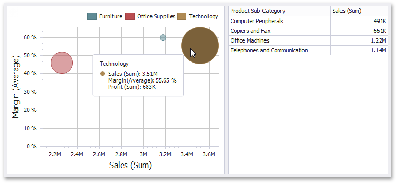 |
To learn how to enable Master Filtering in the Designer, see the Master Filtering topic.
To reset filtering, use the Clear Master Filter ( ) button in the Chart's caption area, or the Clear Master Filter command in the context menu.
Drill-Down
The built-in drill-down capability allows end-users to change the detail level of data displayed in dashboard items on the fly. To learn more about drill-down concepts common to all dashboard items, see the Drill-Down topic.
When drill-down is enabled, you can click a point to view the details.
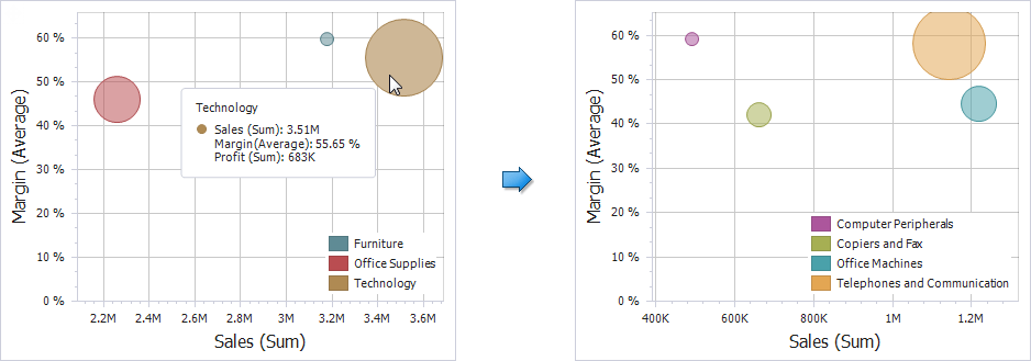 |
Anmerkung
When Master Filtering is enabled, you can view the details by double-clicking a point.
Drill-down requires that the Arguments section contain several dimensions, from the least to the most detailed dimension.
 |
Anmerkung
In OLAP mode, you can perform drill-down for either a hierarchy data item or several dimension attributes. To learn more about OLAP mode, see Binding Dashboard Items to Data in OLAP mode.
To enable drill-down, click the Drill Down button in the Data Ribbon tab (or the button if you are using the toolbar menu).
|
To return to the previous detail level (drill up), use the Drill Up ( ) button in the caption of the Scatter Chart dashboard item, or the Drill Up command in the context menu.
Legend
A legend is an element of a scatter chart that identifies chart points (for instance, colored points corresponding to argument values).
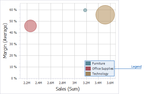 |
This topic describes how to customize various legend settings.
Visibility
You can specify whether or not a chart should display a legend.
In the Designer, use the Show Legend button in the Legend section of the Design Ribbon tab (or the button if you are using the toolbar menu).
|
Position and Orientation
To specify the legend's position and orientation, select one of the predefined options from the gallery in the Design Ribbon tab.
|
If you are using the toolbar menu, use the button to invoke this gallery.
|
Axes
Scatter Chart X and Y-axes are numerical axis of values. You can specify various axes settings to change visual data presentation.
 |
To access X and Y-axis settings, use the X-Axis Settings/Y-Axis Settings buttons in the Diagram section of the Design Ribbon tab (or the button if you are using the toolbar menu).
|
This will invoke the X-Axis Settings/Y-Axis Settings dialog.
 |
In this dialog, you can specify the following settings.
Always show zero level - Specifies whether or not the axis' zero level is visible. If this option is unchecked, the visible axis range is defined based on the values plotted in the chart.
Note that the X-Axis Settings dialog does not contain this option.
Reverse - Allows you to reverse the axis. If the axis is reversed, its values are ordered from top to down.
Show grid lines - Allows you to hide and show grid lines for the axis.
Show axis - Allows you to hide and show the axis.
Show title - Allows you to hide and show the axis title. You can choose whether to use the default text or specify a custom string.
Logarithmic scale - Specifies whether or not the axis should display its numerical values using a logarithmic scale. The combo box next to this option allows you to select the logarithmic base from one of the predefined values.
Orientation
You can rotate the Scatter Chart so that the X-axis becomes vertical, and the Y-axis becomes horizontal.
To rotate a Chart in the Designer, use the Rotate button in the Diagram section of the Design Ribbon tab (or the button if you are using the toolbar menu).
|
Labels
The Scatter Chart display can display point labels that contain descriptions for data points, and provide tooltips with additional information.
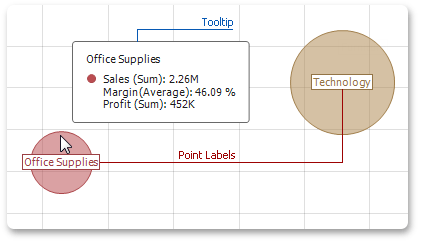 |
Point Labels
To manage the visibility of point labels, click the Point Labels button in the Design ribbon tab.
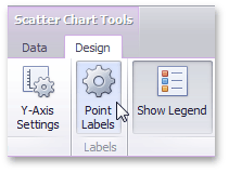 |
In the invoked Point Label Settings dialog, enable the Show point labels check box to show point labels.
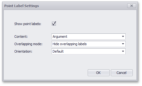 |
You can specify the following settings for point labels.
Option | Description |
Content | Specifies the type of content displayed within point labels. You can select one of the following options.
|
Overlapping mode | Specifies the label overlap mode. The following options are available.
|
Orientation | Specifies the orientation of point labels. The following options are available.
|
Grid
The topics in this section describe the features available in the Grid dashboard item, and provide extensive information on how to create and customize grids in the Dashboard Designer.
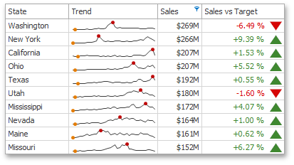 |
This section consists of the following subsections.
Providing Data: Provides information about how to supply the Grid dashboard item with data.
Columns: Describes different types of grid columns.
Interactivity: Describes features that imply interaction between the Grid and other dashboard items.
Conditional Formatting: Describes the conditional formatting feature that provides the capability to apply formatting to grid cells whose values meet the specified condition.
Layout: Describes the Grid's layout options.
Style: Describes the Grid's style settings.
Providing Data
The Dashboard Designer allows you to bind various dashboard items to data in a virtually uniform manner. To learn more, see the Binding Dashboard Items to Data topic.
The only difference is in the data sections that the required dashboard item has. This topic describes how to bind a Grid dashboard item to data in the Designer.
The Grid dashboard item has the following data sections.
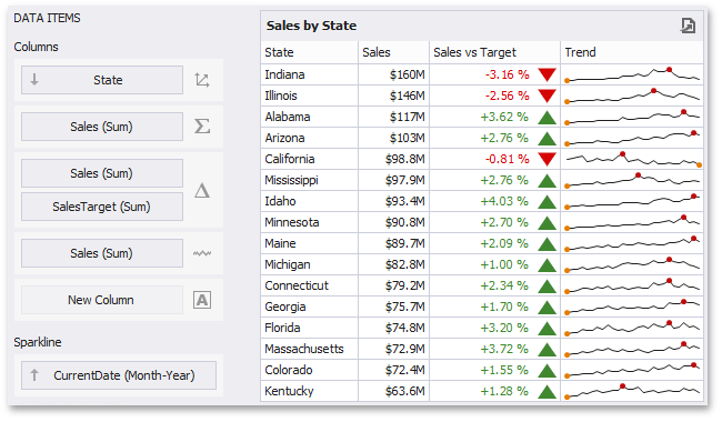 |
The Columns section contains data items that provide values for grid columns. The Options button next to the Column data item allows you to select the column type and specify their options.
The Sparkline section contains a data item that provides arguments for sparkline columns. To learn more, see Sparkline Column.
Columns
The topics in this section describe the different types of grid columns, and contain information on when to use each column type and how to customize them based on the type.
This section consists of the following topics.
Provides general information about column types and describes how to change the type of a particular column.
Describes dimension column specifics.
Describes measure column specifics.
Describes delta column specifics.
Describes sparkline column specifics.
Column Type Overview
The Grid dashboard item supports four types of columns.
Displays values in the bound data item "as is".
Displays summaries calculated against data in the bound data item.
Bound to two measures, it calculates summaries for both measures, and displays the difference between these summaries.
Displays values in the bound data item using sparklines.
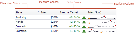 |
When you drop a data item into the Columns section, the type for the new column is determined automatically, based on the data type.
Column Type Indication
The type of the column is indicated within the corresponding data item container in the DATA ITEMS area.
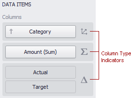 |
Column type indicators are defined as follows:

Changing Column Type
To change the column type, click the column type indicator. In the invoked Column Options window, select the required column type in the Column type section.
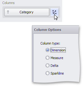 |
Dimension Column
The dimension column displays values from the bound data item "as is".
|
If the dimension column is bound to a data source containing images, it can display images.
See Also
Measure Column
A measure column displays summaries calculated against data in a bound data item.
|
Values in the measure column can be displayed as text or represented by bars.
 |
To select between these modes, invoke the Column Options window (see Column Type Overview to learn how to do this) and select Value or Bar.
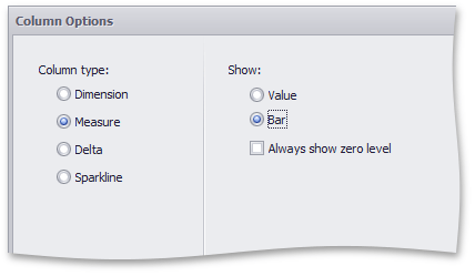 |
If bars are displayed, use the Always show zero level check box to specify whether the bar's zero level is always visible.
See Also
Delta Column
A delta column calculates summaries against two measures, and displays the difference between these summaries. This difference can be indicated with a numeric value displayed within the delta element and an additional delta indication.
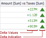 |
Data Binding Specifics
Delta columns are bound to two measures that provide two values: the Actual value and the Target value. The difference between these values is displayed in the column.
When you switch the column type to Delta, the data item container is changed, to accept the Actual and Target measures.
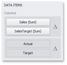 |
Display Mode
Values in the delta column can be displayed as text, or represented by bars.
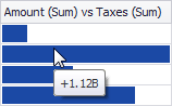 |
To select between these modes, invoke the Column Options window (see the Column Type Overview topic to learn how to do this) and select Value or Bar.
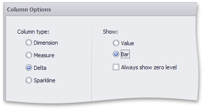 |
If bars are displayed, use the Always show zero level check box to specify whether the bar's minimum value is zero (checked) or an automatically selected value that ensures that the difference between bars is clearly displayed (unchecked).
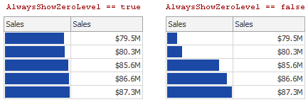 |
Delta Values and Indication
If the display type is set to Value, the Column Options window displays options that allow you to configure delta values and indication.
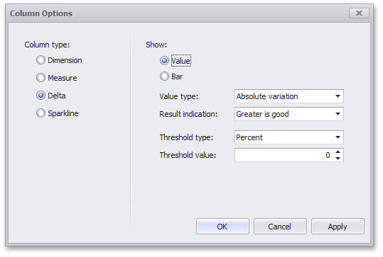 |
You can specify which values should be displayed in the delta column. To do this, use the Value type combo box in the Column Options window.
Actual value | Absolute variation | Percent variation | Percent of target | ||||
|
|
|
|


To specify the condition for displaying delta indication, use the Result indication combo box in the Column Options window.
Greater is good | Less is good | Warning if greater | Warning if less | No indication | |||||
|
|
|
|
|


Comparison Tolerance
The comparison tolerance allows you to specify more advanced conditions for displaying delta indication. For instance, you can set a specific indication to be displayed when the actual value exceeds the target value by 10% or by $2K.
Use the Threshold type combo box to select whether you wish to specify the comparison tolerance in percentage values or in absolute values. Then use the Threshold value box to specify the comparison tolerance.
|
See Also
Sparkline Column
A sparkline column visualizes the variation in summary values over time.
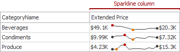 |
Data Binding Specifics
The sparkline column is bound to a measure providing sparkline values and to a dimension providing a date-time interval.
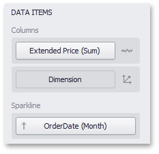 |
Sparkline Options
You can control sparkline appearance settings using the Column Options dialog. To invoke this dialog, click the column type indicator ( ).
).
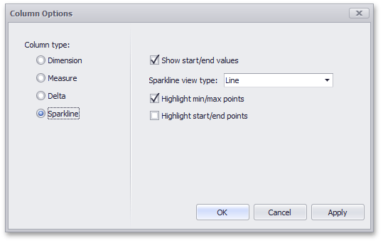 |
In this dialog, you can control various settings that affect how the sparkline is displayed within a grid cell.
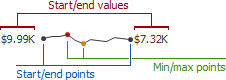 |
Sparkline Options | Description |
Show start/end values | Species whether or not to display sparkline start/end values within a grid cell. |
Sparkline view type | Defines the view type of a sparkline. Sparkline view types include Line, Area, Bar, and Win/Loss. |
Highlight min/max points | Specifies whether or not to highlight the minimum/maximum points of a sparkline. |
Highlight start/end points | Specifies whether or not to highlight the start/end points of a sparkline. |
See Also
Interactivity
This section describes features that enable interaction between the Grid and other dashboard items. These features include Master Filtering and Drill-Down.
The section consists of the following topics.
Master Filtering
The Dashboard allows you to use any data aware dashboard item as a filter for other dashboard items (Master Filter). To learn more, see the Master Filtering topic, which describes filtering concepts common to all dashboard items.
Configure Master Filters in the Designer
The Grid dashboard item supports filtering by rows.
When Master Filtering is enabled, you can click a grid row (or multiple rows by holding down the CTRL key) to make other dashboard items only display data related to the selected record(s).
|
To learn how to enable Master Filtering in the Designer, see the Master Filtering topic.
To reset filtering, use the Clear Master Filter button (the icon) in the grid's caption area, or the Clear Master Filter command in the grid's context menu.
|
Drill-Down
The built-in drill-down capability allows you to change the detail level of data displayed in dashboard items on the fly. To learn more about drill-down concepts common to all dashboard items, see the Drill-Down topic.
The Grid dashboard item supports drill-down for rows.
When drill-down is enabled, you can click a grid row to view the details.
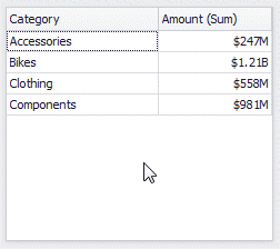 |
Anmerkung
When Master Filtering is enabled, you can view the details by double-clicking a grid row.
Drill-down requires that the Columns section contains several dimensions at the top, from the least detailed to the most detailed dimension.
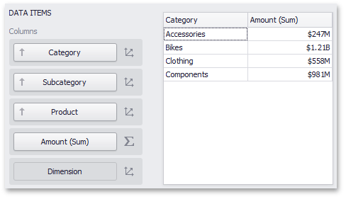 |
Anmerkung
In OLAP mode, you can perform drill-down for either a hierarchy data item or several dimension attributes.
To enable drill-down, click the Drill Down button in the Data Ribbon tab (or the button if you are using the toolbar menu).
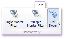 |
To return to the previous detail level (drill up), use the Drill Up button (the icon) within the grid's caption area, or the Drill Up command in the grid's context menu.
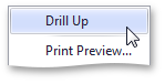 |
Conditional Formatting
The Grid dashboard item supports the conditional formatting feature that provides the capability to apply formatting to grid cells whose values meet the specified condition. This feature allows you to highlight specific cells or entire rows using a predefined set of rules. To learn more about conditional formatting concepts common for all dashboard items, see the Conditional Formatting topic.
Conditional Formatting Overview
The Grid dashboard item allows you to apply conditional formatting to data items providing data to the following column types:
Anmerkung
It is possible to use hidden measures to specify a condition used to apply formatting to visible values.
New appearance settings are applied to grid cells corresponding to the target dimension/measure values.
Create a Format Rule
To create a new format rule for the Grid's dimension/measure, do one of the following.
Click the Options button next to the required measure/dimension, select Add Format Rule and choose the condition.
|
Right-click the column header corresponding to the required measure/dimension and select Add Format Rule.
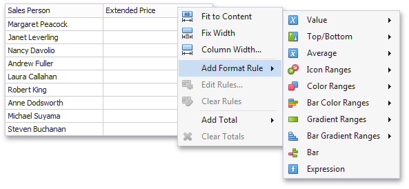 |
Use the Edit Rules dialog.
Depending on the selected format condition, the dialog used to create a format rule for Grid contains different settings. For instance, the image below displays the Greater Than dialog corresponding to the Value format condition.
|
The Apply to row check box allows you to specify whether to apply the formatting to the entire grid row.
Edit a Format Rule
To edit format rules for the current Grid dashboard item, use the following options.
Click the Edit Rules button in the Home ribbon tab or use corresponding item in the Grid context menu.
Click the menu button for the required data item and select Edit Rules. As an alternative, right-click the column header corresponding to the required data item and select Edit Rules.
All of these actions invoke the Edit Rules dialog containing existing format rules. To learn more, see Conditional Formatting.
Layout
The Grid dashboard item allows you to customize its layout in various ways. You can manage the width of grid columns, specify the visibility of column headers, enable cell merging, etc.
To do this, use the Layout and Column Width Mode groups in the Design Ribbon tab (or the corresponding buttons in the toolbar menu).
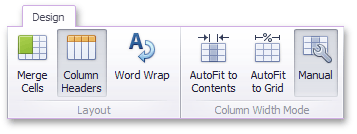 |
Column Width Modes
The Grid dashboard item allows you to manage column widths using different modes. Use buttons in the Column Width Mode group to manage the column width modes.
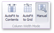 |
The following modes are available.
AutoFit to Contents
The grid adjusts columns to the minimum width required to completely display their content automatically. If the entire content cannot be displayed within the dashboard item, horizontal scrolling is enabled..
AutoFit to Grid
The grid adjusts the width of all columns to fit their content in an optimal way. If you are changing the size of the dashboard item, the width of columns is changed proportionally..
Manual
The grid allows you to adjust column widths manually.
In this mode, you can adjust the width of individual columns in the following ways.
Specify the width of the required column by dragging the right edge of the column header.
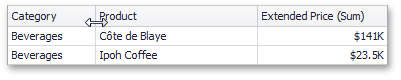 |
In this case, all columns preserve their relative size when the grid width is changed.
Specify the column width and fix it by right-clicking the required column header and selecting Fix Width.
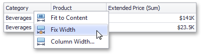 |
You can also specify the fixed column width by selecting Column Width... This invokes the Column Width window that allows you to specify the width of the column in characters.
 |
Fit the column width to its content and fix it by right-clicking the required column header and selecting Fit to Content.
Column Header
Use the Column Headers button to toggle column header visibility.
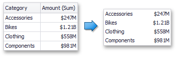 |
Cell Merging
The Grid allows you to merge neighboring cells with identical values . To do this, use the Merge Cells button.
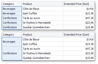 |
Anmerkung
Note that banded rows are not available when cell merging is enabled.
Word Wrapping
The word wrapping feature enables the capability to display cell content on multiple lines if the size of a dashboard item is insufficient to completely display the cell content on a single line.
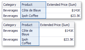 |
Anmerkung
The word wrapping feature is not in effect when the AutoFit to Contents column width mode is enabled.
Style
The Grid dashboard item allows you to specify various style settings.
To do this, use the Style group in the Design Ribbon tab (or the corresponding buttons in the toolbar menu).
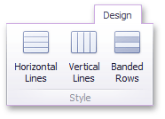 |
Grid Lines
The Horizontal Lines and Vertical Lines buttons control grid line visibility.
|
Banded Rows
To paint the background of odd and even rows differently, use the Banded Rows button.
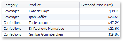 |
Anmerkung
Note that banded rows are not available when cell merging is enabled.
Pies
The Pie dashboard item displays a series of pies or donuts that represent the contribution of each value to a total.
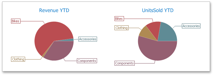 |
This section consists of the following subsections:
Describes how to supply the Pie dashboard item with data.
Describes features that enable interaction between the Pie dashboard item and other items.
Describes layout options of the Pie dashboard item.
Explains how to customize data labels and tooltips.
Describes how to select the style of pie charts.
Providing Data
The Dashboard Designer allows you to bind various dashboard items to data in a virtually uniform manner. To learn more, see the Binding Dashboard Items to Data topic.
The only difference is in the data sections that the required dashboard item has. This topic describes how to bind a Pie dashboard item to data in the Designer.
The Pie dashboard item has the following data sections.
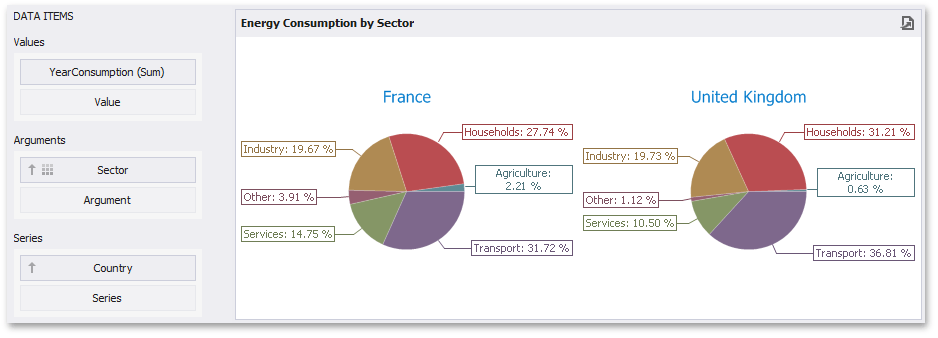 |
The Values section contains data items that define the share of pie segments.
The Arguments section contains data items that provide values used to label pie segments.
The Series section contains data items whose values are used to label pie charts.
Anmerkung
The Pie dashboard item allows you to manage coloring of their measures and dimensions. To learn more, see Coloring.
The Pie dashboard item provides the capability to transpose pie arguments and series. In this case, data items contained in the Arguments section are moved to the Series section, and vice versa.
To transpose the selected Pie dashboard item, use the Transpose button in the Home ribbon tab.
|
Interactivity
This section describes features that enable interaction between the Pie dashboard item and other items. These features include Master Filtering and Drill-Down.
The section contains the following topics.
Master Filtering
The Dashboard allows you to use any data aware dashboard item as a filter for other dashboard items (Master Filter). To learn more about filtering concepts common to all dashboard items, see the Master Filtering topic.
The Pie dashboard item supports filtering by argument or series values.
Filtering by Arguments
When filtering by arguments is enabled, you can click a pie segment to make other dashboard items only display data related to the selected argument value.
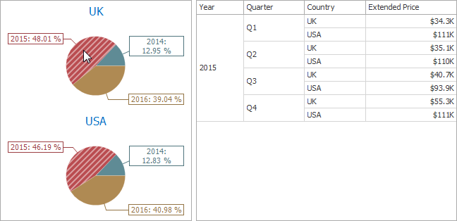 |
To enable filtering by arguments in the Designer, set the required Master Filter mode and click the Arguments button in the Data Ribbon tab (or the  button if you are using the toolbar menu).
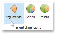 |
Filtering by Series
When filtering by series is enabled, you can click a pie to make other dashboard items display only data related to the selected pie.
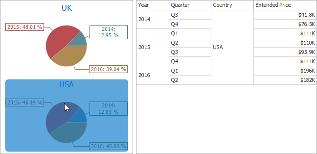 |
To enable filtering by series in the Designer, set the required Master Filter mode and click the Series button in the Data Ribbon tab (or the  button if you are using the toolbar menu).
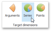 |
Filtering by Points
When filtering by points is enabled, you can click a single pie segment to make other dashboard items display only data related to the selected segment.
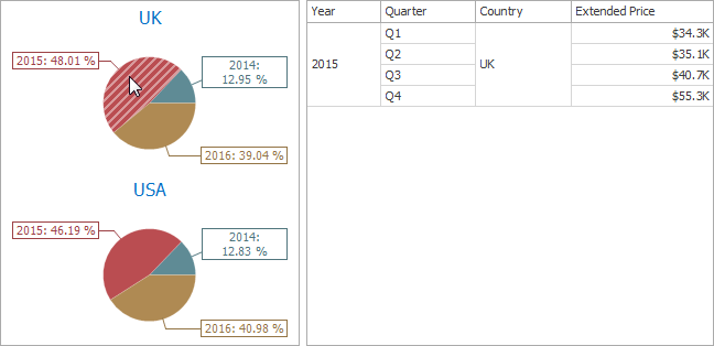 |
To enable filtering by points in the Designer, set the required Master Filter mode and click the Points button in the Data Ribbon tab.
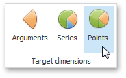 |
Reset Filtering
To reset filtering, use the Clear Master Filter button (the icon) in the caption area of the Pie dashboard item, or the Clear Master Filter command in the Pie's context menu.
Drill-Down
The built-in drill-down capability allows you to change the detail level of data displayed in dashboard items on the fly. To learn more about drill-down concepts common to all dashboard items, see the Drill-Down topic.
The Pie dashboard item supports drill-down on argument or series values.
Drill Down on an Argument
When drill down on an argument is enabled, you can click a pie segment to view a detail diagram for the corresponding argument value.
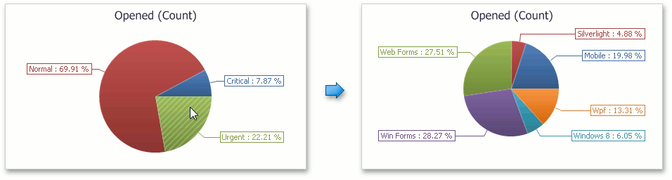 |
When Filtering by Arguments is enabled, you can view the details by double-clicking a pie segment.
Drill down on an argument requires that the Arguments section contains several data items, from the least detailed to the most detailed item.
 |
Anmerkung
In OLAP mode, you can perform drill-down for either a hierarchy data item or several dimension attributes.
To enable drill down on an argument, click the Drill Down button in the Data Ribbon tab (or the button if you are using the toolbar menu)...
|
...and the Arguments button (or the button if you are using the toolbar menu).
|
Drill Down on a Series
When drill down on a series is enabled, you can click a pie chart to view a detail diagram for the corresponding series value.
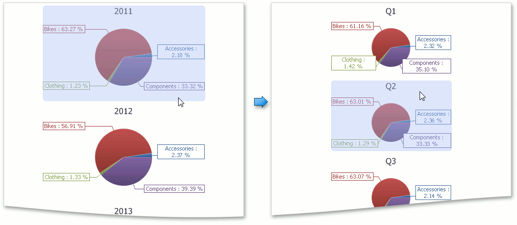 |
When Filtering by Series is enabled, you can view the details by double-clicking a pie chart.
Drill down on a series requires that the Series section contains several data items, from the least detailed to the most detailed item.
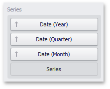 |
Anmerkung
In OLAP mode, you can perform drill-down for either a hierarchy data item or several dimension attributes.
To enable drill down on a series, click the Drill Down button in the Data Ribbon tab (or the button if you are using the toolbar menu)...
|
...and the Series button (or the button if you are using the toolbar menu).
|
Drill Up
To return to the previous detail level (drill up), use the Drill Up button (the icon) in the caption area of the Pie dashboard item, or the Drill Up command in the context menu.
Layout
The Pie dashboard item allows you to specify the number of columns or rows in which individual diagrams are arranged.
To control how pies are arranged, use the buttons in the Content Arrangement group of the Design Ribbon tab.
By default, the Auto Arrange option is enabled, which automatically resizes pies to fit within the dashboard item.
 |
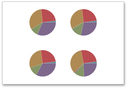 |
If you are using the toolbar menu, use the  button to enable this mode.
You can also specify the number of columns in which pies are arranged. Click the Arrange in Columns button (or the  button if you are using the toolbar menu) and specify the appropriate number in the Count field.
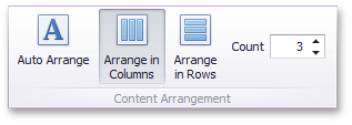 |
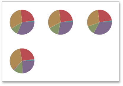 |
Similarly, you can arrange pies in a specific number of rows (use the  button if you are using the toolbar menu).
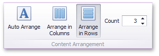 |
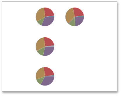 |
Labels
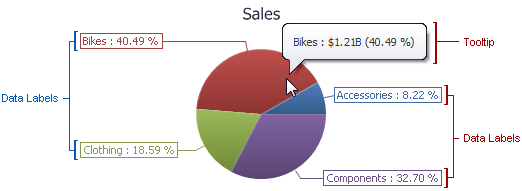 |
You can specify which information should be displayed within data labels and tooltips. To do this, use the Data Labels and Tooltips buttons in the Labels group of the Design Ribbon tab (or the  and
and  buttons if you are using the toolbar menu).
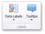 |
These buttons invoke a drop-down menu that is similar for both buttons. This menu allows you to specify which values are displayed within data labels or tooltips.
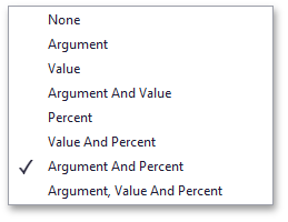 |
Style
The Pie dashboard item allows you to select whether diagrams should be painted as pies or donuts.
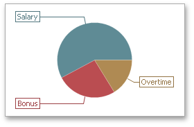 |
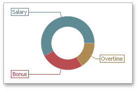 |
To select the diagram style, use the Pie and Donut buttons in the Style section of the Design Ribbon tab (or the  and
and  buttons if you are using the toolbar menu).
 |
Cards
The Card dashboard item displays a series of cards. Each card illustrates the difference between two values. This difference can be expressed as an absolute value, an absolute variation or a percentage variation.
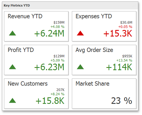 |
This section consists of the following subsections.
Provides information about how to supply the Card dashboard item with data.
Provides an overview of the Card dashboard item's capability to display the difference between two parameters.
Provides an overview of the Card dashboard item's capability to visualize data using sparklines.
Describes features that enable interaction between the Card dashboard item and other items.
Describes layout options of the Card dashboard item.
Providing Data
The Dashboard Designer allows you to bind various dashboard items to data in a virtually uniform manner. To learn more, see the Binding Dashboard Items to Data topic.
The only difference is in the data sections that the required dashboard item has. This topic describes how to bind a Card dashboard item to data in the Designer.
The Card dashboard item has the following data sections.
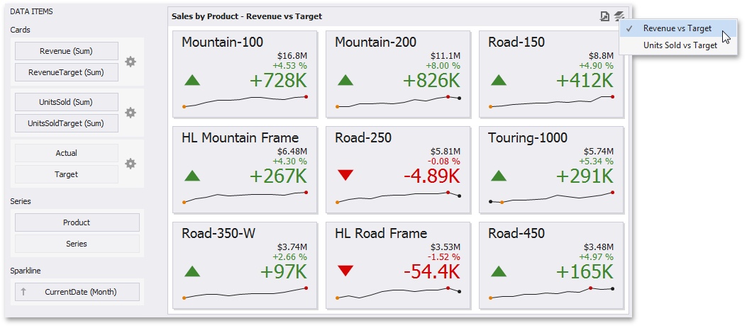 |
The Cards section contains data items used to calculate values displayed within cards. Data items are arranged in containers. Each data item container can hold two data items. The first item contains actual data and the second item (optional) contains target data. If both items are provided, cards show the difference between actual and target values.
You can fill several data item containers in the Cards section and use the Values drop-down menu to switch between the provided values. To invoke the Values menu, click the  icon in the dashboard item caption or use its context menu.
This drop-down menu is available if the Series section is not empty. Otherwise, a separate card is created for each data item container, and all cards are displayed simultaneously.
The Series section contains data items whose values are used to label cards.
The Sparkline section is used to provide a date-time dimension whose data will be used to visualize values using sparklines. To learn more, see the Sparkline topic.
Delta
Cards allow you to display the difference between the actual and target values of a particular parameter. This difference is called delta.
Delta is shown with a delta indicator (indicating whether the actual value is less than or greater than the target value) and delta values (representing this difference as an absolute value or a variation).
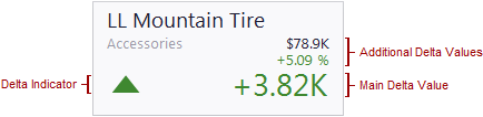 |
To customize settings that relate to the calculation and display of deltas, use the options buttons (the  icon) displayed next to the data item container in the Cards section of the DATA ITEMS pane.
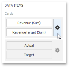 |
These buttons invoke the Card Settings dialog.
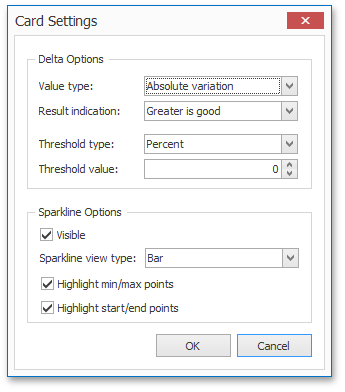 |
Use it to define the conditions for displaying delta indication, specify which delta values should be displayed, and introduce the comparison tolerance.
This dialog also allows you to control various sparkline options. To learn how to display a sparkline within a Card, see the Sparkline topic.
Delta Values
You can specify which values should be displayed within cards. Use the Value type combo box in the Card Settings window to select the value that will be displayed as the main delta value. Additional delta values are selected automatically.
Value Type | Result | |
Actual Value | Main: actual value Additional: absolute variation, percentage variation
| |
Absolute Variation | Main: absolute variation Additional: actual value, percentage variation
| |
Percentage Variation | Main: percentage variation Additional: actual value, absolute variation
| |
Percentage of Target | Main: percentage of target Additional: actual value, absolute variation
|
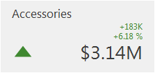
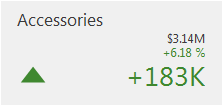
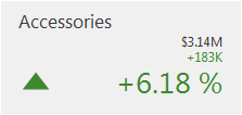
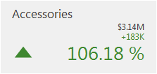
Delta Indication
You can specify the condition for displaying delta indication. To do this, use the Result indication combo box in the Card Settings window.
Condition | Result | |
Greater is Good | The 'good' indication is displayed if the actual value exceeds the target value; if the target value exceeds the actual value, the 'bad' indication is displayed.
| |
Less is Good | The 'bad' indication is displayed if the actual value exceeds the target value; if the target value exceeds the actual value, the 'good' indication is displayed.
| |
No Indication | Indication is not displayed.
| |
Warning if Greater | A warning is displayed if the actual value exceeds the target value; otherwise, no indication is displayed.
| |
Warning if Less | A warning is displayed if the target value exceeds the actual value; otherwise, no indication is displayed.
|
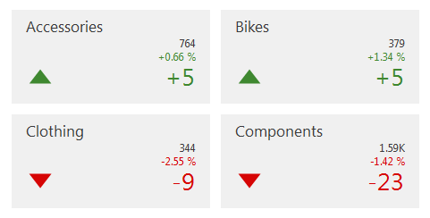
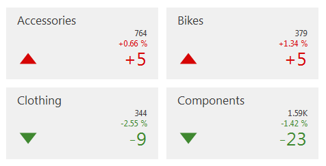
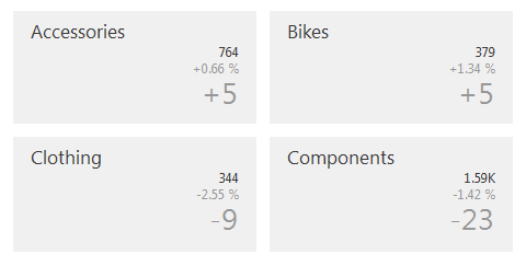
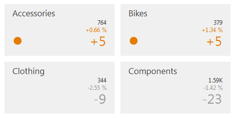
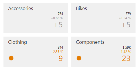
Comparison Tolerance
The comparison tolerance allows you to create more advanced conditions for displaying delta indication. For instance, you can specify that a specific indication should be displayed when the actual value exceeds the target value by 10% or by $2K.
Use the Threshold type combo box to select whether you wish to specify the comparison tolerance in percentage values or in absolute values. Then use the Threshold value box to specify the comparison tolerance.
Sparkline
Sparklines can be used in cards to visualize the variation of actual (or target) values over time.
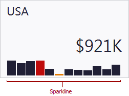 |
Data Binding Specifics
To display a sparkline within a card, provide a date-time dimension whose data will be used to visualize values over time.
Anmerkung
To learn how to provide actual (or target) values for a card, see the Providing Data topic.
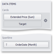 |
Note that if you have provided both actual and target values, a sparkline visualizes the actual value's variation over time.
Sparkline Options
You can control sparkline appearance settings using the Card Settings dialog. To invoke this dialog, click the options button (the icon) displayed next to the data item container.
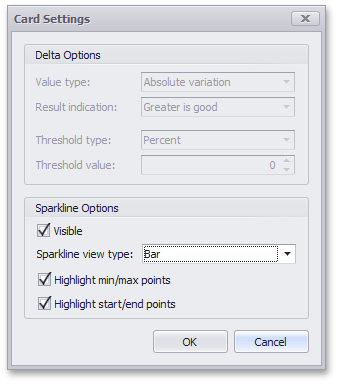 |
In this dialog, you can control various settings that affect how the sparkline is displayed within a card.
Sparkline Options | Description |
Visible | Specifies whether or not to show a sparkline within a card. |
Sparkline view type | Defines the view type of a sparkline. Sparkline view types include Area, Line, Bar and Win/Loss. |
Highlight min/max points | Specifies whether or not to highlight the minimum/maximum points of a sparkline. |
Highlight start/end points | Specifies whether or not to highlight the start/end points of a sparkline. |
Interactivity
This section describes features that enable interaction between the Card dashboard item and other items. These features include Master Filtering and Drill-Down.
The section contains the following topics.
Master Filtering
The Dashboard allows you to use any data aware dashboard item as a filter for other dashboard items (Master Filter). To learn more about filtering concepts common to all dashboard items, see the Master Filtering topic.
When Master Filtering is enabled, you can click a card (or multiple cards by holding down the CTRL key) to make other dashboard items only display data related to the selected card(s).
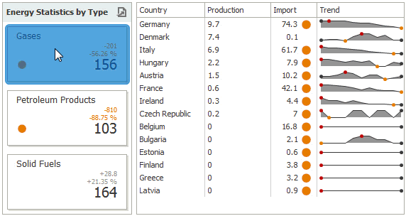 |
To learn how to enable Master Filtering in the Designer, see the Master Filtering topic.
To reset filtering, use the Clear Master Filter button (the icon) in the caption of the Card dashboard item, or the Clear Master Filter command in the Card's context menu.
|
Drill-Down
The built-in drill-down capability allows you to change the detail level of data displayed in dashboard items on the fly. To learn more about drill-down concepts common to all dashboard items, see the Drill-Down topic.
When drill-down is enabled, you can click a card to view the details.
|
When Master Filtering is enabled, you can view the details by double-clicking a card.
Drill-down requires that the Series section contains several dimensions, from the least to the most detailed dimension.
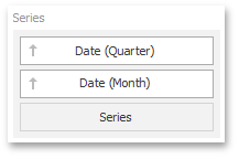 |
Anmerkung
In OLAP mode, you can perform drill-down for either a hierarchy data item or several dimension attributes.
To enable drill-down, click the Drill Down button in the Data Ribbon tab (or the button if you are using the toolbar menu).
|
To return to the previous detail level (drill up), use the Drill Up button (the icon) in the caption of the Card dashboard item, or the Drill Up command in the Card's context menu.
|
Layout
The Card dashboard item allows you to specify the number of columns or rows in which individual cards are arranged.
To control how cards are arranged, use the buttons in the Content Arrangement group of the Design Ribbon tab.
The Auto Arrange option is enabled by default, which automatically resizes cards to fit within the dashboard item.
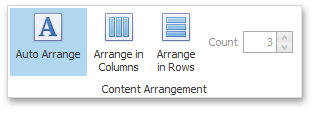 |
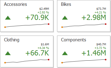 |
If you are using the toolbar menu, use the button to enable this mode.
You can also specify the number of columns in which cards are arranged. Click the Arrange in Columns button (or the button if you are using the toolbar menu) and specify the appropriate number in the Count field.
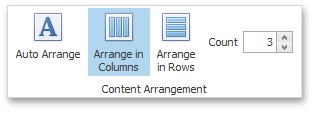 |
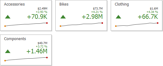 |
Similarly, you can arrange cards in a specific number of rows (use the button if you are using the toolbar menu).
 |
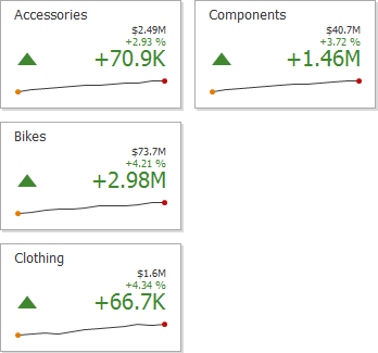 |
Gauges
The Gauge dashboard item displays a series of gauges. Each gauge can communicate two values - one with a needle and the other with a marker on the scale.
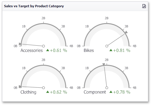 |
This section consists of the following subsections:
Provides information about how to supply the Gauge dashboard item with data.
Provides an overview of the Gauge dashboard item's capability to display the difference between two parameters.
Describes options that relate to the gauge scales.
Describes features that enable interaction between the Gauge dashboard item and other items.
Describes layout options of the Gauge dashboard item.
Provides information about how to specify the gauge style.
Providing Data
The Dashboard Designer allows you to bind various dashboard items to data in a virtually uniform manner. To learn more, see the Binding Dashboard Items to Data topic.
The only difference is in the data sections that the required dashboard item has. This topic describes how to bind a Gauge dashboard item to data in the Designer.
The Gauge dashboard item has the following data sections.
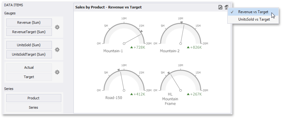 |
The Gauges section contains data items used to calculate values displayed by gauges. Data items are arranged in containers. Each data item container can hold two data items. The first item contains actual data and the second item (optional) contains target data. If both items are provided, gauges show the difference between actual and target values.
You can fill several data item containers in the Gauges section and use the Values drop-down menu to switch between the provided values. To invoke the Values menu, click the icon in the dashboard item caption.
Anmerkung
This drop-down menu is available if the Series section is not empty. Otherwise, a separate gauge is created for each data item container, and all gauges are displayed simultaneously.
The Series section contains data items whose values are used to label gauges.
Delta
Gauges allow you to display the difference between the actual and target values of a particular parameter. This difference is called delta.
Delta is shown with a delta indicator (indicating whether the actual value is less than or greater than the target value) and delta values (representing this difference as an absolute value or a variation).
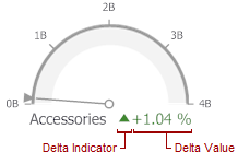 |
To customize settings that relate to the calculation and display of deltas, use the options buttons (the icon) displayed next to the data item container in the Gauges section of the DATA ITEMS pane.
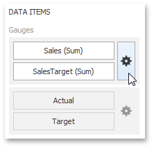 |
These buttons invoke the Gauge Options dialog.
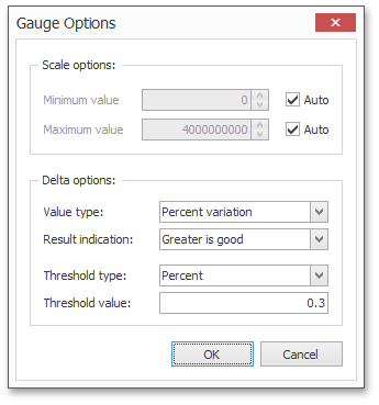 |
Use it to define the condition for displaying delta indication, specify which delta values should be displayed, and introduce the comparison tolerance.
Delta Values
You can specify which values should be displayed within gauges. Use the Value type combo box in the Gauge Options window to select the value that will be displayed as the delta value.
Value Type | Result | |
Actual Value |
| |
Absolute Variation |
| |
Percentage Variation |
| |
Percentage of Target |
|
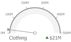
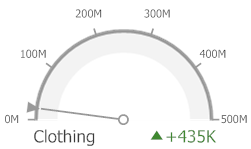
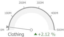
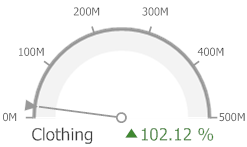
Delta Indication
You can specify the condition for displaying delta indication. To do this, use the Result indication combo box in the Gauge Options window.
Condition | Result | |
Greater is Good | The 'good' indication is displayed if the actual value exceeds the target value; if the target value exceeds the actual value, the 'bad' indication is displayed.
| |
Less is Good | The 'bad' indication is displayed if the actual value exceeds the target value; if the target value exceeds the actual value, the 'good' indication is displayed.
| |
No Indication | Indication is not displayed.
| |
Warning if Greater | A warning is displayed if the actual value exceeds the target value; otherwise, no indication is displayed.
| |
Warning if Less | A warning is displayed if the target value exceeds the actual value; otherwise, no indication is displayed.
|
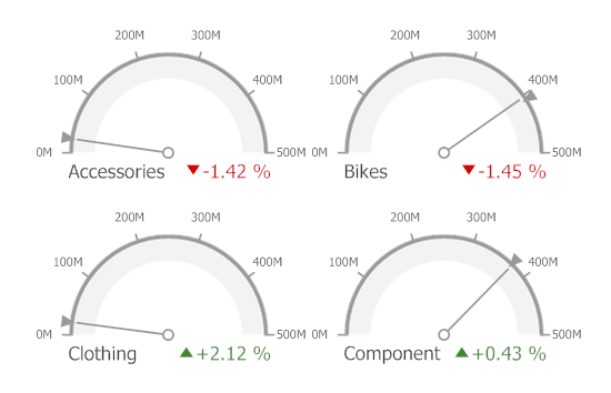
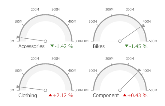
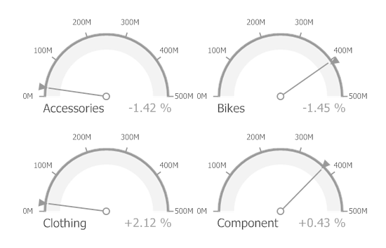
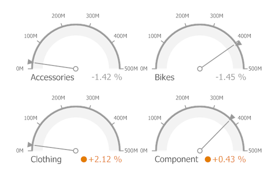
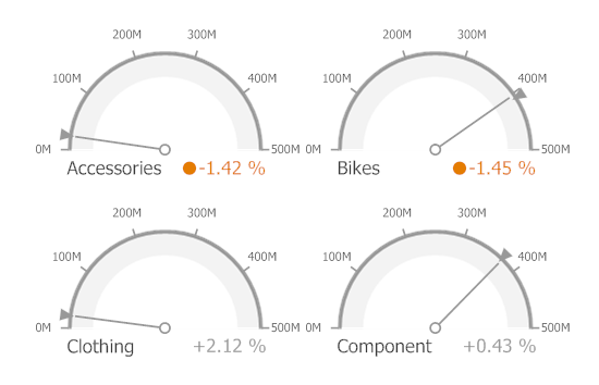
Comparison Tolerance
The comparison tolerance allows you to create more advanced conditions for displaying delta indication. For instance, you can specify that a specific indication should be displayed when the actual value exceeds the target value by 10% or by $2K.
Use the Threshold type combo box to select whether you wish to specify the comparison tolerance in percentage values or in absolute values. Then use the Threshold value box to specify the comparison tolerance.
Gauge Scale
By default, the Gauge dashboard item automatically determines the range of the gauge scales based on the values they display.
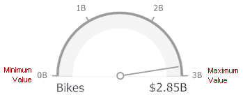 |
You can override this behavior and specify the maximum and minimum values on the scale.
To do this, invoke the Gauge Options window using the Options button displayed in the data item container in the Gauges section of the DATA ITEMS pane.
|
In the Gauge Options window, uncheck the Auto check box for the maximum or minimum value, and specify this value in the corresponding field.
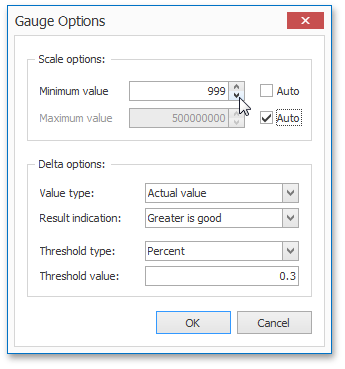 |
Interactivity
This section describes features that enable interaction between the Gauge dashboard item and other items. These features include Master Filtering and Drill-Down.
The section contains the following topics.
Master Filtering
The Dashboard allows you to use any data aware dashboard item as a filter for other dashboard items (Master Filter). To learn more about filtering concepts common to all dashboard items, see the Master Filtering topic.
When master filtering is enabled, you can click a gauge (or multiple gauges by holding down the CTRL key) to make other dashboard items only display data related to the selected gauge(s).
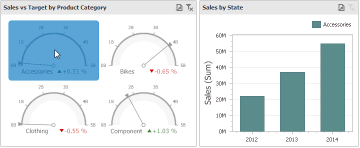 |
To learn how to enable master filtering in the Designer, see the Master Filtering topic.
To reset filtering, use the Clear Master Filter button (the icon) in the caption of the Gauge dashboard item, or the Clear Master Filter command in the Gauge’s context menu.
Drill-Down
The built-in drill-down capability allows you to change the detail level of data displayed in dashboard items on the fly. To learn more about drill-down concepts common to all dashboard items, see the Drill-Down topic.
When drill-down is enabled, you can click a gauge to view the details.
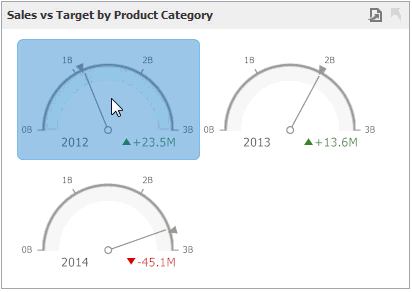 |
Anmerkung
When Master Filtering is enabled, you can view the details by double-clicking a gauge.
Drill-down requires that the Series section contains several dimensions, from the least detailed to the most detailed dimension.
|
Anmerkung
In OLAP mode, you can perform drill-down for either a hierarchy data item or several dimension attributes.
To enable drill-down, click the Drill Down button in the Data Ribbon tab (or the button if you are using the toolbar menu).
|
To return to the previous detail level (drill up), use the Drill Up button (the icon) in the caption of the Gauge dashboard item, or the Drill Up command in the Gauge's context menu.
|
Layout
The Gauge dashboard item allows you to specify the number of columns or rows in which individual gauges are arranged.
To control how gauges are arranged, use the buttons in the Content Arrangement group of the Design Ribbon tab.
By default, the Auto Arrange option is enabled, which automatically resizes gauges to fit within the dashboard item.
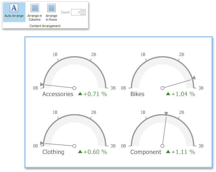 |
If you are using the toolbar menu, use the button to enable this mode.
You can also specify the number of columns in which gauges are arranged. Click the Arrange in Columns button (or the button if you are using the toolbar menu) and specify the appropriate number in the Count field.
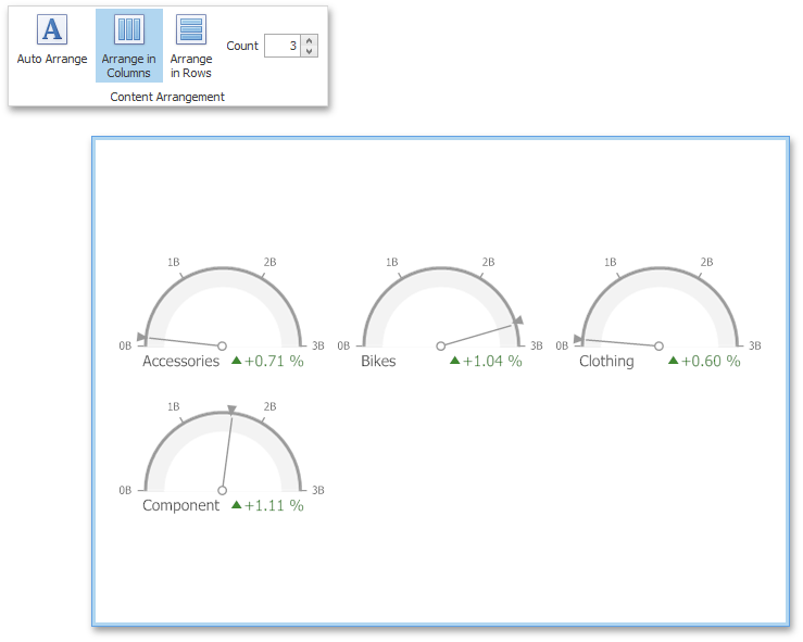 |
Similarly, you can arrange pies in a specific number of rows by clicking the Arrange in Rows button (or the button if you are using the toolbar menu).
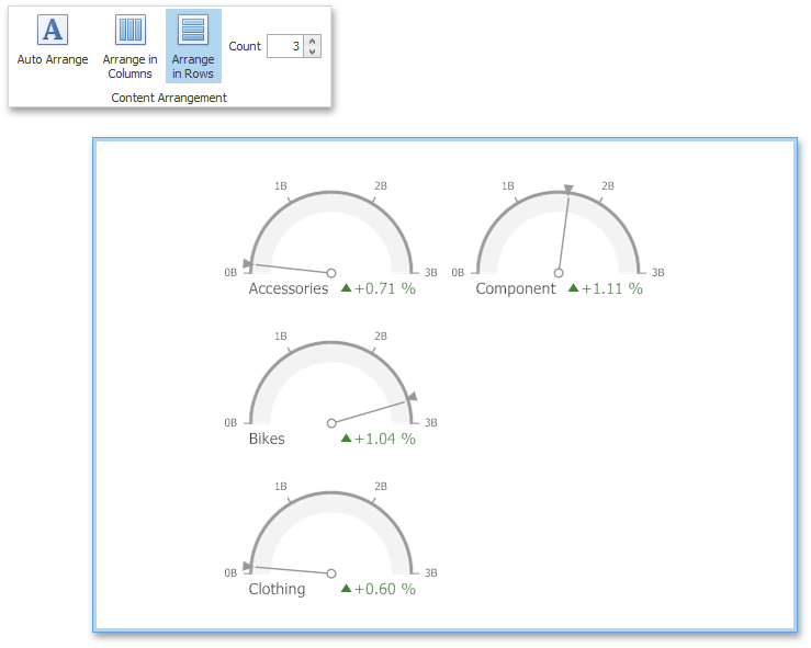 |
Style
The Gauge dashboard item allows you to select the gauge type.
The following types are supported.
Full Circular |
| |
Half Circular |
| |
Left-Quarter Circular |
| |
Right-Quarter Circular |
| |
Three-Fourths Circular |
| |
Linear Horizontal |
| |
Linear Vertical |
|
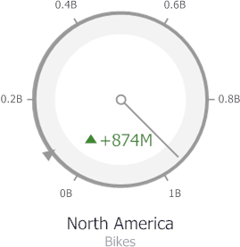
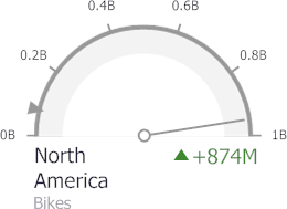
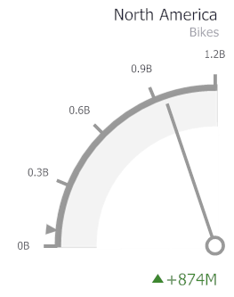
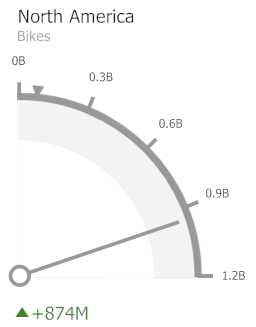
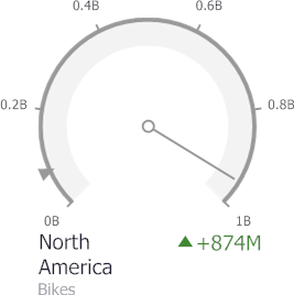
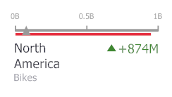
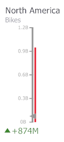
To select the gauge type, use the buttons in the Style group of the Design Ribbon tab.
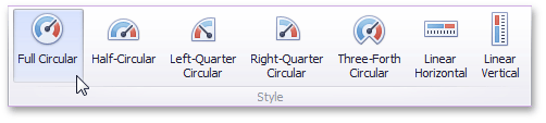 |
Pivot
The Pivot dashboard item displays a cross-tabular report that presents multi-dimensional data in an easy-to-read format.
 |
This section consists of the following subsections.
Explains how to supply the Pivot dashboard item with data.
Describes features that enable interaction between the Pivot and other dashboard items.
Describes the conditional formatting feature that provides the capability to apply formatting to cells whose values meet the specified condition.
Describes layout options of the Pivot dashboard item.
Providing Data
The Dashboard Designer allows you to bind various dashboard items to data in a virtually uniform manner. To learn more, see the Binding Dashboard Items to Data topic.
The only difference is in the data sections that the required dashboard item has. This topic describes how to bind a Pivot dashboard item to data in the Designer.
The Pivot dashboard item has the following data sections.
 |
The Values section contains data items used to calculate values displayed in the pivot table.
The Columns section contains data items whose values are used to label columns.
The Rows section contains data items whose values are used to label rows.
The Pivot dashboard item provides the capability to transpose pivot columns and rows. In this case, data items contained in the Columns section are moved to the Rows section and vice versa.
To transpose the selected Pivot dashboard item, use the Transpose button in the Home ribbon tab.
|
Interactivity
This section describes the features that enable interaction between the Pivot and other dashboard items. These features include Master Filtering.
Master Filtering
The Dashboard allows you to use any data-aware dashboard item as a filter for other dashboard items (Master Filter). To learn more, see the Master Filtering topic, which describes filtering concepts common to all dashboard items.
Data displayed in the Pivot dashboard item can be filtered by other master filter items. You can prevent the pivot from being affected by other master filter items using the Ignore Master Filters button on the Data Ribbon tab.
 |
Conditional Formatting
The Pivot dashboard item supports the conditional formatting feature that provides the capability to apply formatting to cells whose values meet the specified condition. This feature allows you to highlight specific cells or entire rows/columns using a predefined set of rules.
To learn more about conditional formatting concepts common for all dashboard items, see the Conditional Formatting topic.
Conditional Formatting Overview
The Pivot dashboard item allows you to use conditional formatting to measures placed in the Values section and dimensions placed in the Columns/Rows sections.
Anmerkung
Note that you can use hidden measures to specify a condition used to apply formatting to visible values.
New appearance settings are applied to pivot data cell or cells corresponding to column/row field values.
Create a Format Rule
To create a new format rule for the Pivot's dimension/measure, do one of the following.
Click the Options button next to the required measure/dimension, select Add Format Rule and choose the condition.
Use the Edit Rules dialog.
Depending on the selected format condition, the dialog used to create a format rule for Pivot contains different settings. For instance, the image below displays the Greater Than dialog invoked for the measure.
 |
This dialog contains the following settings specific to Pivot.
Intersection mode specifies the level on which to apply conditional formatting to pivot cells. The following levels are supported.
Auto - Identifies the default level. For the Pivot dashboard item, Auto identifies the First Level.
First Level - First level values are used to apply conditional formatting.
Last Level - The last level values are used to apply conditional formatting.
All Levels - All pivot data cells are used to apply conditional formatting.
Specific Level - Values from the specific level are used to apply conditional formatting.
If you specified the Intersection mode as Specific Level, use the Row dimension and Column dimension combo boxes to set the specific level.
The Apply to row and Apply to column check boxes allow you to specify whether to apply the formatting to the entire pivot row/column.
Anmerkung
If you are creating a new format rule for the dimension from the Columns/Rows section, the corresponding format condition dialog would not contain any Pivot specific settings.
Edit a Format Rule
To edit format rules for the current Grid dashboard item, use the following options.
Click the Edit Rules button in the Home ribbon tab or use corresponding item in the Pivot context menu.
Click the menu button for the required data item and select Edit Rules.
All of these actions invoke the Edit Rules dialog containing existing format rules. To learn more, see Conditional Formatting.
Layout
This topic describes how to control the pivot table layout.
Expanding and Collapsing Groups
If the Columns section or Rows section contains several data items, the pivot table column and row headers are arranged in a hierarchy, and make up column and row groups.
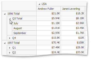 |
You can collapse and expand row and column groups using the  and
and  buttons.
Initial Collapsed State
The actual collapsed state of column and row groups in the Designer is not saved in the Dashboard. However, the Dashboard allows you to specify the collapsed state to be applied in the Viewer by default.
To do this, use the Initial State button in the Data Ribbon group (or the  button if you are using the toolbar menu).
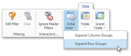 |
This button invokes a popup menu that allows you to select whether column and row groups should be collapsed or expanded by default in the Dashboard Viewer.
Choropleth Map
The topics in this section describe the features available in the Choropleth Map dashboard item.
The Choropleth Map dashboard item allows you to colorize the required areas in proportion to the provided values.
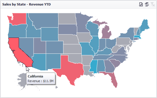 |
This section consists of the following subsections:
Describes how to use default dashboard maps or provide custom maps.
Explains how to supply the Choropleth Map dashboard item with data.
Details how to color map shapes based on the values provided.
Explains how to manage map zooming and scrolling.
Describes features that enable interaction between the Choropleth Map and other dashboard items.
Describes how to display additional information related to map shapes.
Explains the map legend and its options.
Providing Maps
This section explains how to use the default Dashboard maps, or provide custom maps.
Default Maps
The Dashboard has in-built set of default maps showing various parts of the world. The following maps are included.
World Countries - a world map.
Europe - a map of Europe.
Asia - a map of Asia.
North America - a map of North America.
South America - a map of South America.
Africa - a map of Africa.
USA - a map of the USA.
Canada - a map of Canada.
To select the required default map, use the Default Map button in the Open group of the Design ribbon tab (or click the  button if you are using the toolbar menu).
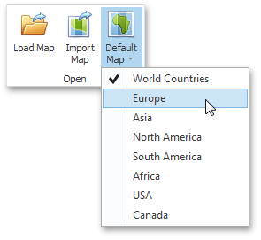 |
As an alternative, use the corresponding command in the map context menu.
Custom Maps
The Dashboard uses a Shapefile vector format to provide custom maps. Commonly, this format includes two file types.
.shp file - holds map shapes (points/lines/polygons).
.dbf file - contains attributes for each shape.
To open an existing shapefile, use the Load Map or Import Map button in the Ribbon, the corresponding menu button in the toolbar (the  or
or  button), or the command in the context menu (Load Map... or Import Map...).
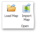 |
In the invoked dialog, locate the required .shp file.
Anmerkung
If the map is opened using the Load Map button, the dashboard XML definition will contain the path to a map shapefile. If the map is opened using the Import Map button, the dashboard XML definition will contain the map itself.
Attributes from the corresponding .dbf file located in the same directory will be included in the map automatically.
Map Attributes
After you select the default map or a custom map, you can view supplemental information (such as the name of the country, state, etc.). To do this, click the Options button next to the Attribute placeholder.
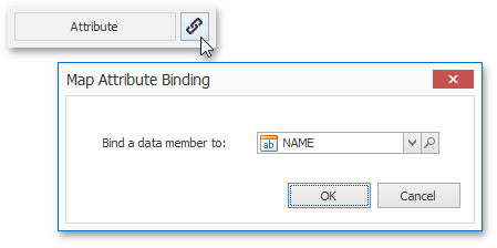 |
In the invoked Map Attribute Binding dialog, click Preview.
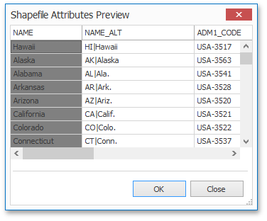 |
This table displays the available attributes for the current map. Each set of attribute values is related to a specific map shape.
To learn how to bind the map attribute to a data source field, see the Providing Data topic.
See Also
Providing Data
The Dashboard Designer allows you to bind various dashboard items to data in a virtually uniform manner. To learn more, see the Binding Dashboard Items to Data topic.
The only difference is in the data sections that the required dashboard item has. This topic describes how to bind a Choropleth Map dashboard item to data in the Designer.
The Choropleth Map dashboard item has the following data sections.
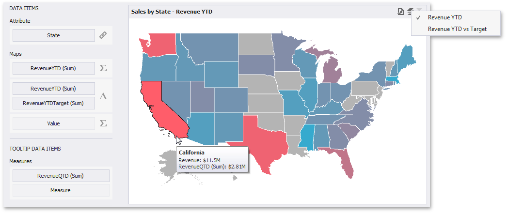 |
The Attribute data section allows you to associate map shapes with data source field values.
To associate map shapes with data source field values, drag-and-drop the required dimension to the data item's placeholder and select the required attribute in the Map Attribute Binding dialog. To invoke this dialog, click the Options button (the  icon) next to the Attribute placeholder.
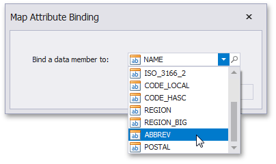 |
Select the required attribute and click OK.
The Maps data section contains data items whose values are used to color map shapes. Map shape colors vary based on the map type.
Click the Options button (the  or
or  icon depending on the map type) next to the Value placeholder and select the required map type in the invoked Choropleth Map Options dialog.
 |
If you select Value, the Choropleth map colors map shapes depending on the values provided. To learn more, see Map Coloring.
If you select Delta, the Choropleth map colors map shapes depending on the difference between two values. To learn how to specify delta indication settings, see Delta.
Anmerkung
You can fill several data item containers in the Maps section and use the Values drop-down menu to switch between the provided values. To invoke the Values menu, click the icon in the dashboard item caption.
The TOOLTIP DATA ITEMS area has the Measures data section that allows you to add supplementary content to the tooltips. Drag and drop the required measures to provide additional data.
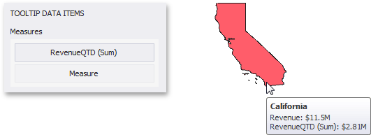 |
See Also
Map Coloring
The Choropleth Map dashboard item colors map shapes depending on the data provided.
For instance, you can visualize a sales amount or population density.
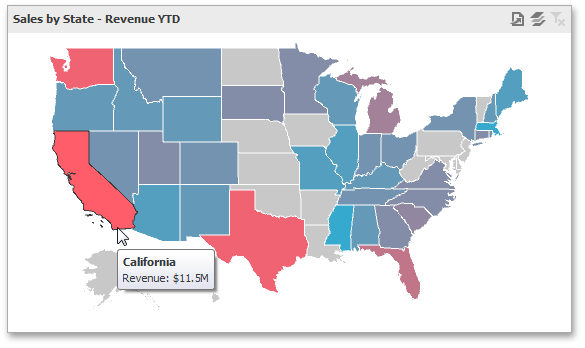 |
Palette and Scale Settings
The Choropleth Map automatically selects palette and scale settings to color map shapes.
If you need to customize these settings, click the Options button next to the data item that contains these values.
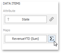 |
This invokes the Choropleth Map Options dialog.
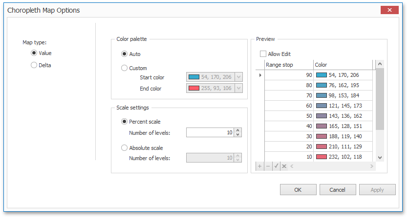 |
You can specify the following settings in this window.
Color palette - allows you to specify the start and end color of the palette.
Scale settings - specifies whether a percent scale or an absolute scale is used to define a set of colors. You can specify the number of levels that represent the number of colors used to color the map.
Preview is used to display a full set of palette colors generated based on the start/end colors and the number of levels. Use the Allow Edit check box to automatically change the generated colors or specify value ranges for each color.
To learn how to display a map legend, see Legend.
Also, the Choropleth Map allows you to visualize the difference between the actual and target values of a particular parameter. To learn more, see the Delta topic.
See Also
Delta
The Choropleth Map allows you to indicate the difference between the actual and target values of a particular parameter. This difference is called delta.
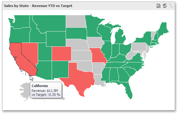 |
Delta Options
To specify delta indication settings, click the Options button next to the data item container.
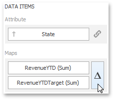 |
This invokes the Choropleth Map Options dialog. When the map type is set to Delta, this dialog contains the following settings.
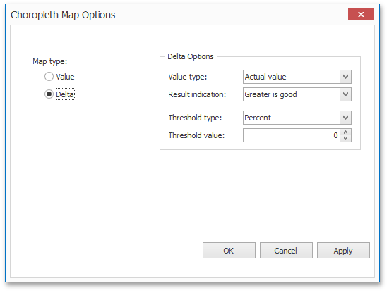 |
Value type
You can specify which values to display within map tooltips. Use the Value type combo box to select the value that will be displayed as the delta value.
Actual value | Absolute variation | Percent variation | Percent of target | ||||
|
|
|
|
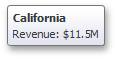
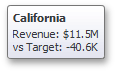
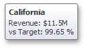
Result Indication
You can specify the condition that will be used to select the indicator color. To do this, use the Result indication combo box.
Greater is good | Less is good | Warning if greater | Warning if less | No indication | ||||||||||
|
|
|
|
|
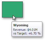
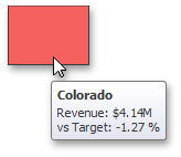
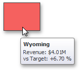
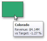
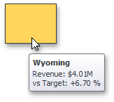
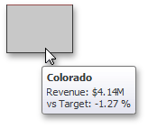
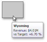
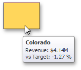
Threshold type and Threshold value
You can specify that a required indicator should only be displayed when the difference between the actual and target values exceeds a specified value. For instance, the actual value exceeds the target value by 10%, or by $2K.
Use the Threshold type combo box to select whether you wish to specify the threshold in percentage values or in absolute values. Then use the Threshold value box to specify the threshold value.
Map Navigation
The Choropleth Map dashboard item allows end-users to perform navigation actions such as zooming and scrolling.
The Dashboard Designer allows you to specify the initial zooming/scrolling state for the Choropleth map using the mouse.
You can disable the capability to scroll/zoom the map using the Lock Navigation button in the Design ribbon tab.
 |
Use the Full Extent button to display the entire map within the dashboard item.
Interactivity
This section describes the Master Filtering feature, which enables interaction between the Choropleth Map and other dashboard items.
Master Filtering
The Dashboard allows you to use any data aware dashboard item as a filter for other dashboard items (Master Filter).To learn more about the filtering concepts common to all dashboard items, see the Master Filtering topic.
When Master Filtering is enabled, you can click a shape (or multiple shapes by holding down the CTRL key) to make other dashboard items only display data related to the selected shape(s).
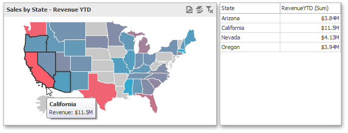 |
To learn how to enable Master Filtering in the Designer, see the Master Filtering topic.
To reset filtering, use the Clear Master Filter button (the icon) in the map's caption, or the Clear Master Filter command in the map's context menu.
|
Labels
A Choropleth map provides the capability to display titles within map shapes and allows you to manage what data to show in the shape tooltips.
To manage map titles and tooltips, click the Shape Labels button in the Design ribbon tab.
 |
This invokes the Shape Label Settings dialog.
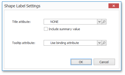 |
In this dialog, you can specify attributes whose values will be displayed within shapes and tooltips. Use the  button to preview the available attributes and their values for the current map.
Shape Titles
The Title attribute option allows you to select the attribute whose values are displayed within corresponding map shapes.
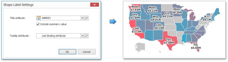 |
You can also use the Include summary value option to add summary values to shape titles.
Tooltips
The Choropleth Map dashboard item displays a tooltip that shows information related to a hovered shape.
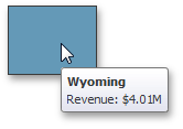 |
You can choose whether to use a binding attribute to display as the title of shape tooltips (the Use binding attribute option) or specify a custom attribute using the Tooltip attribute option.
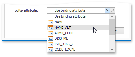 |
The Choropleth Map also allows you to add supplementary content to the tooltips using the TOOLTIP DATA ITEMS area. To learn more, see the Providing Data topic.
See Also
Legend
A legend is an element of a map that shows values corresponding to each color.
 |
Visibility
To display a legend within a map, use the Show Legend button in the Legend group of the Design Ribbon tab (or the  button if you are using the toolbar menu).
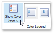 |
Position and Orientation
To specify the legend's position and orientation, select one of the predefined options from the gallery in the Design Ribbon tab.
 |
If you are using the toolbar menu, use the  button to invoke this gallery.
See Also
Geo Point Maps
The topics in this section describe various types of Geo Point Map dashboard items that allow you to place callouts, bubbles or pies on the map using geographical coordinates.
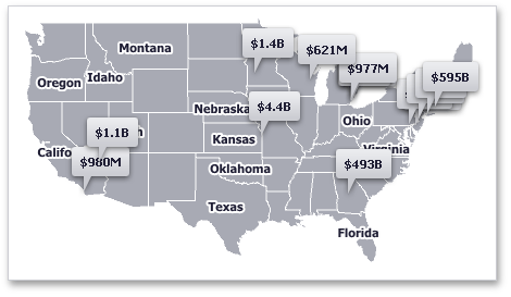 |
This section consists of the following subsections.
Lists the available types of Geo Point maps and its features.
Explains how to use the default dashboard maps or provide custom maps.
Describes how to supply Geo Point maps with data.
Describes the feature that enables grouping of neighboring map objects.
Explains how to manage map zooming and scrolling.
Describes features that enable interaction between the Geo Point maps and other dashboard items.
Describes how to display additional information related to map shapes.
Explains the available map legends and their options.
Map Types Overview
The Dashboard Designer allows you to create three types of Geo Point maps.
The Geo Point Map dashboard item allows you to place callouts on the map using geographical coordinates.
|
The Bubble Map dashboard item allows you to place bubbles on the map. Each bubble can represent data via its weight and color.
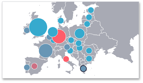 |
The Pie Map dashboard item allows you to display pies on the map. Each pie visualizes the contribution of each value to the total.
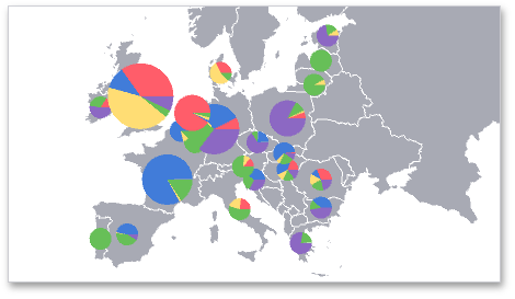 |
To create the required Geo Point Map dashboard item, use the Geo Point Maps button in the Home ribbon tab.
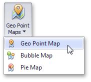 |
If you are using the toolbar menu, use the  button to select the required map type.
To learn how to provide maps for Geo Point Map dashboard items, see the Providing Maps topic. The Providing Data topic describes how to bind different types of Geo Point maps to data.
The following topics describe various Geo Point map capabilities.
Clustering - describes how to group neighboring map objects (callouts, bubbles or pies).
Interactivity - describes capabilities that enable interaction between the Geo Point maps and other dashboard items.
Legends - describes map legends that allow end-users to identify various map objects (bubbles, pies and pie segments).
Providing Maps
This section explains how to use the default Dashboard maps, or provide custom maps.
Default Maps
The Dashboard contains a set of default maps showing various parts of the world.
The following maps are included:
World Countries - a world map.
Europe - a map of Europe.
Asia - a map of Asia.
North America - a map of North America.
South America - a map of South America.
Africa - a map of Africa.
USA - a map of the USA.
Canada - a map of Canada.
To select the default map, use the Default Map button in the Design ribbon.
|
As an alternative, use the corresponding command in the map's context menu.
Custom Maps
The Dashboard uses a Shapefile vector format to provide custom maps. Commonly, this format includes two file types:
.shp file - holds map shapes (points/lines/polygons).
.dbf file - contains attributes for each shape.
To open an existing shapefile, use the Load Map or Import Map button in the Design Ribbon, or the command in the context menu (Load Map or Import Map).
|
In the invoked dialog, locate the required .shp file.
Anmerkung
If the map is opened using the Load Map button, the dashboard XML definition will contain the path to a map shapefile. If the map is opened using the Import Map button, the dashboard XML definition will contain the map itself.
Attributes from the corresponding .dbf file located in the same directory will automatically be included in the map.
After opening the shapefile, link database field with map attribute. See Providing Data.
Providing Data
This topic describes how to bind Geo Point Map dashboard items to data using the Dashboard Designer.
The Dashboard Designer allows you to bind various dashboard items to data in a virtually uniform manner (see Binding Dashboard Items to Data for details). The only difference is in the data sections that these dashboard items have.
Binding Overview
All Geo Point maps have the Lattitude and Longitude data sections, which accept dimensions used to provide geographic latitude and longitude, respectively.
To learn about the data sections provided by specific Geo Point maps, see the table below:
Geo Point Map
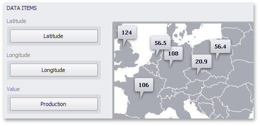 |
The Geo Point Map dashboard item provides the Value data section, which accepts values related to geographic points. These values are displayed within map callouts.
Bubble Map
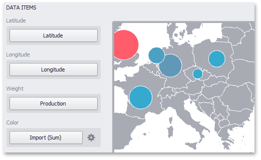 |
The Bubble Map dashboard item provides the Weight and Color data sections, which provide measures used to evaluate each bubble's weight and color, respectively.
The Bubble Map dashboard item automatically selects palette and scale settings used to color bubbles. To customize these settings, click the Options button next to the Color placeholder. This invokes the Color Scale Options dialog, which allows you to specify the palette and scale options. To learn how to use this dialog, see the Palette and Scale Settings paragraph in the Map Coloring topic.
Pie Map
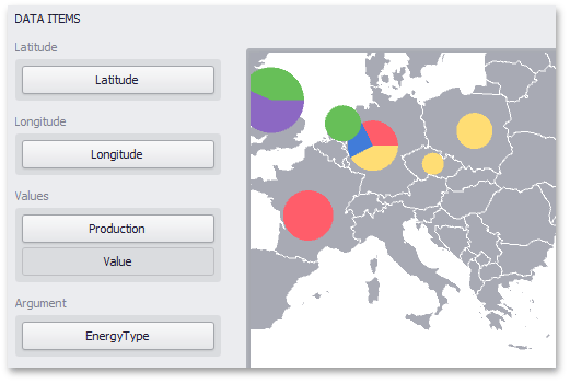 |
The Pie Map dashboard item provides the Values and Argument data sections. The Values section accepts measures used to calculate pie values. The Argument section allows you to provide data for pie arguments.
If you added a data item to the Argument section and several data items to the Values section, you can use the Values drop-down menu to switch between the provided values. To invoke the Values menu, click the icon in the map's caption or use the map's context menu.
Pie Options
The Pie Map dashboard item allows you to take into account the weight of pies. In this case, the relative sizes of the pies depend on the corresponding summary values. To enable this capability, use the Weighted Pies button in the Design ribbon tab. (Click the  button if you are using the toolbar menu.)
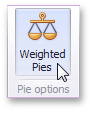 |
Tooltip Data Items
Geo Point maps allow you to add supplementary content to the tooltips using the TOOLTIP DATA ITEMS area. Drag and drop the required dimensions or measures to provide additional data.
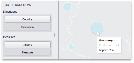 |
See Also
Clustering
When a Geo Point map contains a large number of objects (callouts, bubbles or pies), showing each object individually on the map is not useful. The Dashboard Designer provides the capability to group neighboring map objects. This feature is called Clustering.
For instance, the Geo Point Map dashboard item combines callouts to bubbles.
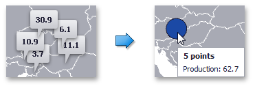 |
The Bubble Map and Pie Map dashboard items cluster bubbles/pies with other bubbles/pies.
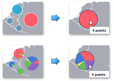 |
To enable clustering in the Designer, use the Enable Clustering button in the Data ribbon tab.
 |
If you are using the toolbar menu, use the  button.
Map Navigation
Geo Point maps allow you to perform navigation actions such as zooming and scrolling.
The Dashboard Designer allows you to specify the initial zooming/scrolling state for the Geo Point map using the mouse.
You can disable the capability to scroll/zoom the map using the Lock Navigation button in the Design ribbon tab.
|
Use the Full Extent button to display the entire map within the dashboard item.
Interactivity
This section describes the Master Filtering capability, which enables interaction between the Geo Point Map and other dashboard items.
Master Filtering
The Dashboard allows you to use any data aware dashboard item as a filter for other dashboard items (Master Filter). To learn more about the filtering concepts common to all dashboard items, see the Master Filtering topic.
When Master Filtering is enabled, you can click a callout/bubble/pie (or multiple callouts/bubbles/pies by holding down the CTRL key) to make other dashboard items only display data related to the selected callout(s)/bubble(s)/pie(s).
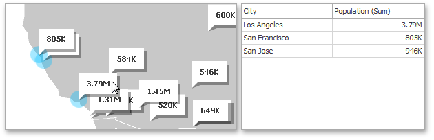 |
Anmerkung
When you select a clustered bubble or pie, master filtering is applied by all points that are clustered into this bubble/pie.
To learn how to enable Master Filtering in the Designer, see the Master Filtering topic.
To reset filtering, use the Clear Master Filter button (the icon) in the map's caption, or the Clear Master Filter command in the context menu.
|
Labels
Geo Point maps provide the capability to display titles within map shapes and allows you to add supplementary content to the callout/bubble/pie tooltips.
Shape Titles
To manage map titles, click the Shape Title button in the Design ribbon tab.
 |
This invokes the Shape Title Settings dialog.
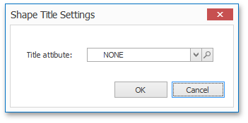 |
In this dialog, you can specify attributes whose values will be displayed within shapes. Use the button to preview the available attributes and their values for the current map.
The Title attribute option allows you to select the attribute whose values are displayed within corresponding map shapes.
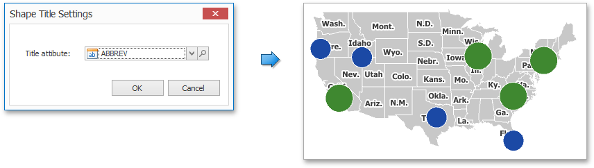 |
Tooltips
Geo Point maps also allow you to add supplementary content to the callout/bubble/pie tooltips using the TOOLTIP DATA ITEMS area. To learn more, see the Tooltip Data Items paragraph in the Providing Data topic.
Legends
Geo Point maps provide two types of legends used to identify map objects - color and weighted legends.
Color Legend
The color legend helps end-users identify which colors correspond to specific values.
|
To display a color legend within a map, use the Show Color Legend button in the Color Legend section of the Design Ribbon tab (or the button if you are using the toolbar menu).
|
To specify the legend's position and orientation, select one of the predefined options from the gallery in the Design Ribbon tab.
|
If you are using the toolbar menu, use the button to invoke this gallery.
Weighted Legend
The weighted legend allows end-users to identify values corresponding to specific bubble/pie sizes.
 |
To select the required weighted legend type, use the Show Weighted Legend button in the Weighted Legend section of the Design Ribbon tab (or the  button if you are using the toolbar menu).
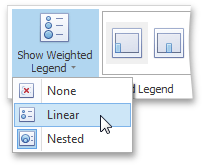 |
Anmerkung
The Pie Map dashboard item does not display the weighted legend if weighed pies are disabled.
To specify the legend's position, select one of the predefined options from the gallery in the Design Ribbon tab.
 |
If you are using the toolbar menu, use the button to invoke this gallery.
Range Filter
The Range Filter dashboard item allows you to apply filtering to other dashboard items. This item displays a chart with selection thumbs that allow you to filter out values displayed along the argument axis.
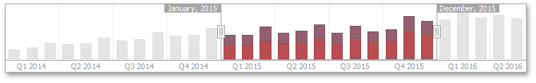 |
This section consists of the following subsections.
Explains how to supply the Range Filter dashboard item with data.
Enumerates and describes different types of series that can be displayed within the Range Filter dashboard item.
Describes features that enable interaction between the Range Filter and other dashboard items.
Providing Data
The Dashboard Designer allows you to bind various dashboard items to data in a virtually uniform manner. To learn more, see the Binding Dashboard Items to Data topic.
The only difference is in the data sections that the required dashboard item has. This topic describes how to bind a Range Filter dashboard item to data in the Designer.
The Range Filter dashboard item has the following data sections.
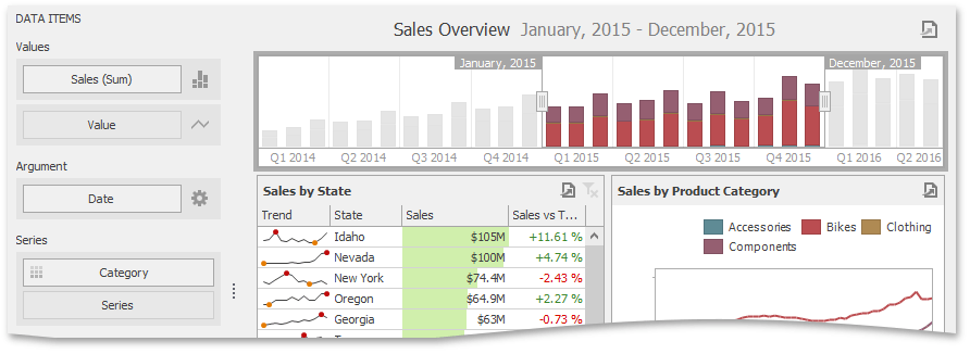 |
The Values section contains data items against which the Y-coordinates of data points are calculated.
The Arguments section contains data items that provide values displayed along the horizontal axis of the Range Filter. Filtering is performed based on these values.
The Series section contains data items whose values are used to create chart series.
Series
The Range Filter dashboard item supports various Line and Area series types.
To switch between series types in the Designer, click the options button next to the required data item in the Values section. In the invoked Series Type dialog, select the required series type and click OK.
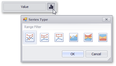 |
You can also do this using the buttons in the Series Type group of the Design Ribbon tab.
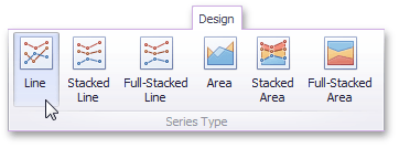 |
The Range Filter supports the following series types.
Line |
| |
Stacked Line |
| |
Full-Stacked Line |
| |
Area |
| |
Stacked Area |
| |
Full-Stacked Area |
|
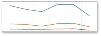
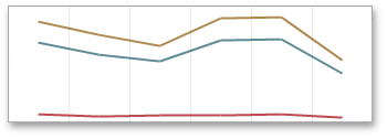
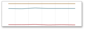
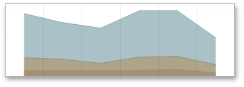
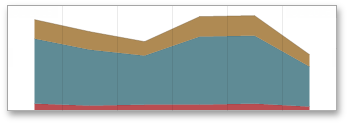
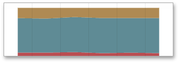
Interactivity
This section describes the features that enable interaction between the Range Filter and other dashboard items. These features include Master Filtering.
Master Filtering
The Dashboard allows you to use any data-aware dashboard item as a filter for other dashboard items (Master Filter). To learn more, see the Master Filtering topic, which describes filtering concepts common to all dashboard items.
Master filtering is always enabled for the Range Filter dashboard item. This Range Filter displays a chart with selection thumbs that allow you to filter out values displayed along the argument axis.
|
You can enable/disable ignoring of other master filter items using the Ignore Master Filters button in the Data Ribbon tab.
Predefined Periods
The Range Filter dashboard item allows you to add a number of predefined date-time periods that can be used to perform a selection (for instance, year-to-date or quarter-to-date). To add a period, click the Options button (the  icon) next to the Argument placeholder or use the Edit Periods button in the ribbon's Design tab. This invokes the Edit Periods dialog.
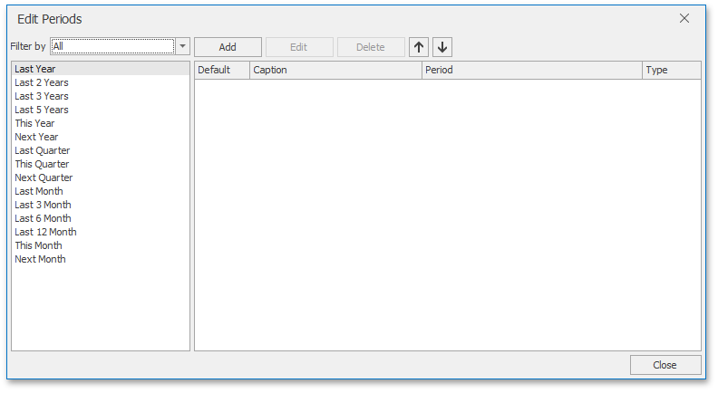 |
To add the predefined period from the left pane, double-click the required period.
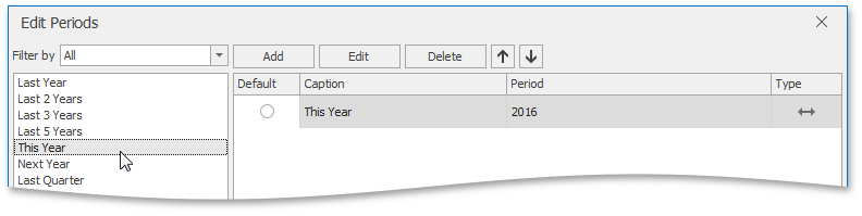 |
If necessary, you can customize the selected period by clicking the Edit button in the Edit Periods dialog. This invokes the Period dialog.
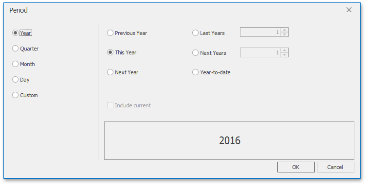 |
This dialog allows you to add the Year, Quarter, Month, Day or Custom periods with specific settings.
Image
The Dashboard Designer allows you to add images to a dashboard.
 |
You can either add a static image or you can use the Bound Image as a detail item along with the Master Filtering feature.
Image Types Overview
The Dashboard Designer allows you to create two types of an Image dashboard item.
The Image dashboard item allows you to add static images to a dashboard.
|
The Bound Image dashboard item can be bound to a set of images (for instance, stored in the database). You can use the Bound Image as a detail item along with the Master Filtering feature.
 |
To create the required Image dashboard item, use the Images button in the Home ribbon tab.
 |
Providing Images
Providing Static Images
To load an image to a dashboard item, use the Load Image and Import Image buttons in the Ribbon, the corresponding menu buttons in the toolbar (the  or
or  buttons, respectively), or commands in the context menu (Load Image... and Import Image..., respectively).
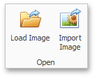 |
These commands invoke the Open dialog, which allows you to locate the desired image.
The Load Image command saves the path to the image in the dashboard definition, while the Import Image command saves the image itself.
Binding the Bound Image to Data
The Bound Image dashboard item provides the Attribute data section containing the corresponding placeholder.
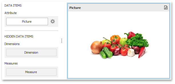 |
Specify the binding mode for the Bound Image by clicking the Options button (the icon) next to the Attribute placeholder. This invokes the following dialog.
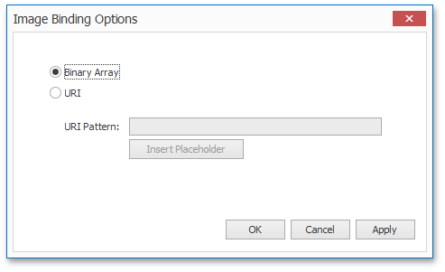 |
This dialog provides two options.
Binary Array - Use this mode if images are stored in the data source as byte arrays.
URI - Use this mode to locate images accessible by a predefined URI. In this case, the data source field should return strings that are parts of URIs to these images.
For instance, the URI pattern in the form below specifies the path to the folder containing the required images.
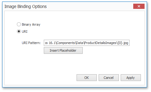 |
Data source field values will be inserted to the position of the {0} placeholder. Thus, the Bound Image maps the current dimension value with the image placed at the specified URI.
Interactivity
This section describes the features that enable interaction between the Bound Image and other dashboard items. These features include Master Filtering.
Master Filtering
The Dashboard allows you to use most of the data-aware dashboard items as a filter for other dashboard items (Master Filter). To learn more, see the Master Filtering topic, which describes filtering concepts common to all dashboard items.
Data displayed in the Bound Image dashboard item can be filtered by other master filter items. For instance, the Bound Image below shows an image corresponding to a category selected in the Grid dashboard item.
|
You can prevent the Bound Image from being affected by other master filter items using the Ignore Master Filters button on the Data ribbon tab.
|
Image Settings
You can customize the representation of Image and Bound Image dashboard items in different ways.
Image Alignment
To specify how the image is aligned within the dashboard item, use the Alignment group in the Design ribbon tab.
 |
Image Size Mode
You can specify the image size mode that defines how the image fits within the dashboard item.
To do this, use the Size Mode group in the Ribbon's Design tab.
 |
The following table illustrates each size mode in two cases: when the image is smaller than the dashboard item, and vice versa.
Size Mode | Image Smaller than Dashboard Item | Image Larger than Dashboard Item | Description | ||
Clip |
|
| The image is clipped if it is larger than the Image dashboard item. | ||
Stretch |
|
| The image is stretched or shrunk to fit the size of the Image dashboard item. | ||
Squeeze |
|
| If the dimensions of the Image dashboard item exceed those of the image it contains, the image is shown in full-size. Otherwise, the image is resized to fit the dimensions of the Image dashboard item. | ||
Zoom |
|
| The image is sized proportionally (without clipping), so that it best fits the Image dashboard item. If the aspect ratio of the Image dashboard item is the same as the aspect ratio of the image, it will be resized to fit into the Image dashboard item while maintaining its aspect ratio. Otherwise, the image will be resized in the closest fitting dimension (either the height or the width), and the remaining dimension will be resized while maintaining the image's aspect ratio. |


Text Box
Use the Text Box dashboard item to display rich text within a dashboard.
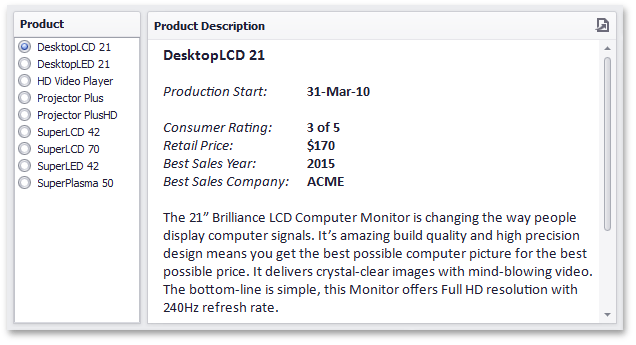 |
Editing Text
To edit text within the text box, click the Edit button in the Design ribbon tab, the corresponding item in the context menu, or double-click the Text Box dashboard item.
 |
This invokes the Edit Text window in which you can edit the text content and customize its formatting.
Providing Data
The Text Box dashboard item can be bound to data as other data-aware dashboard items. To do this, enable the editing mode and place the pointer in the Text Box item. Then, right-click the document and select Insert Field (or use the Insert Field button in the ribbon).
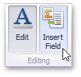 |
Then, click the Select value placeholder and select a required field from the list.
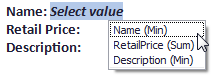 |
Click the Edit button again to leave the editing mode. You can use this Text Box as a detail item along with the Master Filtering feature to filter data according to the selected product.
Interactivity
You can prevent the Text Box from being affected by other master filter items using the Ignore Master Filters button on the Data ribbon tab.
|
Filter Elements
Filter elements represent a special type of dashboard item that allows you to apply filtering to other dashboard items.
Topics in this section:
Filter Elements Overview
The Dashboard Designer allows you to create three types of filter elements that provide the capability to filter other dashboard items.
To add the required filter element to the dashboard, use the Filter Elements button in the Home ribbon tab.
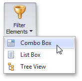 |
If you are using the toolbar menu, use the button to add the required filter element.
Combo Box
The Combo Box dashboard item allows end-users to select a value(s) from the drop-down list.
You can switch the combo box type in the ribbon Design tab.
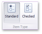 |
The Standard type allows end-users to select only a single value.
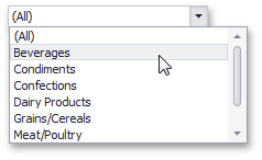 |
The Checked type allows end-users to select multiple values in the invoked drop-down list.
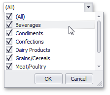 |
List Box
The List Box dashboard item allows end-users to select a value(s) from the list.
You can switch the list box type in the ribbon Design tab.
 |
The Checked type allows end-users to select multiple values in the list box.
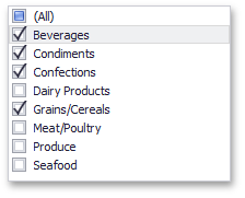 |
The Radio type allows end-users to select only a single value in the radio group.
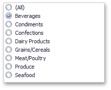 |
Tree View
The Tree View dashboard item displays values in a hierarchical way and allows end-users to expand/collapse nodes.
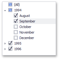 |
You can manage the initial expanded state of filter values using the Auto Expand button in the Design ribbon tab.
 |
Providing Data
This topic describes how to bind filter elements to data using the Dashboard Designer, or directly in code.
The Dashboard Designer allows you to bind various dashboard items to data in a consistent manner (see Binding Dashboard Items to Data for details), the only difference being the data sections that these dashboard items comprise.
Binding Overview
All filter elements provide the Dimensions data section, which accepts dimensions used to provide filter values.
To learn about the specifics of binding various filter elements to data, see the table below.
Dashboard Item | Data Sections | |
Combo Box |
The Combo Box filter element can contain several dimensions at the Dimensions data section. In this case, the drop-down list will contain combinations of dimension values. | |
List Box |
The List Box filter element can contain several dimensions at the Dimensions data section. In this case, the list will contain combinations of dimension values. | |
Tree View |
The Tree View filter element allows you to display dimension values in a hierarchical way. This can be the set of dimensions with different group intervals (for instance, Year/Quarter/Month) or the set of related dimensions (for instance, geographical data such as continents/countries/cities). |
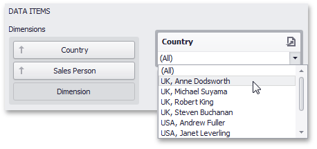
Interactivity
This section describes the filtering capabilities supported by filter elements. You can use filter elements to apply master filtering to other dashboard items or introduce hierarchical filtering by adding several connected filters.
Master Filtering
The Dashboard allows you to use any data aware dashboard item as a filter for other dashboard items (Master Filter). To learn more, see the Master Filtering topic, which describes filtering concepts common to all dashboard items.
Warnung
Note that filter elements do not support Master Filter selection modes. You can switch the selection mode by changing the type of the required filter element.
Depending on the filter element type, end-users can select a value(s) to make other dashboard items display only data related to the selected value(s).
 |
You can also create a set of related filter elements containing relevant filter values. For instance, in the image below, the State/Province filter element contains states related to the 'United States' value, while the City filter element contains cities related to the 'New York' value.
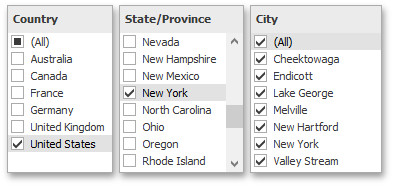 |
Disable the Ignore Master Filters option for the required filter element to allow applying filtering to this element.
Filter Element Options
Filter elements provide the capability to specify whether to enable the (All) option that allows you to apply filtering by all values. To do this, use the Show 'All' Value button in the Design ribbon tab.
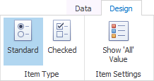 |
Note that this capability is supported by the Standard Combo Box and 'Radio' List Box filter elements.
Dashboard Item Group
The Dashboard provides the capability to combine dashboard items into a group. The dashboard item group serves two main purposes.
Combine dashboard items within the dashboard into a separate layout group.
Manage interaction between dashboard items within and outside the group.
For instance, you can combine related filter elements and data visualization dashboard items into a group.
|
Create a Group
To create a new group, use the Group button in the Home ribbon tab.
 |
You can add dashboard items to a group and manage item layout using drag-and-drop. To learn how to manage a group's caption, see the Dashboard Item Caption topic.
Anmerkung
Note that a dashboard item group cannot be added to another group.
Interactivity
The dashboard item group provides the capability to manage interaction between dashboard items within and outside the group.
The Master Filter button allows you to specify whether the current group allows you to filter external dashboard items using master filter items contained within the group. If this option is disabled, master filter items contained within the group can filter only dashboard items from this group.
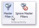 |
The Ignore Master Filters button allows you to isolate dashboard items contained within the group from being filtered using external master filter items.
UI Elements
The topics in this section describe the main elements of Dashboard Designer.
This section consists of the following topics.
Data Source Browser
The Data Source Browser allows you to navigate through dashboard data sources. It displays the data source structure and allows you to bind dashboard items to the required data source fields using drag-and-drop operations.
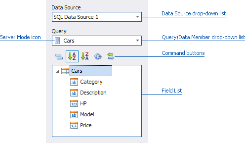 |
The Data Source Browser contains the following elements.
Data Source drop-down list - allows you to select the required data source.
Query/Data Member drop-down list - allows you to select the required query or data member.
The following Command buttons are available.
The  button groups fields by type.
The  and
and  buttons are used to switch the sort order.
The  button is used to refresh the Field List.
Field List displays data source fields. You can drag these fields to the data item placeholders to specify data binding.
The Data Source Browser identifies the following data field types.
Icon | Description |
 | Boolean |
 | Byte |
 | Date-time |
 | Numeric |
 | String |
 | Calculated field |
Data Items Pane
The DATA ITEMS pane is placed side-by-side with the Data Source Browser, and allows you to create and modify data binding using drag-and-drop operations.
To learn how to bind dashboard items to data source fields, see the Binding Dashboard Items to Data topic.
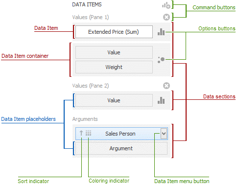 |
The DATA ITEMS pane can contain the following elements.
Data Item placeholder - used to create a data binding using drag-and-drop operations.
Data Item - identifies a data binding by mapping to a particular data source field. Each data item has the Data Item menu button, used to invoke a menu that allows you to perform various data shaping operations.
Data Section - corresponds to a particular dashboard item area or element.
Data Item container - used to provide data item sets (e.g., for calculating the difference between two measures). Data item containers have Options buttons that allow you to change specific dashboard item settings (e.g., to switch between chart series types or grid column types).
Sort indicator - shows the current sort order for the data item.
Coloring indicator - indicates whether coloring by hue is enabled for the data item.
Specific dashboard items have command buttons that allow you to perform various operations, for instance, to add a new pane to the chart dashboard item.
Print Preview
This section describes the Print Preview window, which displays the dashboard/dashboard item as it will appear on paper.
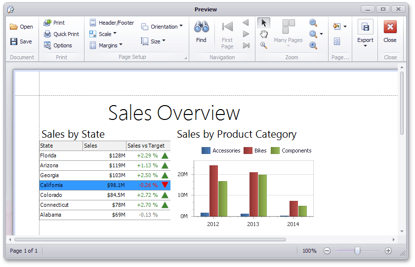 |
Specific Options
In the Print Preview, you can change the orientation and size of the printed page, specify the margins, scale the document, etc. To learn more, see Print Preview for WinForms.
You can also customize printing options specific to a dashboard/dashboard item. To do this, click the Options button in the Print group. When previewing the dashboard, the following Options dialog will be invoked.
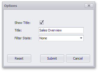 |
Show Title - Specifies whether or not to show the Chart caption as the printed document title.
Title - Specifies the title of the printed document.
Filter State - Specifies the filter state's location in the exported document.
This dialog can contain different options, depending on the dashboard item. To learn more, see the section for the required dashboard item.