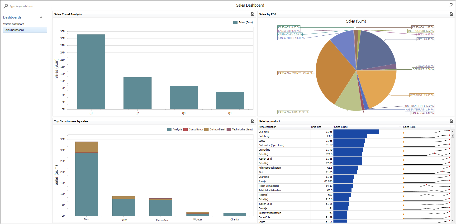
Dashboard Viewer
The Dashboard Viewer provides the capability to display dashboards.
Go to Reporting > Dashboards > View
 |
Data Presentation
The topics in this section provide information on how the Dashboard Viewer presents data.
Dashboard Parameters
This topic describes how to change dashboard parameter values.
Printing and Exporting
A Dashboard Viewer provides the capability to print or export both individual items of a dashboard, as well as the entire dashboard.
Dashboard Items
Dashboard items are used to present information in various ways.
Data Presentation
Data Presentation Basics
The Dashboard Viewer is used to present the configured dashboards. A wide range of dashboard items are used to display visual or textual information.
|
|
| |||
|
|
| |||
|
|
| |||
|
|
|
The Dashboard also provides the Image and Text Box dashboard items used to display static images or text within the dashboard.
The Dashboard Viewer enables interaction between various dashboard items. These features include Master Filtering and Drill-Down.
To learn more about the dashboard layout, see the Dashboard Layout topic.
Master Filtering
The Dashboard allows you to use any data-aware dashboard item as a filter for the entire dashboard (Master Filter). You can select elements in a Master Filter item (chart bars, pie segments, grid records, etc.) to filter data in the rest of the dashboard by the selected values.
 |
Master Filtering Modes
The Master Filter item supports two selection modes.
Multiple
Allows you to select multiple elements in the Master Filter item.
To clear the selection in the Master Filter item, use the Clear Master Filter button in the dashboard item's caption.
 |
Single
Allows you to select only one element in the Master Filter item. When this mode is enabled, the default selection will be set to a Master Filter element. You can change this selection, but cannot clear it.
To learn how to filter dashboard data via a specific dashboard item, refer to the section for this item in the topic Dashboard Items.
Drill-Down
Dashboard provides the drill-down feature, which allows you to change the detail level of data displayed in a dashboard item. This feature allows you to drill down to display the details, or drill up to view more general information.
 |
To learn how to drill down using a particular dashboard item, refer to the topic Dashboard Items.
To return to the previous detail level (drill up), use the Drill Up button (the  icon) in the dashboard item's caption, or the corresponding command in the context menu.
 |
Dashboard Layout
This topic describes the features related to the dashboard layout.
Dashboard Title
The Dashboard Title is located at the top of the Dashboard. The dashboard title can contain text or image content, elements selected in the master filter item and command buttons.
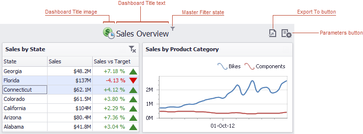 |
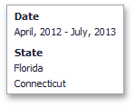
When you hover over the filter icon ( ), all master filters applied to the dashboard are displayed in the invoked popup.
 |
The dashboard title can contain the following command buttons.
Export To button (the
 icon) - allows you to print/export the dashboard. To learn more about printing and exporting, see the Printing and Exporting topic.
Parameters button (the
 icon) - allows you to modify dashboard parameter values. To learn how to modify dashboard parameter values, see the Requesting Parameter Values topic.
Dashboard Item Caption
Each dashboard item has a caption that is displayed at the top of this item. The caption contains static text along with other information, as well as command buttons.
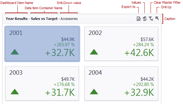 |
The caption of the Dashboard item contains the following information and buttons, depending on the dashboard item type.
Names |
|
Interactivity Information |
|
Command Buttons |
|
Resizing Dashboard Items
The Dashboard Viewer provides the capability to resize dashboard items.
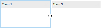 |
You can resize individual items (or a group of items) by dragging their edges.
Dashboard Parameters
Requesting Parameter Values
The Dashboard Viewer provides a built-in Dashboard Parameters dialog, which allows you to change dashboard parameter values. This dialog can be used to apply filtering to dashboard data.
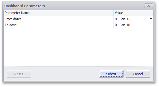 |
To invoke the Dashboard Parameters dialog in the Dashboard Viewer, click the Parameters button (the icon) in the dashboard title.
Select the required parameter values in the Dashboard Parameters dialog and click the Submit button to apply the changes.
To reset changes to the default values, click the Reset button.
Printing and Exporting
This section of the document explains how to print or export a dashboard and its items using the Dashboard Viewer functionality.
Printing and Exporting Dashboards
To print or export the entire dashboard, click the button in the dashboard title and choose the required action.
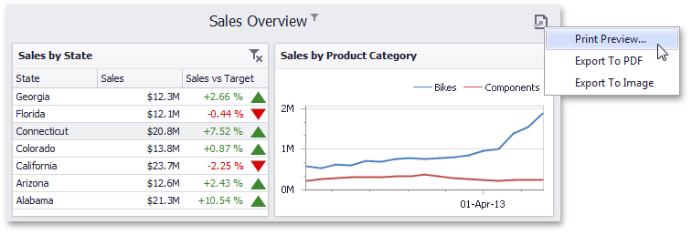 |
If you have selected the Print Preview... menu item, the Preview window will be invoked. Here, you can change the orientation and size of the printed page, specify the margins, scale the document, etc.
If you selected the Export to PDF or Export to Image menu item, the Export To... dialog will be invoked.
Export to PDF | Export to Image | ||
|
| ||
The following options are available.
Specify the required options in this dialog and click the Export button to export the dashboard. To reset changes to the default values, click the Reset button. | The following options are available.
Specify the required options in this dialog and click the Export button to export the dashboard. To reset the changes to the default values, click the Reset button. |
Anmerkung
The current state of the dashboard is maintained when it is printed (e.g., the dashboard layout, the scroll position of individual dashboard items and selections within master filter items).
Printing and Exporting Dashboard Items
To print or export a dashboard item, click the  button in the dashboard item caption area and choose the required action. Alternatively, you can use the dashboard item's context menu.
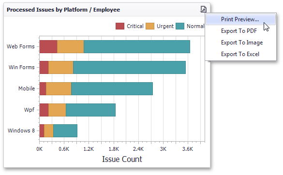 |
If you select the Print Preview... menu item, the Preview window will be invoked.
If you are exporting a dashboard item, an Export To... dialog specific to the exported dashboard item will be invoked.
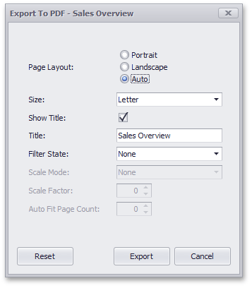
Export To PDF
The following options are available when exporting a dashboard item to a PDF.
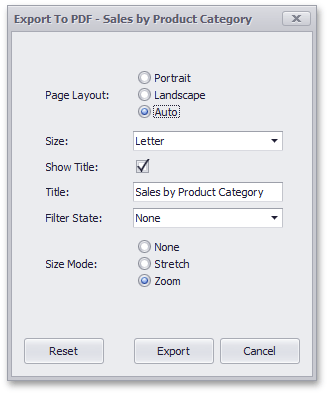 |
Page Layout - Specifies the page orientation used to export the dashboard item.
Size - Specifies the standard paper size.
Show Title - Specifies whether or not to apply the dashboard item caption to the exported document title.
Title - Specifies the title of the exported document.
Filter State - Specifies the filter state's location in the exported document.
Size Mode - Specifies the export size mode for the dashboard item.
Specify the required options in this dialog and click the Export button to export the Chart dashboard item. To reset changes to the default values, click the Reset button.
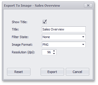
Export To Image
All dashboard items provide the same set of options when exporting them to an Image format. The following options are available.
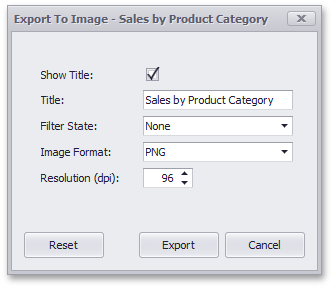 |
Show Title - Specifies whether or not to apply the dashboard item caption to the exported document title.
Title - Specifies the title of the exported document.
Filter State - Specifies the filter state's location in the exported document.
Image Format - Specifies the image format in which the dashboard item is exported.
Resolution (dpi) - Specifies the resolution (in dpi) used to export the dashboard item.
Specify the required options in this dialog and click the Export button to export the dashboard item. To reset changes to the default values, click the Reset button.
Export To Excel
Data visualized within all data-bound dashboard items can be exported to the required Excel format. The following options are available.
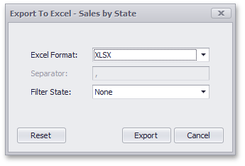 |
Excel Format - Specifies the Excel format in which the dashboard item is exported. You can use the XLSX, XLS or CSV formats.
Separator - Specifies the string used to separate values in the exported CSV document.
Filter State - Specifies the filter state's location in the exported file. For example, you can add the filter state to a separate sheet for the XLSX and XLS formats.
Anmerkung
Note that the Separate Sheet option is not available for the CSV format.
Specify the required options in this dialog and click the Export button to export the dashboard item. To reset changes to the default values, click the Reset button.
Anmerkung
When an individual dashboard item is printed, the entire item's content is reflected in the printed document regardless of the item's current scroll position.
Dashboard Items
The Dashboard provides a number of visualization elements (dashboard items) designed to effectively present visual or textual information in a dashboard.
This section describes the available dashboard items.
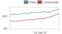
Chart
The topics in this section describe the Chart dashboard item, which visualizes data in XY-diagrams of different kinds - from the line and bar charts to candle stick and bubble charts.
Interactivity
This topic describes features that enable interaction between the Chart and other dashboard items. These features include Master Filtering and Drill-Down.
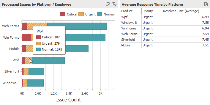
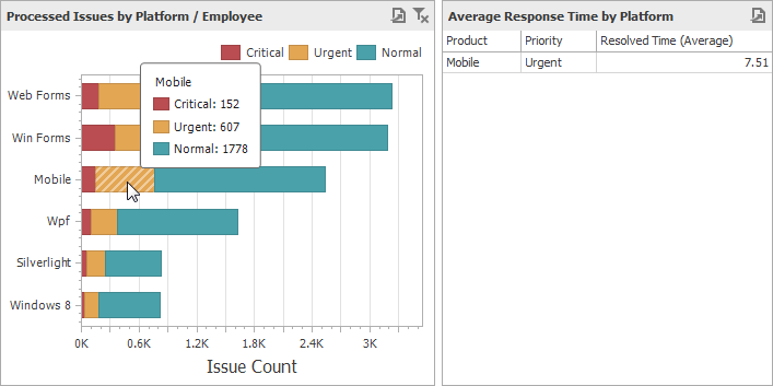
Master Filtering
The Dashboard allows you to use any data aware dashboard item as a filter for other dashboard items (Master Filter). To learn more about filtering concepts common to all dashboard items, see the Master Filtering topic.
The Chart dashboard item supports filtering by argument or series values.
Filtering by Arguments
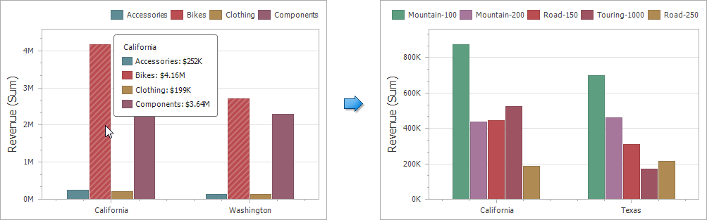
When filtering by arguments is enabled, you can click series points to make other dashboard items display only data related to selected argument values.
 |
Filtering by Series
When filtering by series is enabled, you can click a series point to make other dashboard items display only data related to the selected series.
 |
Filtering by Points
When filtering by points is enabled, you can click a individual point to make other dashboard items display only data related to the selected point.
 |
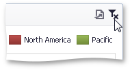
To reset filtering, use the Clear Master Filter button in the Chart's caption, or corresponding command in the Chart's context menu.
 |
Drill-Down
The built-in drill-down capability allows you to change the detail level of data displayed in dashboard items on the fly. To learn more, see Drill-Down.
The Chart dashboard item supports drill-down on argument or series values.
Drill Down on Arguments
When drill-down on arguments is enabled, you can click a series point to view a detail chart for the corresponding argument value.
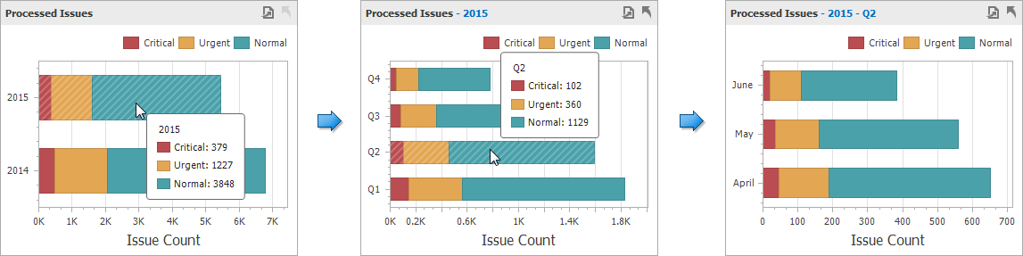 |
Anmerkung
When Filtering by Arguments is enabled, you can view the details by double-clicking a series point.
Drill-Down on a Series
When drill-down on a series is enabled, you can click a series point (or corresponding legend item) to view a detail chart for the corresponding series.
 |
Anmerkung
When Filtering by Series is enabled, you can view the details by double-clicking a series point.
To return to the previous detail level (drill up), use the Drill Up button within the Chart caption area, or the corresponding command in the Chart's context menu.
|
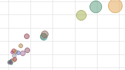
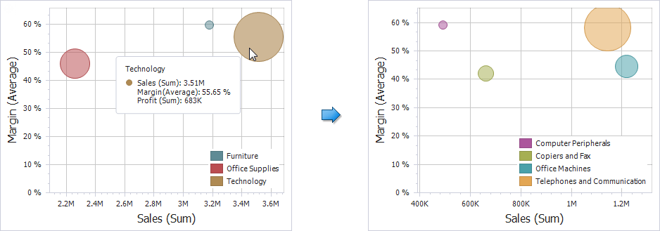
Scatter Chart
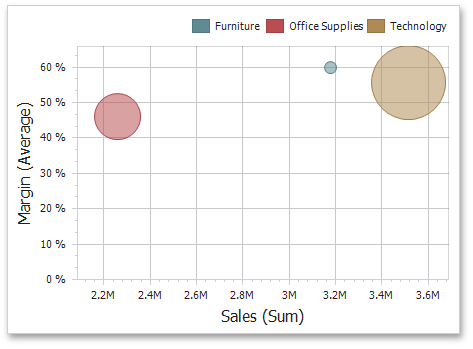
The topics in this section describe the Scatter Chart dashboard item, which visualizes summaries using numerical X/Y-axes and the size of data points.
Data Presentation Basics
The Scatter Chart dashboard item visualizes summaries using three dimensions: the X-axis, the Y-axis and the size of data points.
 |
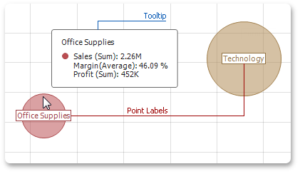
Point Labels and Tooltips
The Scatter Chart dashboard item can display point labels and tooltips that show information on data points. To see a tooltip, hover over the required point.
 |
Interactivity
This topic describes features that enable interaction between the Scatter Chart and other dashboard items. These features include Master Filtering and Drill-Down.
Master Filtering
The Dashboard allows you to use any data aware dashboard item as a filter for other dashboard items (Master Filter). To learn more about filtering concepts common to all dashboard items, see the Master Filtering topic.
When Master Filtering is enabled, you can click a point (or multiple points by holding down the CTRL key) to make other dashboard items only display data related to the selected point(s).
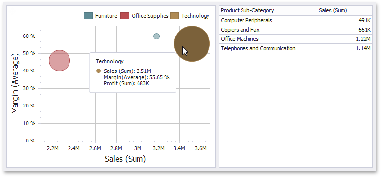 |
To reset filtering, use the Clear Master Filter button (the  icon) in the Chart's caption area, or the Clear Master Filter command in the Chart's context menu.
Drill-Down
The built-in drill-down capability allows you to change the detail level of data displayed in dashboard items on the fly. To learn more, see Drill-Down.
When drill-down is enabled, you can click a point to view the details.
 |
Anmerkung
When Master Filtering is enabled, you can view the details by double-clicking a point.
To return to the previous detail level (drill up), use the Drill Up button (the icon) within the Chart's caption area or the Drill Up command in the Chart's context menu.
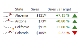
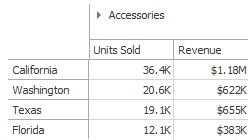
Grid
The topics in this section describe the Grid dashboard item, which displays data in a two-dimensional table.
Data Presentation Basics
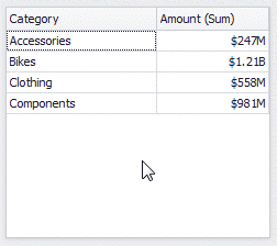
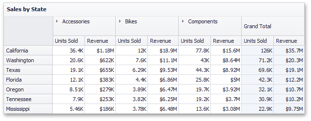
The Grid displays data in a two-dimensional table that supports four types of columns.
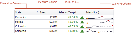 |
The dimension column displays values from the bound data item "as is".
The measure column displays summaries calculated from data in the bound data item.
The delta column, bound to two measures, calculates summaries for both measures, and displays the difference between these summaries.
The sparkline column visualizes the variation of summary values over time.
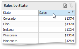
Sort Grid Rows
To sort records by a column's values and replace existing sort conditions that are applied to the current or other columns, click the target column's header until an Up or Down arrow icon is displayed within the header. The Up and Down arrows indicate ascending and descending sort orders, respectively.
 |
To sort records by a column's values while preserving existing sort conditions, click a column header while holding the SHIFT key until an Up or Down arrow icon is displayed within the header.
 |
To remove sorting by a column, click a column header while holding down the CTRL key.
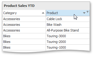
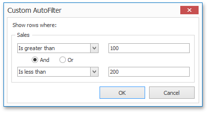
Filter Grid Data
To filter grid data, click the filter button (the  icon) and select the required filter value in the invoked filter dropdown list.
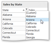 |
Click Custom to construct filter criteria involving up to two conditions. This will invoke the Custom AutoFilter dialog, allowing you to compare a column with one or two values.
 |
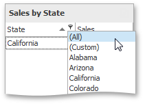
To clear the filter applied to a specific column, invoke the filter dropdown list and click All.
 |
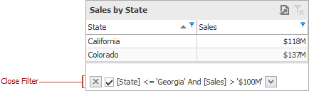
To clear all filter criteria, click the Close Filter button within the Filter Panel.
 |
Tooltips
A Grid dashboard item can display a tooltip when the mouse pointer is hovered over the bar in the measure column.
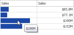 |
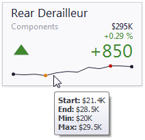
The tooltip shows the value in the measure column as text.
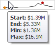
When the mouse pointer is hovered over the cell in the sparkline column, the tooltip can display start/end values and minimum/maximum values.
 |
Interactivity
This topic describes features that enable interaction between the Grid and other dashboard items. These features include Master Filtering and Drill-Down.
Master Filtering
The Dashboard allows you to use any data aware dashboard item as a filter for other dashboard items (Master Filter). To learn more about filtering concepts common to all dashboard items, see the Master Filtering topic.
When Master Filtering is enabled, you can click a grid row (or multiple rows by holding down the CTRL key) to make other dashboard items only display data related to the selected record(s).
|
To reset filtering, use the Clear Master Filter button (the icon) in the Grid's caption area, or the Clear Master Filter command in the Grid's context menu.
Drill-Down
The built-in drill-down capability allows you to change the detail level of data displayed in dashboard items on the fly. To learn more, see Drill-Down.
The Grid dashboard item supports drill-down for rows.
When drill-down is enabled, you can click a grid row to view the details.
 |
Anmerkung
When Master Filtering is enabled, you can view the details by double-clicking a grid row.
To return to the previous detail level (drill up), use the Drill Up button (the icon) within the Grid's caption area, or the Drill Up command in the Grid's context menu.
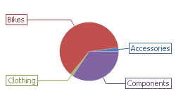
Pies
The topics in this section describe the Pie dashboard item, which displays a series of pies or donuts that represent the contribution of each value to a total.
Data Presentation Basics
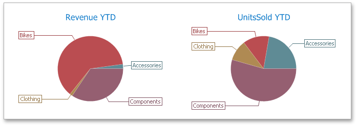
The Pie dashboard item displays a series of pies or donuts that represent the contribution of each value to a total.
 |
Tooltip
A Pie dashboard item can display a tooltip that shows information about the hovered pie segment.
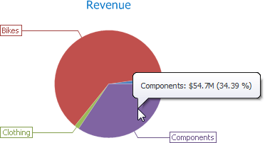 |
Interactivity
This topic describes features that enable interaction between the Pie and other dashboard items. These features include Master Filtering and Drill-Down.
Master Filtering
The Dashboard allows you to use any data aware dashboard item as a filter for other dashboard items (Master Filter). To learn more about filtering concepts common to all dashboard items, see the Master Filtering topic.
The Pie dashboard item supports filtering by argument or series values.
Filtering by Arguments
When filtering by arguments is enabled, you can click a pie segment to make other dashboard items only display data related to the selected argument value.
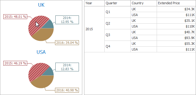 |
Filtering by a Series
When filtering by a series is enabled, you can click a pie to make other dashboard items display only data related to the selected pie.
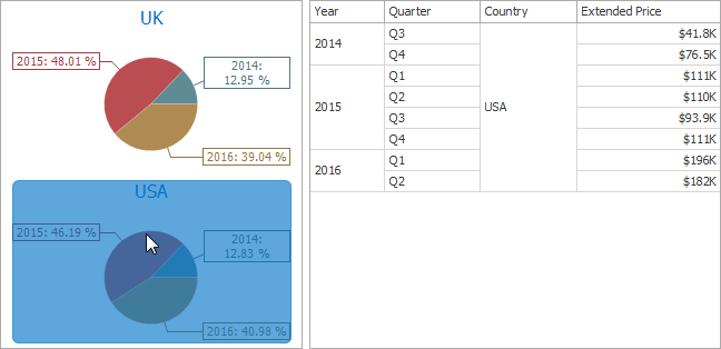 |
Filtering by a Points
When filtering by points is enabled, an end-user can click a single pie segment to make other dashboard items display only data related to the selected segment.
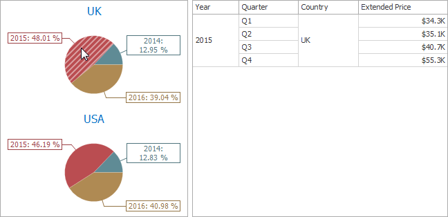 |
To reset filtering, use the Clear Master Filter button (the icon) in the caption area of the Pie dashboard item, or the Clear Master Filter command in the context menu.
Drill-Down
The built-in drill-down capability allows you to change the detail level of data displayed in dashboard items on the fly. To learn more, see Drill-Down.
The Pie dashboard item supports drill-down on argument or series values.
Drill Down on Arguments
When drill-down on arguments is enabled, you can click a pie segment to view a detail diagram for the corresponding argument value.
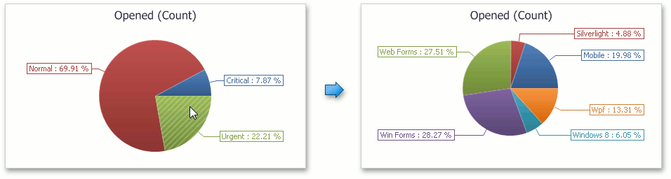 |
Anmerkung
When Filtering by Arguments is enabled, you can view the details by double-clicking a pie segment.
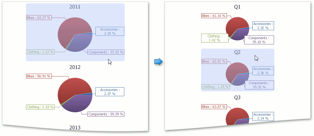
Drill-Down on a Series
When drill-down on a series is enabled, you can click a pie chart to view a detail diagram for the corresponding series value.
 |
Anmerkung
When Filtering by Series is enabled, you can view the details by double-clicking a pie chart.
To return to the previous detail level (drill-up), use the Drill Up button (the icon) in the caption area of the Pie dashboard item, or the Drill Up command in the context menu.
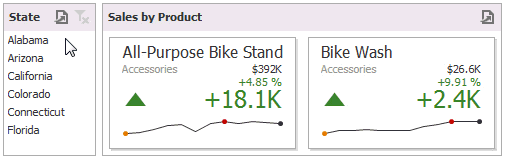
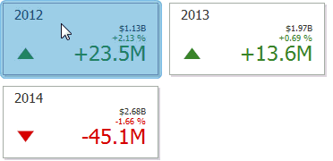
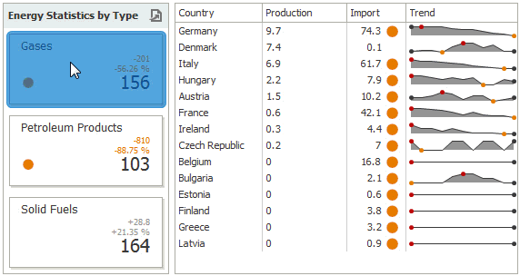
Cards
The topics in this section describe the Card dashboard item, which displays a series of cards. Each card can display a single value, or show the difference between two values.
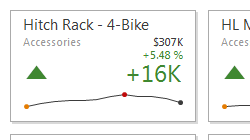
Data Presentation Basics
The Card dashboard item displays a series of cards. Each card illustrates the difference between two values. This difference can be expressed as an absolute value, an absolute variation or a percentage variation.
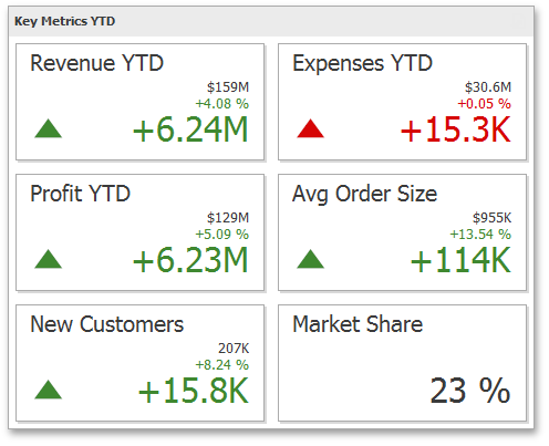 |
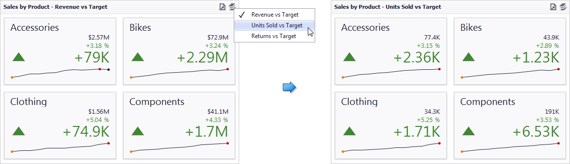
The Card dashboard item can illustrate this difference for various sets of values. You can switch between these sets using the Values button (the  icon) in the dashboard item caption area or in the context menu.
 |
Tooltip
A Card dashboard item can display a tooltip for cards containing a sparkline. When the mouse pointer is hovered over the sparkline, the tooltip can display start/end values and minimum/maximum values.
 |
Interactivity
This topic describes features that enable interaction between the Card and other dashboard items. These features include Master Filtering and Drill-Down.
Master Filtering
The Dashboard allows you to use any data aware dashboard item as a filter for other dashboard items (Master Filter). To learn more, see the Master Filtering topic, which describes filtering concepts common to all dashboard items.
When Master Filtering is enabled, you can click a card (or multiple cards by holding down the CTRL key) to make other dashboard items only display data related to the selected card(s).
 |
To reset filtering, use the Clear Master Filter button (the icon) in the caption area of the Card dashboard item, or the Clear Master Filter command in the context menu.
Drill-Down
The built-in drill-down capability allows you to change the detail level of data displayed in dashboard items on the fly. To learn more, see Drill-Down.
When drill-down is enabled, you can click a card to view the details.
|
Anmerkung
When Master Filtering is enabled, you can view the details by double-clicking a card.
To return to the previous detail level (drill up), use the Drill Up button (the icon) in the caption area of the Card dashboard item, or the Drill Up command in the context menu.
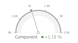
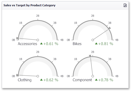
Gauges
The topics in this section describe the Gauge dashboard item, which displays a series of gauges.
Data Presentation Basics
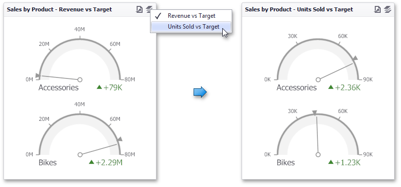
The Gauge dashboard item displays a series of gauges. Each gauge can communicate two values - one with a needle and the other with a marker on the scale.
 |
The Gauge dashboard item can illustrate the difference for various sets of values. You can switch between these sets using the Values button (the icon) in the dashboard item caption or in the context menu.
 |
Interactivity
This topic describes features that enable interaction between the Gauge and other dashboard items. These features include Master Filtering and Drill-Down.
Master Filtering
The Dashboard allows you to use any data aware dashboard item as a filter for other dashboard items (Master Filter). To learn more about filtering concepts common to all dashboard items, see the Master Filtering topic.
When Master Filtering is enabled, you can click a gauge (or multiple gauges by holding down the CTRL key) to make other dashboard items only display data related to the selected gauge(s).
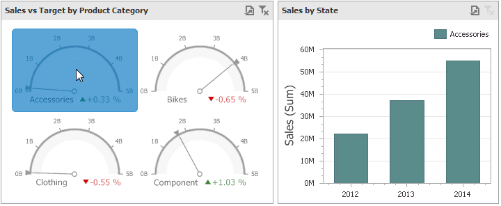 |
To reset filtering, use the Clear Master Filter button (the icon) in the caption area of the Gauge dashboard item, or the Clear Master Filter command in the context menu.
Drill-Down
The built-in drill-down capability allows you to change the detail level of data displayed in dashboard items on the fly. To learn more, see Drill-Down.
When drill-down is enabled, you can click a gauge to view the details.
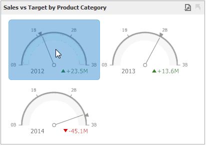 |
Anmerkung
When Master Filtering is enabled, you can view the details by double-clicking a gauge.
To return to the previous detail level (drill up), use the Drill Up button (the icon) in the caption area of the Gauge dashboard item, or the Drill Up command in the context menu.
Pivot
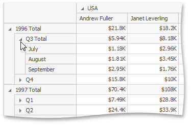
The Pivot dashboard item displays a cross-tabular report that presents multi-dimensional data in an easy-to-read format.
 |
Expanding and Collapsing Groups
To expand and collapse row and column groups, use the  and
and  buttons, respectively.
 |
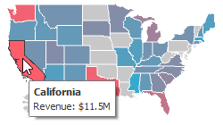
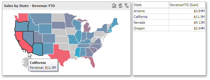
Choropleth Map
The topics in this section describe the Choropleth Map dashboard item, which colorizes the required areas in proportion to the provided values.
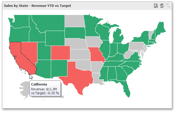
Data Presentation Basics
The Choropleth Map dashboard item colorizes map areas in the following two ways.
Based on the values provided.
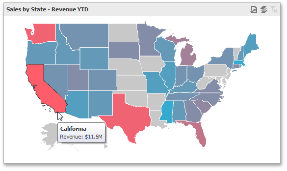 |
By indicating the difference between the actual and target values of a particular parameter.
 |
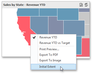
You can switch between the provided values using the Values button (the icon) in the map's caption area, or by using the context menu.
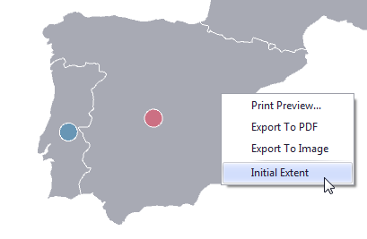
Map Zooming and Scrolling
You can use the mouse wheel to change the current zoom level for the map. To scroll the map, hold down the left mouse button and drag it.
To move to the initial zooming and scrolling state, select the Initial Extent menu item in the map's context menu.
 |
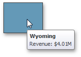
Tooltip
The Choropleth Map dashboard item can display a tooltip that shows information on a hovered area.
 |
Interactivity
This topic describes the features that enable interaction between the Choropleth Map and other dashboard items. These features include Master Filtering.
Master Filtering
The Dashboard allows you to use any data aware dashboard item as a filter for other dashboard items (Master Filter). To learn more about filtering concepts common to all dashboard items, see the Master Filtering topic.
When Master Filtering is enabled, you can click a shape (or multiple shapes by holding down the CTRL key) to make other dashboard items only display data related to the selected shape(s).
 |
You can also select multiple shapes in the following way.
Hold the SHIFT key and the left mouse button;
Drag the mouse pointer to mark an area that includes the desired shapes;
Release the left mouse button. All shapes within the area will be selected.
To reset filtering, use the Clear Master Filter button (the icon) in the Map's caption, or the Clear Master Filter command in the context menu.
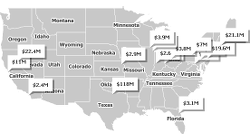
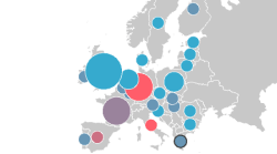
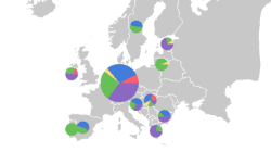
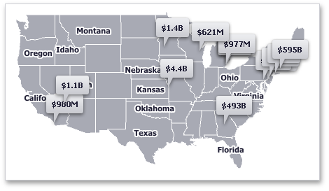
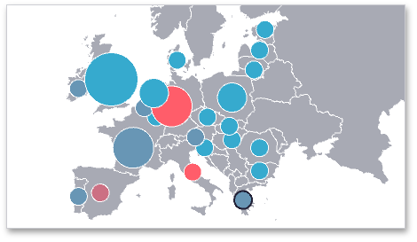
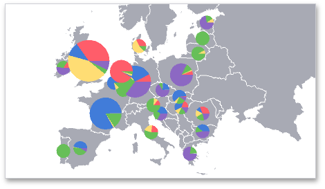
Geo Point Maps
The topics in this section describe various types of Geo Point Map dashboard items which places callouts, bubbles or pies on the map using geographical coordinates.
Data Presentation Basics
The Dashboard supports three types of Geo Point maps.
The Geo Point Map dashboard item allows you to place callouts on the map using geographical coordinates.
 |
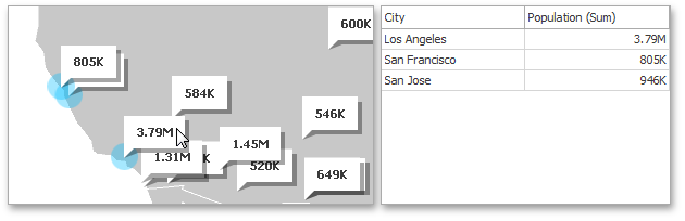
The Bubble Map dashboard item allows you to place bubbles on the map. Each bubble can represent data via its weight and color.
 |
The Pie Map dashboard item allows you to display pies on the map. Each pie visualizes the contribution of each value to the total.
 |
Map Zooming and Scrolling
You can use the mouse wheel to change the current zoom level for a map. To scroll the map, hold down the left mouse button and drag it.
To move to the initial zooming and scrolling state, click the Initial Extent menu item in the map's context menu.
 |
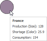
Tooltip
A Geo Point Map dashboard item can display a tooltip that shows information on a hovered callout/bubble/pie.
 |
Interactivity
This section describes the capabilities that enable interaction between Geo Point maps and other dashboard items. These capabilities include Master Filtering.
Master Filtering
The Dashboard allows you to use any data aware dashboard item as a filter for other dashboard items (Master Filter). To learn more about filtering concepts common to all dashboard items, see the Master Filtering topic.
When Master Filtering is enabled, you can click a callout/bubble/pie (or multiple callouts/bubbles/pies by holding down the CTRL key) to make other dashboard items only display data related to the selected callout(s)/bubble(s)/pie(s).
 |
You can also select multiple callouts/bubbles/pies in the following way.
Hold the SHIFT key and the left mouse button;
Drag the mouse pointer, to mark an area that includes the desired elements;
Release the left mouse button. All elements within the area will be selected.
To reset filtering, use the Clear Master Filter button (the icon) in the Map's caption area, or the Clear Master Filter command in the context menu.
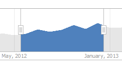
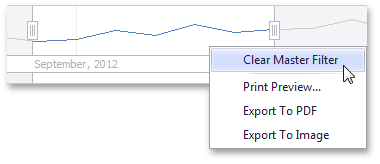
Range Filter
The Range Filter dashboard item allows you to apply filtering to other dashboard items. This item displays a chart with selection thumbs that allow you to filter out values displayed along the argument axis.
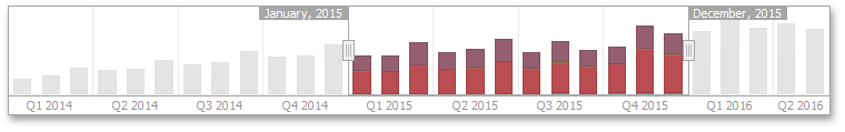 |
To reset filtering, use the Clear Master Filter command in the context menu.
 .
.
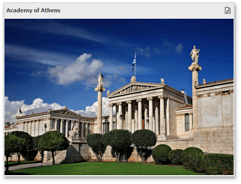
Image
The Image dashboard item is used to display static images within a dashboard.
 |
Text Box
The Text Box dashboard item is used to display rich text within a dashboard.
 |
Filter Elements
Filter elements provide the capability to filter other dashboard items.
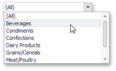
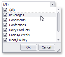
Combo Box
The Combo Box dashboard item allows you to select a value(s) from the drop-down list.
The Standard type allows you to select only a single value.
 |
The Checked type allows you to select multiple values in the invoked drop-down list.
 |
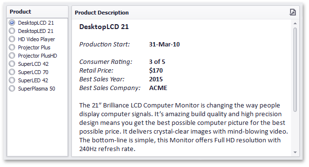
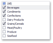
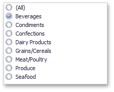
List Box
The List Box dashboard item allows you to select a value(s) from the list.
The Checked type allows you to select multiple values in the list box.
 |
The Radio type allows you to select only a single value in the radio group.
 |
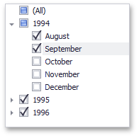
Tree View
The Tree View dashboard item displays values in a hierarchical way and allows you to expand/collapse nodes.
 |