Widget configurations
On the Widget configurations overview page, you can consult, create, edit, clone and delete widget configurations.
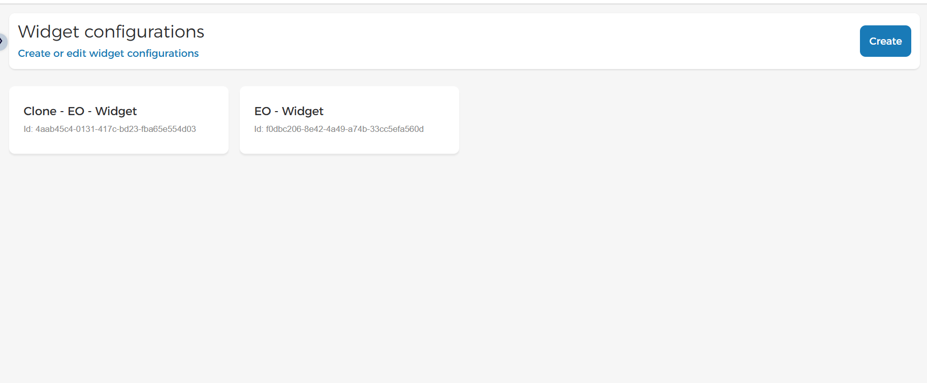 |
Click a widget configuration to view or update its settings.
Create widget
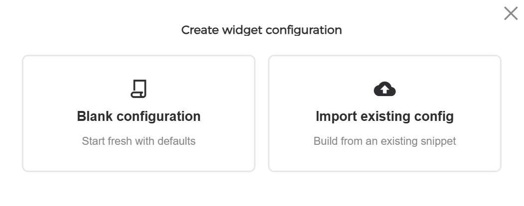
On the page widget configuration , click Create in the top-right of the page.
 |
In the resulting pop-up, you can choose to either create a new widget from scratch or import the existing widget configuration.
 |
Import existing configuration
To create a widget configuration from an existing widget, click Import existing configuration. In the resulting pop-up, paste the complete <enviso-ticket-widget> element from your current website.
Before applying the configuration, you can review and edit the imported widget settings.
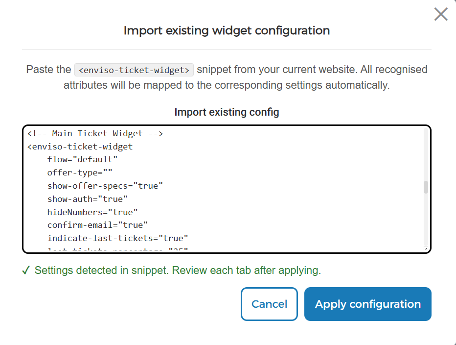 |
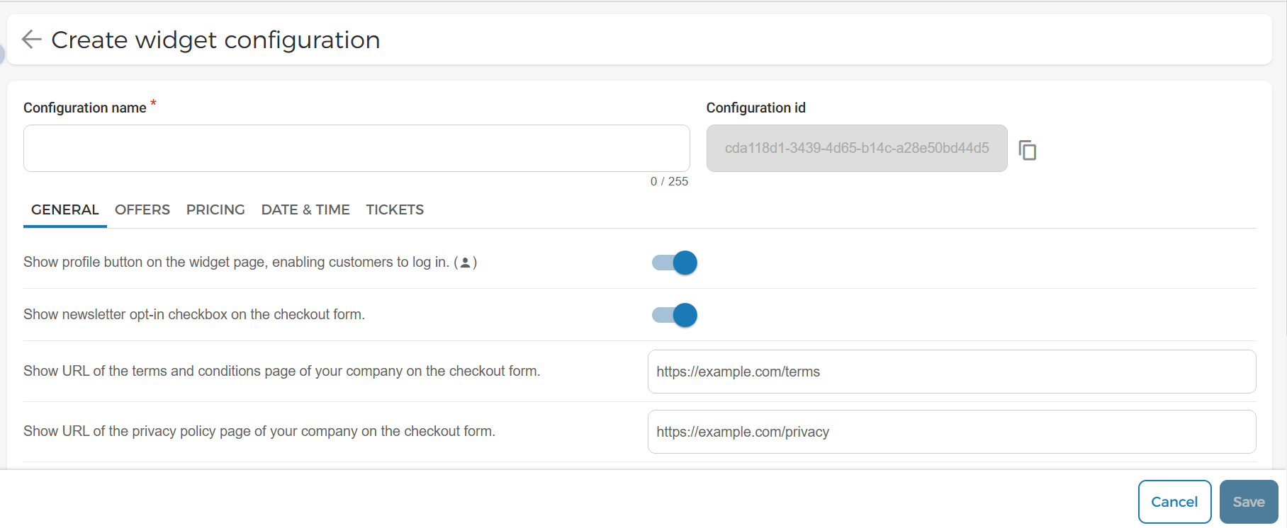
Click Apply configuration. All recognised attributes will be mapped to the corresponding settings automatically. Review the imported settings on each tab and make any required changes. When you save the configuration, it is ready to be linked to your website widget.
 |
Blank widget configuration
In the create widget configuration pop-up select blank configuration . Next enter the configuration name & other widget-related details.
A unique Configuration ID is generated automatically when the configuration is created and it cannot be edited. This ID can be copied & set on widget HTML component in the html code on your website.
General
This section allows you to configure the overall behaviour and appearance of the Ticketing Widget.
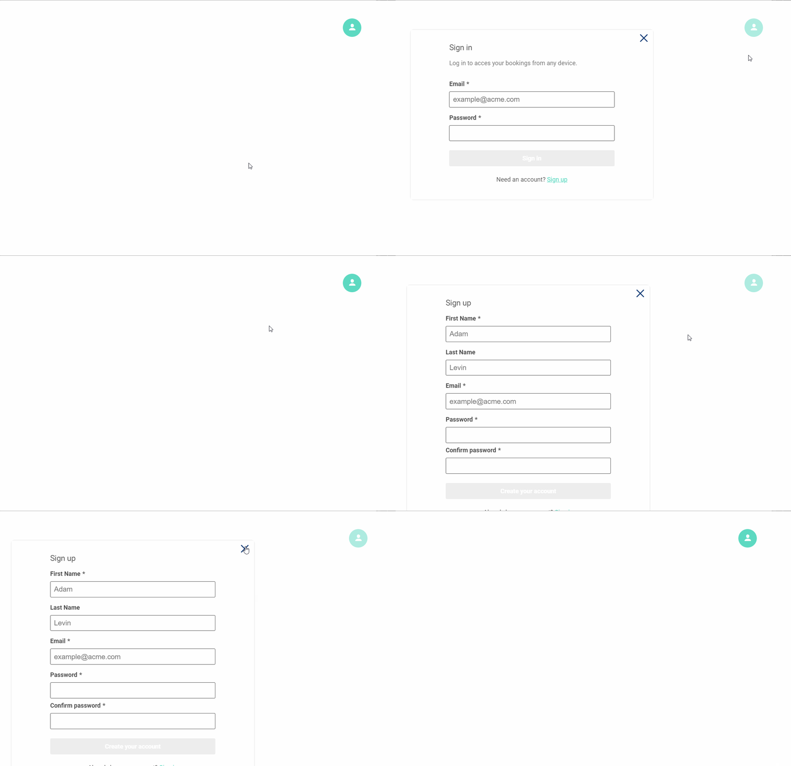
Show profile button | Displays the profile button on the widget, allowing customers to sign in to their account.
| |
Show newsletter opt-in checkbox | Displays a newsletter subscription checkbox during checkout.
| |
Terms and conditions URL | Enter the URL of your company's Terms and Conditions page. The link is displayed during checkout.
| |
Privacy policy URL | Enter the URL of your company's Privacy Policy page. The link is displayed during checkout. | |
Hide cart button | Hides the shopping cart button from the widget. | |
Reflect widget routing in URL hash | When enabled, routing in the widget will be reflected in the hash of the URL, and the widget will also listen to hash changes. NoteThis setting only works when there is a single widget embedded on the page. | |
Functional flow | Select the functional flow used by the widget. Available options are Sales and Redeem. By default, the widget uses the Sales flow. | |
Hide step numbers | Hides the step numbers displayed throughout the sales flow.
|



Offers
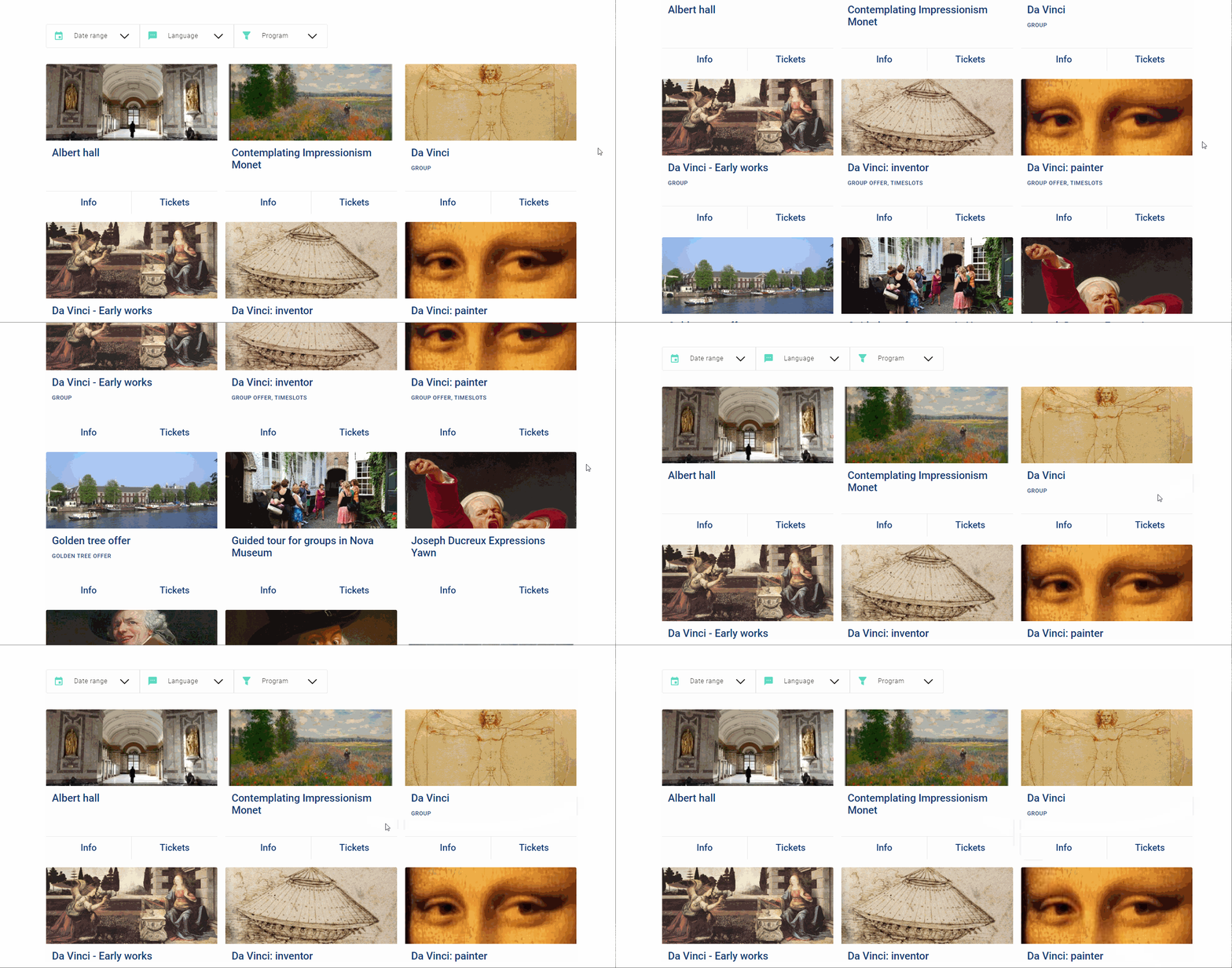
This section allows you to control which offers are displayed in the widget and how they are visible to visitors.
Show only one specific offer | If enabled , it will show only one specific offer, skipping the offer overview. This takes priority over the offer type setting. NoteThis overrides the Include and Exclude specific offers settings & Restricting the offer overview to a single offer type.
| |
Restrict the offer overview to a single offer type | Limits the offer overview to a specific offer type.By default, this is set to 'All'. NoteIt overrides the Include and Exclude specific offers settings and overridden by Show only one specific offer & Skipping the offer overview. settings.
| |
Include only specific offers on the widget | Displays only the selected offers in the widget. NoteThis setting overrides Exclude specific offers from the widget. However, it is ignored when Show only one specific offer , Skipping the offer overview & Restrict the offer overview to a single offer type is configured. | |
Exclude specific offers from the widget | Prevents the selected offers from being displayed in the widget. NoteThis setting is ignored if Show only one specific offer, Skipping the offer overview, Restrict the offer overview to a single offer type, or Include only specific offers on the widget is configured. | |
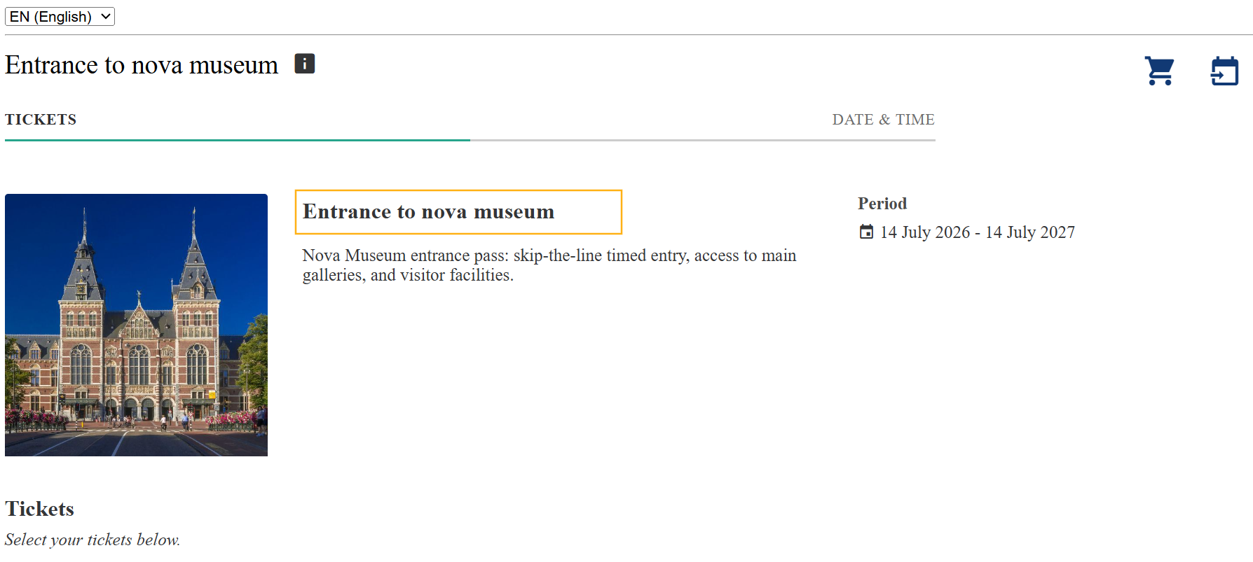
Show offer details for regular offers without guides | It displays additional offer information on the product selection page for regular offers without guides. It is always shown for (guided) group offers. | |
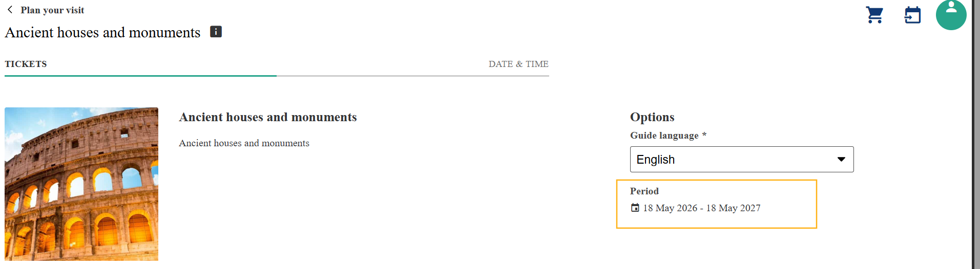
Show offer validity period | Displays the offer validity period on the product selection page.
|
Pricing
This section allows you to control how pricing information is displayed throughout the Ticketing Widget.
Show reservation prices on offers with a price rule | Displays reservation prices for offers that use price rules. If enabled , you can also configure types of price to display . Available options include lowest total, highest total, lowest unit and highest unit. | |
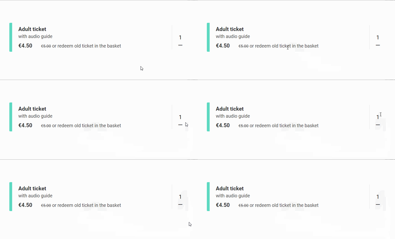
Show pre-discount prices | Displays the original price before discounts on the product selection page, calendar, time slots and basket. If enabled , you can also configure number of days from today used to determine the dynamic price.
|
Date & Time
This section allows you to control how visitors select visit dates and time slots.
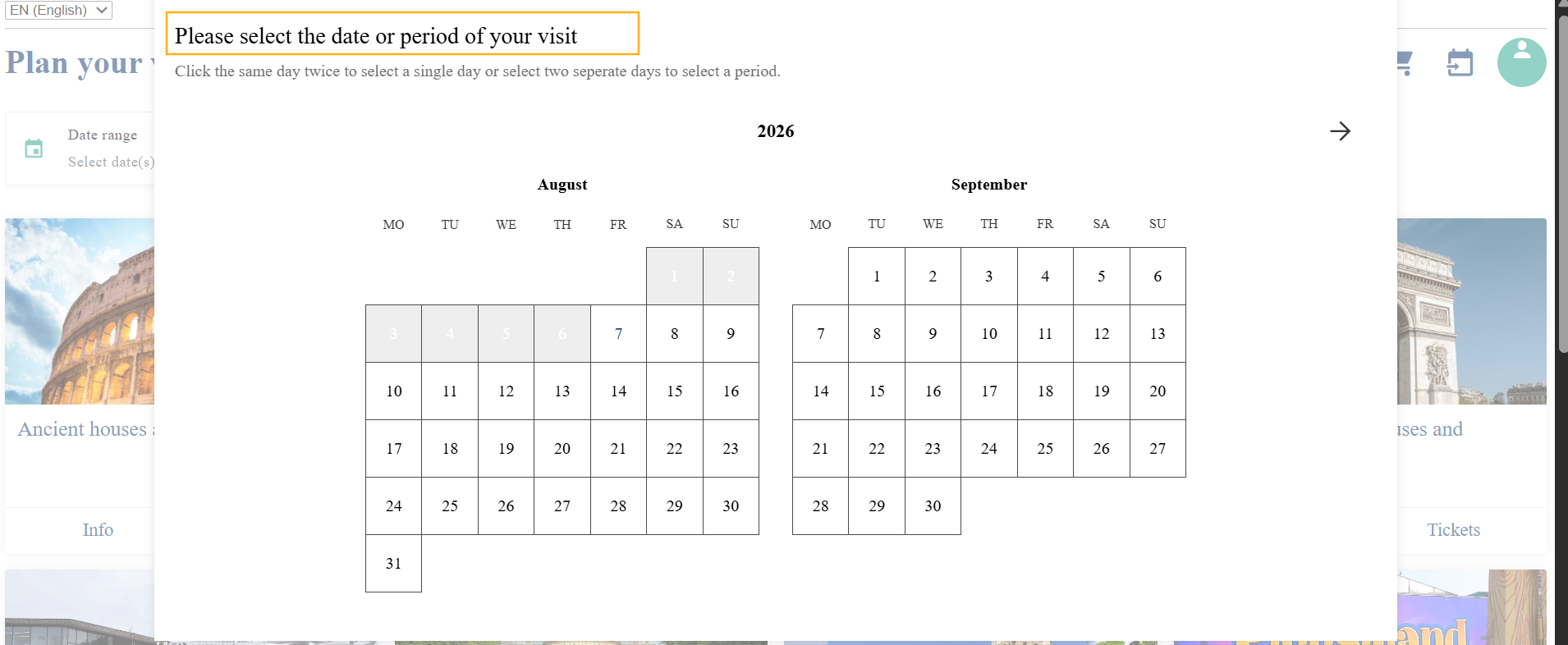
Show a popup to select the date after loading the widget | Displays a date selection popup when the widget first loads.
| |
Preferred dates | Configure one or more preferred dates. The first date in the list that has available capacity is automatically selected. | |
Prevent auto-selecting the first available date/time slot | Prevents the widget from automatically selecting the first available date and time slot. | |
Hide time slot end time | Displays only the start time of each time slot. For example, 14:00 instead of 14:00–15:00. Example: |
Tickets
The Tickets section allows you to control how ticket availability is displayed in the widget.
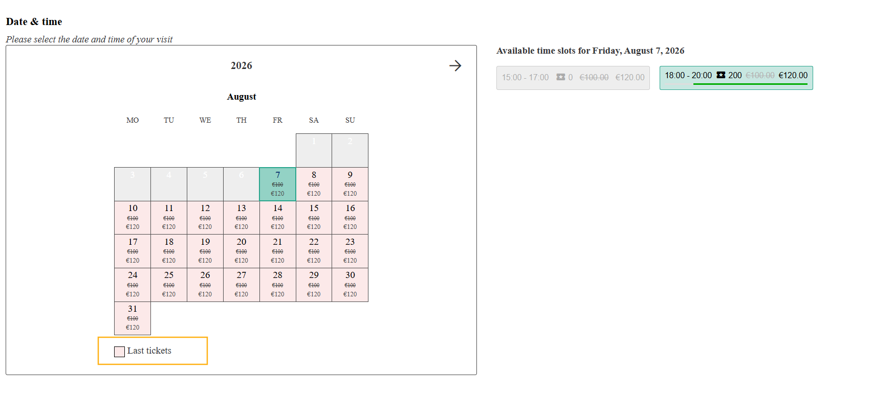
Show a 'Last tickets' label | Displays a Last tickets indicator on offers and in the calendar when availability becomes limited.
| |
Show this label when the remaining capacity drops below this percentage | Specify the remaining capacity percentage at which the Last tickets label is displayed. | |
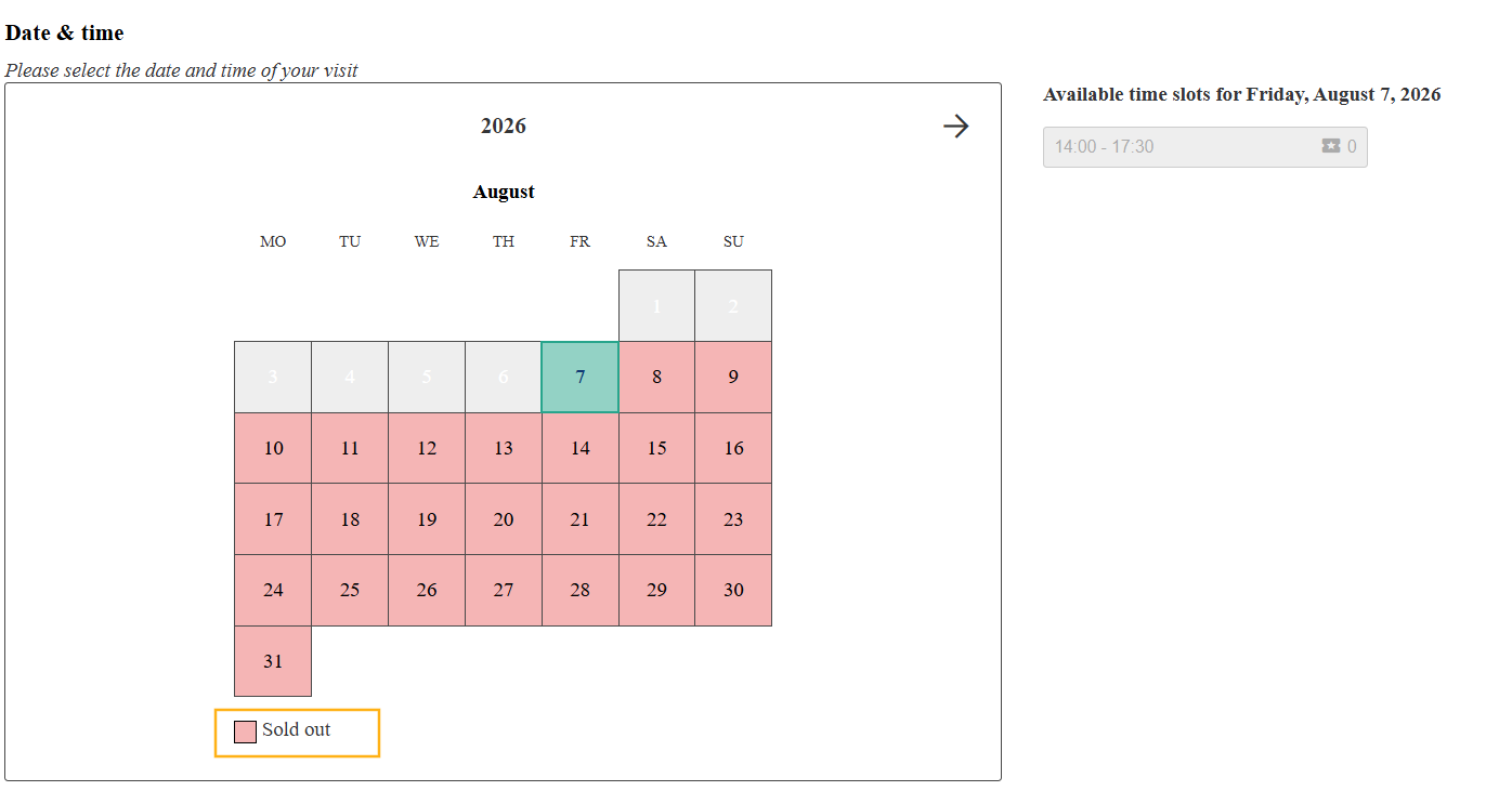
Show a 'Sold out' label | Displays a Sold out indicator on offers and in the calendar when tickets are no longer available.
|
Translations
This section allows you to manage custom translations for the default widget text labels in one or more languages by providing a JSON object directly in the text editor.
Note
Only include the keys you wish to translate. Any key that is not included will fall back to its default value.
Section | Label & Description | |
|---|---|---|
Offer overview | Page title - Main heading shown at the top of the offer overview. (Default: Plan your visit)
| |
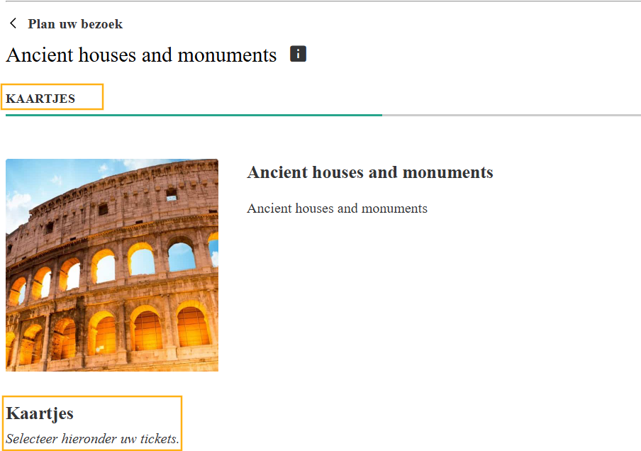
Ticket selection | Section title - Bold heading above the ticket quantity selectors. (Default: Tickets)
| |
Section subtitle - Italic instruction shown below the section title. (Default: Select your tickets below.) | ||
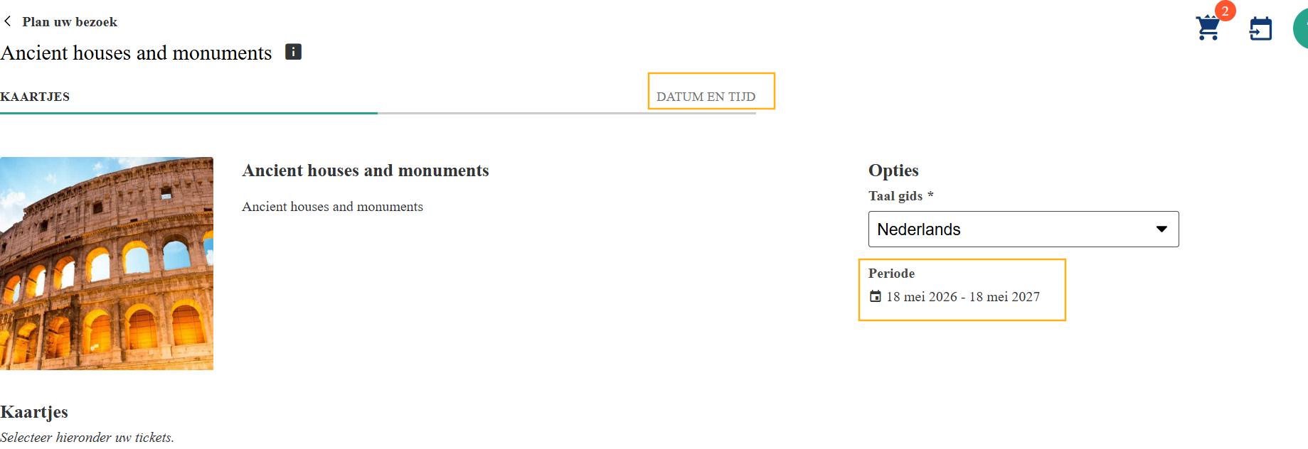
Date & time | Section title - Bold heading above the calendar and time slot picker. (Default: Date & time)
| |
Section subtitle - Italic instruction shown below the date & time heading. (Default: Please select the date and time of your visit) | ||
Cross-sell title - Heading above cross-sell activity suggestions. Only shown when cross-sell items are available. (Default: Complete your visit, choose an activity:) | ||
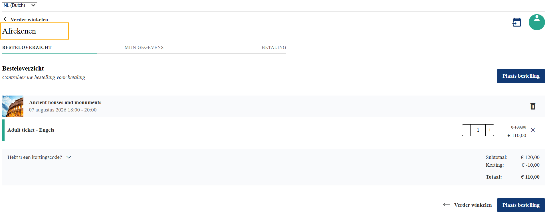
Basket & checkout | Continue shopping label - Label on the back link in the basket and checkout flow. (Default: Continue shopping) | |
Checkout page title - Main heading shown at the top of the checkout flow. (Default: Checkout)
| ||
Order overview title - Bold heading on the order overview step. (Default: Order overview) | ||
Order overview subtitle - Italic instruction below the order overview title. (Default: Check your order before paying) | ||
My info | Section title - Bold heading on the personal details form step. (Default: My info) 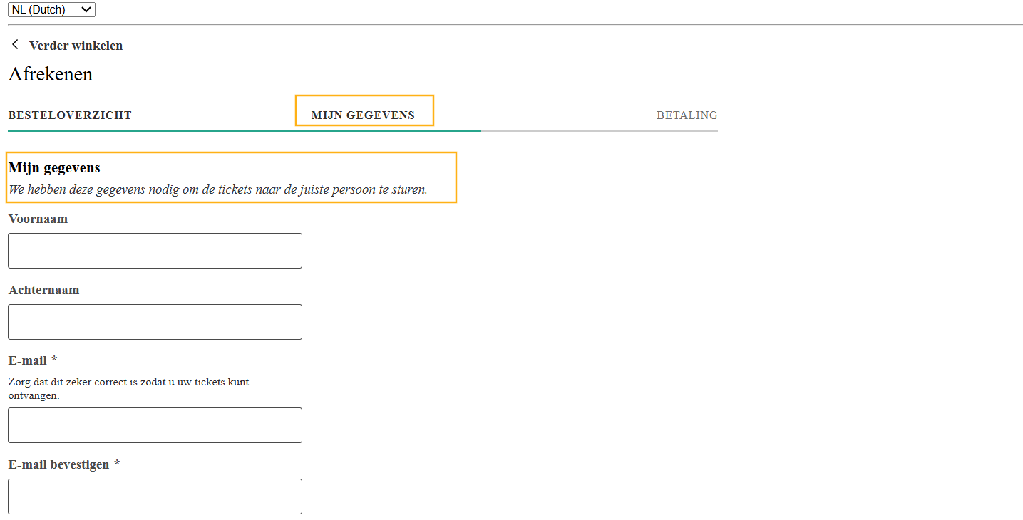 | |
Section subtitle - Italic instruction below the "My info" heading. (Default: We require this info to send the tickets to the correct person.) |

Edit Widget
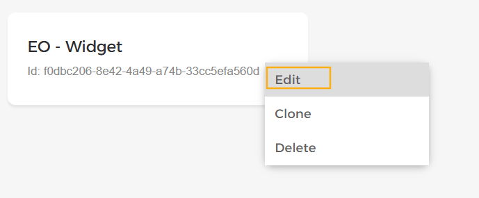
On the Widget configurations overview , locate the widget configuration you want to edit and click the Edit option.
 |
Make the required changes across the available tabs and click Save to update the widget configuration.
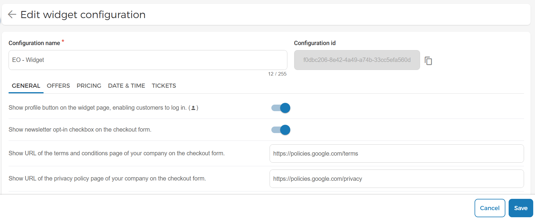 |
Any widgets linked to this configuration will use the updated settings.
Clone Widget
On the Widget configurations overview, locate the widget configuration you want to clone and click the Clone option.
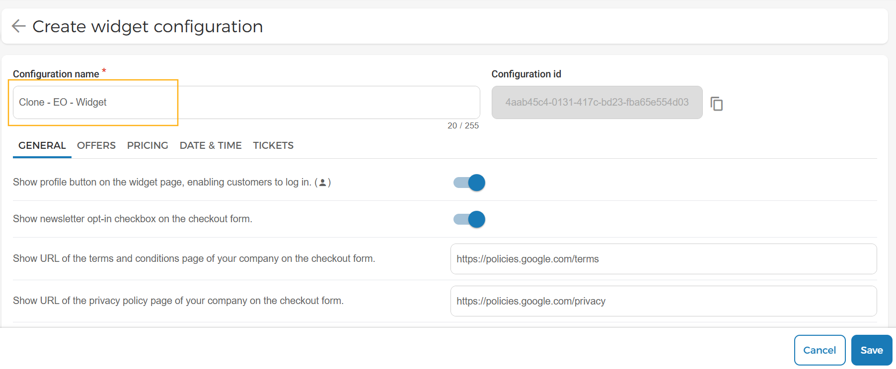
A copy of the selected widget configuration is created. The cloned configuration name is automatically prefixed with Clone, followed by the original configuration name with the unique configuration id.
You can modify the cloned widget configuration as required before saving it.
 |
Delete Widget
On the Widget configurations overview, locate the widget configuration you want to remove and click the Delete option.
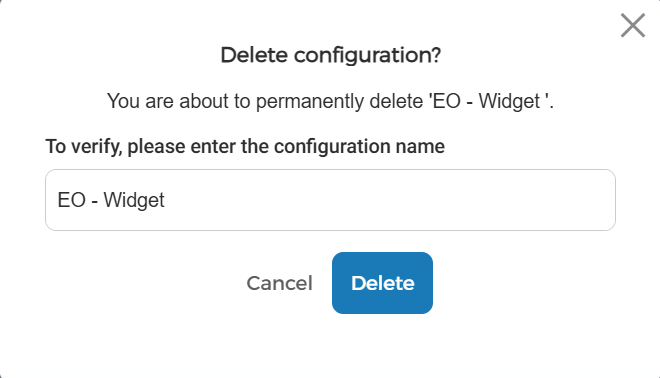
In the resulting confirmation pop-up, enter the name of the widget configuration to confirm the deletion.
Click Delete to permanently remove the widget configuration.
 |