Inputs
Textbox
An element to a textbox with a label
Tagname:
<enviso-textbox>URL:
Staging: enviso-textbox-element.js
Production: enviso-textbox-element.js
Empty element: Yes
Demo
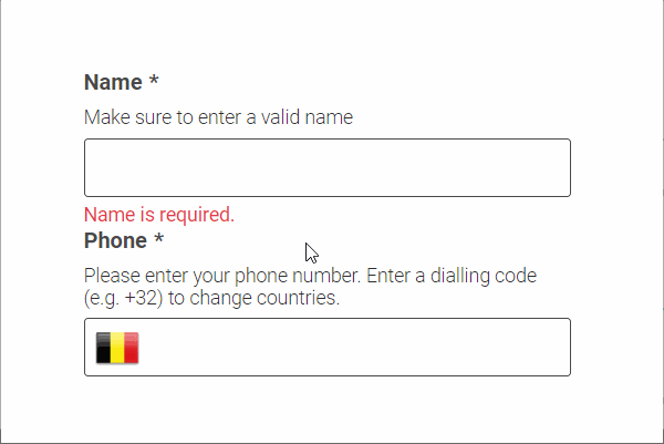
<enviso-textbox label="Name" info="Make sure to enter a valid name" required required-error-message="Name is required.">
</enviso-textbox>
<enviso-textbox label="Phone" type="tel" phone-number-country="BE" info="Please enter your phone number. Enter a dialling code (e.g. +32) to change countries." phone-number-error-message="Invalid phone number" required required-error-message="Phone is required.">
</enviso-textbox>
Properties
Attribute | Property | Type | Description |
|---|---|---|---|
info | info | string | To display extra information for the enduser |
label | label | string | The text to display as a label |
value | value | string | The value of the textbox |
type | type | string | The type of the underlying input field, supports fully-featured 'tel' input |
required | required | boolean | Whether this is a required input field |
required-error-message | requiredErrorMessage | string | The validation message to show if the textbox is required and empty |
confirm | confirm | boolean | Whether to show a second input field whose value must match in order to pass validation |
confirm-error-message | confirmErrorMessage | boolean | The validation message to show if the value in the confirm textbox doesn't match |
pattern | pattern | string | Regex pattern that the content should match for validation |
pattern-error-message | patternErrorMessage | string | The validation message to show if the textbox content does not match the pattern |
phone-number-country | phoneNumberCountry | string | The initial or automatically detected country for the phone number, changes when a dialling code is entered |
phone-number-error-messge | phoneNumberErrorMessage | string | The validation message to show if the input does not contain a valid phone number |
max-length | maxLength | number | The maximum number of characters for the input field |
max-length-message | maxLengthMessage | string | The validation message to show if the textbox content length is greater than the max length |
min-length | minLength | number | The minimum number of characters for the input field |
min-length-message | minLengthErrorMessage | string | The validation message to show if the textbox content length is less than the min length |
/ | errorMessage | string | The error message that is currently displayed (readonly) |
Methods
validate() - Validates the content of the textbox according to the configured validation rules.
Events
Name | Description | Data |
|---|---|---|
change | When the content of the textbox changes |
|
Text Area
An element to a text area with a label
Tagname:
<enviso-textarea>URL:
Staging: enviso-textarea-element.js
Production: enviso-textarea-element.js
Empty element: Yes
Demo
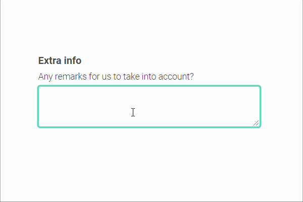
<enviso-textarea label="Extra info" info="Any remarks for us to take into account?" max-length="50" max-length-message="Please enter at most 50 characters.">
</enviso-textarea>
Properties
Attribute | Property | Type | Description |
|---|---|---|---|
info | info | string | To display extra information for the enduser |
label | label | string | The text to display as a label |
value | value | string | The value of the text area |
required | required | boolean | Whether this is a required input field |
required-error-message | requiredErrorMessage | string | The validation message to show if the textbox is required and empty |
pattern | pattern | string | Regex pattern that the content should match for validation |
pattern-error-message | patternErrorMessage | string | The validation message to show if the textbox content does not match the pattern |
max-length | maxLength | number | The maximum number of characters for the input field |
max-length-message | maxLengthMessage | string | The validation message to show if the textbox content length is greater than the max length |
min-length | minLength | number | The minimum number of characters for the input field |
min-length-message | minLengthErrorMessage | string | The validation message to show if the textbox content length is less than the min length |
/ | errorMessage | string | The error message that is currently displayed (readonly) |
Methods
validate() - Validates the content of the textbox according to the configured validation rules.
Events
Name | Description | Data |
|---|---|---|
change | When the content of the text area changes |
|
Add Text
An input element with an add button
Tagname:
<enviso-add-text>URL:
Staging: enviso-add-text-element.js
Production: enviso-add-text-element.js
Empty element: Yes
Demo
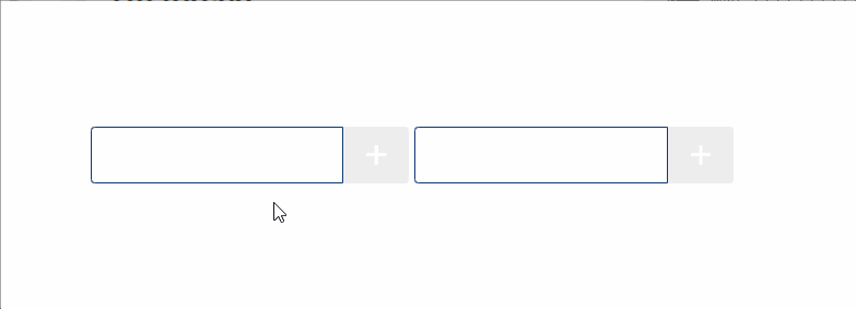
<enviso-add-text>
</enviso-add-text>
<enviso-add-text value="test" max-length="5">
</enviso-add-text>
Properties
Attribute | Property | Type | Description |
|---|---|---|---|
value | value | string | The value of the textbox |
max-length | maxLength | number | The max length of the textbox |
Events
Name | Description | Data |
|---|---|---|
add | When the add button is clicked |
|
Button
A simple button element
Tagname:
<enviso-button>URL:
Staging: enviso-button-element.js
Production: enviso-button-element.js
Empty element: No
Demo
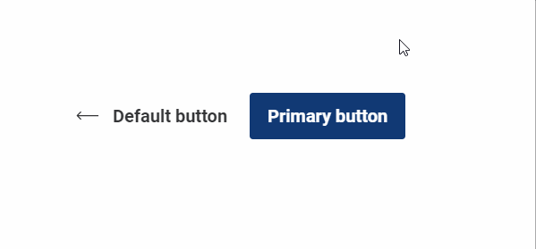
<enviso-button icon-name="back-arrow">
  Default button
</enviso-button>
<enviso-button primary>
  Primary button
</enviso-button>
Properties
Attribute | Property | Type | Description |
|---|---|---|---|
icon-name | iconName | string | Adds an enviso-icon with the specified name to the button |
icon-right | iconRight | boolean | Moves the icon to the right side of the button |
icon-only | iconOnly | boolean | Display only the icon, hiding the text in an accessibility-friendly way |
primary | primary | boolean | Makes the button primary |
disabled | disabled | boolean | Makes the button disabled |
Dropdown Button
A drop-down button element
Tagname:
<enviso-dropdown-button>URL:
Staging: enviso-dropdown-button-element.js
Production: enviso-dropdown-button-element.js
Empty element: No
Demo
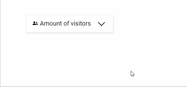
<enviso-dropdown-button>
  <span slot="button-face">
    <enviso-icon name="group">
    </enviso-icon>
    <span>
      Amount of visitors
    </span>
  </span>
  <span>
    <enviso-numeric-up-down>
    </enviso-numeric-up-down>
  </span>
</enviso-dropdown-button>
Slots
Name | Location | Extra Info |
|---|---|---|
button-face | Button | Markup of the button face itself |
- | Dropdown | Contents of the dropdown element |
Numeric up/down
Shows the option to redeem tickets
Tagname:
<enviso-numeric-up-down>URL:
Staging: enviso-numeric-up-down-element.js
Production: enviso-numeric-up-down-element.js
Empty element: Yes
Demo
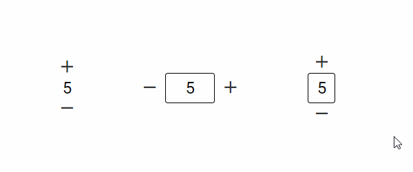
<style>
  enviso-numeric-up-down { margin: 0 2em; vertical-align: middle; }
</style>
<enviso-numeric-up-down value="5" min="0" max="10" label="amount of Adult tickets">
</enviso-numeric-up-down>
<enviso-numeric-up-down value="5" min="0" max="10" layout="horizontal" bordered>
</enviso-numeric-up-down>
<enviso-numeric-up-down value="5" min="0" max="10" bordered>
</enviso-numeric-up-down>
Properties
Attribute | Property | Type | Description |
|---|---|---|---|
max | max | number | Highest possible value |
min | min | number | Lowest possible value |
value | value | number | Current (or initial) value |
label | label | string | Invisible label that describes the input's purpose (for accessibility) |
layout | layout | string | Possible values: "horizontal" and "vertical", default "vertical" |
bordered | bordered | boolean | Whether to draw a box around the numerical value |
/ | canGoDown | boolean | True if the value can be decreased (read-only) |
/ | canGoUp | boolean | True if the value can be increased (read-only) |
Events
Name | Description | Data |
|---|---|---|
change | When the value of the NUD changes |
|
Select
A select box/drop-down for selecting one of the multiple possible options
Tagname:
<enviso-select>URL:
Staging: enviso-select-element.js
Production: enviso-select-element.js
Empty element: Yes
Demo
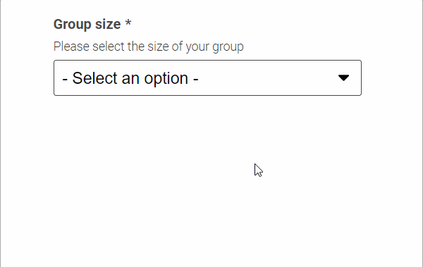
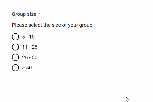
<enviso-select id="select-groupsize" label="Group size" info="Please select the size of your group" required required-error-message="Group size is required.">
</enviso-select>
<script>
  document.addEventListener('DOMContentLoaded', function () { document.getElementById('select-groupsize').options = [ { text: "5 - 10", value: "small" }, { text: "11 - 25", value: "medium" }, { text: "26 - 50", value: "large" }, { text: ">50", value: "x-large" } ] });
</script>
Properties
Attribute | Property | Type | Description |
|---|---|---|---|
info | info | string | To display extra information for the enduser |
label | label | string | The text to display as a label |
/ | options | Array(Object) | An array of selectable options; objects with |
selected-value | selectedValue | string | The selected value |
required | required | boolean | Whether this is a required input field |
required-error-message | requiredErrorMessage | string | The validation message to show if the selection is required and empty |
/ | errorMessage | string | The error message that is currently displayed (readonly) |
Methods
validate() - Validates the content of the textbox to required attribute values.
Events
Name | Description | Data |
|---|---|---|
change | When the selected option changes |
|
Country Select
A select box for selecting a country
Tagname:
<enviso-country-select>URL:
Staging: enviso-country-select-element.js
Production: enviso-country-select-element.js
Empty element: Yes
Demo
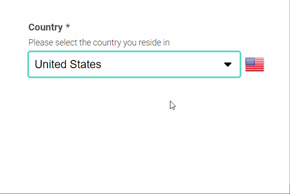
<enviso-country-select label="Country" info="Please select the country you reside in" required required-error-message="Country is required.">
</enviso-country-select>
Properties
Attribute | Property | Type | Description |
|---|---|---|---|
info | info | string | To display extra information for the enduser |
label | label | string | The text to display as a label |
value | value | string | The country code |
/ | countryList | array | A list of countries to choose from, objects containing |
required | required | boolean | Whether this is a required input field |
required-error-message | requiredErrorMessage | string | The validation message to show if the selection is required and empty |
/ | errorMessage | string | The error message that is currently displayed (readonly) |
Methods
validate() - Validates the content of the textbox to required attribute values.
Events
Name | Description | Data |
|---|---|---|
change | When the selected country changes |
|
Checkbox
A simple checkbox element
Tagname:
<enviso-checkbox>URL:
Staging: enviso-checkbox-element.js
Production: enviso-checkbox-element.js
Empty element: No
Demo
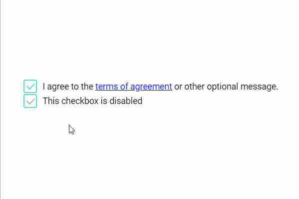
<enviso-checkbox checked>
  I agree to the
  <a href="#">
    terms of agreement
  </a>
  or other optional message.
</enviso-checkbox>
<enviso-checkbox checked disabled>
  This checkbox is disabled
</enviso-checkbox>
Properties
Attribute | Property | Type | Description |
|---|---|---|---|
checked | checked | boolean | Checks the checkbox |
disabled | disabled | boolean | Disables the checkbox |
required | required | boolean | Makes the checkbox required |
required-error-message | requiredErrorMessage | string | The validation message to show if the checkbox is not checked |
Events
Name | Description | Data |
|---|---|---|
change | When the checkbox gets checked or unchecked |
|
Methods
validate() - Validates the required property.
Multiselect
A list of items that can be selected
Tagname:
<enviso-multiselect>URL:
Staging: enviso-multiselect-element.js
Production: enviso-multiselect-element.js
Empty element: Yes
Demo
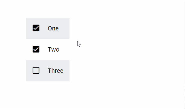
<enviso-multiselect items="["One", "Two", "Three"]" selected-items="["Two"]"> </enviso-multiselect>
Properties
Attribute | Property | Type | Description |
|---|---|---|---|
items | items | Array(String) | Available items for selection |
selected-items | selectedItems | Array(String) | Selected items |
Events
Name | Description | Data |
|---|---|---|
change | When items are selected or deselected |
|
Radio Button
A simple radio element
Tagname:
<enviso-radio>URL:
Staging: enviso-radio-element.js
Production: enviso-radio-element.js
Empty element: No
Demo
<enviso-radio id="radio-groupsize" label="Group size" info="Please select the size of your group" required required-error-message="Group size is required." value>
</enviso-radio>
<script>
  document.addEventListener('DOMContentLoaded', function () { document.getElementById('radio-groupsize').options = [ { text: "5 - 10", value: "small" }, { text: "11 - 25", value: "medium" }, { text: "26 - 50", value: "large" }, { text: ">50", value: "x-large" } ] });
</script>
Properties
Attribute | Property | Type | Description |
|---|---|---|---|
info | info | string | To display extra information for the enduser |
label | label | string | The text to display as a label |
/ | options | Array(Object) | An array of selectable options; objects with |
required | required | boolean | Whether this is a required input field |
required-error-message | requiredErrorMessage | string | The validation message to show if the selection is required and empty |
/ | errorMessage | string | The error message that is currently displayed (readonly) |
Methods
validate() - Validates the content of the textbox to required attribute values.
Events
Name | Description | Data |
|---|---|---|
change | When the selected option changes |
|
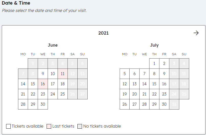
Calendar
A calendar element with date selection
Tagname:
<enviso-calendar>URL:
Staging: enviso-calendar-element.js
Production: enviso-calendar-element.js
Empty element: Yes
Demo
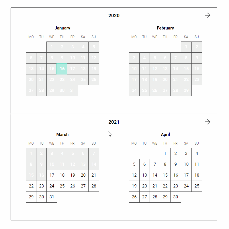
<enviso-calendar selected-date="2020-01-16" disable-past-dates="disable-past-dates" disabled-dates="["2020-01-29","2020-01-30","2020-02-01","2020-02-02"]"> </enviso-calendar> <enviso-calendar disable-past-dates="disable-past-dates" select-mode="range" max-range-days="14"> </enviso-calendar>
Properties
Attribute | Property | Type | Description |
|---|---|---|---|
disabled-dates | disabledDates | Array(Date/TimeInfo) | All dates that cannot be selected |
enabled-dates | enabledDates | Array(Date/TimeInfo) | If this property is set, only the dates within this property will be enabled |
disable-past-dates | disablePastDates | boolean | Automaticly disable all dates that have passed |
month | month | number | The month to visualize |
year | year | number | The year to visualize |
select-mode | selectMode | string | The selection mode: "single" or "range", default "single" |
selected-date | selectedDate | Date | The selected date or null in "single" select mode, null in other modes |
selected-range | selectedRange |
| The selected range or null in "range" select mode, null in other modes |
max-range-days | maxRangeDays | number | The maximum amount of days a range can span (start/end inclusive) |
Events
Name | Description | Data |
|---|---|---|
change | When the selected date or range changes |
|
Calendar legend
A legend for the calendar component. When certain timeslots have last tickets available, the dates will be coloured as per the calendar legend.
Tagname:
<enviso-calendar-legend>URL:
Staging: enviso-calendar-legend-element.js
Production: enviso-calendar-legend-element.js
Empty element: Yes
<enviso-calendar-legend>
</enviso-calendar-legend>
Calendar Month
Displays a single month of the calendar element
Tagname:
<enviso-calendar-month>URL:
Staging: enviso-calendar-month-element.js
Production: enviso-calendar-month-element.js
Empty element: Yes
Demo
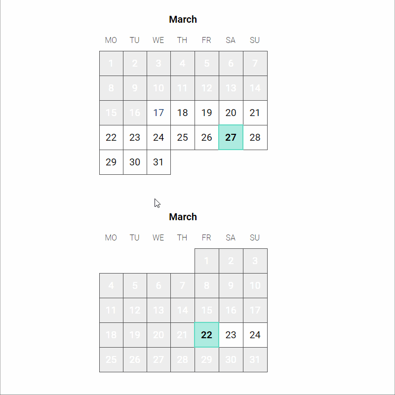
<div>
<enviso-calendar-month selected-date="2018-11-16" disable-past-dates="disable-past-dates" onchange="console.log('date', event.detail.date);">
</enviso-calendar-month>
</div>
<div>
<enviso-calendar-month id="ecmExample" year="2019" month="3" enabled-dates="["2019-03-22","2019-03-23","2019-03-24"]">
</enviso-calendar-month>
</div>
<div>
<enviso-calendar-month id="ecmExample3" year="2019" month="11" select-mode="range" max-range-days="7">
</enviso-calendar-month>
</div>Properties
Attribute | Property | Type | Description |
|---|---|---|---|
disabled-dates | disabledDates | Array(Date/TimeInfo) | All dates that cannot be selected |
enabled-dates | enabledDates | Array(Date/TimeInfo) | If this property is set, only the dates within this property will be enabled |
disable-past-dates | disablePastDates | boolean | Automaticly disable all dates that have passed |
month | month | number | The month to visualize |
year | year | number | The year to visualize |
select-mode | selectMode | string | The selection mode: "single" or "range", default "single" |
selected-date | selectedDate | Date | The selected date or null in "single" select mode, null in other modes |
selected-range | selectedRange |
| The selected range or null in "range" select mode, null in other modes |
max-range-days | maxRangeDays | number | The maximum amount of days a range can span (start/end inclusive) |
Events
Name | Description | Data |
|---|---|---|
change | When the selected date or range changes |
|
Date
An element to enter a date with a label, info and validation
Tagname:
<enviso-date>URL:
Staging: enviso-date-element.js
Production: enviso-date-element.js
Empty element: Yes
Demo
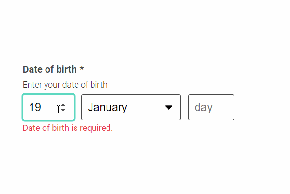
<enviso-date label="Date of birth" info="Enter your date of birth" required required-error-message="Date of birth is required." min-date="1900-01-01" min-date-error-message="You can't possibly be that old!">
</enviso-date>
Properties
Attribute | Property | Type | Description |
|---|---|---|---|
info | info | string | To display extra information for the enduser |
label | label | string | The text to display as a label |
value | value | date | The value of the input |
required | required | boolean | Whether this is a required input field |
required-error-message | requiredErrorMessage | string | The validation message to show if the input is required and empty |
min-date | minDate | date | The earliest date the user can input |
min-date-error-message | minDateErrorMessage | date | The validation message to show when the user enters a date that is before the earliest date |
max-date | maxDate | date | The latest date the user can input |
max-date-error-message | maxDateErrorMessage | date | The validation message to show when the user enters a date that is after the latest date |
/ | errorMessage | string | The error message that is currently displayed (readonly) |
Methods
validate() - Validates the content of the date input.
Events
Name | Description | Data |
|---|---|---|
change | When the content of the date input changes |
|
Tab Context
An element that keeps tab navigation inside. Once the focus is inside this element, you cannot tab out.
Tagname:
<enviso-tab-context>URL:
Staging: enviso-tab-context-element.js
Production: enviso-tab-context-element.js
Empty element: No
Demo
<enviso-tab-context>
  <input type="text">
  <input type="number">
  <enviso-button>
    Button
  </enviso-button>
</enviso-tab-context>