Display
Expand
Collapsed box with information that can open and show its full content
Tagname:
<enviso-expand>URL:
Staging: enviso-expand-element.js
Production: enviso-expand-element.js
Empty element: No
Demo
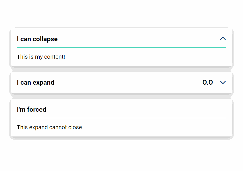
<enviso-expand caption="I can collapse" open>
  <span>
    This is my content!
  </span>
</enviso-expand>
<enviso-expand caption="I can expand" onchange="console.log('e', event)">
  <span slot="teaser">
    O.O
  </span>
  <span>
    This is my second content!
  </span>
</enviso-expand>
<enviso-expand caption="I'm forced" force>
  <span>
    This expand cannot close
  </span>
</enviso-expand>
Properties
Attribute | Property | Type | Description |
|---|---|---|---|
caption | caption | string | The title of the box |
open | open | boolean | True if the element is open (expanded) |
force | force | boolean | Forces the element to be open at all times |
Events
Name | Description | Data |
|---|---|---|
change | When the element is opened or closed |
|
Slots
Name | Location | Extra Info |
|---|---|---|
teaser | Top right | Only shows when the element is closed |
Accordion
Accordion Item
An accordion item element to use inside the <enviso-accordion> element.
Tagname:
<enviso-accordion-item>URL:
Staging: enviso-accordion-element.js
Production: enviso-accordion-element.js
Empty element: No
Properties
Attribute | Property | Type | Description |
|---|---|---|---|
open | open | boolean | Whether the item is open |
Accordion
An element to display an accordion with enviso-accordion-items
Tagname:
<enviso-acordion>Empty element: No
Demo
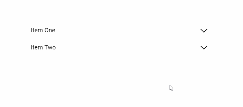
<enviso-accordion>
  <enviso-accordion-item>
    <span slot="header">
      Item One
    </span>
    <span>
      This is a first item
    </span>
  </enviso-accordion-item>
  <enviso-accordion-item>
    <span slot="header">
      Item Two
    </span>
    <span>
      This is a second item
    </span>
  </enviso-accordion-item>
</enviso-accordion>
Properties
Attribute | Property | Type | Description |
|---|---|---|---|
open-multiple-items | openMultipleItems | boolean | Determines whether multiple accordion items can be open at the same time |
Responsive
An element that allows you to use simple queries to display or hide content based on the room that the element has.
Tagname:
<enviso-responsive>URL:
Staging: enviso-responsive-element.js
Production: enviso-responsive-element.js
Empty element: No
Demo
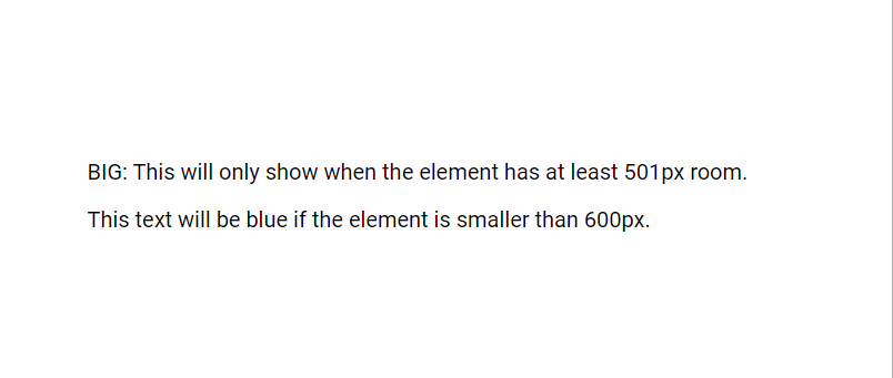
<enviso-responsive max-width="500">
  <p>
    SMALL: This will only show when the element has at most 500px room.
  </p>
</enviso-responsive>
<enviso-responsive min-width="501">
  <p>
    BIG: This will only show when the element has at least 501px room.
  </p>
</enviso-responsive>
<style>
  .examp { color: blue; }
</style>
<enviso-responsive responsive-class="examp" max-width="600">
  <p>
    This text will be blue if the element is smaller than 600px.
  </p>
</enviso-responsive>
Properties
Attribute | Property | Type | Description |
|---|---|---|---|
max-width | maxWidth | number | If set, the content will not show if the available width is larger than this value |
min-width | minWidth | number | If set, the content will not show if the available width is smaller than this value |
responsive-class | responsiveClass | string | If set, the given class will be set on this element instead of making it visible/invisible |
/ | visible | boolean | Whether the content is visible (readonly) |
Tooltip
Component that shows a tooltip when you hover over its content
Tagname:
<enviso-tooltip>URL:
Staging: enviso-tooltip-element.js
Production: enviso-tooltip-element.js
Empty element: No
Demo
<style>
table.tooltips { width: 100%; }
</style>
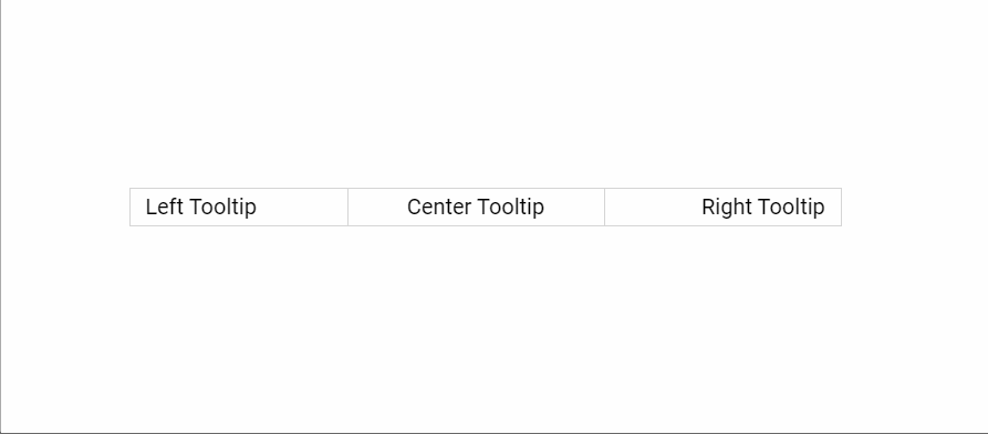
<table class="tooltips">
<tbody>
<tr>
<td style="text-align:left;">
<enviso-tooltip tooltip="It opens the information from left side.">
<span>
Left Tooltip
</span>
</enviso-tooltip>
</td>
<td style="text-align:center;">
<enviso-tooltip tooltip="It opens the information in center.">
<span>
Center Tooltip
</span>
</enviso-tooltip>
</td>
<td style="text-align:right;">
<enviso-tooltip tooltip="It opens the information from right side. If it does't then please hide the code part.">
<span>
Right Tooltip
</span>
</enviso-tooltip>
</td>
</tr>
</tbody>
</table>Properties
Attribute | Property | Type | Description |
|---|---|---|---|
tooltip | tooltip | string | The text to display when hovering |
Icon
Shows an icon
Tagname:
<enviso-icon>URL:
Staging: enviso-icon-element.js
Production: enviso-icon-element.js
Empty element: Yes
Demo
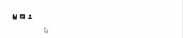
<enviso-icon name="bookmark">
</enviso-icon>
<enviso-icon name="comments">
</enviso-icon>
<enviso-icon name="customer">
</enviso-icon>
Properties
Attribute | Property | Type | Description |
|---|---|---|---|
name | name | string | The name of the icon |
Flag
Shows a flag
Tagname:
<enviso-flag>URL:
Staging: enviso-flag-element.js
Production: enviso-flag-element.js
Empty element: Yes
Demo
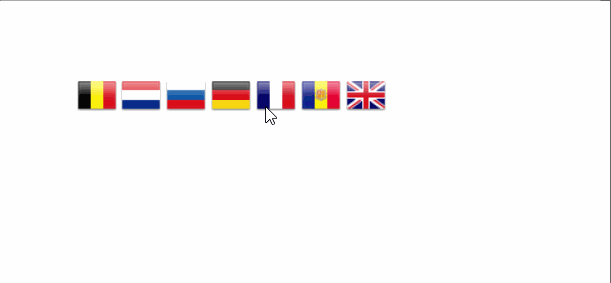
<enviso-flag country="BE">
</enviso-flag>
<enviso-flag country="nl">
</enviso-flag>
<enviso-flag country="ru">
</enviso-flag>
<enviso-flag country="DE">
</enviso-flag>
<enviso-flag country="fr">
</enviso-flag>
<enviso-flag country="sp">
</enviso-flag>
<enviso-flag country="GB">
</enviso-flag>
Properties
Attribute | Property | Type | Description |
|---|---|---|---|
country | country | string | The 2 letter iso code of the country |